We all have been awed and amazed by the Hans Rosling talk Debunking third-world myths with the best stats you’ve ever seen.
The software used by Professor Rosling is Gapminder. There are demos and links to numerous similar presentations on their web site.
I’ve made numerous animated charts in Excel, including Gas Prices – Animated Bar Chart for Excel and Gas Prices – Animated Bar Chart for Excel 2. I’ve been meaning to try one of these Gapminder-style animated bubble charts, but I’d never taken the time. However, I received an email from Wiebe van der Waals, who had put together a prototype Gapminder chart in Excel.
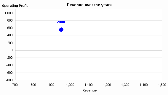
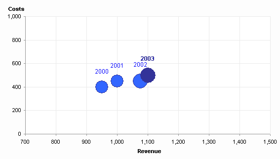
Here is Wiebe’s simple data, followed by his chart, which I’ve adjusted a bit.


Move a scroll bar to display the point for a particular year. Click a Play button to show each year in sequence.
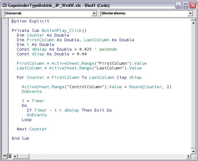
Wiebe’s animation was very simple, jumping from one year to the next in a very irregular fashion, but it had the right idea. To smooth the animation, I introduced an interpolation routine so the transition from year to year took a series of steps in between individual data points. Here is the current state of the animation program.

There is still a lot of room to improve this simple charting animation. There is already a scrollbar and a Play button. It would be easy to include additional controls as in my Gas Price animation, such as Pause, Reverse, Go To Start, Go To Finish. Other adjustments would include the ability to change the number of steps in the interpolation (smoothing) algorithm and to change the playback rate, preferably on the fly.
Download the Gapminder Type Bubble Chart workbook, try it out, and give me your comments. The code is unprotected, so you can see how it works. This is a very cool addition to Excel’s arsenal.
Update 9 December 2008
In response to Eric’s comment, I’ve put together a version of this file in which the moving bubble leaves a “breadcrumb” corresponding to the data point for each year. This new workbook is described in Gapminder For Excel II.


