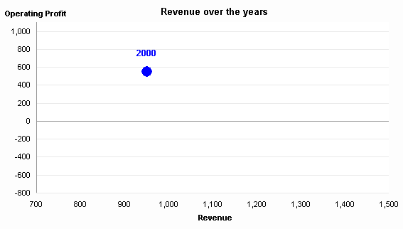
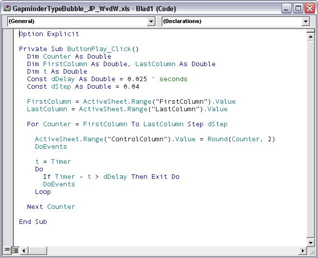
A few months ago in Gapminder for Excel I made a simplistic mockup of Hans Rosling’s Gapminder presentation Debunking third-world myths with the best stats you’ve ever seen in Excel. It was fairly simple, with a single bubble marching across a chart, interpolating between yearly data points as a simple timer-based VBA procedure incremented.
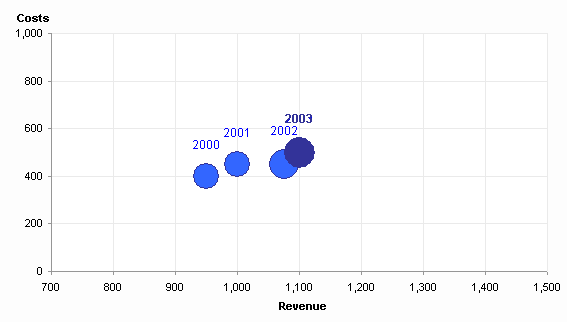
An astute reader named Eric thought that the chart would be more effective if the moving bubble left a trail of breadcrumbs, as it were, the annual mileposts along the travels of the moving bubble. I took up the challenge, and it took less time to work up than it’s taking to write this post.


