In-Cell Charts Using Worksheet Formulas
Data visualization is an integral part of analysis and reporting, and charts are a major part of data visualization in Excel. But “formula charts” are small charts built with simple formulas and displayed within worksheet cells. Formula charts were developed when electronic spreadsheets were text-only, and such lightweight charts may be better suited to a report depending on its specific requirements. Formula charts are ideally suited to visualize data within a tabular framework in a dashboard or other report.
Bar Formula Charts
Everyone uses Excel bar charts. They are easy to create (though you may need to turn them upside–down) and float above the worksheet. You can resize the charts to align with your tabulated data, but they easily become misaligned, causing repeated tweaking.
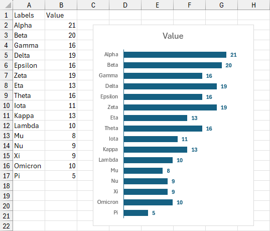
We can build a bar chart in the cells next to our data by stacking characters up like bricks.
The formula we use is based on the REPT function which repeats a string of text a certain number of times. In our case, this formula in cell C2 repeats the pipe character “|” by the number given in cell B2.
=REPT("|",$B2)Copy the formula into the range C2:C17 to produce this “chart.”
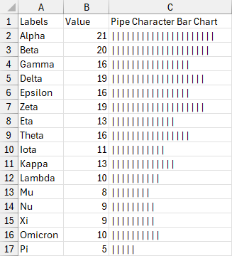
Well, that is hardly the nicest bar chart; using the default Aptos Narrow font the pipe characters are widely spaced. But we can improve on that using Aptos Black or Arial, which have narrow spaces between the pipes, and Brittanic Bold has no space at all between pipes. These font options are displayed below.
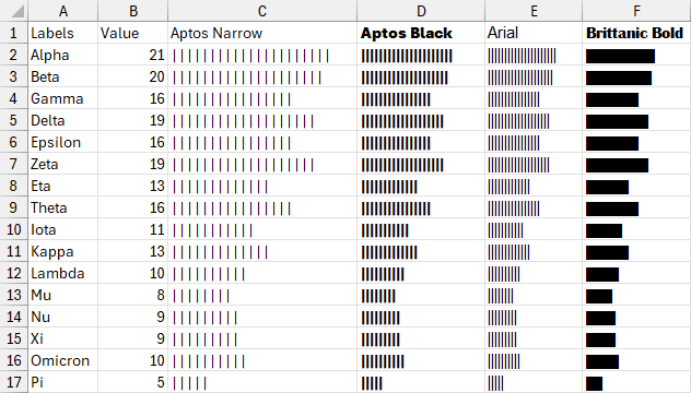
Much nicer. But what happens if we want to fit our bar chart into a narrower or wider column? We can scale our bar length by multiplying it by a factor. We modify our formula in cell C2 by multiplying the value in cell B2 by the scaling factor or percentage in cell C1.
=REPT("|",$B2*C$1)This results in these variations of the bar chart.
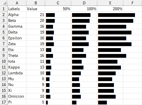
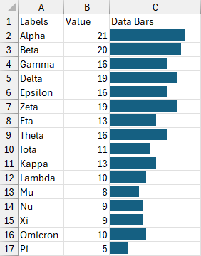
People have used these formula charts since before spreadsheet programs had such extensive charting features. Excel 2007 introduced in-cell bar charts called “Data Bars” and Excel 2010 improved them. Data Bars are probably more useful nowadays: they are easier to scale to fit within a column and are not constrained to display whole characters.
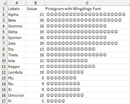
We can turn our bar chart into a pictogram by replacing the pipe character with a different character. We can replace the pipe character with a capital J in our formula in cell C2
=REPT("J",$B2)
then format the cells to use the Wingdings font, since uppercase J is a smiley face character in Wingdings.
Column Formula Charts
We can also create a vertical bar chart (or column chart) using formulas, as shown below. All we have done below is rotate the text direction upwards.
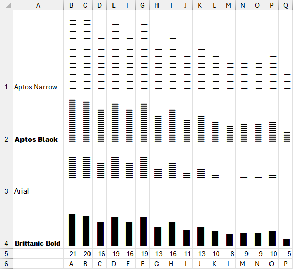
Sparkline charts were introduced in Excel 2010, perhaps making our vertical formula charts obsolete.

Even though Data Bars and sparklines have made in-cell bar charts easier, our formula charts can still be useful, especially if we want to create pictograms.
Dot Formula Plots
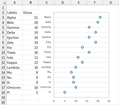
Dot Plots can be made in Excel, but there is no native dot plot chart type, so it takes a clever combination of data layout, combination chart types, and formatting to pull it off. My commercial utility Peltier Tech Charts for Excel produces this “classic” dot plot, which is configured to line up with the worksheet’s gridlines and the chart’s source data.
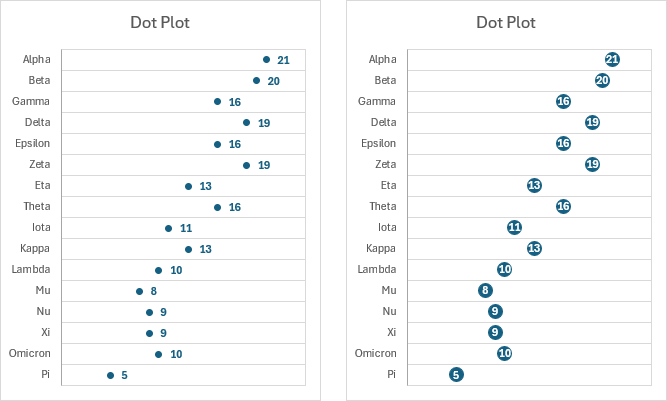
Peltier Tech Charts for Excel can create other dot plots which are not aligned with the grid, and which can be embellished to make charts like these.
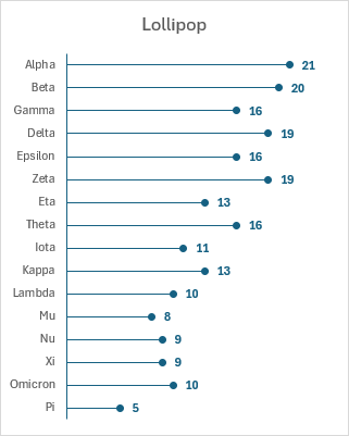
Another Peltier Tech dot plot variation is called a lollipop chart because a line connects each point to the axis next to the tick labels.
Like all Excel charts, these dot plots float above the worksheet and do not automatically maintain alignment with the cells in the data range. But we can use formula charts to build dot plots within the grid. And Excel has not implemented its own in-cell dot plots.
Instead of stacking pipes or other characters to build a bar, we use a character as a marker and precede it by a certain number of spaces to display a value. In cell C2, this formula repeats a space character by one less than the number in cell B2, then uses the ● character as a marker.
=REPT(" ",$B2-1)&"●"Here is our chart.
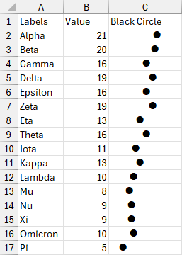
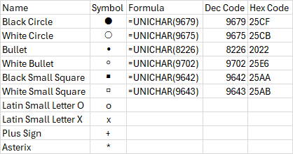
Where did I find the ● character? I clicked on Insert > Symbol and spent a few minutes browsing through the Symbol dialog. ● is Unicode character 9679 (or Hex 25CF) in the standard font. You can dig it out of the Insert Symbol dialog, which is tedious, or use the formula below to display it in a cell.
=UNICHAR(9679)Copy the cell and Paste Special > Values to get the character where you can copy and paste it.
Here are some characters that you may find suitable as markers in an in-cell dot plot. If you want more, you can browse through the various wingding fonts.
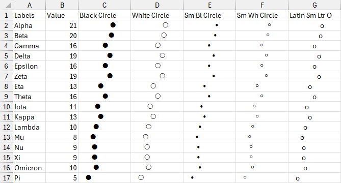
Here is the same chart as above but using a few different symbols. The lowercase O is easy to use and probably suitable for most formula dot plots.
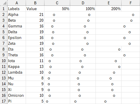
You can adjust the formula if you need to scale the in-cell dot plots. I multiply the value in B2 by the percentage in C1 then subtract 1, repeat a space character this many times, then append a lowercase o, in the formula in cell C2.
=REPT(" ",$B2*C$1-1)&"o"
Here are charts with three different scales.
Lollipop Formula Charts
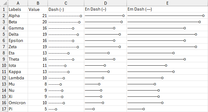
Replace the space in the formula in cell C2 by a dash (or an en-dash or em-dash).
=REPT("-",$B2-1)&"o"Here are the resulting lollipop charts.
You can replace the character “o” in any of these formulas with an emoji (in quotes).
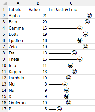
One of the cool kids can show you how to get the emoji keyboard on your computer.
Rotated Dot Formula Charts
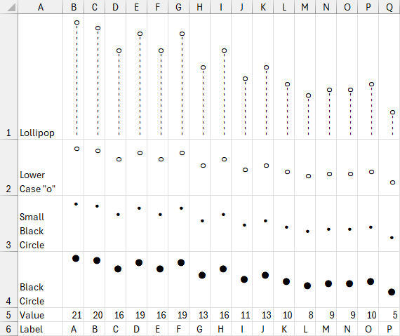
Our dot plots and lollipops can be turned sideways by rotating the text upwards.
Conditional Formatting
You can conditionally format the formula charts; this is hard to do with a regular chart and is unsupported for Data Bars and sparklines. We apply formats by conditionally formatting the text in the formula chart range C2:F17. The font is gray before applying conditional formatting. The following two rules are applied to the range.
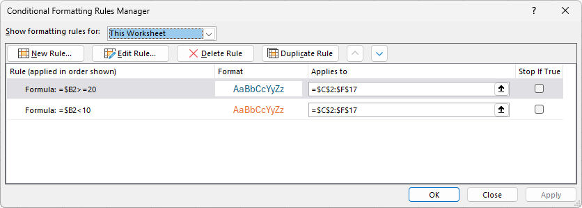
If the number in the Value column is 20 or greater, make the font blue; if it is less than 10, make the font orange. This works for the bar charts and dot plots.
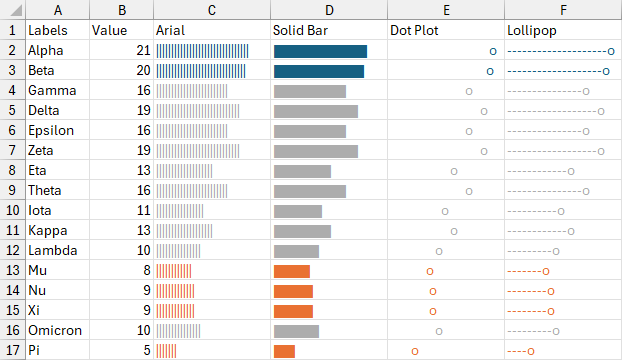
We can change marker characters with a formula. To get a lowercase o for values above 15 and a lowercase x for values below 15, we use this formula:
=IF($B2>=15,"o","x")
This is appended to the formula in cell D2, for example:
=REPT("-",$B2-1)&IF($B2>=15,"o","x")
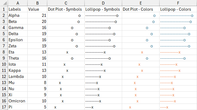
All four columns of dot plots below have conditionally applied markers. Apply conditional formatting to color the font blue for values above 15 and orange for values below 15 to get the last two columns of dot plots below.
