The Problem
You’ve made a nice custom chart, and now you want to make copies of it with new data. The copies come out fine, but when you change to new data, they lose their custom formatting. What’s wrong? The culprit is an Excel setting called “Properties Follow Chart Data Point.”
I originally wrote this post several years ago, before Microsoft had any documentation about this property. I have added a shorter summary to the top of this article, but you can read to the end for more examples.
“Properties Follow Chart Data Point”
What does that phrase even mean? It’s not clear, and if you do an internet search, the first two pages of search results have lots of forum posts. The forums mention it as a way to change some unexpected and undesired behavior, but nobody describes what it means that “Properties Follow Chart Data Point”.
Microsoft has finally added some documentation in its article about Advanced Options. They say, “Select this option to have formatting and data labels follow data points when they move or change.” Okay, I know what those words mean, but I don’t know what that sentence means.
To help explain this strange setting, I’ll show a couple of simple scenarios which I’ll use to describe how the property works. Then I’ll show a real-world example where it can mess up a small multiple chart layout, for example, in your dashboard. After the examples I’ll show how to change this setting.
Which Properties Follow Which Data Point?
This option affects custom properties, including most but not all series formatting, and some but not all data labels and label formatting. This custom formatting is linked to (that is, it follows) the cells that contain the data which contains the data being formatted and the labels being displayed.
Custom Series Formatting and Data Labels
This first example shows one series in a chart with custom formatting: series ‘beta’, the second series in the chart is formatted with red and white diagonal stripes, and its data labels are bold and red. I’ve also applied the diagonal red and white pattern to the worksheet range that contains the data for ‘beta’. The chart is selected so that the plotted data range is highlighted in the worksheet.
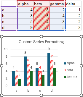
With Properties Follow set to true (see instructions below), adjust the data so that ‘beta’ becomes the first series in the chart. The red and white striped formatting and the bold red data labels have followed series ‘beta’ as it moved from second to first position in the chart. The formatting has followed the worksheet data.
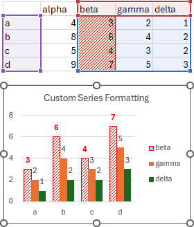
With Properties Follow set to false, adjust the data so that ‘beta’ becomes the first series in the chart. The red and white striped formatting and bold red data labels are now applied to series ‘gamma’, even though series ‘beta’ has moved from the second to the first series in the chart. The formatting has not followed the worksheet data.
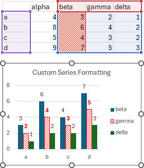
I can think of cases where I’d want the formatting to follow my worksheet data, and other cases, perhaps more, where I’d want the formatting not to follow my worksheet data.
Custom Point Formatting and Data Labels
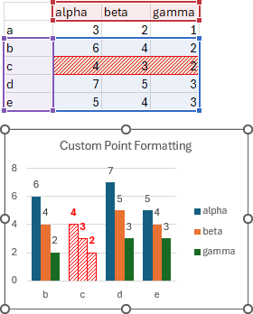
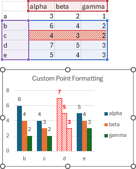
The next example shows one point in each series in a chart with custom formatting: the third point in each series (category ‘c’) is formatted with the same red and white diagonal stripes, and its data label is bold and red. I’ve also applied the diagonal red and white pattern to the worksheet range that contains the data for these points. The chart is selected so that the plotted data range is highlighted in the worksheet.
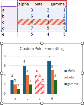
With “Properties Follow” set to true (see instructions below), adjust the data so that ‘c’ becomes the second category in the chart. The red and white striped formatting and the bold red data labels have followed category ‘c’ as it moved from third to second position in the chart. The formatting has followed the worksheet data.
With “Properties Follow” set to false, adjust the data so that ‘c’ becomes the second category in the chart. The red and white striped formatting and bold red data labels are now applied to category ‘d’, even though category ‘c’ has moved from the third to the second position in the chart. The formatting has not followed the worksheet data.
Properties Follow Consequences for Small Multiples
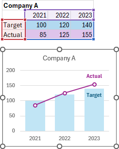
The phrase “Small Multiples” refers to a situation where two and often more charts are placed side by side. Each chart shows the same data for a different subgroup of the main data set. Using consistent formatting in all the charts means that once the first chart is deciphered, the subsequent charts are easier to comprehend. In our example we will show yearly Target and Actual sales for two companies.
When building a small multiple of charts, don’t make multiple charts and try to format them separately: you will never make them exactly the same. Instead, make one chart, and make it as close to perfect as possible. Then copy the chart, and change the source data of the copied chart to the next subset of data.
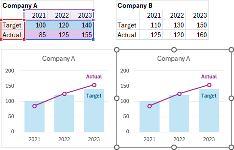
In his example we have ‘Target’ and ‘Actual’ sales data for ‘Company A’. Custom formatting has been applied to the ‘Target’ bars and the ‘Actual’ lines and markers, and data labels with custom font properties (bold and color) have been applied to the last point in each series.
Here we have added data for ‘Company B’.
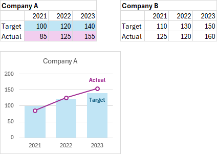
We’ve copied the ‘Company A’ chart.
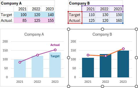
With “Properties Follow” set to true, we have changed the ‘Company B’ chart’s source data range to the data for ‘Company B’. Our carefully crafted customizations are lost, since our data no longer points to the ‘Company A’ data that the formatting is linked to. We have lost the data labels, the ‘Target’ fill color, and the ‘Actual’ line color and thickness, though the ‘Actual’ markers retain their custom formatting. The formatting has followed the worksheet data and spoiled our chart.
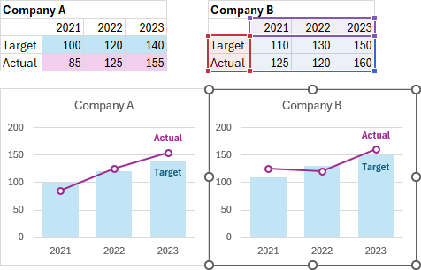
With “Properties Follow” set to false, we have changed the ‘Company B’ chart’s source data range to the data for ‘Company B’. Our carefully crafted customizations are maintained. We still have our data labels, the ‘Target’ fill color, and the ‘Actual’ line and marker formatting. The formatting has not followed the worksheet data and our chart is formatted identically to the first.
Properties Following Data Points: Changing the Setting
The Dialogs
To get to the Properties Follow Chart Data Point setting, click on Excel’s File tab on the ribbon, choose Options, then click on Advanced. Scroll down to Chart, and you’ll see “Properties Follow Chart Data Point for All New Workbooks” and “Properties Follow Chart Data Point for Current Workbook”.
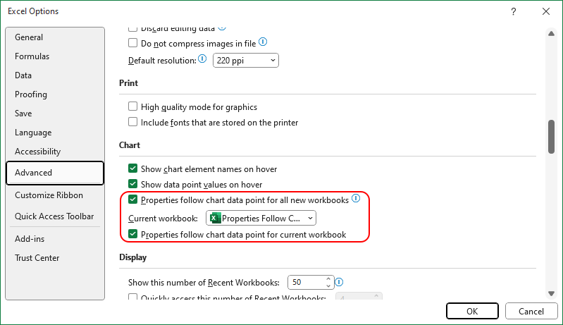
There’s a little i-in-a-circle information icon; click on it and you’ll be able to read this description:

Sounds special, custom formatting and labels follow data points, whatever that means.
The default setting for both of these settings is checked (True), so that the properties will follow the data point.
Okay, so uncheck the box. I always just uncheck the box for the current workbook. Because of a fear of missing out on something magical, I’ll admit that I always return here and check it later, and I never check the box for all new workbooks.

It still isn’t very clear what it means.
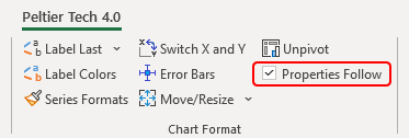
It takes a bit of clicking and scrolling to change this setting. If you have Peltier Tech Charts for Excel, there is an easier-to-access checkbox on the Peltier Tech ribbon, in the Chart Format group.
The Visual Basic Commands
You may need to change these properties in your VBA code. The syntax to check and uncheck the box for all workbooks is:
    Application.ChartDataPointTrack = True
    Application.ChartDataPointTrack = False
The syntax to check and uncheck the box for the active workbook is:
    ActiveWorkbook.ChartDataPointTrack = True
    ActiveWorkbook.ChartDataPointTrack = False
If you are using a Mac, there is nowhere in the user interface to change this setting. I’ve reported this shortcoming to Microsoft, and they’ve placed it in their queue. Fortunately, these VBA commands work on the Mac as well as in Windows.
Examples from the original article continue below.
Small Multiple Charts
Scenario A – No Problem
Very often, in a dashboard or other report, you need to make a set of charts which are all formatted the same but show different data. The steps to accomplish this easily are straightforward: (1) arrange your data, (2) create the first chart, and format it perfectly, (3) make copies of the perfect chart, and (4) change the data in the copied charts as appropriate.
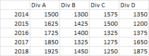
(1) Arrange your data: Below is a simple data set, with four columns of data, one for each chart in the report.
(2) Create the first chart, and format it perfectly: Here is the first chart, formatted simply as we want all of our charts to look.

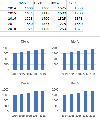
(3) Make copies of the perfect chart: Here are our four charts, showing the original data in each.
(4) Change the data in the copied charts: Each chart below shows its own division’s data.
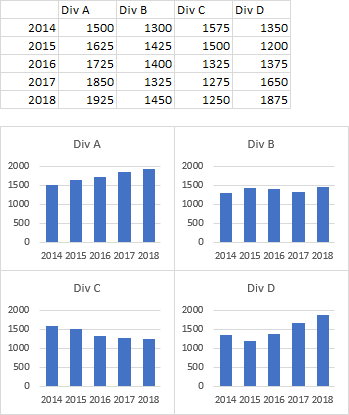
No problem! But then, none of the points in any chart had any special formatting applied.
Scenario B – Aaagh!
In the more practical case, one or more points in our charts have custom formatting applied. Let’s apply the same protocol as above and see how it plays out.
(1) Arrange your data: Below is a simple data set, with four columns of data, one for each chart in the report. Also note that we’ve indicated that our corporation got a new CEO in 2015.

(2) Create the first chart, and format it perfectly. We’ve highlighted the arrival of the new CEO by labeling the data point “New CEO” and coloring the bar green instead of the default blue.
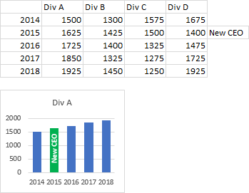
(3) Make copies of the perfect chart: Here are our four charts, showing the original data and custom formatting in each.
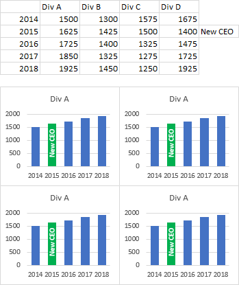
(4) Change the data in the copied charts: Each chart below shows its own division’s data, but the custom formatting is lost.

Where did our formatting go?? Now we’re going to have to apply it chart by chart.
Well, maybe not, if we first change the “Properties Follow Chart Data Point” setting as described above.
Examples of Properties Following Data Points
I’ve prepared a handful of examples to illustrate how this setting works, and why you may not want to uncheck it permanently.
Example A – Properties Following Data Points
Properties Follow Chart Data Points
This simple example has one series of data. The first view below shows the default chart, and I’ve highlighted two cells, with gold and green fill colors.
The second view shows how I’ve applied custom formatting to two bars, gold and green filled bars plus labels reading “Gold” and “Green”, corresponding to the cells with those fill colors. I’ve also highlighted the chart data range in the worksheet.
In the third view, I’ve changed the chart’s data range, shifting values and categories one row down (note the highlighting in the worksheet). Since the Properties Follow Points setting is true, the green and gold bars and labels have moved in the chart from the second and fourth bars to the first and third bars, so the same cells’ values are still highlighted.

With the Properties Follow Points setting checked (True), the custom formatting (bar fill colors and labels) have followed the points as the data range changed.
This is useful if you apply highlighting or labels to particular points in the data range (linking those points to their corresponding cells), for example, to indicate certain categories or events within the data.
Properties Do Not Follow Chart Data Points
This is the same example. The first view below shows the default chart, and I’ve highlighted two cells, with gold and green fill colors.
The second view shows identical custom formatting, gold and green filled bars plus “Gold” and “Green” data labels, corresponding to the cells with those colors. I’ve highlighted the chart data range in the worksheet.
In the third view, I’ve changed the chart’s data range, shifting values and categories one row down (note the highlighting in the worksheet). Since the Properties Follow Points setting is false, the green and gold bars and labels have not moved in the chart, but remain on the second and fourth bars.

With the Properties Follow Points setting unchecked (False), the custom formatting (bar fill colors and labels) have not followed the points as the data range changed.
Also we’ve learned that “properties” include point formatting and data labels.
This is useful if you apply highlighting or labels to particular points in the chart.
Example B – Properties Following Data Points and Series
Properties Follow Chart Data Points and Series
This example has multiple series of data. The first view below shows the default chart with two series, and I’ve highlighted two cells in each column, with gold and green fill colors.
The second view shows how I’ve applied custom formatting to two bars in each series, gold filled bars plus labels reading “Gold” on the first series, and green filled bars and “Green” labels on the second series. I’ve also highlighted the chart data range in the worksheet.
In the third view, I’ve changed the chart’s data range, shifting values and categories one row down (note the highlighting in the worksheet). Since the Properties Follow Points setting is true, the green and gold bars and labels have moved in the chart from the second and fourth bars to the first and third bars.
In the fourth view, I’ve changed the chart’s original data range, shifting values and series names one column right. Since the Properties Follow Points setting is true, the green bars and labels have moved in the chart from the second series to the first, and the gold bars and labels have fallen off the chart.

Now we’re starting to see where all of our custom formatting went in our second scenario at the start of this article. Move the data far enough, so the cells corresponding to the chart’s highlighting move out of range, and all the formatting moved off the chart.
Properties Do Not Follow Chart Data Points and Series
This repeats the same example. The first view below shows the default chart with two series, and the two highlighted cells in each column, with gold and green fill colors.
The second view shows the same custom formatting, two gold filled bars plus labels reading “Gold” on the first series, and green filled bars and “Green” labels on the second series. I’ve also highlighted the chart data range in the worksheet.
In the third view, I’ve changed the chart’s data range, shifting values and categories one row down (note the highlighting in the worksheet). Since the Properties Follow Points setting is false, the green and gold bars and labels have not moved in the chart, staying with the second and fourth bars in each series.
In the fourth view, I’ve changed the chart’s original data range, shifting values and series names one column right. Since the Properties Follow Points setting is false, the custom formats have not moved in the chart, with the gold bars and labels on the first series and the green on the second.

Now we see our answer. If we want to keep custom formatting in our chart when we assign a different data range to it, make sure the Properties Follow Points setting is unchecked.
Example C – Properties Following Custom Data Labels (or not)
This example takes a closer look at data labels, including two ways to apply labels from worksheet cells. It also shows what I think is a bug in the Excel’s implementation of the property.
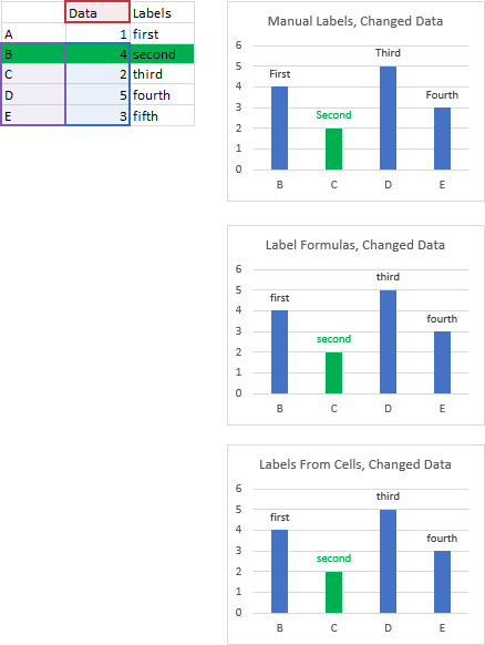
The data is simple, with categories (X values), Y values, and labels in adjacent columns. I’ve made three charts, each with a green-highlighted second bar and with data labels. The labels in the first chart (“First”, “Second”, etc.) were typed manually. Data labels in the second chart were applied using formulas, for example, =Sheet1!$C$1 for “first”, etc. Labels in the third chart were applied using the Values from Cells setting, and selecting the range of labels.
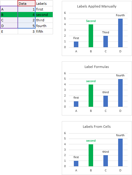
Properties Follow Chart Data Points
Here I’ve moved the data range down one row. The green formatting has followed the data from the second to the first bars in each chart. The data labels have also moved down one bar. There was no fifth bar with a label to move to the fourth bar, so the fourth label reads the default Y value, or 3.
The exception to this data label movement is the labels that use values from cells. I would expect these to move with the data even more reliably, but they don’t. This is the bug I think I’ve identified in Excel.
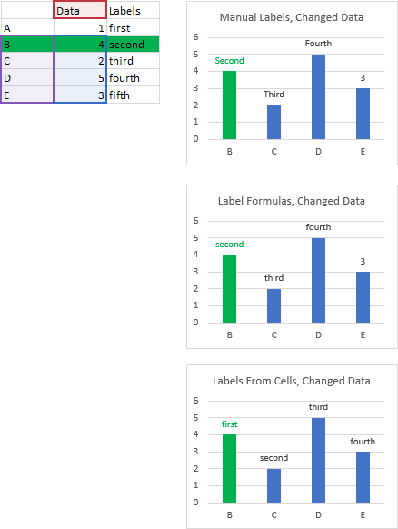
Properties Do Not Follow Chart Data Points
Here I’ve moved the data range down one row. As expected, neither the green formatting nor the label text has followed the data; instead, they remain anchored to the bars in the chart.
Example D – Properties Following Chart Data Range
Have we finished flogging this dead horse? No? Okay, I have one more example. This is like our initial scenarios. I have two different ranges I want to plot in identically formatted charts. Below are the two ranges and the original default chart.

Here the chart series have had custom formatting applied, and a couple of arbitrary labels have been applied.
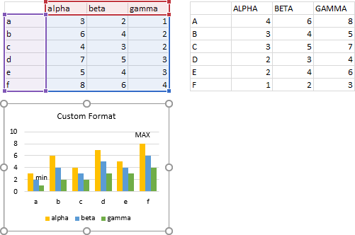
Now a copy of the customized chart has been made and aligned under the second data range, though the chart still points to the original range.
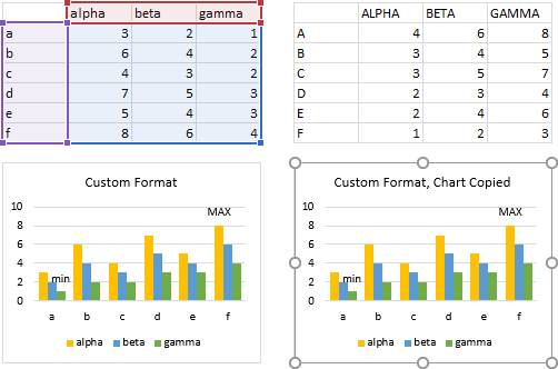
Properties Follow Chart Data Range
The copied chart’s data has been reassigned to the new data range. And with Properties set to Follow Data Points, we’ve lost our custom formatting.
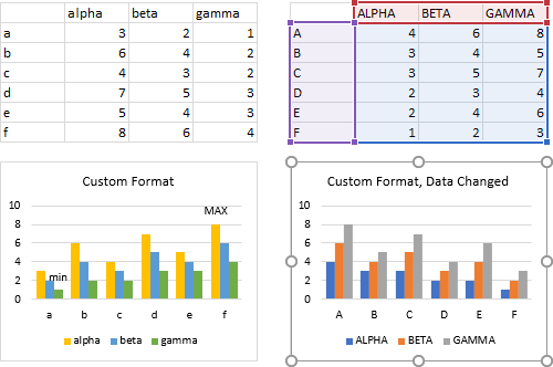
Properties Do Not Follow Chart Data Range
The copied chart’s data has been reassigned to the new data range. And with Properties set NOT to Follow Data Points, we retain our custom formatting. These particular data labels are now incorrect, but they were not lost altogether.

Scenario B – Fixed
Since we want to retain our custom formatting as we select different data for our charts, let’s set Properties Follow Chart Data Points to False, and repeat the second scenario from what now seems so long ago.
(1) Arrange your data: Below is a simple data set, with four columns of data, one for each chart in the report. Also note that we’ve indicated that our corporation got a new CEO in 2015.

(2) Create the first chart, and format it perfectly. We’ve highlighted the arrival of the new CEO by labeling the data point “New CEO” and coloring the bar green instead of the default blue.

(3) Make copies of the perfect chart: Here are our four charts, showing the original data and custom formatting in each.

(4) Change the data in the copied charts: Each chart below shows its own division’s data, and the custom formatting remains in the charts.









 Jon Acampora writes the blog at