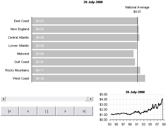
In Watch the Rise of Gasoline Retail Prices, 1993 – 2008, Nathan shows an animated bar chart that traces the price of gasoline over the past 15 years. A number of readers responded with links to assorted time series.
I downloaded Nathan’s data workbook and duplicated Nathan’s animated bar chart in Excel in Gas Prices – Animated Bar Chart for Excel, and while the animation was captivating, the viewer loses track of the actual time period of the data at the point of the animation. I added a small inset chart in Gas Prices – Animated Bar Chart for Excel 2 to show progreess along the entire time series, but this wasn’t totally satisfactory.
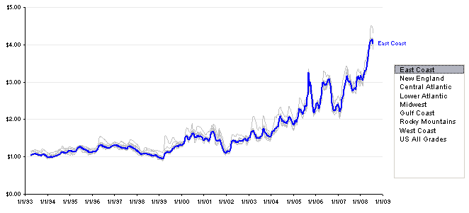
I went to work creating an interactive time series chart in Excel. The basic chart is a line chart showing all the data; all series are in a light color, and one particular series, selected in a listbox, is highlighted in a bright color. This technique was described in Easier Interactive Multiple Line Chart and in Interactive Parallel Coordinates Chart.
The top section of the worksheet is shown below. I inserted a couple columns to accommodate the highlighted series. Cell C1 is named ColIndex, and its value is used in formulas in column A to determine which column between D and L is reflected in column A. The formula in cell A4, for example, is
=INDEX(D4:L4,ColIndex)

The chart is shown below. The listbox is linked to the ColIndex cell, so changing the listbox changes the values in column A of the data sheet.
All series have been plotted in the line chart, using the dates in column C as the X values, and the prices in columns D through L for the Y values. All of these series are colored light gray. The prices in column A are added to the chart as a new series, and this series is given a bright color so it stands out. The last point is given a data label, using the Series Name option.

To try out the animated chart, download this zip file. It is unlocked and unprotected, so you can see how it is constructed and how it works.


