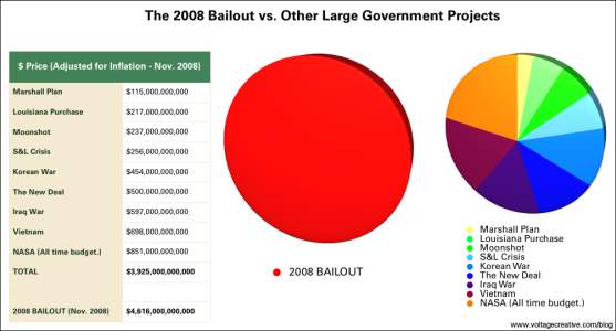
In a comment to my post How to Make a Donut-Pie Combination Chart, Sjoerd Hoogwater pointed me to Scary Bailout Money Info Graphic. The post features information about the federal bailout of the banking industry, but I don’t know what’s scary, the bailout money or the info graphic. In this scary post, Wade took data from Boing Boing’s Cory Doctorow (Bailout costs more than Marshall Plan, Louisiana Purchase, moonshot, S and L bailout, Korean War, New Deal, Iraq war, Vietnam war, and NASA’s lifetime budget — *combined*!), whe got it from Barry Ritholtz, Big Bailouts, Bigger Bucks, and made this outstanding example of why pies are bad, and why two pies are worse than one:

There are a few things to note about this chart.


