Arrow Charts
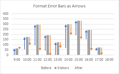
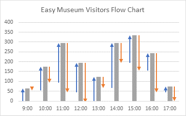
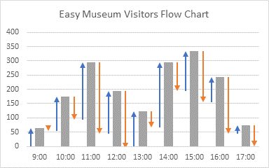
My previous tutorial showed how to make Arrow Charts in Excel. This morning I saw an arrow chart in the New York Times’ The Morning newsletter that I have replicated below. It’s not a perfect copy, but for a five-minute exercise, it’s very close.
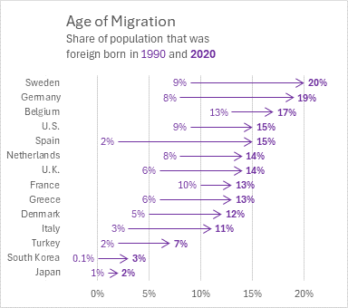
This newsletter, titled The Force Shaping Western Politics, discussed the effects of increased global migration on politics. This is the original New York Times chart showing how migration has changed the foreign-born populations of several Western nations, with data taken from the Migration Policy Institute.
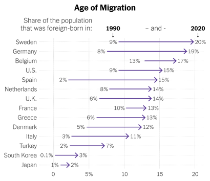
The New York Times produces many eye-catching and effective charts and visualizations.
Age of Migration Arrow Chart Data
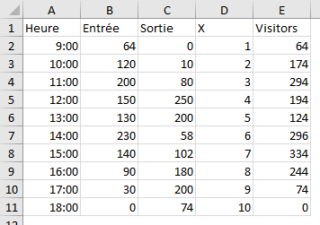
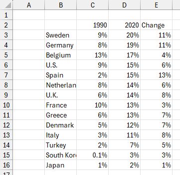
I manually extracted the following data from the chart’s data labels. I added a Change column that showed the difference between 1990 and 2020 values.
Creating the Age of Migration Arrow Chart
The Bar Chart
As in the previous tutorial, the basis of the arrow chart is a bar chart. To facilitate the data labels in the chart, I have modified the protocol somewhat.
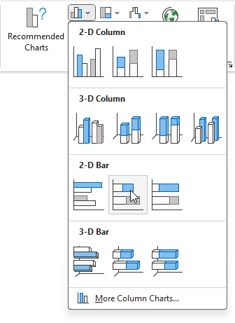
I selected B2:D16 (my data range above excluding the Change column) and inserted a clustered bar chart.
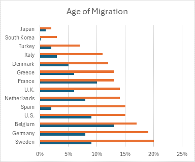
As always, Excel builds the bar chart upside-down (see Excel Plotted My Bar Chart Upside-Down and Why Are My Excel Bar Chart Categories Backwards?). Easy to fix: select the vertical axis and press Ctrl+1 to format it. Under Axis Options, select Categories in Reverse Order and Horizontal Axis Crosses at Maximum Category. Now the countries are sorted in descending order of the 2020 foreign-born population.
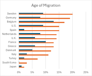
I kept the bar colors, but changed the transparency to 50% so they remain visible until the end of this tutorial, when they will become fully transparent. I also changed the overlap to 100%.
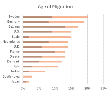
Data Labels
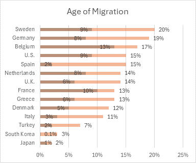
The data labels are easy. I added value labels to both bar series, using the Inside End position for 1990 and Outside End for 2020.
Rescale the Horizontal Axis
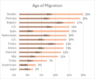
The data labels don’t fit within the shortest 1990 bars, but I can cheat by adjusting the horizontal axis scale. I changed the minimum from zero to -5%, and I changed the maximum to 22%. Then I changed the Vertical Axis Crosses setting to Axis Value and I entered a value of -0.03 (or -3%).
Format the Vertical Axis
Changing the horizontal axis results in unwanted artifacts: we don’t want the vertical gridline at -5%, the vertical axis line at -3%, and the axis tick label at -5%. I can hide the tick label by applying a custom number format of 0%;;0%; and I can use No Line as the format for the vertical axis line.
Hiding the -5% gridline is a little harder, since Excel doesn’t provide such granularity in gridline positioning and formatting. So I tweaked the axis tick labels. I applied a glow effect, using white as the color, a size of 50 pt, and a transparency of 0%.
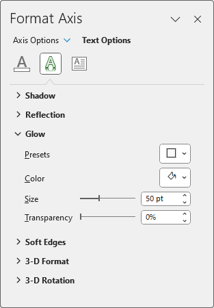
This glow obscured the unwanted gridline.
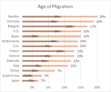
I never use effects such as glows and shadows to make my charts “look nice”, but this is an example of how such effects can be used for good.
Use Error Bars for the Arrows
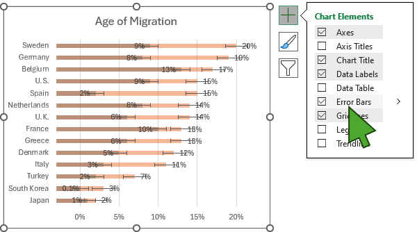
I selected the 1990 bars and clicked the Plus sign next to the chart to add error bars. Here are the default error bars, which show the standard error of the 1990 series.

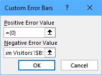
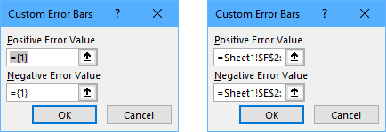
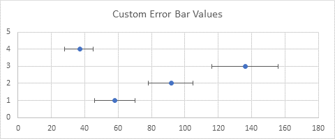
Next I formatted the error bars. I selected the No Cap option, then under Error Amount I selected Custom. For Positive Error Value I selected the Change values I calculated in column E, and for Negative Error Value I entered zero. I selected purple for the line color, and I selected an End Arrow Type.
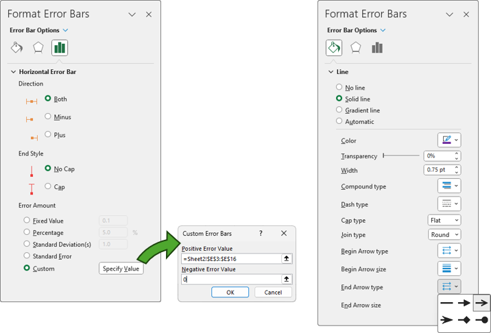
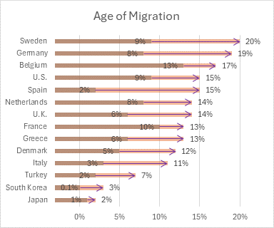
The arrows overlay the semi-transparent bars.
Clean Up the Bars
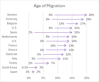
The chart becomes an arrow chart when the bars are formatted with No Fill.
The Finished Age of Migration Arrow Chart
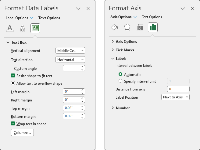
I did a few more things to enhance the chart. I gave the data labels the same purple color as the arrows, and made the 2020 labels bold. I added a subtitle with purple text for “1990” and “2020” and I bolded “2020” to match the data labels. I moved the data labels closer to the arrows by changing the Left and Right Margins from 0.04 to zero. I changed the vertical axis tick label Distance From Axis from 100 to zero.
The result is this finished arrow chart.

Don’t let anyone tell you Excel is incapable of making eye-catching and effective charts and visualizations.


