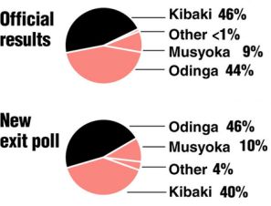
In the wake of the Mark Sanford scandal, in which the South Carolina governor was accused of hiking in the Andes with his mistress or something, political blog FiveThirtyEight has published results of surveys about Sanford in Should Sanford Resign?. I was pointed to the FiveThirtyEight survey results by Andrew Gelman in Doing graphics the George Orwell way, and he got it from Should Mark Sanford Resign?. Andrew’s take is that the pie charts used by FiveThirtyEight to present the survey results weren’t as bad as they first looked.
Polling and Election Results on FiveThirtyEight
I’ve stated in this blog that the FiveThirtyEight web site uses pie charts in a very effective way. It helps that there are only two or three segments in their pies, and the third, if present, is very small. Here is a partial view of the FiveThirtyEight analysis of the November 2008 US elections.
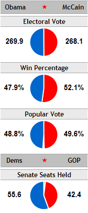
This isn’t a full-blown Chart Busters article, but I thought I’d discuss some alternatives.
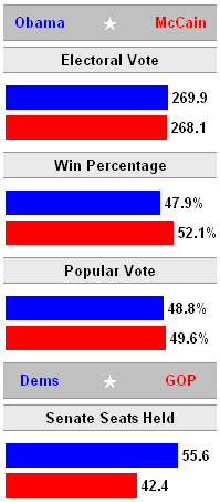
In an unfinished post from last fall, I undertook to replace FiveThirtyEight’s pies with bars, using roughly the same amount of space. The bars may have slightly better resolution, but I didn’t include a third bar for the third tiny segment. Take your pick.
Survey Results
FiveThirtyEight used pie charts to illustrate the survey results. As every second grade student will tell you, pies are the chart of choice when showing parts of a whole. The educational system has trained our children to behave like sheep, and follow the herd.
Editorializing aside, these charts of the poll results are what motivated this post.
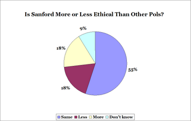
Is Mark Sanford more or less ethical than other politicians?
FiveThirtyEight didn’t even change the Excel defaults for their pie. Black chart border, ugly fill colors, and way more space everywhere than needed, especially on either side of the chart. It’s nice that the data points are labeled, but they are only partially labeled with the percentages, and the reader still must journey back and forth to the legend to see which segment means what. I also think it’s useful to put the results of a poll not in numerical order (55%-18%-18%-9%) but in some value order of the categories (more-same-less).
I have redesigned the pie chart, shrinking the white space and using arguably better colors. I also reordered the points, and centered the chart differently to try to make comparisons easier.
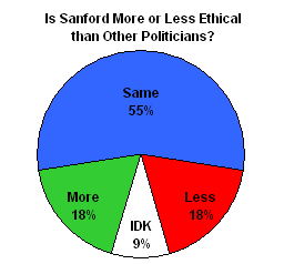
All well and good, but without the percentages, it’s still a guess whether More or Less had a greater response.
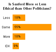
So I pulled a bar chart out of my magic hat. We can see that most of the cynical poll responders think Sanford’s ethics are no different than the other politicians, and equal numbers thought he was more ethical and less ethical. 9% have been busy watching Real Housewives and don’t know who Mark Sanford is.
Should Mark Sanford Resign?
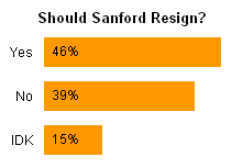
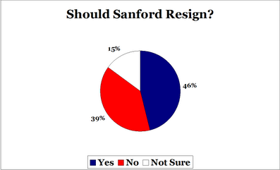
FiveThirtyEight used another pie to show whether respondents want Sanford to resign. The colors have been changed from the gruesome defaults, but the large wasted spaces remain, as does the legend and border. Also, FiveThirtyEight didn’t use its usual style where competing results A and B meet at the vertical line at 12 o’clock.
I’ve addressed these stylistic issues in my own version of the pie chart, and it doesn’t totally suck.
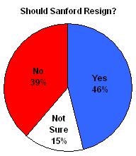
Here’s the obligatory bar chart. Apparently 15% of the respondents think he should stay at the junkyard with his son.
