A recent post in the Mr Excel forum requested a conditional donut chart. The chart had to have 31 sections, one for each day of the month, and each section had to be colored according to a code in a worksheet cell. I started working on a solution, but I ran out of time. I tried returning to the post later, but I can’t find it, and Google can’t find it either.
It was a great question, though, so I’ll reproduce a simpler variation of it here.
The Conditional Donut Chart Problem
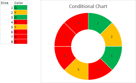
The donut chart must have eight slices, and the color of each slice must reflect a value in the worksheet.
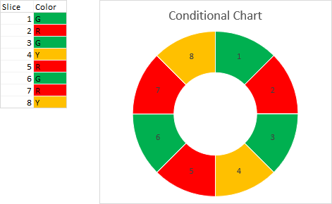
The required color for each slice is shown in the worksheet range to the left of the chart. I have colored the cells red, yellow, and green based on whether they contain the letter “R”, “Y”, or “G”. This is easy to do in the worksheet, but there is no mechanism to change colors like this in a chart.
You could do this with VBA, of course. I’ve written a tutorial with the necessary code: VBA Conditional Formatting of Charts by Category Label. But this is a problem which does not require VBA. You can make it work just as well with a handful of clever worksheet formulas, without requiring that someone enable macros in your workbook, and without coming up with a mechanism to run the code when the data changes.
Set Up the Data
While our conditional donut chart must have eight visible slices, it will have three times that amount, and two thirds will be hidden.
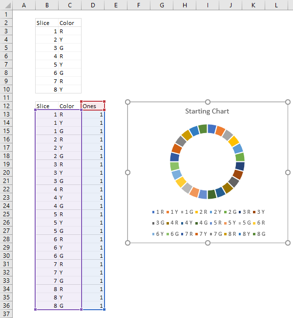
I’ve reproduced the slice and color data in this screenshot. You can’t make a meaningful chart of this data, of course, so below it I have constructed an expanded data region. The Slice column repeats the slice number three times for the three colors, and the Color column repeats all three colors for each slice, not just the one which appears in the first range.

Insert the chart
Next I have added a column to the lower range, with a header of “Ones” and with a value of 1 in every cell. I can finally make a donut chart. With the chart selected, you can see from the data highlights in the worksheet that both the Slice and Color columns are used for category labels, and the Ones column is used for the donut slice values. The category labels are seen in the legend, and the donut slices are all the same size, 1/24 of the donut circumference.
Format the Chart
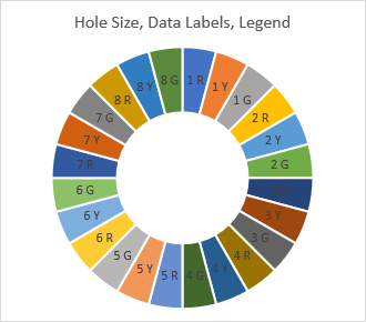
Let’s do a little formatting. Double click on one of the donut slices to open the Format Data Series task pane, and under Series Options, change the Donut Hole Size from the default 75% to 50%. Click the plus icon that floats alongside the chart, and check Data Labels. Double click on one of the labels to open the Format Data Labels task pane, and under Label Options, check Category Name and uncheck Value. Finally, delete the legend.
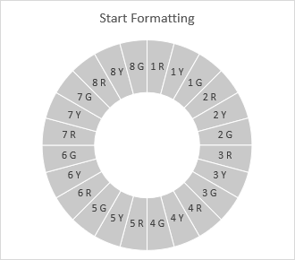
I started formatting the slices by first making them all gray. This made it somewhat easier to see where I was in the process. To change all slices to the same color, click once on a slice to select all slices, then choose the color in any convenient way (Format Data Series task pane, ribbon control, or right-click pop-up). At the same time, keep the white border between slices, but change it from 1.5 points to 0.75.
Now, slice by slice, apply the colors. Here I have colored the slices in the first sector of the chart. To color an individual slice, click once to select all slices, then click to select a single slice, then apply the color.
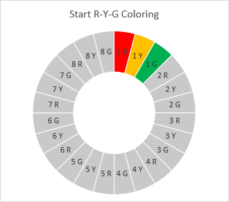
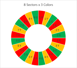
Now finish coloring the slices. Here’s a trick that will work faster than clicking on and choosing its color, then clicking on the next, etc. Single click twice on the first slice to select it, then apply its red color. Then hold down Ctrl while you click the right arrow key three times, which brings you to the next red slice, and click the F4 function key. This should apply the same red color to this slice. Repeat the Ctrl+Right Arrow and F4 sequence until the red slices are formatted, then repeat for the yellow and green slices.
Properties Unfollow Chart Data Point
Before you change the chart source data, you have to apply the trick in Properties Follow Chart Data Point. This relatively unknown and totally misunderstood feature of Excel charts will otherwise screw up your chart. What it means is, if you have customized your plotted data, then change the data so the reformatted feature (chart series or data label) references a different range, some or all of the formatting will revert to its defaults.
Click on Excel’s File tab on the ribbon, choose Options, then click on Advanced. Scroll down to Chart, and you’ll see “Properties Follow Chart Data Point for All New Workbooks” and “Properties Follow Chart Data Point for Current Workbook”.
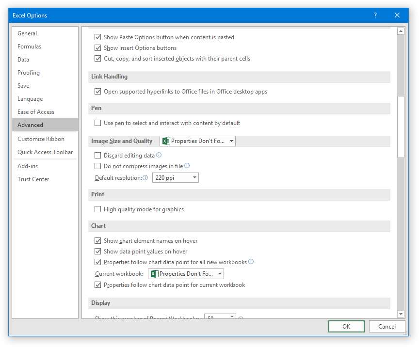
Uncheck the box for “Properties Follow Chart Data Point for Current Workbook”.

Now changing the range in the following step will not mess up the chart.
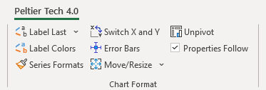
If you have Peltier Tech Charts for Excel, there is an easier-to-access checkbox on the Peltier Tech ribbon, in the Chart Format group.
Write Formulas to Apply Conditions
Now the chart is fully formatted. We just need to build the formulas that show and hide slices according to the data in the upper range.
Add two more columns to the second data range, and insert the headers “Labels” and “Values”. Ignore the Labels for now, but enter this formula into the range F13:F36:
=IF(INDEX($C$3:$C$10,B13)=C13,1,0)The result is a column of zeros and ones, with two zeros and a single one for each slice number, according to the colors specified in C3:C10.
Click on the chart and notice the highlighted ranges in the worksheet. Drag the edge of the blue region so the highlight includes the Values column instead of the Ones column. The red highlight should move with the blue highlight if you had selected the chart or the plot area (which is the square that includes the donut). If you had selected one or all of the donut slices, the red highlight would not have followed the blue, but you can simply move it yourself.
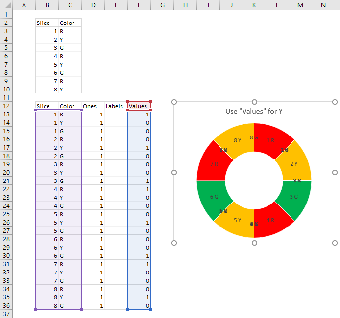
Note that there is now only one visible slice for each of the eight sectors of the donut, and these are colored according to the values in C3:C10. Unfortunately we have a bunch of overlapping labels that we don’t want.
These labels correspond to the hidden slices, which are still in the chart. We need another formula that will let us show only the visible slice numbers. So enter this formula into the range E13:E36:
=IF(F13=1,B13,"")Now select the pie slices (all of them or just one), drag any corner of the purple highlight so it occupies a single column, then drag the edge of the purple highlight so it includes the Labels column. The extraneous labels are gone, and we only see the slice numbers.
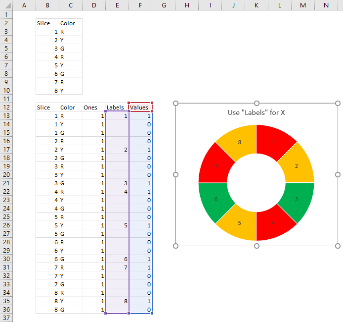
The Finished Conditional Donut Chart
This is our conditional donut chart. You can select and drag the lower data range off to the side of the chart; you can even cut it and paste it onto another worksheet, out of the way. Move the chart closer to the data it indirectly reflects.

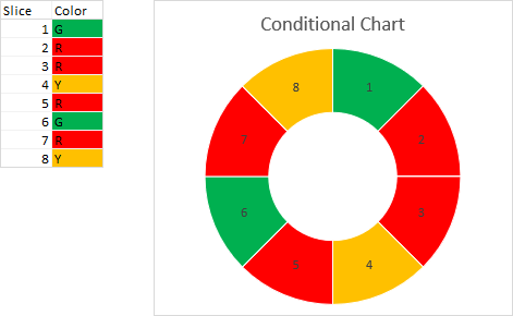
When the colors for each slice are changed in the worksheet, the chart instantly reflects the change.
Change the colors in the worksheet again, and the chart updates again.
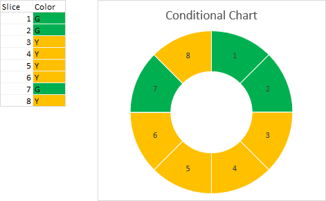
And again, and again,…
Properties Follow Chart Data Point
When I change this option as shown above, I always just uncheck the box for the current workbook. Because of a fear of missing out on something magical, I’ll admit that I always return here and check it later, and I never check the box for all new workbooks. Because not even I understand exactly what this setting does.
More Peltier Tech Articles About Conditional Formatting of Excel Charts
- Conditional Formatting of Excel Charts
- Conditional XY Charts Without VBA
- Invert if Negative Formatting in Excel Charts
- Highlight Min and Max Data Points in an Excel Chart
- Split Data Range into Multiple Chart Series without VBA
- Conditional Formatting of Lines in an Excel Line Chart Using VBA
- VBA Conditional Formatting of Charts by Value and Label
- VBA Conditional Formatting of Charts by Series Name
- VBA Conditional Formatting of Charts by Value
- VBA Conditional Formatting of Charts by Category Label


