Histograms with Ugly Category Labels
Most histograms made in Excel don’t look very good. Partly it’s because of the wide gaps between bars in a default Excel column chart. Mostly, though, it’s because of the position of category labels in a column chart. The labels are centered below the bars, but it would look nicer with the bin value labels positioned between the bars.
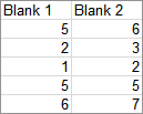
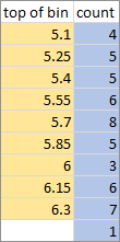
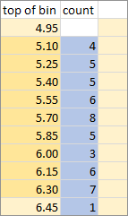
To illustrate, I generated fifty random values between 4.95 and 6.45. The values are summarized in this table. The gold shaded range is the list of bin values, actually the value at the top of each bin. The blue shaded range is the result of the FREQUENCY function, which tells us the number of values below the first bin value, the number of values between each successive pair of bin values, and the number of values above the top bin.
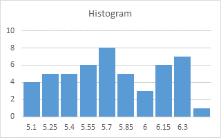
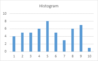
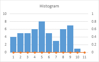
Used as is beneath each column of the histogram, these bin values make misleading category labels.
To make category labels, people often add some text to each bin value, and then make their chart.
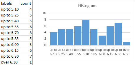
It’s descriptive, and it’s better than single unqualified values, but it’s not elegant.
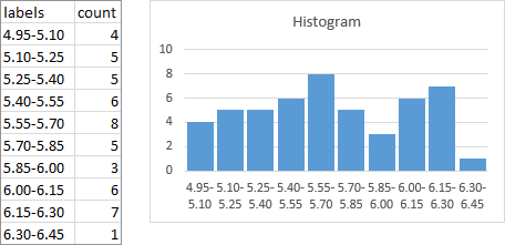
The labels can be “improved” by putting consecutive values together, separated by a dash to indicate a range.
This is arguably better than the previous labels, but it’s still not what we’d really like. But stay tuned, because I’m going to tell you how to make a conventional histogram in Excel, with bin labels between the bars.
Histograms with Nice Labels
As before, we’ll use the FREQUENCY results to plot the bars of our histogram. Then we’ll add another series as a line chart on the secondary axis, and this axis will provide the nice labels.
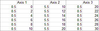
Here’s our slightly modified data range. There is a line inserted above the top FREQUENCY value, and the two extreme bin values have been added. I’ll assume that any values beyond the highest and lowest bin values fall within a bin width of these extremes.
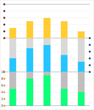
Select the blue shaded range and insert a column chart.
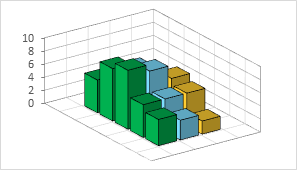
Those bars are too thin for a histogram. A histogram’s bars typically touch each other (gap width of zero), but I’m not using bars with borders, so I’m using a thin gap (10 or 15%) to delineate the bars.
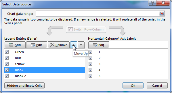
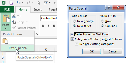
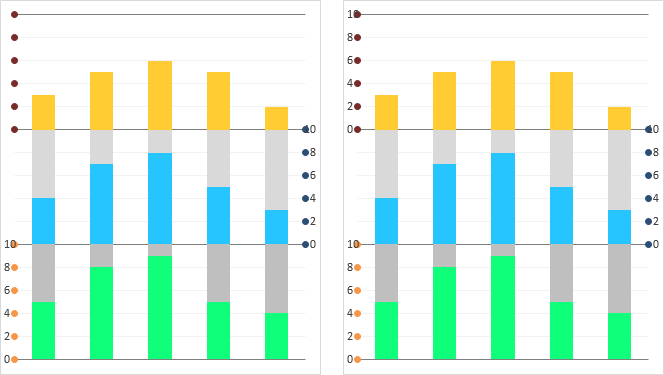
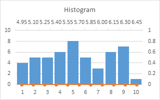
Select the first gold shaded range, then hold Ctrl while selecting the second gold shaded range, so that both ranges are selected. Copy this range. Select the chart, then use Home tab > Paste dropdown > Paste Special to add the copied data as a new series, with category labels in the first column. You don’t see the new series, because it’s a series of bars with zero height. But you should notice that the wide bars have been squeezed a bit to make room for the added series. Also the generic 1, 2, 3 category labels have been overwritten by the pasted labels.
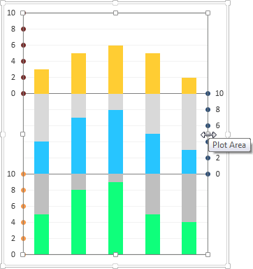
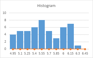
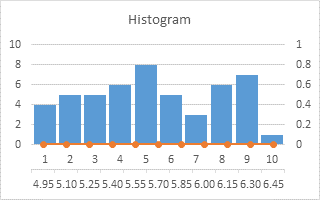
Select the added series (select the visible series and press the up arrow key, or use one of the chart element picker dropdowns on the ribbon or right click menu), then click the menu key between the Alt and Ctrl keys to the right of the Space bar. This pops up the right click menu. Select Change Series Chart Type, and select one of the Line types. It shouldn’t appear, because Excel doesn’t plot blank cells, but I added them in these illustrations so you can see what’s going on.
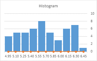
Format the line series so it is plotted on the secondary axis. Excel adds a secondary vertical axis.
We need the secondary horizontal axis, so use the plus icon in Excel 2013 or the Chart Tools > Layout tab > Axes dropdown to add it.
Format the secondary (right) vertical axis, so the secondary horizontal axis crosses at the automatic position (zero).
Format the primary (left) vertical axis, so the primary horizontal axis crosses at the maximum axis value.
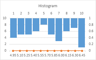
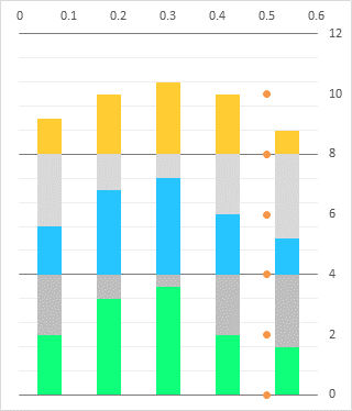
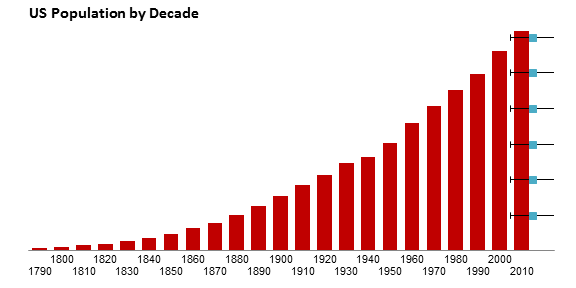
The bars are now dancing on the ceiling. Delete the primary (left) vertical axis to spoil their fun.
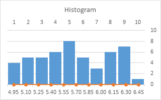
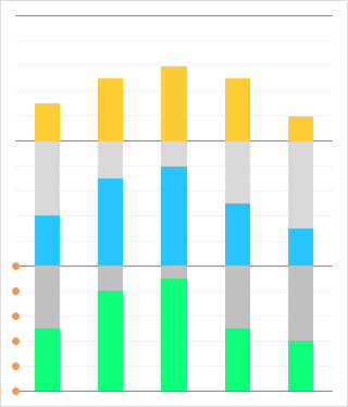
Format the primary (top) horizontal axis so it uses no line, and has no labels or tick marks.
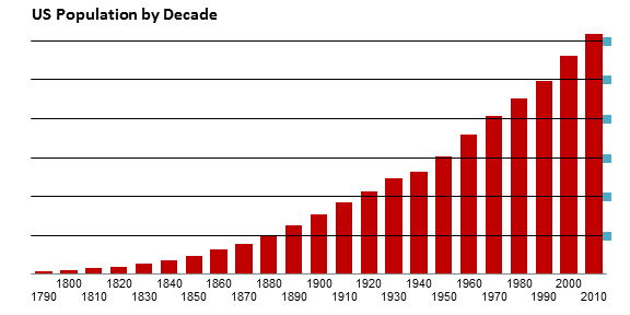
Format the secondary (bottom) horizontal axis, so the secondary vertical axis crosses at the automatic position.
Format the secondary (bottom) horizontal axis, to position the vertical axis on the tick marks.
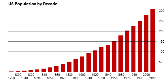
Finally, if the line chart is visible, format it to use no markers and no lines.
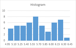
That’s a lot of small steps, but they go quickly, and the results are a vast improvement over all the ugly histograms that have ever been created in Excel.