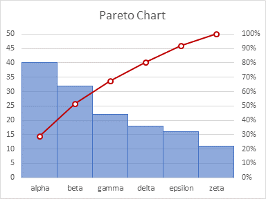
A Pareto Chart is a horizontal or vertical bar chart with its data sorted in descending order. The largest items (categories) in the chart are listed first for emphasis. A line is usually overlaid on the bar chart, showing cumulative sums or percentages of the total. The intent of the chart is to show which category contains the most items, for example, which part of a machine incurs the most failures, or which point in the supply chain suffers the most delays.
The Pareto Principle, named for Italian economist Vilfredo Pareto, is based on the observation that most of the effects of an action come from a small amount of the causes. This is often called the 80-20 rule, implying that 80% of the failures come from 20% of the defects, or that 80% of one’s sales come from 20% of one’s customers, or pretty much any 80-20 metaphor you can come up with.
I think, though, that people are too obsessed with the magical 80:20 ratio. A deeper understanding is that “the relationship between inputs and outputs is not balanced” [Investopedia]. The Pareto diagram is a convenient, easy tool to show which inputs of a process have a greater effect on its outputs.
I’m sure that in most processes the top 20% of the inputs affect maybe 40% of the outputs, and 80% of the results are influenced by 60% of the causes.
But the exact proportions aren’t critical. If the first input has the greatest impact on the output, it’s clear: if it’s good, get more of it; if it’s bad, get rid of it.
Pareto Data
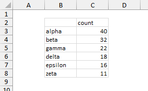
The data for a Pareto Chart is fairly straightforward, consisting of a list of items and a measure of the importance, frequency, or impact of each item. This measure could be a number of occurrences, total costs or revenues, etc. Below it is simply a count. Generally, the data is sorted from highest frequency to lowest.
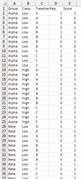
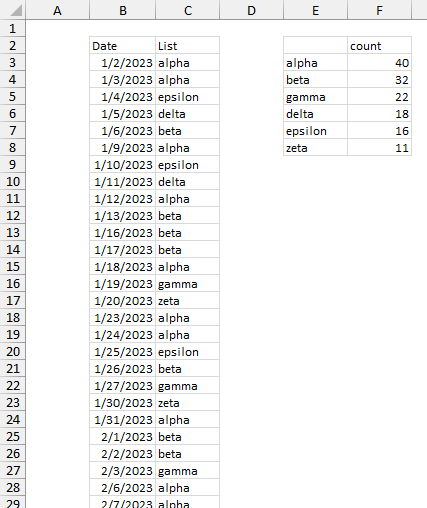
Sometimes the data is not compiled, but exists in a list, perhaps by date or lot number, as shown in columns B and C below. You could get a list of the items in column C using
=UNIQUE(C3:C141)but that list will be sorted in order of the item’s appearance in the list. However, you can construct a more complicated formula in cell E3 to get what you want:
=LET(input,C3:C141,
     list,UNIQUE(input),
     counts,COUNTIF(input,list),
     table,HSTACK(list,counts),
     output,SORT(table,2,-1),
     output)
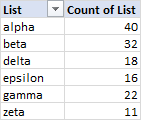
An alternative is to build a Pivot Table from the uncompiled list. Put the List field into the Rows area and Values area (as Count of List) of the pivot table, then sort List in descending order by Count of List.
Depending on your data and your requirements, you could build any number of different formulas or use Pivot Tables or Power Query to generate Pareto-ready data.
Native Excel Pareto Chart
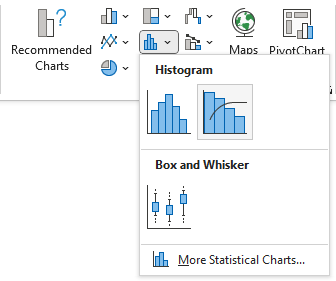
Using compiled data shown above, with counts by category (unsorted data works fine), you can insert a native Pareto Chart. Go to the Insert tab and click the Pareto Chart icon shown below.
The result is the following chart.
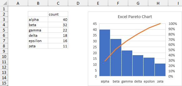
It’s pretty quick, you don’t need to sort the data before you make the chart, and you don’t need to calculate your cumulative percentages.
This chart is almost useful, but like any of the charts added to Excel since 2016, it has some limitations. Most annoying is that, while you can add data labels to the bars (counts), you can’t add data labels to the percentage line. You also can’t add markers to the percentage line, and I generally use markers, so I know precisely where the data is. You can’t change the vertical axis tick label spacing on either axis. You can’t link the chart title to text in a cell. And there is probably more that you can do with a regular chart that you can’t do with the native Pareto.
If you want these features in your Pareto chart, follow these instructions to build your own.
A Simple “Pareto Chart” with Counts Only
The simplest homemade Pareto Chart is a simple column or bar chart, with the data sorted from highest to lowest. The data is simple, as shown above: a list of categories and values, sorted with the highest values first. Select the data and insert a column chart.
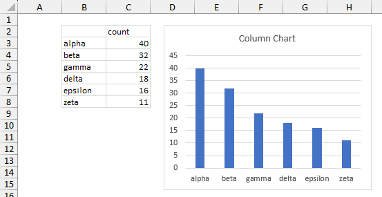
We can tell just from this chart that Alpha is the highest category and Beta the second highest. For a simple analysis, that might be sufficient. If you need percentages, you can add formulas to compute them in column D. The formula in cell D3, filled down to D8, is
=C3/SUM($C$3:$C$8)Select the series of columns, click the plus icon beside the chart, click the right “arrow” beside Data Labels, and choose More Options.
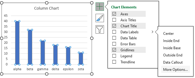
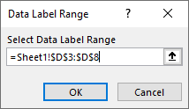
Select Outside End for Label Position. Select Value From Cells for Label Contains, and in the small dialog that pops up, select D3:D8, which contains the percentages. Then uncheck the Value box.
I’ve also applies some formatting. I set the column chart Gap Width to 0, so the columns are touching. I like to use a transparent fill color for these columns, which allows the gridlines to show through the columns. I kept the default blue color but applied 40% transparency to the fill, and I used the same blue for the border. I also used the dark red standard color for the data labels.
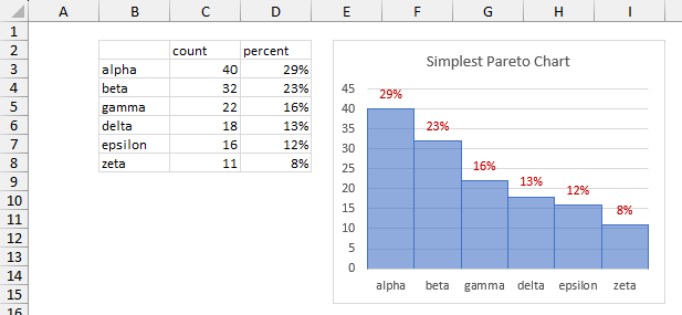
I can see that Alpha accounts for 29% of the total. But the labels are not the cumulative percentages, so I must dust off my tired old brain and determine that Alpha plus Beta account for 62%.
Of course, that’s not what most people would consider an “official” Pareto Chart. If you’re one of those people, read on.
DIY Pareto Chart: Counts and Cumulative Percentages
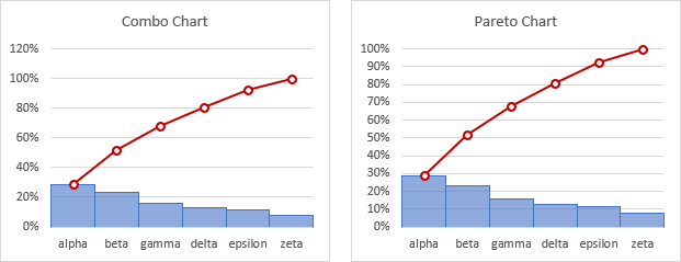
It’s easy to build your own “official” Pareto Chart. It’s really a simple combination chart, with columns on the primary axis and cumulative percentages on the secondary axis. But you need to sort your data and calculate your percentages. In the data range below, the formula in cell D3, which is filled down to D8, is
=SUM(C$3:C3)/SUM(C$3:C$8)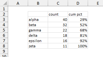
Select this range (or just one cell within this range) and insert a clustered column chart (below left).
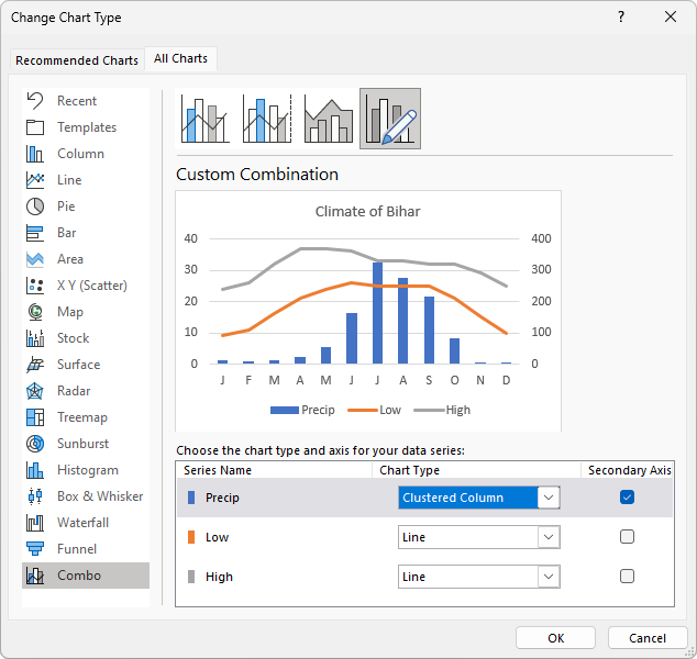
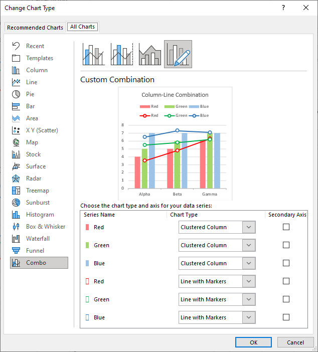
Right click on either series, and choose Change Series Chart Type from the pop-up menu. In the Change Chart Type dialog (shown below these charts), select Line With Markers for the cumulative percentage axis, and select the corresponding Secondary Axis box.
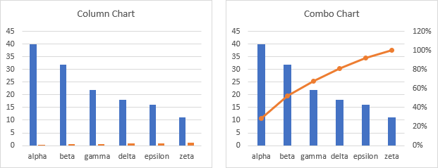
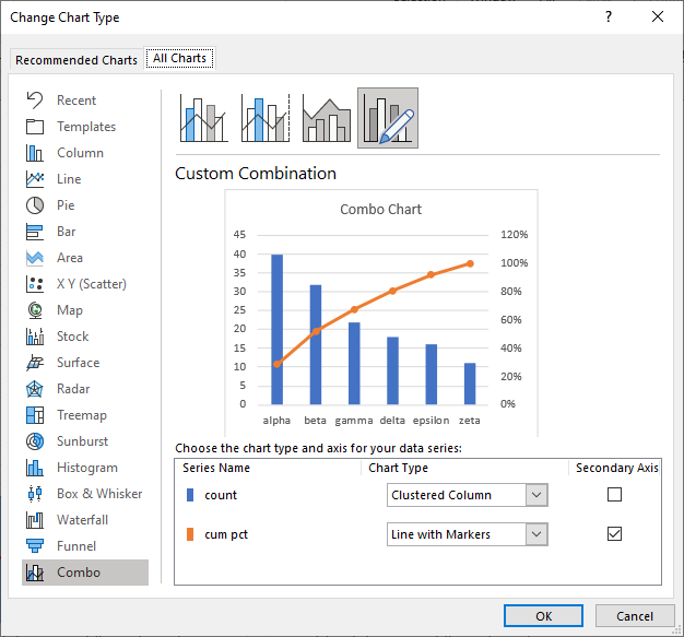
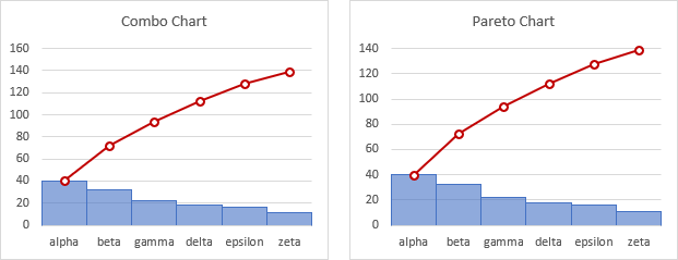
Format the series as in the previous example. Set gap width for the columns to 0, so the bars are touching. I used the default blue fill with 40% transparency, so the gridlines show through, and I used the same blue without transparency for the borders. For the percentages, I used the dark red standard color and a 2-pixel (1.5 point) line thickness for the line and the marker border, and a white marker fill (below left).
Format the axes. I set the maximum on the secondary (percentage) axis to 100%. I also set the maximum of the primary axis to 50, because the gridlines correspond to the tick labels on either side of the chart (I’m not always so lucky).
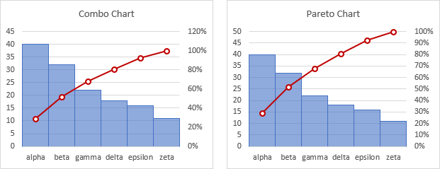
This is probably the Pareto chart style that most people expect. Read on to see how to implement other styles.
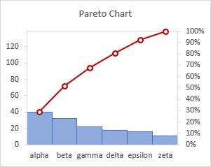
You can scale the primary vertical axis (left side) so the minimum is zero and the maximum is the total counts (139 in our chart). Since the gridlines won’t line up, I’ve removed them, added visible vertical axis lines with tickmarks, and used a light gray for the plot area border. I like to see the bars and markers vertically aligned like this. In this case, it shows that none of the columns are very tall compared to the others.
Pareto Chart Option: Counts and Cumulative Counts
A somewhat simpler Pareto chart shows counts as columns and cumulative counts as a line with markers, both on the primary axis. The data is simple:
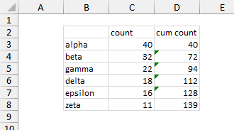
Select B2:D8 and insert a column chart, then change the chart type of the cumulative count series to a line with markers.
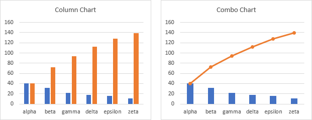
Apply the desired formatting, and you have a simple Pareto chart with counts and cumulative counts.
Pareto Chart Option: Percentages and Cumulative Percentages
Another simple Pareto chart option plots percentages as columns and cumulative percentages as a line with markers. The data is shown below.
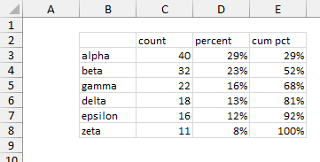
Select B2:B8 and hold Ctrl while selecting D3:E8 so a multiple area range is selected (ignoring the counts), and insert a column chart, then change the chart type of the cumulative percent series to a line with markers.
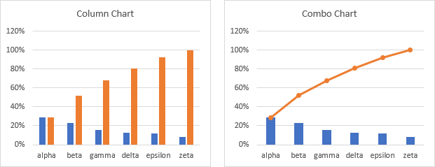
Format the series, and you have a simple Pareto chart with percentages and cumulative percentages.
Pareto Chart Option: Stepped or Waterfall
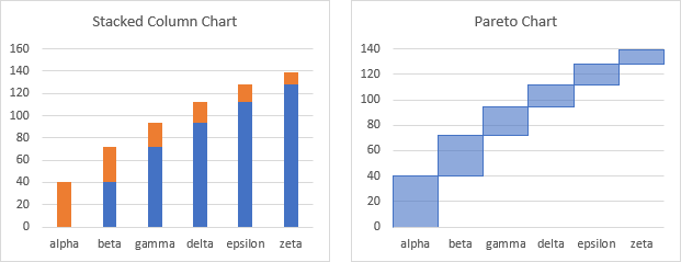
Another Pareto chart option plots the data as a staircase or waterfall of counts. You need to compute counts as before, with a column of values for a blank series which is the cumulative total prior to the current row.
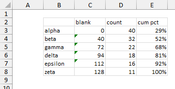
Select B2:D8 (ignoring cumulative percentages) and insert a stacked column chart. Format the (blue) blank series with no border and no fill and format the (orange) count series as our count columns in previous charts.
Pareto Chart Option: Diagonal Lines
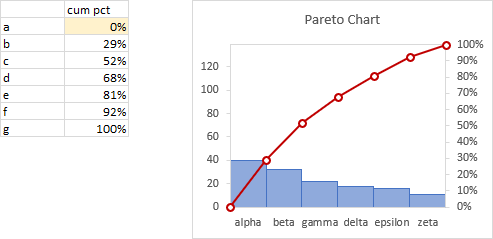
Some purists feel that a true Pareto chart should show its cumulative lines with points between the count columns instead of centered on the columns. For this we need two blocks of data, since the line chart will have one more point than the column chart. The line chart data’s extra point is the initial zero value; the letters a, b, c are merely placeholders for this illustration.
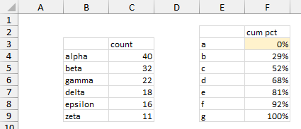
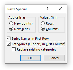
Select B3:C9 and insert a column chart. Copy E2:F9, select the chart, and use Paste Special to add the data as a new series in columns, with series names in the first row and categories in the first column. It is added as a second set of columns.
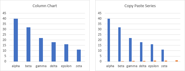
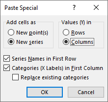
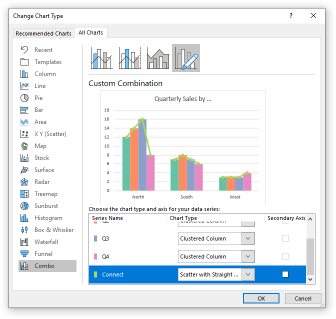
Right click on either series and select Change Series Chart Type from the pop up menu. Change the cumulative percent series to a line with markers and check its Secondary Axis box. Click the plus sign floating beside the chart, select Axes, and check the secondary horizontal axis box.
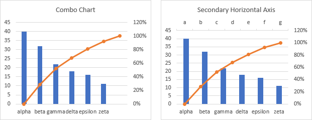
Format the secondary horizontal axis (top of the chart), change Axis Position to On Tick Marks (below left), then change Label Position to None and change the line color to No Line (below right).
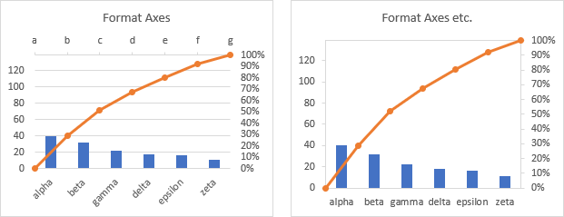
Finally, format the columns as before. The secondary horizontal axis settings above and the column gap width of zero aligns the markers and columns horizontally.
You can adjust the scale of the primary value axis (left side) so the minimum is zero and the maximum is the total counts, which will align the markers and columns vertically.
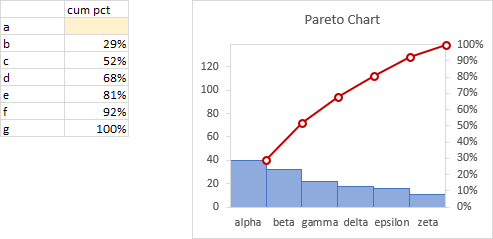
If you don’t want a diagonal line to run through the first column (some purists don’t), simply clear the cell with 0% (or if it is generated formulaically, insert NA() instead of 0).
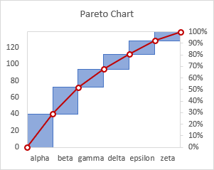
Here is a variation with diagonal lines and between-column markers overlaid on the Pareto step chart, showing that the diagonal lines correspond to each category’s counts.
Pareto Charts in Peltier Tech Charts for Excel
This tutorial shows how to create Pareto Charts, including the specialized data layout needed, and the detailed combination of chart series and chart types required. This manual process takes time, is prone to error, and becomes tedious.
I have created Peltier Tech Charts for Excel to create Pareto Charts (and many other custom charts) automatically from raw data. This utility, a standard Excel add-in, lays out data in the required layout, then constructs a chart with the right combination of chart types.
Pareto charts can be created in vertical or horizontal orientation.
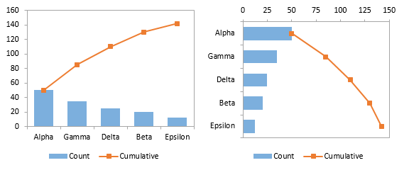
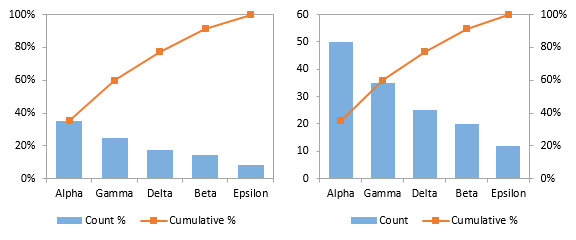
Values can be plotted (above), or percentages (below left), or bars as values and the line as cumulative percentages (below right).
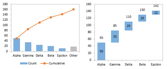
An “Other” category with different shading can be plotted at the end of the data (below left). The data can also be plotted as a floating cumulative bar shart, like a waterfall (below right).
All of these options are available in vertically or horizontally oriented charts.
This is a commercial product, tested on thousands of machines in a wide variety of configurations, Windows and Mac, which saves time and aggravation.
Please visit the Peltier Tech Charts for Excel page for more information.
More Articles About Combination Charts
A Pareto chart is a common combination chart. Here are articles that use combination charts in other ways.
- Clustered Column and Line Combination Chart
- Precision Positioning of XY Data Points
- Add a Horizontal Line to an Excel Chart
- Horizontal Line Behind Columns in an Excel Chart
- Bar-Line (XY) Combination Chart in Excel
- Salary Chart: Plot Markers on Floating Bars
- Shaded Quadrant Background for Excel XY Scatter Chart
- Excel Chart With Colored Quadrant Background
- Fill Under or Between Series in an Excel XY Chart
- Fill Under a Plotted Line: The Standard Normal Curve


