Is Your Data Numeric or Text?
It’s important that you check your data before charting it. One common problem with data is that it may look like numbers but get treated as text.
I’ll illustrate with a simple example provided by a customer. He emailed me to say he was having trouble with my software, and none of his charts looked right.
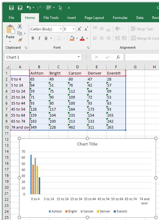
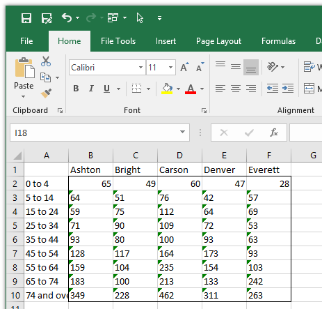
This is a snapshot of the worksheet he provided (the data has been changed, but not enough to affect this discussion). There are two features of this data: first, everything is left-aligned. Second, many of the cells with numbers also have small green triangles in their top left corners: these are error flags. I’ll discuss each of these in turn.

One of your first steps to validate your data, even if you don’t see such clues as left-alignment or error flags, is to make a quick chart with it. In the chart below, we see that only the first category shows visible bars. This corresponds to the first numeric row which does not have error flags. Since Excel plots text values as zero regardless of any apparent numbers in that text, I suspected that the error flags had to do with numbers stored as text.
In addition to numbers stored as text, a quick diagnostic chart made this way can uncover blank cells, rows, and columns. It can help highlight keying errors; for example, deep in a table, you might not notice a misplaced decimal point in 12345.6789, which is supposed to be 1234.56789, but the chart will show one point wildly out of scale with its neighbors.
Fix Horizontal Alignment
The first thing I usually do is clean up any gratuitous formatting. This usually means inconsistent fonts and font sizes, bold, italic, colors, borders, and the like. You can format your output tables, the ones used in reports and on web sites, however you like. Or however your boss likes. But your working data should be as clean as possible.
One important formatting element is horizontal alignment. Forcing left alignment, or even more commonly, center alignment, can mask characteristics in the data. A better choice is general alignment, because this will align all text to the left, all numbers to the right, and errors in the center. This general alignment by data type is a great visual indicator of possible issues in the cells.
The selected text below is horizontally left-aligned, forced by the left-aligned icon highlighted in the ribbon.
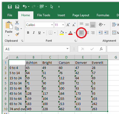
To change to general alignment, simply click once on the highlighted alignment icon. This changes to general alignment, and unhighlights all of these icons.
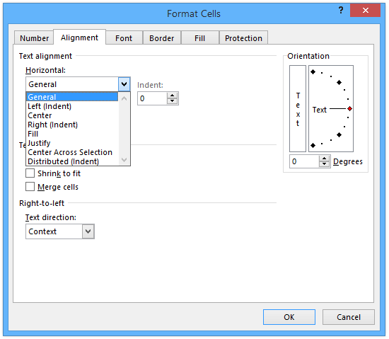
You can also format the cells, and on the Alignment tab of the dialog, under Horizontal, choose General.
Below you can see the effect of applying general horizontal alignment. The cells which plotted correctly are now right-aligned the way we expect numbers to look. The cells with error flags are still left-aligned, indicating that the numbers are somehow stored as text.
Fix the Errors
Sometimes a person will disable Error Checking because of all those unsightly green flags littering their worksheet. And maybe the flags are ugly, but nothing is as ugly as an undetected error that causes other problems in your model. Hiding error flags to make your spreadsheet pretty is like trying to sweep all those error flags under the industrial carpet of your cubicle. What’s more attractive is a worksheet that has Error Checking enabled and also has no error flags.
First, you should ensure that Error Checking is enabled. Click the Excel File tab, choose Options, then click Formulas. Make sure the “Enable background error checking box” is checked.

When Error Checking is enabled, not only do you get a green flag in the top corner of the cell, but if you select the cell, Excel pops up a little traffic symbol (a yellow diamond icon with an exclamation point) telling you to examine the active cell.
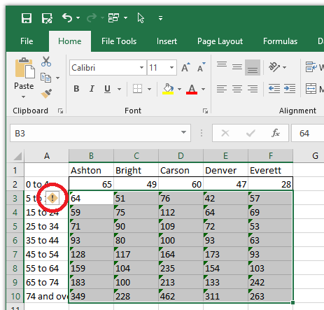
When you mouse over this error icon, it pops up a description of the error. And as I suspected from the start, “The number in this cell is formatted as text”.

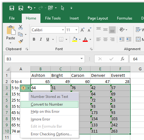
When you click on the icon, a menu drops down which provide some options for you. The best option in this particular list is “Convert to Number.”
That Was Easy!
When you click Convert to Number, the cells all lose their green flags and become right-aligned. The chart looks nice, too, without all those text values being plotted as zero.


