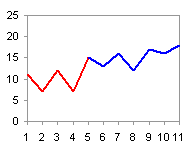
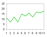
I came across a blog post called Is it just me? (software defaults), which asks the age-old question, Why Are My Excel Bar Chart Categories Backwards? The post was in a new blog by Alex Kerin of Data Driven Consulting. Alex works on projects in analytics and dashboarding.
I have been asked this question a number of times, and being a founding member of Chart Busters, of course I know the answer. I’ve answered the question a number of times, but if I answer it here, it will become available for the ages.
I describe the problem and how to correct it. If you are really interested, I finish with an explanation of why this happens.
The Problem
Let’s use some very simple data to illustrate the problem.

Let’s make a simple bar chart.
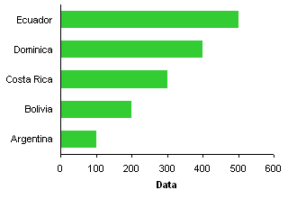
The labels were sorted from top down in the worksheet, but they appear from bottom up along the chart axis.
The Fix
It’s easy, if tedious, to correct the order of category axis labels. Select the axis, press Ctrl+1 (numeral one), the universal shortcut in Excel for Format This Object, and in Excel 2003 the following dialog appears.
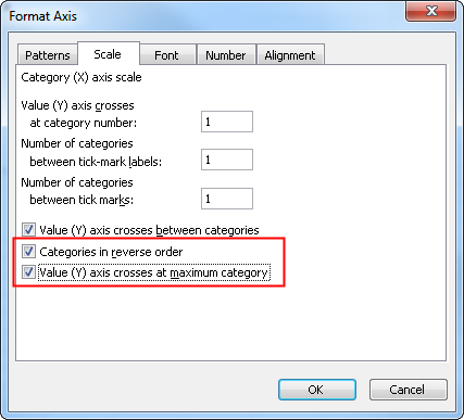
The fix is simple: check the two boxes for Categories in reverse order and Value (Y) axis crosses at maximum category.
The protocol in Excel 2007 is the same, except the dialog looks a little different. You select the same options, but they are located far apart on the dialog.
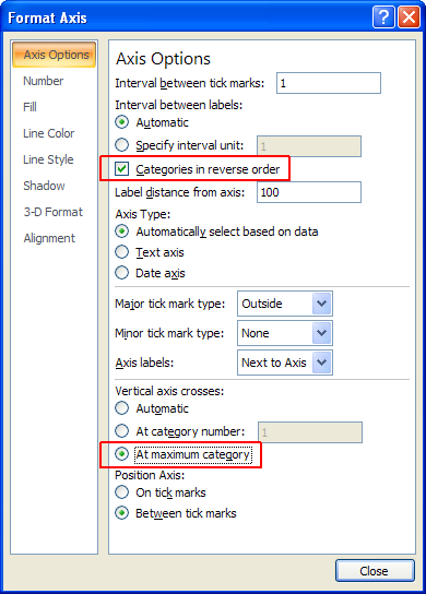
This changes the order of axis labels in our bar chart.

If you forget to make the value axis cross at the maximum category, the axis will now appear at the top of the chart. After reversing the order of the categories, the maximum category is at the bottom of the axis.

Why Does Excel Do That, Anyway?
If we use the same data to make a column chart (line and area chart, too), the labels go from left to right, as expected.
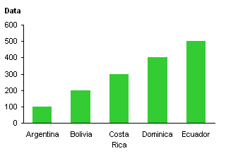
Take another look at the column chart, and note where the origin of the axis system is located. I’ve indicated the origin with a red circle.
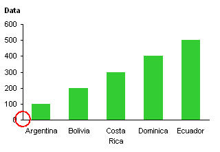
The values start low (at zero in this case) at the origin and increase in value as they move away from the origin. The category labels start with the first one next to the origin and later labels in the list extend further from the origin.
Now look at the bar chart and consider the origin of its axis system.
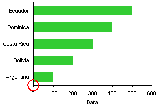
The values start low (zero) at the origin and increase in value as they move away from the origin. The category labels start with the first one next to the origin and later labels in the list extend further from the origin. Just like in the column chart.
Perhaps this is better illustrated if we remove the category data from the bar chart. In this case, Excel uses the counting numbers 1, 2, 3, etc. in place of the empty categories.

Both axes have low numbers next to the origin and higher numbers further away.
The whole problem arises because Excel follows the same axis ordering scheme for bar chart category axes as for any other axis in any other chart.
This describes the mechanics of axis label ordering. But, 99% of the time, a user expects the axis labels to go in the same order top to bottom as in the data source. Why Are My Excel Bar Chart Categories Backwards? is still a valid question: Why can’t bar chart categories automatically be reversed? Alternatively, why can’t the options for a bar chart’s category axis default to:

Works for me.


