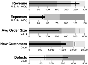
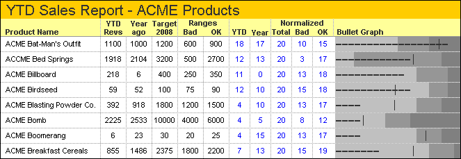
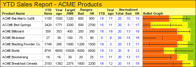
People have struggled for a long time to find effective means of displaying single points of data. With the recent obsession with dashboard displays of business data, this struggle has come to a head. On one side, there are myriad gauge designs; on the other are more effective charts, notably Stephen Few’s Bullet Graphs. In this tutorial I’ll show how to make bullet graphs in Excel, using a simplified approach that works for horizontal and vertical bullet charts.
Gauges
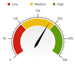
Gauge graphs are based on the numerous dials found in automobile dashboards and aircraft cockpits. These dials make sense in a mechanical setting: they are activated by small voltages generated by sensors in the equipment. In the gauge, this small voltage results in rotation of a needle around a pivot. These gauges are reliable and inexpensive, compared to comparable linear electromechanical gauges. These dials also make sense in a cockpit: you need to know what’s happening right now, and in general, you do not need to compare the values on several dials.
Some business dashboard designers have missed the point. Instead of treating a dashboard as a place where a lot of information is displayed in a limited field of view, they apply the metaphor of cockpit too literally, as if the manager is driving his desk around the company. Dial gauges in a business dashboard are remarkably ineffective. They take up a lot of space to show very little information, and comparisons among several gauges are difficult to judge with any precision. They also show only a “right now” value, rather than a historical view afforded by line charts. It seems that more design effort has gone into making them gauge-like rather than making them comprehensible.
Yet so-called Business Intelligence dashboards are loaded with gauges. BI graphics packages are full of them, each more glossy and glittery than the next.
Bullet Graphs

To address many of the problems with gauges, Stephen Few started with a simple bar chart and developed Bullet Graphs. Bullet graphs require less space than gauges to show the same amount of information, and their linear style makes it easy to compare values on adjacent bullet graphs. Stephen describes bullet graphs in Bullet Graphs for Not-to-Exceed Targets and has published a Bullet Graph Design Specification.
Vertical Single Bullet
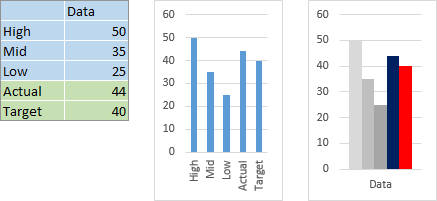
A bullet chart requires five values: high, medium, and low background values, a target, and an actual value, as in the table below. Insert a clustered column chart, and make the chart narrow or adjust it later (middle); in most cases you won’t need to go to the extra effort of making a stacked column chart. Excel assumes that one column of data should be plotted as a single series, so click the Switch Row/Column button on the Chart Tools > Design ribbon tab (right). Format High, Medium, and Low as light to dark gray bars. I’ve formatted Actual as a dark blue bar (which will show up slightly better on screen than a black bar), and Target as a red bar, but these formats will have to be recreated since their chart types will be changed.
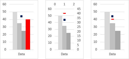
Right-click the Actual series, and choose Change Series Chart Type. Select the Line chart type with markers, format its marker as a square with dark blue border and fill, and format it to use No Line (left chart below). Right-click the Target series, and choose Change Series Chart Type. Select the XY chart type with markers and no lines, and choose the dash marker using red fill and a red border with thickness of 1.5 instead of the default 0.75, which will eventually look better in the legend (middle chart below). Since Excel automatically plots Actual on the secondary axis, format the series to appear on the primary axis (below right).
Note that all of the above three steps can be accomplished in Excel 2013 in one trip to the Chart Type dialog, but earlier versions need three different formatting steps.
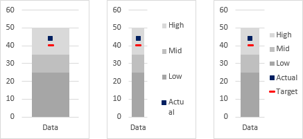
Format any of the remaining column chart series (High, Medium, or Low) and set the Overlap to 100 and Gap Width of 50 (below left). Add a legend (middle). For this thin chart, Excel may make both the chart and the legend too narrow, so adjust the width of the plot area and the legend so both fit nicely (below right).
Select the Actual series and add error bars. It’s a line chart series, so you only get vertical error bars (first chart below). Format the error bars to show the minus direction only with a percentage of 100, without end caps, using the same dark blue for the line, and make the line thick (such as 7.5 points in the second chart below).
Select the Target series and add error bars. It’s an XY scatter chart series, so you get horizontal and vertical error bars (third chart below). Delete the vertical error bars, and format the horizontal error bars to show both directions, at a value of 0.3, without end caps, with a 1.5-point red line.
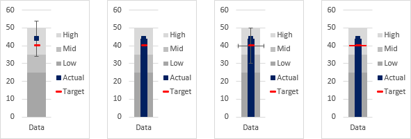
Sometimes the default error bars are too short to see, so you need to use the dropdown in the top left of the Chart Tools > Format or Layout tab to select the set of error bars you need to format.
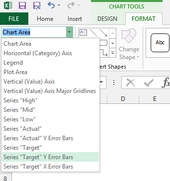
Now comes a little bit of Excel Chart Magic. Error bars do not show up in the legend, so the dark blue and red symbols for Actual and Target would disappear. But we went to the trouble of formatting our markers to look good in the legend.
If we format individual points in a series differently than we format the entire series, the formatting for the entire series stays in the legend. We need to format the individual Actual and Target points differently, by selecting the individual points and choosing No Marker. Here’s how:
Click on the marker for Actual, which selects the whole Actual series. Then click on the marker again or click the right keyboard arrow key, which selects just the single point. Now press Ctrl+1 to format the point. If the title of the format dialog or task pane says “Format Data Point”, you are ready to go. If it says “Format Data Series”, you need to try again to select just the data point. In the Format Data Point dialog, choose No Marker for Marker Style. This hides the Actual marker for the data point in the chart but leaves the marker in the Actual legend entry.
Repeat the single click plus single click technique to select the marker for Target. In the Format Data Point dialog, again choose No Marker for Marker Style. This hides the marker for the data point in the chart but leaves the marker in the legend.
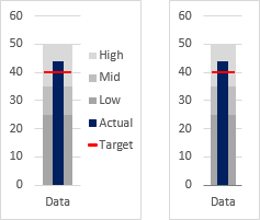
The result is the left chart below. Of course, if you don’t need a legend, you could have skipped all the marker formatting we did before, not shown a legend at all, and made the bullet chart even slimmer (below right).
Vertical Multiple Bullet
The protocol for multiple vertical bullets in a single chart is the same as for a single bullet, with minor adjustments. You need one column per bullet, with High, Mid, and Low, plus Actual and Target for each. The High, Mid, Low, and Target can be the same or different for each bullet. From the data below left, insert a clustered column chart (below middle), and if necessary switch rows and columns so each category (Alpha, Beta, and Gamma below) has its own bullet components.

Right-click the Actual series, and choose Change Series Chart Type. Select the Line chart type with markers, format its marker as a square with dark blue border and fill (left chart below). This messes up the legend, but remembering to set the line to No Line fixes it (below right)
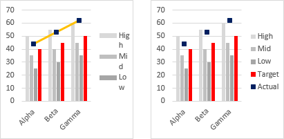
Right-click the Target series, and choose Change Series Chart Type. Select the XY chart type with markers and no lines, and choose the dash marker using red fill and a red border with thickness of 1.5 instead of the default 0.75, which will eventually look better in the legend (left chart below). Since Excel automatically plots Actual on the secondary axis, format the series to appear on the primary axis (below middle). Format any of the remaining column chart series (High, Medium, or Low) and set the Overlap to 100 and Gap Width of 50 (below right).

Select the Actual series and add error bars. It’s a line chart series, so you only get vertical error bars (left chart below). Format the error bars to show the minus direction only with a percentage of 100, without end caps, using the same dark blue for the line, and make the line thick (such as 7.5 points in the right chart below).
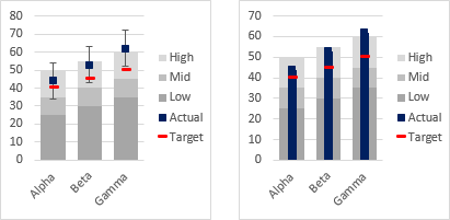
Select the Target series and add error bars. It’s an XY scatter chart series, so you get horizontal and vertical error bars (left chart below). Delete the vertical error bars, and format the horizontal error bars to show both directions, at a value of 0.3, without end caps, with a 1.5-point red line (below right).
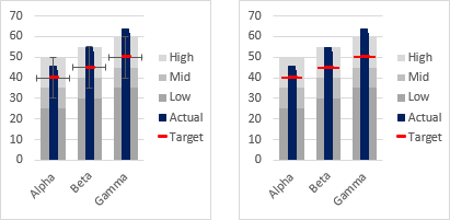
Now we repeat our little bit of Excel Chart Magic.
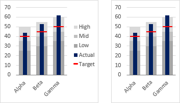
Click on the Actual series, which selects the whole series. Then click on the first marker or click the right keyboard arrow key, which selects just the first point. Now press Ctrl+1 to format the point. If the title of the format dialog or task pane says “Format Data Point”, choose No Marker for Marker Style. Click the right arrow key to select the next point, and again choose the No Marker option. Repeat for the rest of the Actual points. This hides the Actual marker for the points in the chart, but leaves the marker in the Actual legend entry.
Click on the Target series, then click on the first Target marker or click the right arrow key to select the first marker for Target. In the Format Data Point dialog, choose No Marker for Marker Style. Click the right arrow key to select the next Target point, and again choose the No Marker option, and repeat for the rest of the Target data points. This hides the marker for the points in the chart, but leaves the marker in the legend.
The result is the left chart below. Again, if you don’t need a legend, you could have skipped all the marker formatting we did before, omitted the legend, and made the bullet chart narrower (below right).
Single Horizontal Bullet
The protocol for a horizontal bullet is similar to that for a vertical bullet, with adjustments to account for different axis behavior in a horizontal bar chart. First, one more row of data is needed for the Y value of 0.5 for plotting Actual and Target (below left). Select only the blue shaded range (not the entire data range as before) and insert a clustered horizontal bar chart (below right)
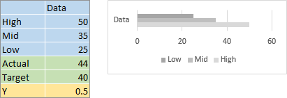
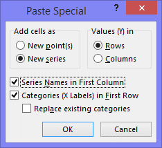
Select the cells containing the Actual label and value, then hold Ctrl and select the cells containing the Y label and value, so both areas are highlighted, and copy (Ctrl+C). Select the chart, and use Paste Special from the Home ribbon tab to paste the data as a new chart series, using values in rows, series names in first column, and categories in first row.
The result is the barely visible bar at the top of the chart, below left. Change the series name from Y to Actual, either by using the Select Data dialog, by selecting the series and dragging the series name highlight from the cell containing Y to the cell containing Actual, or by editing the series formula to put the proper cell reference in the first argument of the formula (below right). Right-click the Actual series, choose Change Series Chart Type, and select the XY Scatter option with markers and no line, and format it as a marker with dark blue border and fill (bottom middle).
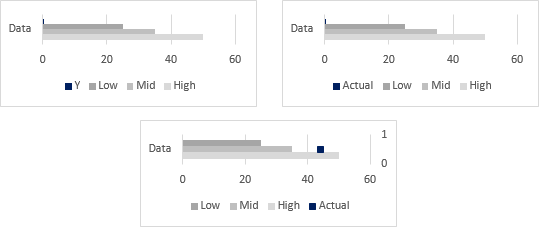
Select the cells containing the Target label and value and the Y label and value, and copy (Ctrl+C). Select the chart, and use Paste Special to paste the copied data as a new chart series, using values in rows, series names in first column, and categories in first row. This is pasted as another XY Scatter series, again with the name Y. Format the series using the dash marker with a 1.5 point red line and red fill (below left). Change the series name to Target (below right).

Format any of the remaining column chart series (High, Medium, or Low) and set the Overlap to 100 and Gap Width of 50 (below left). Format the secondary vertical axis (right edge of the chart) so the minimum and maximum are manually fixed at 0 and 1, the axis tick label setting is No Labels, and the line option is No Line (below right). Format the horizontal axis so the tick label spacing is more frequent (bottom middle).
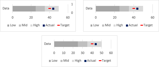
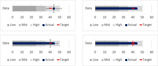
Select the Actual series and add error bars. It’s an XY scatter chart series, so you get horizontal and vertical error bars (top left chart below). Delete the vertical error bars. Format the horizontal error bars to show the minus direction only with a percentage of 100, without end caps, using the same dark blue for the line, and make the line thick (such as 6 points in the top right chart below).
Select the Target series and add error bars. As an XY scatter chart series, it gets horizontal and vertical error bars (bottom left chart below). Delete the horizontal error bars, and format the vertical error bars to show both directions, at a value of 0.3, without end caps, with a 1.5-point red line (bottom right chart below).
Time to work our Excel Chart Magic again. Click on the marker for Actual to select the whole series. Then click on the marker again or click the right keyboard arrow key, which selects just the single point, and press Ctrl+1 to format the point. In the Format Data Point dialog, choose No Marker for Marker Style, which hides the Actual marker for the data point in the chart, but leaves the marker in the Actual legend entry.
Repeat the single click plus single click technique to select the marker for Target. In the Format Data Point dialog, again choose No Marker for Marker Style, to hide the marker for the data point in the chart, but leave the marker in the legend.
The result is the left chart below. If you don’t need a legend, you could have skipped all this finagling with markers, not shown a legend, and made the bullet chart thinner (below right).

Multiple Horizontal Bullet
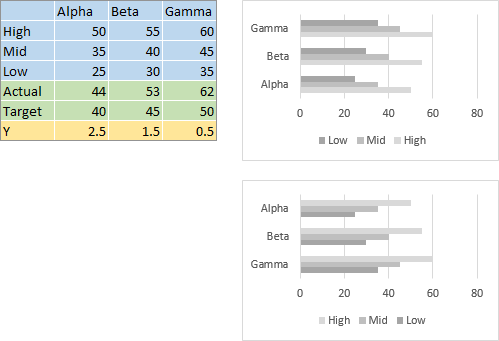
The protocol for multiple horizontal bullets in a single chart is similar to that for a single bullet, with minor adjustments. You need one column of data per bullet, with High, Mid, and Low, plus Actual and Target for each. Also, a row of data is needed for the Y values for plotting Actual and Target (below left). These values are 0.5 for the first category (Alpha), 1.5 for the next (Beta), and so on, adding 1 to each previous Y value.
Select only the blue shaded range (not the entire data range as before) and insert a clustered horizontal bar chart (top right below). The categories (Alpha, Beta, and Gamma) are plotted bottom-to-top, in a phenomenon described in Excel Plotted My Bar Chart Upside-Down. This is normal behavior, of course, and it’s simple to counteract by formatting the vertical axis to plot categories in reverse order, with the horizontal axis crossing at the maximum category (bottom right below).
Select the cells containing the Actual label and values, then hold Ctrl and select the cells containing the Y label and values, so both areas are highlighted, and copy (Ctrl+C). Select the chart, and use Paste Special from the Home ribbon tab to paste the data as a new chart series, using values in rows, series names in first column, and categories in first row.
The result is the barely visible bar at the top of the chart, below left. Change the series name from Y to Actual (below right). Right-click the Actual series, choose Change Series Chart Type, and select the XY Scatter option with markers and no line, and format it as a marker with dark blue border and fill (bottom middle).
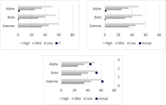
Select the cells containing the Target label and values and the Y label and values, and copy (Ctrl+C). Select the chart, and use Paste Special to paste the copied data as a new chart series, using values in rows, series names in first column, and categories in first row. This is pasted as another XY Scatter series, again with the name Y. Format the series using the dash marker with a 1.5 point red line and red fill (below left). Change the series name to Target (below right).

Format any of the remaining column chart series (High, Medium, or Low) and set the Overlap to 100 and Gap Width of 50 (below left). Format the secondary vertical axis (right edge of the chart) so the minimum and maximum are manually fixed at 0 and the number of categories (3 for Alpha, Beta, and Gamma), the axis tick label setting is No Labels, and the line option is No Line (below left). Format the horizontal axis so the tick label spacing is more frequent (bottom middle).

Select the Actual series and add error bars. It’s an XY scatter chart series, so you get horizontal and vertical error bars (top left chart below). Delete the vertical error bars. Format the horizontal error bars to show the minus direction only with a percentage of 100, without end caps, using the same dark blue for the line, and make the line thick (such as 6 points in the top right chart below).
Select the Target series and add error bars. As an XY scatter chart series, it gets horizontal and vertical error bars (bottom left chart below). Delete the horizontal error bars, and format the horizontal error bars to show both directions, at a value of 0.3, without end caps, with a 1.5-point red line (bottom right chart below).
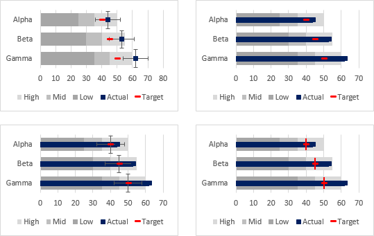
Time to disappear the Actual and Target markers from the chart but keep them in the legend. Click on the marker for Actual to select the whole series. Then click on the marker again or click the right keyboard arrow key, which selects just the single point, and press Ctrl+1 to format the point. In the Format Data Point dialog, choose No Marker for Marker Style, which hides the Actual marker for the data point in the chart, but leaves the marker in the Actual legend entry.
Repeat the single click plus single click technique to select the marker for Target. In the Format Data Point dialog, again choose No Marker for Marker Style, to hide the marker for the data point in the chart, but leave the marker in the legend.
The result is the left chart below. If you don’t need a legend, you could have skipped all this finagling with markers, not shown a legend, and made the bullet chart thinner (below right).

The only problem with the multiple horizontal bullet chart as created here is that the High, Mid, and Low legend entries are in the wrong order. Plotting the vertical axis in reverse order also caused these series to be entered in the legend in reverse order.
There are two ways to avoid this legend reversal. One is to reverse the order of the data in the worksheet, the other is to convert from a clustered bar chart to a stacked bar chart.
Multiple Horizontal Bullet, Reverse Data Order
If you have control over the data sheet, the easiest way to keep the legend entries in the right order is to change the order of the bullets in the sheet. In the range below left the bullets are listed Gamma, Beta, Alpha. When you select the bar chart data (shaded blue) and insert a clustered bar chart, the categories are ordered top down in the desired Alpha-Beta-Gamma order, and the legend is also shown in the desired Low-Mid-High order.

Following the rest of the protocol above, but omitting the Categories in Reverse Order and Horizontal Axis Crosses at Maximum Category settings, results in the following bullet charts, with and without a legend.

Multiple Horizontal Bullet, Stacked Bars
If you can’t change the order of the bullet categories, you need to insert a couple rows for calculations. In the range below, the second through fourth rows contain High, Mid, and Low values. The fifth row, labeled “Mid”, has a formula that subtracts the Low value from the Mid value, while the sixth row, labeled “High”, has a formula that subtracts the Mid value from the High value. These calculated values will be stacked together onto the Low value to display the bands in the chart.
Select the first blue shaded row in the data range (top left, below), then hold Ctrl and select the other three blue shaded rows, so that both areas are highlighted, and insert a stacked horizontal bar chart (top right, below). Format the vertical axis to plot categories in reverse order, with the horizontal axis crossing at the maximum category (bottom right below).
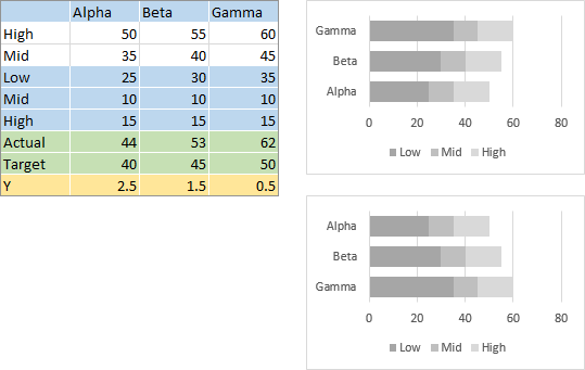
Select the cells containing the Actual label and values, then hold Ctrl and select the cells containing the Y label and values, so both areas are highlighted, and copy (Ctrl+C). Select the chart, and use Paste Special from the Home ribbon tab to paste the data as a new chart series, using values in rows, series names in first column, and categories in first row.
The result is the bars stacked on the right edge of the existing bars, below left. Change the series name from Y to Actual (below right). Right-click the Actual series, choose Change Series Chart Type, and select the XY Scatter option with markers and no line, and format it as a marker with dark blue border and fill (bottom middle).
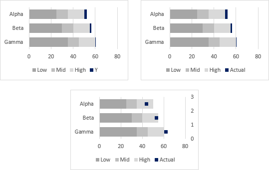
Select the cells containing the Target label and values and the Y label and values, and copy (Ctrl+C). Select the chart, and use Paste Special to paste the copied data as a new chart series, using values in rows, series names in first column, and categories in first row. This is pasted as another XY Scatter series, again with the name Y. Format the series using the dash marker with a 1.5 point red line and red fill (below left). Change the series name to Target (below right).

Format the secondary vertical axis (right edge of the chart) so the minimum and maximum are manually fixed at 0 and the number of categories (3 for Alpha, Beta, and Gamma, below right). Format the horizontal axis so the tick label spacing is more frequent (bottom middle).

Select the Actual series and add error bars. It’s an XY scatter chart series, so you get horizontal and vertical error bars (top left chart below). Delete the vertical error bars. Format the horizontal error bars to show the minus direction only with a percentage of 100, without end caps, using the same dark blue for the line, and make the line thick (such as 6 points in the top right chart below).
Select the Target series and add error bars. As an XY scatter chart series, it gets horizontal and vertical error bars (bottom left chart below). Delete the horizontal error bars, and format the horizontal error bars to show both directions, at a value of 0.3, without end caps, with a 1.5-point red line (bottom right chart below).

Hide the Actual and Target markers from the chart but keep them in the legend. Click on the marker for Actual to select the whole series. Then click on the marker again or click the right keyboard arrow key, which selects just the single point, and press Ctrl+1 to format the point. In the Format Data Point dialog, choose No Marker for Marker Style, which hides the Actual marker for the data point in the chart, but leaves the marker in the Actual legend entry.
Repeat the single click plus single click technique to select the marker for Target. In the Format Data Point dialog, again choose No Marker for Marker Style, to hide the marker for the data point in the chart, but leave the marker in the legend.
The result is the left chart below. If you don’t need a legend, you could have skipped all this finagling with markers, not shown a legend, and made the bullet chart thinner (below right).

Bullet Charts in Peltier Tech Charts for Excel
This tutorial shows how to create Bullet Charts, including the data layout needed, and the detailed combination of chart series, chart types, and formatting required. This manual process takes time, is prone to error, and becomes tedious.
I have created Peltier Tech Charts for Excel to create Bullet Charts (and many other custom charts) automatically from raw data. This utility, a standard Excel add-in, lays out data in the required layout, then constructs a chart with the right combination of chart type and format. This is a commercial product, tested on thousands of machines in a wide variety of configurations, Windows and Mac, which saves time and aggravation.
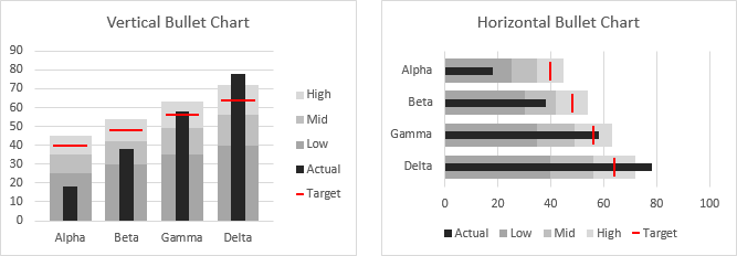
Peltier Tech Charts for Excel can make vertical and horizontal bullet charts in default shades of gray…
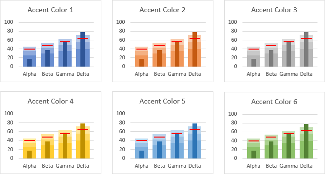
… and it can make the charts using shades of the accent colors of the workbook’s theme.
Please visit the Peltier Tech Charts for Excel page for more information.


