Plot Blank Cells in Excel Charts
A common problem around web forums and blogs is how to plot blank cells in Excel charts. There is a lot of confusion about plotting of hidden and empty cells, about what constitutes a blank cell, and about various workarounds that purport to produce blank cells that will or will not be displayed in a chart.
I discuss the “plot blank cells” issue in several tutorials in this blog: Mind the Gap – Charting Empty Cells, Area Chart With Gap, Another approach to plotting gaps in Excel charts, and VBA Approaches to Plotting Gaps in Excel Charts, among others. New behavior introduced in Excel 2016 makes these older workarounds unnecessary.
tl;dr
A new feature introduced in a late build of Excel 2016, Show #N/A As An Empty Cell, solves the pain and frustration experienced by generations of Excel users trying to avoid plotting what look like apparently blank cells.
Excel’s Hidden and Empty Cell Settings Dialog
You can easily tell Excel how to plot empty cells in a chart. Right-click on the chart and choose Select Data, or choose Select Data from the ribbon. Click on Hidden and Empty Cells in the bottom left of the Select Data Source dialog that appears. The Hidden and Empty Cell Settings dialog appears. There are three options for Show Empty Cells As: Gaps, Zero, and Connect Data Points with Line.
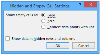
There is also an option to Show Data in Hidden Rows and Columns. By default, Excel will not chart data in rows or columns which have been hidden, but checking this box causes hidden cells to be plotted.
I’ll explain what the Empty Cells settings mean below, including some of their idiosyncrasies.
What’s a “Blank Cell”, Anyway?
Part of the confusion over this whole issue is what Excel considers a blank cell.
People will type a space character in a cell and wonder why that’s not blank, it looks blank. The answer is, because it is simply a transparent piece of text.
People will enter a formula like =IF(A1>0,A1,"") and wonder why it’s blank, because it makes a cell look blank too. The answer is, because the cell contains a formula. But it returns “”, why isn’t that blank? Because “” is a piece of text, albeit zero characters long.
Sometimes a null string (i.e., “” without the quotes) gets imported into a cell, and people don’t see anything, so they wonder about that too. As above, it’s a piece of text.
But this is all confusing because different Excel functions treat “” differently. For example, if cell A1 contains “”, ISBLANK(A1) is FALSE, but COUNTBLANK(A1) is 1. So is it a blank, or isn’t it? Well, a chart plots it as zero, so for my money, it’s not a blank at all.
The fact is, there is no magic function in Excel, no BLANK() or NULL(), which would cause a cell to behave consistently as a blank cell.
Use #N/A Instead of Blanks
A partial solution to the problem is to write a formula that displays #N/A instead of “” to prevent drawing a point. For example, =IF(A1>0,A1,NA()) instead of =IF(A1>0,A1,""), where the function NA() displays #N/A in a cell. However, this is of limited use, since it doesn’t really mimic the behavior of a blank cell, and it works differently for different chart types. People also avoid this approach because they think the #N/A value in a cell is ugly, even though it is informative. Sometimes the advice for this is to use conditional formatting to hide the error; I tend to use a light gray font to de-emphasize it without hiding it altogether.
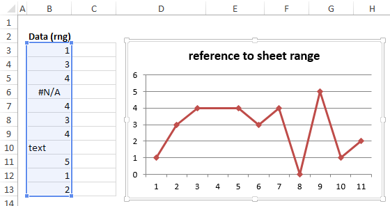
Care must be taken with the #N/A approach. =IF(A1>0,A1,NA()) and =IF(A1>0,A1,#N/A) both return the error value #N/A, which as an error is centered in a cell with General Horizontal Alignment (see my post Check Your Data: Is It Numeric or Text to learn why General Horizontal Alignment is important). However, =IF(A1>0,A1,"#N/A") returns a text label “#N/A”, which as text is left-aligned in a cell, and will be plotted like any text, as a zero value.
This is the behavior that has changed in very recent versions of Excel 2016. I also believe that when these changes were implemented, some inconsistencies crept into this behavior.
Other Workarounds
There are numerous other ways to get around the inability to plot a formula as a blank cell.
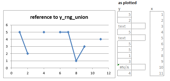
In Another approach to plotting gaps in Excel charts (on this blog), Roberto Mensa, Kris Szabó, and Gábor Madác of the FrankensTeam showed an elegant and sometimes fragile technique that used defined range names that would substitute a blank cell for any cell containing #N/A.
In the comments to another post on my blog, which I cannot now locate, another reader suggested creating a range that linked multiple times to each value in the original range, so each point appears three times. The middle time it is actually a blank cell, which the first and third time it links to the original. If the original is #N/A, we are left with a sequence of #N/A-Blank-#N/A, and if the #N/A is next to a blank cell, it does not get an interpolated line segment. Clever but cumbersome.
Among the VBA approaches I’ve seen (including those I wrote about in VBA Approaches to Plotting Gaps in Excel Charts) are routines that step through the data and clear any cells with #N/A or text, so they plot as blanks, or step through the chart and format any points with undesired markers or line segments to show neither. Of course, if the data changes, then other routines must be run to restore any formulas which were deleted and reformat any points. Cumbersome, and most examples you’ll find were hacked together by non-programmers who just needed something, anything, to get it done.
New in Excel 2016: Plot #N/A as Blank in Excel Charts
In a recent build of Excel 2016, the behavior of #N/A in a chart’s values has changed. It is now possible to make Excel plot #N/A values as empty cells. The new feature was announced on the Microsoft Office blog in Display empty cells, null (#N/A) values, and hidden worksheet data in a chart. I’d like to think it was partly in response to my suggestion on Excel UserVoice, Give us a proper NULL() worksheet function. I was asking for a general function that would make any Excel formulas or charts treat a given cell as a blank cell, but my main interest was in the ability to chart the result of a function as a blank cell.
When the feature was first introduced to a subset of Insiders, there was no option; #N/A was always treated like a blank cell in a chart. The Hidden and Empty Cell Settings dialog was unchanged from previous builds (shown earlier).
Once Microsoft was confident that the feature had no show-stopping bugs, they rolled it out more broadly. Insiders were also treated to a new Hidden and Empty Cell Settings dialog, which features a checkbox to Show #N/A as an empty cell.
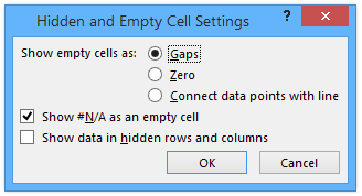
Notice that there is a space in the old dialog where the new checkbox appears. This space was cleared in Excel 2013, but only utilized recently.
This new feature has been rolled out not only to Office 365 subscribers but also to regular Excel 2016 users. On my Office 365 laptop, I have the full-blown Show #N/A As An Empty Cell behavior. On my non-Office-365 laptop, I get the new behavior, but I still do not have the new dialog, so I can’t toggle it on and off.
Now let’s see how this plays out in Excel charts.
Plot Blank Cells in Common Excel Chart Types
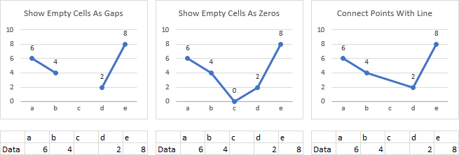
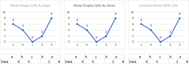
Here is how a blank cell is plotted in a line chart, for all three options. Left, for Show empty cells as: Gap, there is a gap in the blank cell’s position. Center, for Show empty cells as: Zero, there is an actual data point (a marker and a data label) with a value of zero in the blank cell’s position. Right, for Connect data points with line, there is a line connecting the points on either side of the blank cell. Perfect.
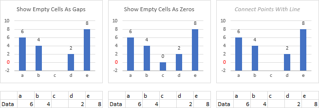
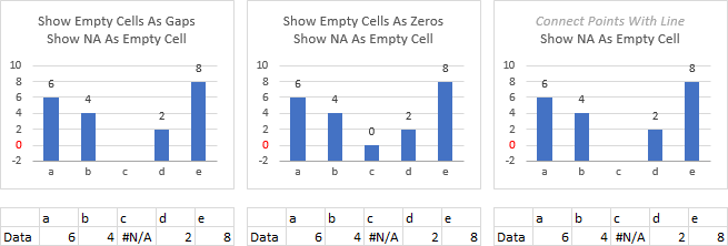
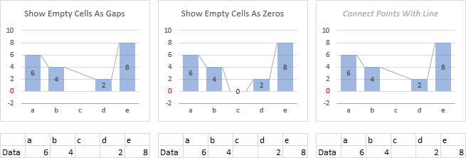
Here is how Excel plots a blank cell in a column chart. Left, for Show empty cells as: Gap, there is a gap in the blank cell’s position. Center, for Show empty cells as: Zero, there is an actual data point (or at least a data label) with a value of zero in the blank cell’s position. Right, since it makes no sense to connect points with a line if the points are columns or bars, the Connect data points with line option (also known as the Interpolate option) is disabled; I’ve denoted this by using gray italic text in the chart title. You can still have that option in a column chart, though; for example, if you start with a line chart with that option selected and then change the chart type, or if you apply the option with VBA. Since the interpolate option is disabled, Excel defaults to leaving a gap.
I’ve modified the column charts by extending the Y-axis minimum to -2, and setting the Horizontal Axis Crosses property to -2. The tick label at Y=0 is colored red to draw attention to the altered axis settings.
The bars start at the axis (at Y=-2, not at Y=0), and extend upward to the Y value. We can now also clearly see the column with a value of zero, exactly what we signed up for by selecting Show Empty Cells as Zero.
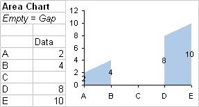
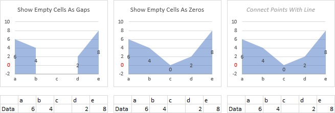
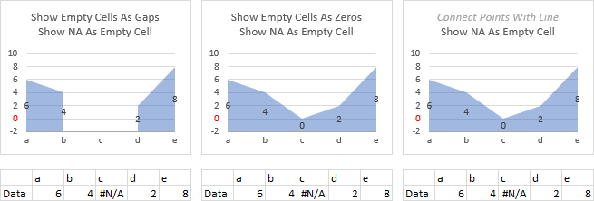
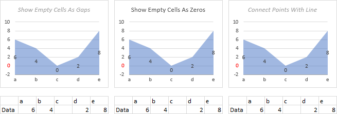
Here’s how blank cells are plotted in an area chart. Left, for Show empty cells as: Gap, there is a gap in the blank cell’s position. Center, for Show empty cells as: Zero, there is an actual data point (or at least a data label) with a value of zero in the blank cell’s position. Right, Excel decides it makes no sense to connect points with a line (though it might have made sense to fill in the area as if there were a line), the Connect data points with line option (the Interpolate option) is disabled. You can still have that option in an area chart, the same as you can in a column chart. The interpolate option is disabled, so Excel defaults to plotting a zero-value point, not leaving a gap as in the column chart.
As I did with the column charts above, I’ve modified the area charts by extending the Y-axis minimum to -2, and setting the Horizontal Axis Crosses property to -2 (note the red label at Y=0). You can clearly see that there is a data point at zero corresponding to the blank cell in the Y values.
Plot Null String in Excel Charts
I’ll illustrate the problem in one set of line charts. In the data ranges below, the cell for the value corresponding to category “c” is a null string, created using the formula =””, as shown below the first chart. Regardless of the Show Empty Cells setting, the null string (and any text) is plotted as a zero value data point, with a marker and data label.
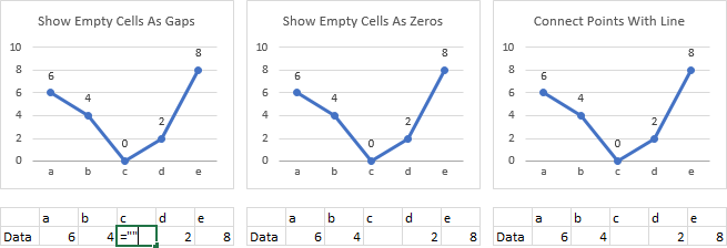
This is what people are trying to plot as a gap.
Plot #N/A (as #N/A) in Common Excel Chart Types
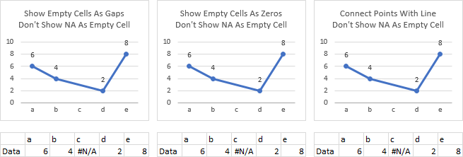
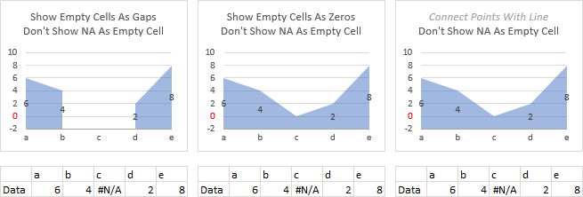
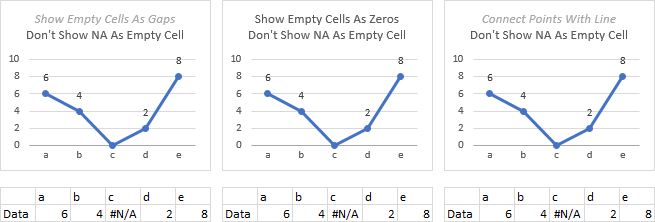
Since time immemorial, in a line chart, no marker is drawn for a #N/A value, but a line is drawn connecting the markers on either side. So if all you wanted was to suppress the drawing of a marker, this is great. If the series has lines connecting points and you want the line to connect adjoining points, this is great. If you don’t want the line but want a gap, this doesn’t do it. All three charts are the same: #N/A isn’t a blank cell, so it shouldn’t care what Show Empty Cells As setting the user has selected.
The Don’t Show NA As Empty Cell in the chart titles is to distinguish legacy behavior from the new Show NA As Empty Cell behavior I will discuss below.
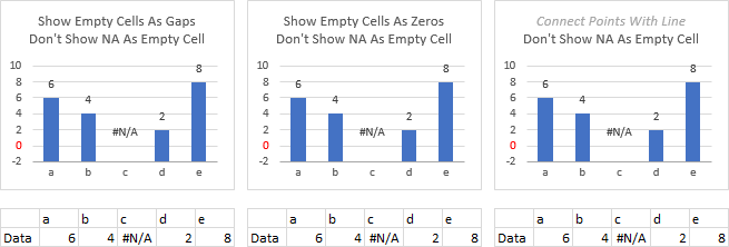
In a column chart, no data point is plotted (which is great). However, if you have data labels on the series, you’ll get a label floating above zero. Here the label reads #N/A because the Show Values option is selected for the data labels. As with line charts, all three charts are the same.
In an area chart, there are inconsistent behaviors. The three charts should be the same, but the Show Empty Cells As Gaps also shows #N/A as a gap, even though it shouldn’t recognize #N/A as a blank. In the other cases, unlike the column and line charts, it plots #N/A as zero; unlike the column chart, it does not display a data label.
I suspect that some of the behaviors for plotting #N/A as #N/A have been adjusted from earlier versions by the new #N/A as Blank feature, but I have not bothered to track down my suspicions.
Plot #N/A as Blank Cells in Common Excel Charts
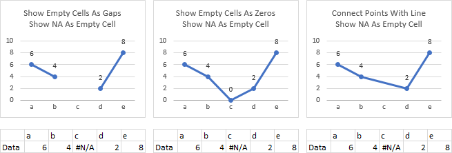
This feature works pretty much as advertised. When enabled, the #N/A value is treated just like an empty cell. I will not show all combinations as I have above, but just a few highlights.
In the line charts below, we see #N/A values treated As Gaps, As Zeros, and Interpolated.
In the column charts below, we see #N/A values treated As Gaps and As Zeros, with Interpolated mimicking the As Gaps behavior.
In the area charts below, we see #N/A values treated As Gaps and As Zeros, with Interpolated mimicking the As Zeros behavior.
Just like in the examples shown for blank cells.
Excruciating Detail: Plotting Blanks and #N/A Values in Stacked Excel Charts
This section was moved to the end, because it seemed to present too much information at once, and confuse more than clarify. But now that you’ve seen the comparisons above, it might be safe to continue.
Plot Empty Cells in Stacked Excel Charts
These settings work differently in stacked charts. Excel’s rationale is that you can’t plot a gap, because the point stacked on top of the gap might have a value, and it needs something for it to be stacked on. If you are trying to plot an empty cell as a gap, and it isn’t working, make sure you aren’t using a stacked chart type. I should note that Excel does not apply this rationale consistently.
One of the most confusing chart types is a stacked line. People choose it when selecting a chart type, not realizing that each series’ values are plotted on top of previous values. (It’s much easier to notice stacked series and comprehend the data in a stacked column or area chart).
This is how Excel plots a blank cell in a stacked line chart (it has only one series, but it’s still a stacked line chart). The only option you can select is Show as Zeros (though you can apply the other settings through the roundabout means described earlier), and what you always get is a point at zero.
In a stacked column chart, you have both the As Gap and As Zero options available. As Zero results in a zero-height data point (i.e., bar), which we can see because of the data label; As Gaps seems to lack this data point, in conflict with Excel’s apparent decision that it needs a zero point to stack subsequent point on. The disabled Interpolate setting reverts to As Gaps. Note that in the stacked column chart, the bars start at zero, not at the axis.

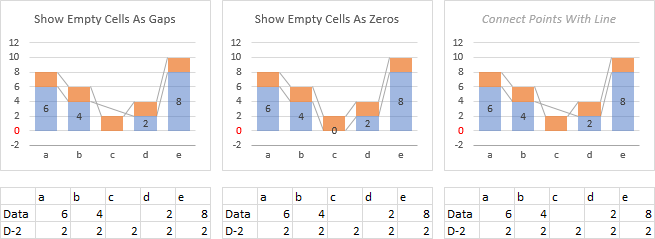
When you add Series Lines to the stacked column chart (please don’t use these confusing bits of clutter), the series lines connect the bars on either side of the gap (left and right), and connect with the zero-height bar when plotted As Zero (center).
If we stack another series of bars atop our series with the blank value, we see two things. The second bar has no problem stacking on the place a missing bar would be, and the series lines show an interesting crossing pattern.
Like the line chart, the stacked area chart only has the As Zeros option available, and you can see the zero-value point where the blank cell goes.
Plot #N/A in Stacked Excel Charts
In a stacked line chart, #N/A is plotted as zero, since you need a point on which to stack other series. The #N/A zero points have markers but no data labels.
In a stacked column chart, the behavior is similar to the plotting of blank cells. Even though the #N/A is supposedly not treated as a blank, there are different behaviors based on the Show Empty Cells setting: As Gaps results in no apparent point, because there is no data label, while the As Zeros setting apparently plots a bar 0 units high, evidenced by the #N/A label. Unlike in the unstacked column charts above, bars start not at the X-axis but at zero, so we can’t actually see the zero-height bar. Connect Points With Line is undefined as before but reverts to the As Gaps behavior.

When we add series lines, we see further evidence for the data point in the As Zeros case: the series lines drop to the top of the zero-height bar in the center.

In an area chart, only the As Zeros case is enabled, and whatever the setting, the appearance of the chart is the same: the #N/A value results in a point at zero, with no data label.


