Blown Saves vs. Fielding Independent Pitching shows the following chart comparing Blown Saves to FIP (Fielding Independent Pitching) for ten relief pitchers on the MLB teams that made the 2009 playoffs. Fielding Independent Pitching is a quantity designed to remove the effect of fielding on a pitcher’s statistics.

This is the wrong chart type for a handful of reasons.
First, we all are aware of the evils of 3D charts. The first green bar in this chart has a data label proclaiming a value of 11, but it sure looks much closer to 12 than to 10. Let’s try to improve this with a 2D clustered column chart:
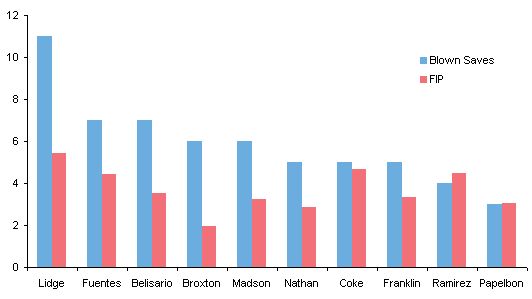
Okay, we can better judge the values of the bars without the 3D-induced parallax.
But what was the analyst trying to show? There was scant description in the post that accompanied the graph.
Is there any relationship between the two measures? A column chart will never show such a relationship.
Here is that same information on an XY chart. There’s a cluster of points in the middle and an outlier (Lidge) in the upper right.

There isn’t a strong dependence of Blown Saves on FIP, as we see from the blue symbols, regression line, and regression equation below. If we throw out the outlier, there’s no relationship at all, illustrated by the red features in the chart.

What was the analyst trying to show? Was he making some comment in the title of the chart?
“When you need them the least”: Does he think these are poor pitchers? What do you think?


