Seth Godin gave his suggestions for using charts in presentations in The three laws of great graphs. He said that
There are 314 principles for good graphs and charts [in presentations]. But these three laws will take you far.
1. One Story
2. No Bar Charts
3. Motion
These are good laws, though I would like to modify law number 2 to read “Choose Chart Types Intelligently”. The following are my restatements of Seth’s points, with additional commentary about my version of his law number 2.
1. One Story
The reason to use a chart in a presentation is to make a point, to tell a story. Make sure each chart tells the story you want people to hear. No distractions, no side stories. Keep it simple, and keep to the point.
2. Choose Chart Types Intelligently
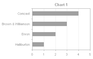
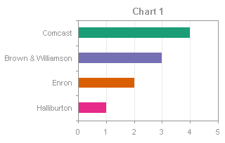
Seth doesn’t like bar charts. That’s cool. I like bar charts, but only where they are used appropriately. Seth points out how bad bar charts are for time series data, and it’s true, line or area (or XY!) charts are a better means for showing trends over time. Seth also shows an ugly 3D bar chart, and it’s also true that 3D effects reduce the effectiveness of your graphics.
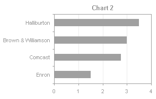
However, bar charts are well suited for displaying categorical data. The important point is to keep it simple, and keep to the point.
3. Motion
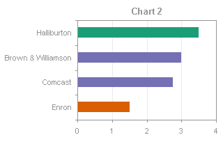
Use motion to help tell a story. This doesn’t mean use a lot of animation, zoom the chart in from Neptune, and drop data points from the sky by parachute. It means a technique as simple as showing two charts, “before” and “after”, on successive slides or even side by side, where the charts are aligned and use the same axis scales. In fact, if the charts are adjacent, motion isn’t necessary, and it is easier for the audience to make comparisons.


