This post was inspired by Moving a Pie Slice, a recent post on Patricia the Excel Diva’s Chatting about Excel blog. Patricia presents a few helpful Excel tips each week.
In Moving a Pie Slice, Patricia shows how to explode one pie segment out of the pie chart. I’ll review the protocol, not because I want all you Chart-Busters-in-Training to start making these charts, but just for completeness. Then I’ll present an alternative way to show the data. Here’s Patricia’s chart, which she claims describes sales of different pies in the days leading up to Thanksgiving, but which I think indicates the relative risk of me exploding from eating too much of each type of pie.
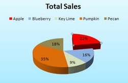
For our non-US friends, I’ll simply say that Thanksgiving is a celebration of abundance, and often celebrants overindulge themselves.
Explode a Pie
I used Patricia’s numbers and created a 3D pie chart in Excel 2003.
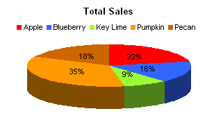
The tilt on that sucker is ridiculous, so I backed it off some. It’s still 3D, so there’s some distortion (note how much larger the 16% Blueberry s than the 18% Pecan slice). If you right click on a 3D chart, there’s an item called 3D View which opens a dialog that lets you adjust the vantage point.
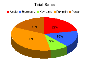
That’s a bit better.
To explode just one individual slice of the pie, click once on the slice (not the label) to select the pie, then click on it once more to select just the slice. Now click and drag the segment away from the center.
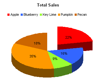
If desired you can now select another individual slice of pie and drag it away from the center of the pie.
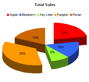
To explode all slices by the same amount, just click once on any slice, and drag outward.
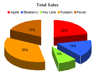
Let’s step back for a moment and let this chart remind us why we don’t like 3D Pie Charts. See the brown slice? It’s a lot bigger than the blue slice, isn’t it? But the values are very close, 18% vs. 16%. The chart exaggerates this difference.
You can also explode one or more slices in a 2D pie chart. What you lose in 3D effect, you make up for in easier to compare slices. (Comparisons are still likely to be inaccurate because there’s no common baseline for each data point, but the brown and blue slices look closer in size.)
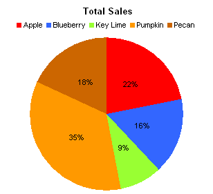
And here is the 2D version of a pie chart with one piece dragged away.
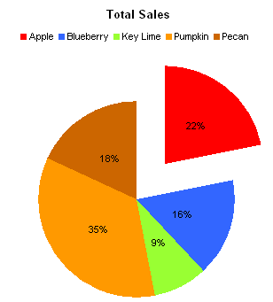
Alternate to an Exploded Pie
In my role as Chart Buster, it is my duty to show an alternate chart style which makes comparison of the data easier. We’ll use a classic bar chart. Data points (bars) in a bar chart are easier to compare, because they share a common baseline: the left edge of the chart. We can also dispense with the legend, because the category labels are located immediately adjacent to the bars. No need to look back and forth between the legend and the data.

The first thing to do with this chart is to sort its data range, in decreasing order so the largest bar is at the top.

Note the comparison between the brown and blue bars. You can tell that Pecan is slightly larger than Blueberry. The difference is greater than if you’d guessed using the 2D pie chart, but much less than if you’d guessed using the 3D version. Yet here you know the score without having to guess.
How can we highlight the Apple data point? We’re using the same color scheme as in the pie chart, so we can’t just use a different color. Well, we could use a black bar for Apple, of course, but that’s kind of ugly. Instead, I decided to keep red for the Apple bar, and unhighlight the other bars. I did this by keeping the same color, but formatting the fill using a 50% pattern, with white as the second color. (On my good monitor it looks great, but on the monitor that’s slowly dying, the patterned bars give me some interesting moiré effects.)
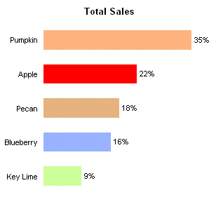
If you’re using Excel 2007 and you can’t find the fill pattern dialog, don’t fret. Microsoft left them out of the Excel 2007 user interface, but kept them in the VBA object model, so patterns can still be applied. If you don’t feel like programming patterns for all the bars, my colleague Andy Pope has written a Fill Patterns Add-In for Excel 2007. It’s free, so download and install it.
All of this futzing with colors is unnecessary. One benefit of bar charts over pie charts is that we need not rely on colors or patterns to help distinguish one data point from another. I’ve decided to pick a light orange-brown for my bars, and a darker brown for the highlighted data point.

It doesn’t match the pie contents as aesthetically as the pie chart’s color fills, but the light and dark hues will survive photocopying in black and white, and we don’t have to worry about bad video settings or misinterpretation by colorblind viewers.
Yet another benefit of a bar chart is that you can make it rather small without sacrificing detail.
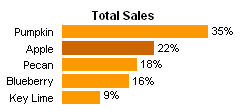
You can construct an information-dense dashboard with arrays of small charts like this.


