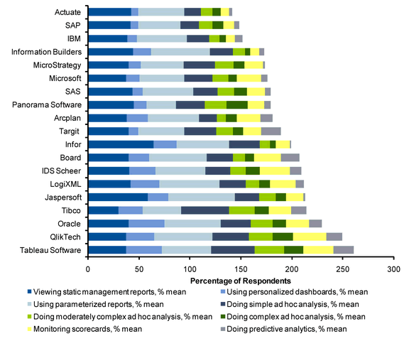
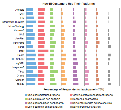
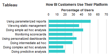
In Gartner’s Customer Survey Results: Customers Using Vendors for BI Activities, Elissa Fink of Tableau presented a stacked bar chart that showed how BI customers use their BI products.
Good first cut through the survey data, perhaps, but stacked charts leave something to be desired. The only common baseline is along the left axis of the chart, so we can only reliably compare values in the first series and for the sum of all series.
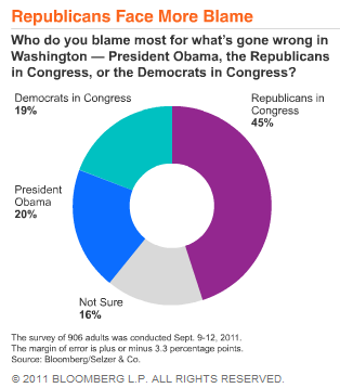
This chart has another issue. The percentage items do not sum to 100%, so it is harder to understand what this tells us. 260% of Tableau users perform these eight tasks? What does that mean? It’s reminiscent of last December’s infamous Fox News pie chart.
I decided to examine some alternative charting approaches. I am in no way criticizing Elissa or Tableau, I’m simply using this chart as the basis for a discussion of alternative charting approaches. Tableau is a great product. My experience with it is limited to playing with Tableau Public examples on the internet, and staring longingly at full blown analyses created by other people. Tableau is on my short list of things to work on, but even this short list exceeds my available time.
Recreation of original stacked bar chart
The first step was to recreate the original chart. Actually that was second, first I had to extract the data from the original chart. I used a technique called Manual Digitization, also referred to as Eyeballing It. Once I had the data, it was easy to make the chart.
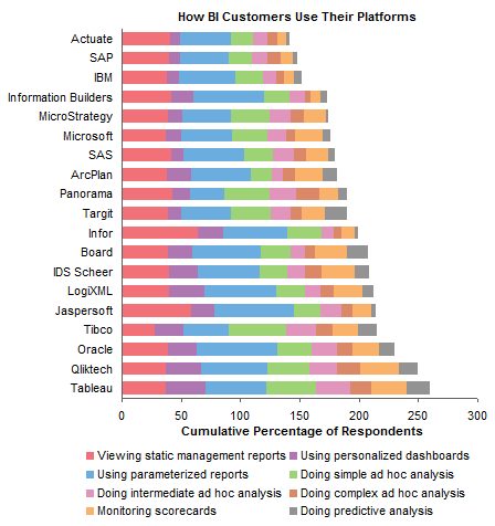
Repositioning legend on original stacked bar chart
I was not fond of the legend. I like to put legends below the chart where they’re out of the way, but the order of the legend entries is by row, and it’s confusing to go back and forth from the chart to the legend, because your eye automatically goes first to the wrong column of legend entries. To fix this, you need a legend with one row or one column of entries. I chose the one-column approach, and stuck the legend to the right of the chart.
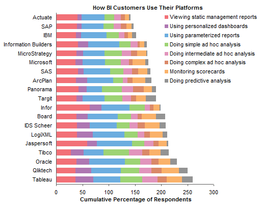
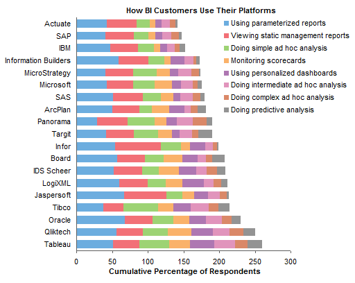
Sorting series in stacked bar chart
I noticed that the vendors were sorted from lowest to highest cumulative percentage, but the series were not sorted in a way that I could fathom. I decided it made sense to stack series from largest to smallest starting at the bottom (okay, on the left).
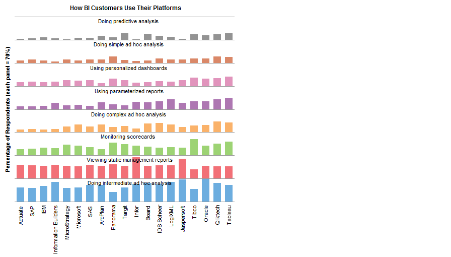
Converting stacked bar chart to panel bar chart
Incremental improvements so far. Let’s convert this stacked bar chart into a panel bar chart so each series has its own common baseline. That’s better, though we’re still stuck using a legend.
Panel bar chart with series labels
We can easily add labels to each panel. To make the labels fit, they were rotated 90°. This isn’t ideal, but it might be better than forcing the labels off the chart into the legend. The labels obscure the ends of the longest bars, but to make room for the labels would require either stretching the chart sideways or making each panel account for a larger percentage (e.g. 100% instead of 70%), reducing resolution. You can click n the chart to see a larger version which makes room for the labels.
Panel column chart with series labels
To make the series labels easier to read, I converted the last chart into a panel column chart. Now the vendor names are rotated 90°. You can’t win, but I guess you can try both and decide which is least problematic. As above, the labels overlay the tops of the longer bars. Click on the chart to see a larger version which has more room for the labels.
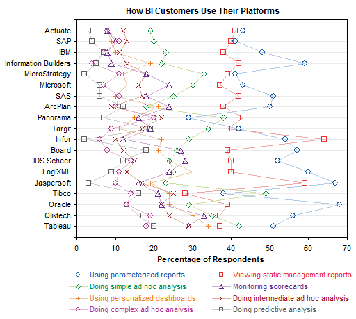
Dot plot
An alternative to the bar or column panel charts is a dot plot. The advantage is that all points are plotted in the same XY space, allowing for easier comparisons. The disadvantage is that all points are plotted in the same XY space, leading to clutter, especially in the lower percentage region of this chart.
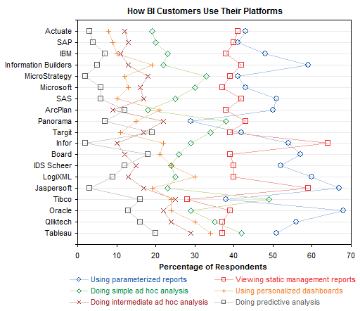
Dot plot with fewer series
I decided to perform triage on the data. The largest item is “Doing intermediate ad hoc analysis”. Two smaller ones are “Doing complex ad hoc analysis” and “Doing simple ad hoc analysis”. The way to address this is to convert these three into “Doing ad hoc analysis”, but without the full set of survey responses, I can’t just add these three together, because I don’t know which respondents answered to more than one of these options. For simplicity and for the sake of illustration, I kept “intermediate” and deleted the other two. This has reduced the clutter in the dot plot, but it’s still too busy. I’ve found that without sufficient separation between series in a dot plot, you should keep to three series or fewer.
Single vendor bar chart
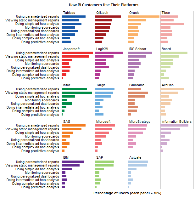
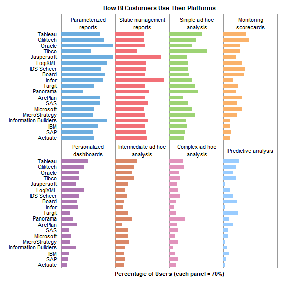
I thought it might be nice to compare the different tasks for each vendor. The relative percentages may lead to insights regarding the capabilities of each software package, the sophistication of each vendor’s target audience, and the emphasis of each vendor’s advertising campaigns.
For example, a package with extensive interaction would likely have more ad hoc analysis. A package with less sophisticated users may not see much predictive analysis or parameterized reports. A package marketed as a scorecard tool would likely have greater scorecard-related usage.
Here is such a chart, a simple bar chart, for a single vendor. We just need a total of 19 of these for this analysis.
Panel vendor bar chart
Rather than 19 individual bar charts, I rearranged my data and came up with panel chart consisting of a matrix of bar charts. I’ve done this with one panel for each vendor and tasks as categories, and also one panel for each task and vendors as categories.
These might be my favorite graphs in this whole article.
Summary
There are many ways to display a data set, even one as simple as this set of survey results. All of the charts I made in this study were done in Excel, but the rationale for the steps I’ve taken should be platform-independent. If the platform influences the course of the analysis, there may be shortcomings in its ability to do certain necessary tasks.
Excel isn’t the most flexible or powerful graphics package, but it’s the most widespread. It seems that my role has become one of helping people use Excel to perform unexpectedly complete visual analyses. With the advent of Tableau Public, I may find this role in less demand.
To make my analysis more flexible, I put the data into a simple list, and based a number of pivot tables on this list. This allowed simple interactive features, like sorting and filtering. I also made only regular charts, not pivot charts, because they offer much greater flexibility, and allow the use of many helper series (i.e., dummy series or invisible series) to produce flexible labeling, gridlines, and other effects.
Presumably Tableau and other worthwhile packages make my Excel gyrations easier for the layman to accomplish. Perhaps one telling test of these packages would be to give regular users of each a data set such as this one, and see how easily they could come up with a series of charts like these.