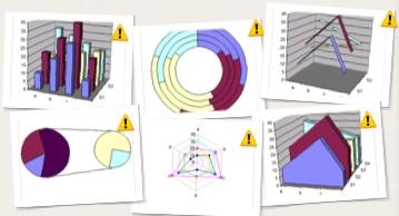
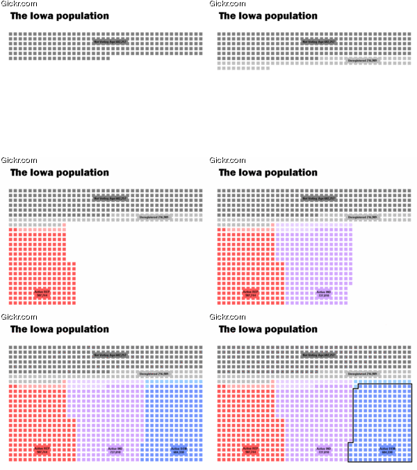
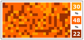
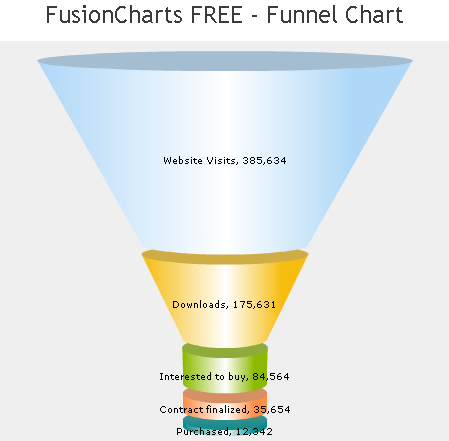
Chandoo offers a discussion of 6 charts you will see in hell.
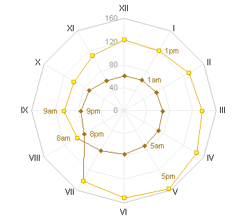
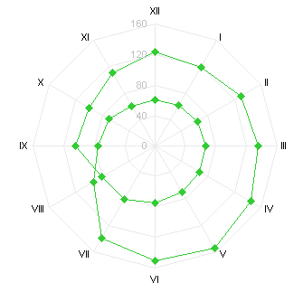
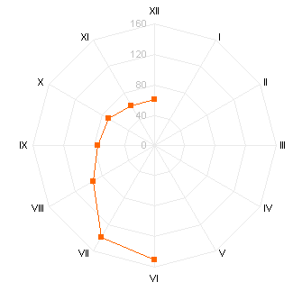
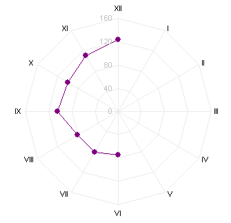
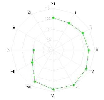
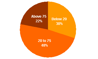
He reintroduces us to some old favorites: the pie chart (actually the pie-of-pie chart, representing multiple pie charts), the donut chart (also representing, in a way, multiple pie charts), the radar chart, the 3D column chart, and more.
The ribbon chart (aka 3D line chart) has actually been “improved upon” in Excel 2007, as shown in PC Magazine’s review of Office 2007 Beta 2 and also described by Kaiser in Microsoft and Innovation:

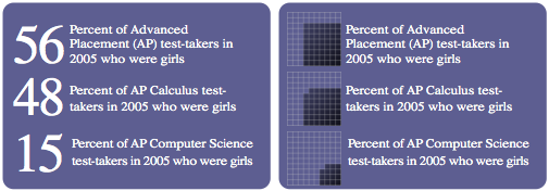
I was amused to see this Gooooogle Ad at the bottom of Chandoo’s post:

