An Enormous Infographic
In Anyone But Romney: The GOP race so far, the National Post shares an enormous infographic with us (click for full size image).
The bulk of the graphic is taken up with what remind me of snake skins laying out to dry. Apparently the widths indicate the relative popularity of each candidate along a vertically-oriented time axis.
The unorthodox alignment of the time axis is initially disorienting, but the blobs are big, they must be important. Hmm, are those all months delineated by the horizontal white lines? Apparently so, even though they differ by more than the days in each month would account for. The spacing must be dictated by the occurrence of each successive poll, not by the passage of days.
The snake skins are decorated with parallel arrows, which change direction in mid-January. Is it the dropping out of Perry or of Huntsman that this change indicates? Or nothing; probably that’s just where the fancy fill pattern changes.
Auxiliary Charts
Okay, I’ve feasted my eyes on this lovely rotated timeline blob thing, what is shown in these small charts added as an afterthought to the bottom of our infographic?
The small chart at bottom left shows the popularity of the candidates. Wait. That’s what the big paint drips also showed. The date axis here is horizontal, left to right, but the data is indistinguishable from that in the upper graph. The months have the same irregular spacing.
At first, the small round markers beside each candidate’s name appear to show a significant time point, because Huntsman’s line is labeled at the point he dropped out. But Santorum and Paul and Romney and Gingrich haven’t dropped out, so that’s not the purpose of the circles. On further inspection, they just seem to say, “This label goes with that line”. Some lines are labeled once, some twice, and . . . QUICK! Without referring to the large chart above, which candidate goes with the yellow line?
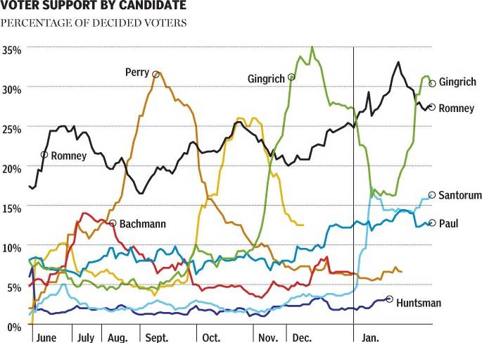
Poor Herman Cain, couldn’t buy any respect.
I think the only purpose of the line chart is to show what the monster paint blobs showed, but in easy to read fashion (except for the labeling issue). Conversely, the big blobchart seems to be shouting, “Look Maw, I made a info graffick!”
The remaining chart shows basically that Mitt Romney has raised a lot of money, much more than his competition, and he’s also spent more than they have.
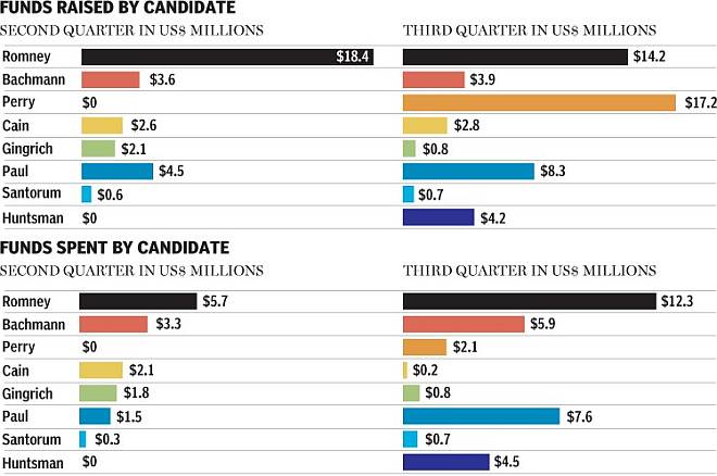
Overall, this monstrous graphic would have been more informative with just the bottom two charts, without the distraction of the rattlesnake hides that occupy 85% of the original. Of course, if the intent was to get people to look at your page, the snake hides may have succeeded.
Apparently the National Post is waiting for anybody, even Newt Gingrich, to overtake Mitt Romney’s lead in the polls. But this article, even the updated edition, predates Gingrich’s poor showing in the Florida primary. The question that remains is, Can money buy election happiness?


