I recently showed several ways to display Multiple Series in One Excel Chart. The current article describes a special case of this, in which the X values are dates. Displaying multiple time series in an Excel chart is not difficult if all the series use the same dates, but it becomes a problem if the dates are different, for example, if the series show monthly and weekly values over the same span of time.
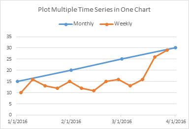
This discussion mostly concerns Excel Line Charts with Date Axis formatting. Date Axis formatting is available for the X axis (the independent variable axis) in Excel’s Line, Area, Column, and Bar charts; for all of these charts except the Bar chart, the X axis is the horizontal axis, but in Bar charts the X axis is the vertical axis. Any of the formatting described here applies to all of these chart types.
XY Scatter charts are different: X axes behave like Y axes. I could write a book just on this subject.
Displaying Multiple Time Series in An Excel Chart
The usual problem here is that data comes from different places. While the data may span a similar range of dates, the different data sets may have varying intervals between recorded values. Perhaps you have daily temperature readings you want to plot against historic monthly temperatures.
I’ve generated the following arbitrary monthly and weekly data for this exercise.
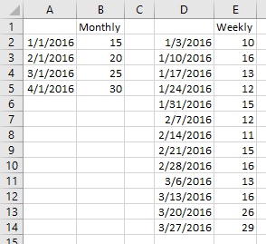
When plotted in separate Excel line charts, this is how it looks.

Displaying Multiple Time Series in A Line Chart
Line Chart 1 – Plot by Month
Start by selecting the monthly data set, and inserting a line chart. Excel has detected the dates and applied a Date Scale, with a spacing of 1 month and base units of 1 month (below left). Select and copy the weekly data set, select the chart, and use Paste Special to add the data to the chart (below right).

To get to Paste Special, on the Home tab, click on the Paste dropdown, select Paste Special, and make sure you’ve selected the settings below:

Excel’s line charts use the same data for all series in the chart, or more precisely, for all series on a particular axis. So let’s assign the weekly data to the secondary axis (below left). Excel only gives us the secondary vertical axis, and we really needed the secondary horizontal axis. Using the “+” skittle floating beside the chart (Excel 2013 and later) or the Axis controls on the ribbon, add the secondary horizontal axis (below right).

Finally format the secondary date axis with the same settings as the primary date axis: Minimum: 1/1/2016, Maximum: 4/1/2016, Major Units: 1 Month, Base Units: Months.
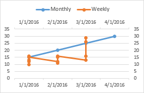
And that looks horrible. With Base Unit of Months, Excel plots everything in a month at one horizontal position, so all weekly values in January are plotted with the monthly value for January 1. So let’s look at these base units.
Date Axis Base Units
Among the options for formatting a Date Axis are the units. These include Major Units (major tick mark spacing), Minor Units (minor tick mark spacing), and Base Unit. Base units are the categories that Excel uses to handle the dates in the data. If base unit is Days, then there will be a slot on the axis for each date within the span of the axis; if base unit is Months, then there is one slot per month along the axis; if base unit is Years, well, you get the picture.

I’ve used a darker line for the axes in the two charts below, I’ve formatted the major ticks to cross the axis and the minor ticks to lie outside the axis, and I’ve added faint droplines to the points, all to illustrate this concept.
The chart below left uses Months for its base unit. There is one slot for each month, the slot’s label is centered within the slot, and the slot’s data point is also centered. If there is no data point for a given slot, the line connecting points would have extended across the unpopulated slot. If there are multiple data points for a given slot, such as the four weekly points in each month in our first attempt above, these points will all be aligned with the center of the slot.
The chart below right uses Days for its base unit. Labels appear every month, so they are centered on the slots for the first point of each month. Data points also appear on the first of each month, and the slots for all the other days of the month lie empty, with the series line connecting points across the empty slots.

The points in the first chart are equally spaced horizontally, since the slots for each month are the same width. The points in the second chart are not equally spaced, since the slots for each day are equally spaced (given rounding errors across pixels) and the months have different numbers of slots (days).
You could count minor tick marks to verify this, but I’ve made the following illustration with two copies of this chart. They are identical: I’ve lightened the horizontal gridlines but added vertical gridlines, hidden the plotted data and chart titles, and colored one red and the other blue. I’ve offset the blue chart laterally so its 1/1/2016 gridline is aligned with the red chart’s 2/1/2016 gridline. Note that the next red gridline comes before the next blue gridline: that’s obvious once we note that February’s 29 days make up a shorter month than March’s 31 days. However, the red (4/1/2106) and blue (3/1/2016) gridlines after that line up, since February + March have 29 + 31 = 60 days on the red chart, and January + February have 31 + 29 = 60 days on the blue chart.
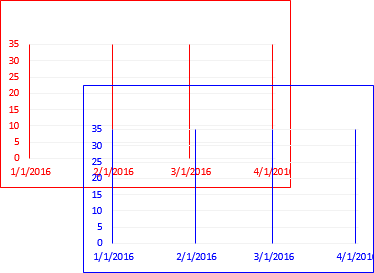
What’s really useful is that a 1-month spacing of labels on the line chart lets you put labels on the first of each month, even with months of unequal length.
Line Chart 2 – Plot by Day
Let’s start again by plotting the monthly data in a line chart. But let’s set our base unit to Days (below left). As before, copy the weekly data, and use Paste Special to add it as a new series to the char. Only the first four weekly points show up, aligned with the monthly point, because the monthly series only has four points (below right).

To allow display of all points in the weekly series, format it so it appears on the secondary axis. Excel at first only draws the secondary vertical axis (below left). Use the “+” icon floating beside the chart (Excel 2013 and later) or the Axis controls on the ribbon toadd the secondary horizontal axis (below right).

Rescale the secondary horizontal axis so it matches the primary: make sure the minimum and maximum units are the same (below left). Finally, you can do a little clean-up. Delete the secondary vertical axis, and all data will be plotted on the primary scale (which was the same anyway). Hide the secondary horizontal axis by formatting it to use no line and no labels (below right).

This is pretty good, but it’s a bit complicated, and if we have a third data set with different dates, we have no more axes to plot it on.
Displaying Multiple Time Series in An XY Scatter Chart
XY Scatter charts have X axes which are much more flexible, so let’s try one with our data.
Select the monthly data, and insert an XY Scatter chart.
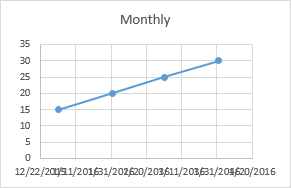
That X axis is cluttered, and what’s up with those axis limits? 12/22/2015 to 4/20/2016? Those aren’t nice round numbers.
Let’s take another look at the data. I’ve duplicated the data in columns A to E in columns G to K, but I’ve formatted the dates as General numbers in columns G and J. Those nice dates that go from 1/1/2016 to 4/1/2016 are actually values that go from 42370 to 42461.
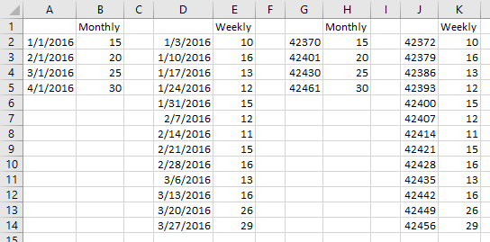
If we reformat our chart’s axis to show General numbers, the scale of 42360 to 42480 looks reasonable (see below). So an XY Scatter chart isn’t as smart as a line chart when picking dates. No matter, will fix it in post.

So let’s revert to dates on the axis.
Copy the weekly data, and use the by now ultrafamiliar Paste Special to add it to the chart (below left). Reformat the horizontal axis so it scales from 1/1 to 4/1/2016, and pick a reasonable major unit (below right).

But look at the tick labels. The reasonable major unit of 30 days gives me funny dates: 1/1, 1/31, 3/1, and 3/31. If I used 31 days instead, I’d get 1/1, 2/1, 3/3, and 4/3. Again, an XY Scatter chart isn’t so smart with dates, despite its flexibility in other ways.
Well, we can hide the axis labels and add a dummy series with data labels that provide the dates we want to see. Here is the data for our dummy series, with X values for the first of each month and Y values of zero so it rests on the bottom of the chart.
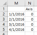
Hide the axis labels by using a custom number format of ” ” (a space surrounded by quotes). If we just set the axis to show no labels, the margin below the axis would have collapsed, but using this dummy number format uses a space character for each label, preserving the space for our replacement labels (below left).
Use Copy – Paste Special to add the new axis data to the chart as a new series (below right).

Add data labels below this new series (below left), and format the labels to show X Value, not Y Value (below right).

Format the Axis series so it uses no line and a gray cross marker (below left). Finally do some clean-up. Delete the Axis legend entry (click once to select the legend, again to select the Axis entry, then click Delete). Make the plot area a bit narrower so the date labels are centered under the markers. I deleted the vertical gridlines, because they did not line up with the axis markers (below right).

You could simulate vertical gridlines by adding plus error bars to the Axis series, but we’ve already spent way too much time on this stupid chart.
When To Use XY Charts for Timeline Data
If you don’t need monthly increments along the X axis, then is makes sense to use an XY Scatter chart for your time series.

A more important case for using an XY Scatter chart for a timeline is when the spacing of points is on the order of hours or less, rather than days. The data below shows four unevenly-spaced points per day over a two day span. The Line chart with a base unit of Days plots all of the points for each day at one horizontal position, while the XY Scatter chart plots the points horizontally according to the time of day.
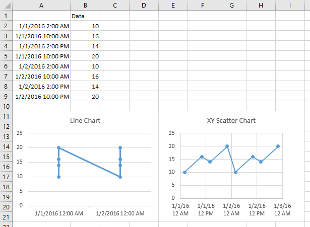
This was the same problem our first line chart attempt ran into while trying to plot multiple days within a month, when the base unit was Months.

Displaying Multiple Time Series in A Line-XY Combo Chart
Now for a short trip down Memory Lane.
In Excel 2003 and earlier, you could plot an XY series along a Line chart axis, and it worked really well. The line chart axis gave you the nice axis, and the XY data provided multiple time series without any gyrations.
So the process was, make a line chart from the monthly data (below left). Copy the weekly data and use Paste Special to add it to the chart. Only four points were visible, but be patient (below right).

Change the weekly series to XY Scatter type (below left). Finally, assign the weekly XY series to the primary axis (below right).

This was really nice, because you could get your nice axis even using a dummy/hidden line chart series. Then you could add as many time series as you wanted, with whatever arbitrary and different date values they contained, all using just the primary axis, so you didn’t have to change the scale on one to keep up with another, etc.
This behavior has been broken since 2007, and I suspect it’s gone for good. In fact, this is one reason I was so slow to adopt Excel 2007.
Try the same process in Excel 2007 or later (this is Excel 2016). Chart the monthly data (below left) and add the weekly data (below right).

Convert the weekly data to an XY type (below left), then move it to the primary axis (below right).

Everything was cool until the real maintenance saving step of using the primary axis for everything. But on the primary axis you can only plot as many XY points as there are points in the original line chart series. I guess you could plot a whole blank column as your line chart, and now that I’ve thought of it, maybe that’s what I’ll start doing.
Displaying Multiple Time Series in A Line Chart – A Better Way
In fact, there is a pretty reasonable and not too convoluted way to get multiple timelines with different date sequences on the same chart. It requires laying out your data differently, and tweaking the chart in the most minor but slightly obscure way.
Start with your monthly data in A1:B5. Add the weekly dates below the monthly dates (A6:A18). Add the weekly values below the monthly values, and one column to the right (C6:C18), with the weekly header in C1. (You can repeat this using more rows and columns for many more series as well.)
Select the data and insert your line chart.
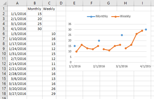
Looks pretty good, except for the gaps. Why are there gaps, anyway? Excel puts a gap between points that have blank cells, but my data had no such gaps.
Well, in a line chart with a date axis, Excel sorts the data behind the scenes before plotting it. So if I sort my data, I can see the gaps in the worksheet range that correspond to gaps in the chart.
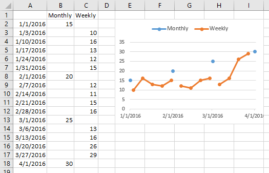
This is easy to fix. Select the chart, choose Select Data from the ribbon (or right click the chart and choose Select Data), and click the Hidden and Empty Cells button at the bottom left of the Select Data Source dialog. In the mini dialog that pops up, select the Connect Data Points With Line option for Show Empty Cells. The result is the nice multiple time series chart below right, without any gaps, all on one set of axes, with almost no messing around.


 My colleague and fellow Excel MVP Mike Alexander of

