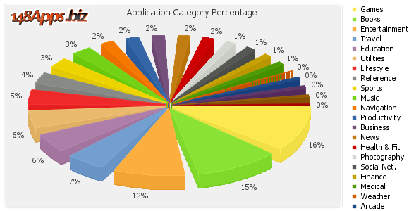
148Apps recently treated us to a fancy pie chart in Apple iTunes App Store Metrics, Statistics and Numbers for iPhone Apps which demonstrated how easy it is, if you’re not satisfies with how much a 3D pie chart can distort data, to add extra distortion. If ever there was a job for Chart Busters, this is it. I originally learned about this exciting chart from Alex Kerin, in Pareto lines on bar charts – an Excel fudge.
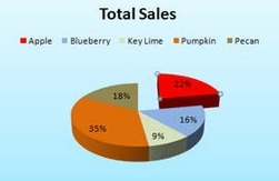
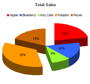
In all of its glory, here is the original 3D not-quite-exploded pie chart.
What’s Wrong?
What’s wrong with this chart? Well, it’s a pie, and we’ve covered this ineffective visualization method before. It’s rendered in 3D, which through the magic of simulated parallax distorts the apparent sizes of the data points (i.e., the wedges). Also the legend is truncated: the last three items are left off the bottom. They’re each only 0% of the total, but you can see paper-thin wedges struggling to remain upright in the pie.
In a few moments I’ll describe the larger visualization sin. But first I’ll try to duplicate this same chart.
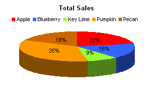
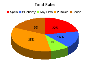
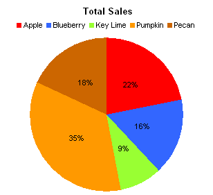
I pasted the data into Excel, made a 3D pie, and adjusted the colors and orientation until I had gotten pretty close to the original.
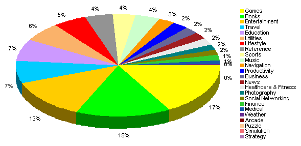
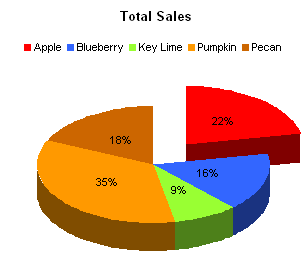
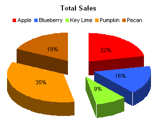
I’ve managed to include all of the legend entries. But my chart doesn’t resemble the original very closely, does it? What if we explode the pie?
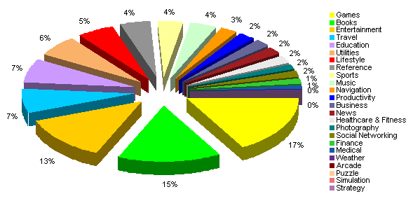
It still doesn’t resemble the original. When I exploded the pie, the wedges moved outwards by the same amount. The edges that were at first touching are still parallel, and the angles at the vertices of the wedges are unchanged.
The original pie, on the other hand, has its wedges still touching in the center. The gaps themselves are wedge-shaped, which decreases the angles of all of the pie’s wedges and distorts our decoding of the underlying values. I guess this is what happens when there is too much art, too much aesthetics, involved in the graphing of data.
Reconstructing the Extra Distortion
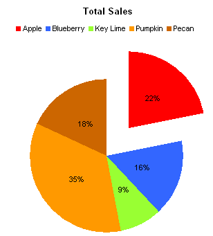
Let’s start with plain vanilla pie charts of the data, in both 2D and 3D. I’ve omitted the legend and labels for clarity.
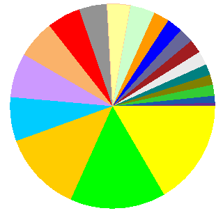
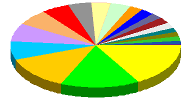
If we do a straightforward explosion, the shapes of the wedges are unchanged. The gaps are not uniform in width, but are larger between wedges with larger values. There is also some kind of optical illusion going on in the center of at least the 2D chart.
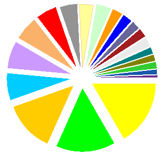
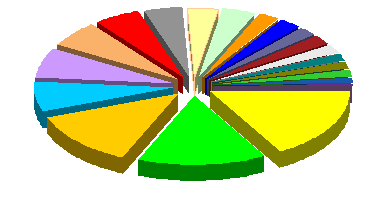
We can recreate the appearance of the original chart by inserting an invisible wedge with value 2500 (I fiddled to get this to look about right) between every pair of adjacent wedges in the first chart, without exploding the chart.
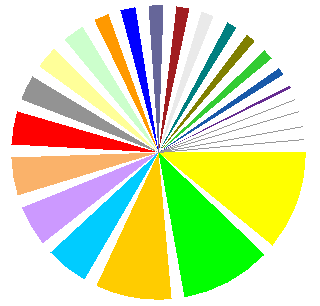
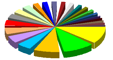
All the gaps are the same width, and some of the real wedges are smaller than the gaps. This proves the maxim, “Less is More”. The 3D pie closely matches the appearance of the original 148Apps chart.
you can take this approach to extremes. With ultra-wide wedges, there isn’t too much differentiation between the data values.
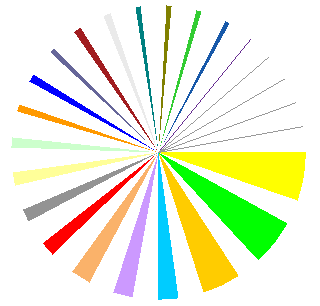
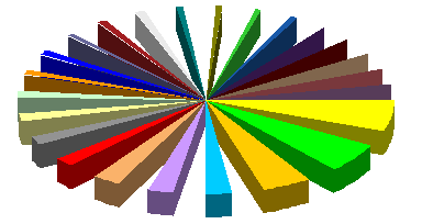
We can take this one step further, by moving all of the gaps to the “end” of the pie.


This clearly illustrates the distortion of the fancy wedge-gapped 3D pie chart. The amount of these pies that are made up of nothing is 31%, leaving only 69% for displaying data. The largest wedge, which comprises 17% of the data, fills only 11% of the circle.
We humans are bad enough at judging areas and angles, so when the angles are distorted in this way, we’re hopeless.


