3D Bar Chart
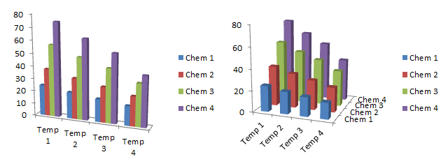
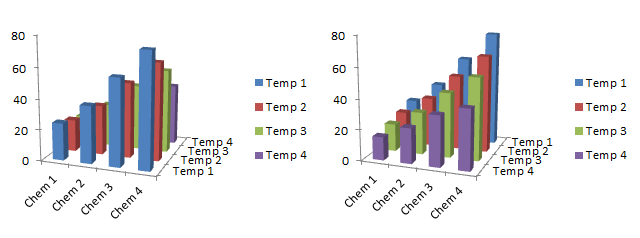
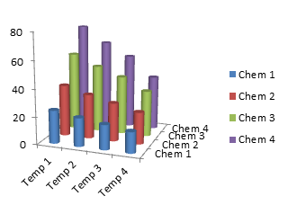
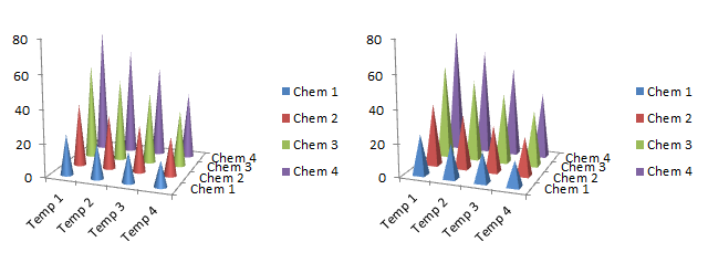
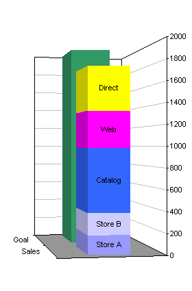
A reader asked if I had an add-in to create this kind of chart. He canceled his request a short time later when he realized that Excel can actually make these charts.
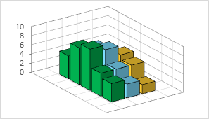
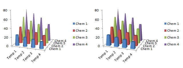
It’s a 3D column chart, and the reader pasted it from another graphing package. This is my reconstruction of the chart in Excel, which is somewhat cleaner than the original. It clearly illustrates how 3D column charts make reading the data difficult to impossible. This chart is in some ways even worse than a regular Excel chart, because of the wider margins between the plotted columns and the back walls with the gridlines. I had to include extra rows and columns in the source data to simulate the wide gaps in the original chart.
First, the columns in front block our view of those in back. The first two yellow columns are completely hidden, as is the first blue column. If you look very closely, you can just make out the top corner of the second blue column.
Second, it’s hard to judge the values of the bars that are not hidden. For example, the tallest yellow bar has a value of 6, yet it seems to be shorter than the gridline for 4. The second green column has a value of 8, yet it barely reaches to the gridline for 4. The first green column has a value of 5, but only reaches to about 3 on the gridline scale. These discrepancies were less pronounced in the regular Excel 3D chart, because the back walls were closer to the plotted data, but it was still necessary to extrapolate to estimate the values.
I have not developed, nor do I plan to develop, any add-in that makes 3D charts.
Alternative Charts
Here is the data from the original 3D chart, based on my best extrapolation from the 3D columns to the gridlines, and made-up data for the columns I couldn’t see at all.

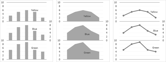
The clustered column chart is the simplest way to show the data. If you haven’t changed Excel’s defaults, this is the chart type that Excel would automatically use. If you don’t have too many series, this shows the data clearly. No extrapolation is needed to a distant set of gridlines; at most you have to interpolate between gridlines. If there are lots of series, it becomes difficult to interpret individual series.

You could also use a line chart. If you have more series, this might be more effective, because markers at small values stand out. In a bar chart, shorter bars may be overshadowed by taller ones.
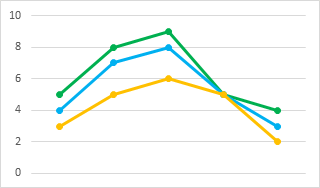
Of course, some purists warn that line charts are evil for categorical axes, because the connecting lines may lead to inadvertent interpolation of values and trends between plotted points. Blah blah blah. If the categories are sorted into some kind of logical order (e.g., by date, by increasing or decreasing values, or by categories that fall into a natural sequence), and if markers are used to signify individual data points, this argument becomes pedantic.
A third option is a panel chart, which separates each series into its own portion of the plot area of the chart. There is no longer any concern about too many series as there would be in a column chart, nor about interpolation between actual data points as in a line chart. On the other hand, it’s not immediately obvious that the fourth bar of each series share the exact same value.
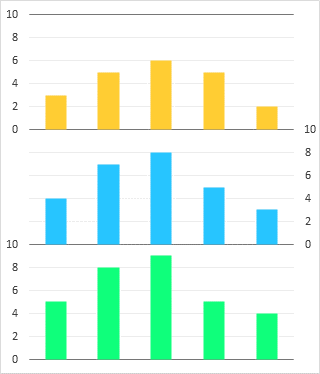
Excel doesn’t have built-in panel charts like this, but they are not hard to make if you follow a simple protocol.
Building the Panel (Separated Stacked) Chart
Add Spacer Data
The panel chart shown above is basically a stacked column chart, with invisible columns between visible data. The built-in vertical axis labels are hidden, and dummy XY series provide the desired labels. The invisible columns make sure each set of columns is positioned in its own panel. Since each of our panels is 10 units high, the data plus the spacer must sum to 10, so our blank data is simply the difference between 10 and the preceding value. You need a blank series for each series of columns except the last.
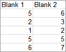
Starting from the clustered column chart shown above as the first alternative to a 3D chart, copy the data, select the chart, and use Paste Special to add the blank data to the chart.

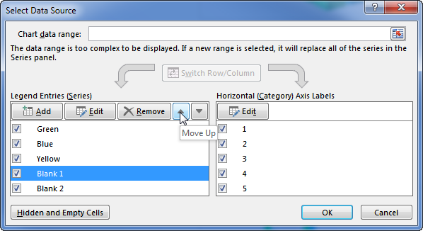
The new data is added after the existing data. Reorder the data, by rearranging the items in the list of series in the Select Data Source dialog…
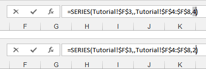
…or by changing the last argument in the SERIES formula in the formula bar.
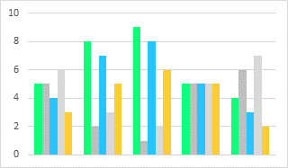
Now the “real” data is interspersed with the blank columns.
Change the chart type to Stacked Column. This could also have been done in the first step, by choosing Stacked Column in the Insert Chart dialog.

Starting from scratch (often a better approach), intersperse the “real” data with the blank data in the worksheet (below), and create the same stacked column chart.

That chart is a bit squat, so stretch it vertically.

Format Real and Dummy Axes
Change the scale of the vertical axis: make the minimum zero, the maximum 30, and the major unit 10, and make sure all of these are not automatic settings, so resizing the chart doesn’t mess everything up. Hide the vertical axis labels.
Format the horizontal axis so it uses no line.
Use a darker gray for the major horizontal gridlines, and insert light gray minor horizontal gridlines.

Now we need some data for our dummy axes. The explanation below shows how we derived the values in the table below.
In a column chart, the categories are at X values equivalent to 1, 2, 3, etc. Each category uses the space from 1/2 category to the left to 1/2 category to the right of its equivalent X value, so the axis minimum is 1 minus 1/2 or 0.5, and the axis maximum is 5 plus 1/2, or 5.5. The X values of the dummy series will be 0.5 for the left-hand axis and 5.5 for the right-hand axis.
Axis 1 (the first dummy axis) has labels to the left of the bottom panel showing 0, 2, 4, 6, 8, and 10 at the actual Y values of 0, 2, 4, 6, 8, and 10. Axis 2 has the same labels to the right of the second panel but at actual Y values of 10, 12, 14, 16, 18, and 20. Axis 3 has these labels to the left of the top panel at actual Y values of 20, 22, 24, 26, 28, and 30. These actual Y values are used to plot the dummy points that will show the desired labels.

Copy the Axis 1 data, select the chart, and from the Home tab, choose Paste Special from the Paste button dropdown (left). Use the Paste Special options shown at right.
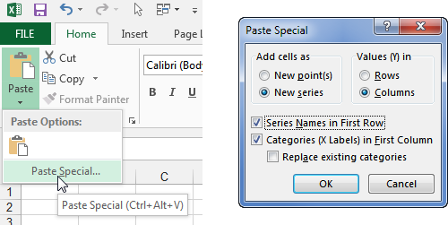
The series is pasted as another column, stacked upon the rest.

Right click on this new series, choose Change Series Chart Type, and select the XY Scatter type. Excel adds secondary X and Y axes for this new series.
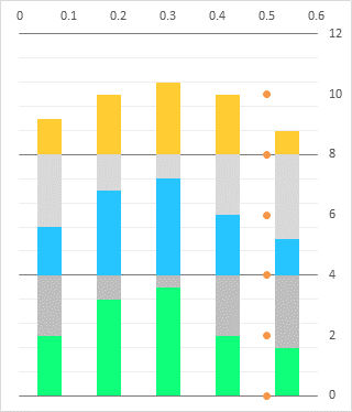
Format the XY series so it’s plotted on the primary axis. In Excel 2013 you can do this right from the Change Series Chart Type dialog.
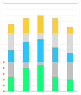
Copy the Axis 2 data, and use Paste Special to add it to the chart (left). New series are added using the same chart type and axis group as the most recent added series was changed to, which saves a lot of time. Repeat the Copy-Paste Special sequence with the Axis 3 data (right)

Select Axis 1 and add data labels. Use the Plus icon in Excel 2013, or use Chart Tools > Layout tab > Data Labels in Excel 2007-2010. Use the Left position and the Show Y Values display option. Don’t worry that the labels are smooshed on top of the data points; we’ll fix that shortly.
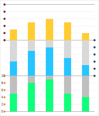
Select Axis 2 and add data labels (left). In Excel 2013, use the Plus icon to add the labels, then choose the Value From Cells option, and select the range containing the Axis 1 Y values (0 through 10). In Excel 2007-2010, add any old labels since there is no Value From Cells option, then manually edit the individual labels to display 0 through 10. Or you could use Rob Bovey’s (free) Chart Labeler add-in to assign data labels from worksheet cells. The labels for Axis 2 must be positioned to the right of the data points.
Select Axis 3 and add data labels (right) using the same steps as for the Axis 2 labels, except that the Axis 3 labels must be positioned to the left of the data points.
Clean Up
Now we just need to tidy up a bit. First, decrease the width of the Plot Area so there is more room for the data labels that label the vertical axes.
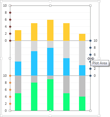
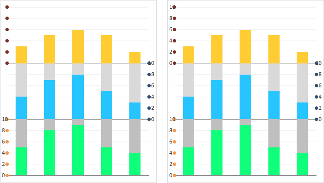
Format Axis 1, Axis 2, and Axis 3 so they show no markers (left).
Format Blank 1 and Blank 2 so they use no fill color (right).

Lighter colored bars seem to hide the major horizontal gridlines that serve as horizontal axes for the panels. If you give the columns a border of any color and a transparency of 100%, the gridlines are somewhat more visible.
If this isn’t good enough, you could muck around with horizontal error bars, or make the colored bars slightly shorter and the transparent spacing bars slightly taller, so the bottoms of the colored bars are slightly higher than the gridlines.

You aren’t limited to separated stacked columns. You could make the original stacked chart using either stacked area (left) or stacked line (right) chart type.
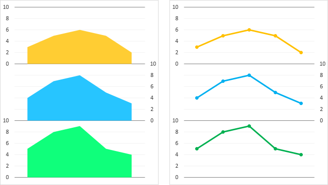
You don’t need to format the plotted series with different colors, because they are located in separate panels. You can avoid the pitfalls of color and simply use the same gray for all plotted data, and use text labels for identification.
