Edouard Buning is a Dutch marketing and communications consultant who has recently started up a Dutch blog in the spirit of Chart Busters. Edouard has provided this article for my Peltier Tech Blog readers.
Recovery by Sector of S&P 500 Companies by Edouard Buning
In Bloomberg Business Week of March 8, 2010 a graph on page 17 representing a breakdown by sector of net income in 2008 and 2009 of S&P 500 companies drew my attention. At first the paired waterfall chart seemed organized, but on second thought I realized that it was in fact confusing and could tell us some more than the conclusions drawn by Business Week.
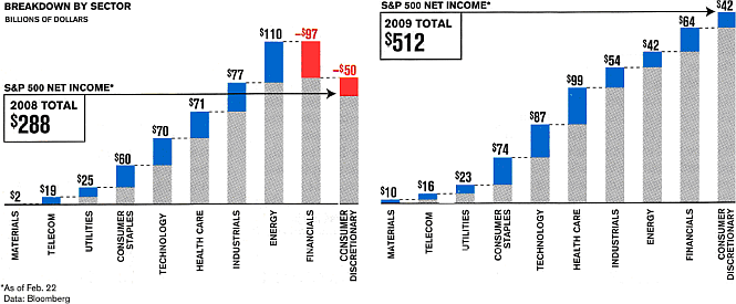
Business Week’s conclusion that financials and consumer discretionary rebounded in 2009 after the severe losses in 2008 is difficult to see in the graph although the red bars in 2008 are clearly the first thing that you see, followed by the increase in total net income from $288B in 2008 to $512B in 2009.
The data by sector and by year:
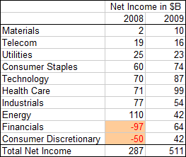
A short look at these data shows us that there are more interesting conclusions that can be drawn, but first we’ll take a look at the chart to see how we can improve it.
The problem with the published chart is that, in trying to show the addition of a sector to the net income, they placed the addition on top of the net income of the preceding sectors. As long as the addition is positive there is no interpretation problem, but in the case of the sectors financials and consumer discretionary the addition is negative. Although the addition is shown in red, it looks weird. How lucky we are they did not use a pie chart!
A vertical bar chart is already an improvement:
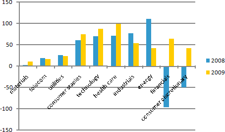
To improve the readability of the sector names, let’s flip the graph and reverse the order of the Y-axis:
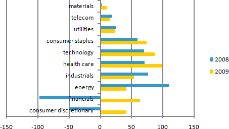
With a little more formatting, such as adding a title and major gridlines, this panel chart is the result:
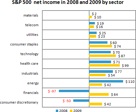
Now for the interesting conclusions:
- It is clear that financials and consumer discretionary rebounded from a combined loss in 2008 of $147 to a combined profit of $106 in 2009.
- But on the other hand, industrials (- $23) and energy (-$68) realized a lower net income in 2009. This is in line with the conclusion at the top of the article on page17, “But some, including Exxon Mobile, actually posted lower fourth-quarter profits than a year earlier.” In another graph (not shown in this post) we see that fourth-quarter earnings per share for Exxon Mobile dropped from $1.58 to $1.33 and for Chevron dropped from $2.58 to $ 1.58 from 2008 Q4 to 2009 Q4.
- Telecom and utilities realized almost the same net income in both years.
- The other sectors materials, consumer staples, technology, and health care increased their net income in 2009.
About the Author
 Edouard Buning is the founder of BuningAdvies, a consulting company in the Netherlands that focuses on how to use market research results in marketing and communication actions. After a 20+ year career in market research and presenting the results of market research studies to his clients he realized that on the one hand client companies were always eager to know all ins and outs of the study, but on the other hand it often happened that the same client company did not use the recommendations nor took any actions based on the study. In many instances this was due to a lack of time, capacity, knowledge, or priority for the follow-up. BuningAdvies offers this follow-up service.
Edouard has recently started a blog on the story behind a chart, Grafiekadvies. This is the first blog in the Netherlands about charting.


Rickard says
I dont agree with you in the above.
The target with Busniess Week’s graph was to show us the impact of the financials and the consumer as part of the total market. Nothing else. And this is much easier to se in ther graph.
Just my 5 cents..
Naomi B. Robbins says
I’ll limit my comments to the final figure and leave comparisons with the original to others.
The labels would be easier to connect to the data if they were moved to the right side of the graph since most of the entries are positive.
The $ in every data label clutters the figure and makes the actual numbers more difficult to read. Also, no where are we told that these represent billions of dollars.
I’m curious to know if other readers think that the panels add anything or if this should just be a grouped bar chart.
Jon Peltier says
It was Edouard’s post, so I didn’t fiddle with his formatting. Naomi raises some good points, though, so I went into my laboratory and came up with this adjusted clustered bar chart:
Colin Banfield says
“I’m curious to know if other readers think that the panels add anything or if this should just be a grouped bar chart.”
Yes, the thick gridlines and plot area border adds considerable distraction, and compete for attention with the bars. It’s like looking at a photo shot through a fence.
The chart does solve the important problem of hard to read vertical text, so it’s a positive improvement in that respect. But the clutter….Naturally, we each have our personal view on this stuff, but the user must be able to read the chart without being unnecessarily distracted. To satisfy this goal, I’d:
1) Remove the plot area border completely.
2) Remove the gridlines, or use a very light grey color. Each category is separated by enough white space to make the gridlines unnecessary.
3) Remove the data labels and use an axis. Data labels are OK when they don’t crowd the chart and distract from quickly and easily comparing the bars, which is the point of using a chart in the first place. I often use data label on bar charts when there aren’t many bars and when the bars aren’t clustered. In this chart, all those labels look like a table of unaligned numbers. If the precise numbers are that important, supplement the chart with a table.
4) As Naomi suggests, remove the dollar sign from the numbers. There are global ways of indicating the chart currency without showing it on every number. If we use an axis, we can add a text box on one side that reads “$ billion.”
5) This has nothing to do with clutter, but the legend is best placed on the right of the bar chart, because we’re reading the bars from left to right. It’s less work for the eyes.
Otherwise, I think that the chart is fine :)
Naomi B. Robbins says
Here’s another alternative:
Colin Banfield says
Jon, I posted before I saw your improvements. Really nice job, especially the work you’ve done with the labels. In my comment, I forgot to mention that the color scheme should be changed to different shades of the same color, like you’ve shown.
Colin Banfield says
Naomi, it was inevitable that you’d show us a dot plot alternative ;) I’d add a duplicate value axis at the top because the one at the bottom is a long way down to read for the upper categories.
Naomi B. Robbins says
Colin,
Note that there are tick marks on the top now. One of these days I’ll add labels but I’ve procrastinated enough for today.
I always prefer an axis to data labels since I’ve seen too many charts without an axis that were not drawn to scale.
Paresh Shah says
I like the clustered bar chart for this particular dataset. The data points are limited, so the bar charts are clear and can be read easily.
For both the charts, I would like to include the total Net Income figure also ; $287 B 2008 and $511 B. The data is not readily evident from the chart. But how do we incorporate this ? as text comments within the chart?
DaleW says
While Jon’s clustered bar chart wins my vote as the best design so far for the data provided . . . why is no one concerned that the data provided is insufficient to answer the question posed?
We can’t honestly tell if the sectors in question have recovered, because the data presented doesn’t go back far enough to establish the baseline from which they fell.
Perhaps a trend chart would be a better design to actually show sufficient data to address the question.
Jeff Weir says
Edouard – thanks for sharing a great post
Jon – I don’t think you should have colored your negative bars with pink, because A) that color is not in your legend and B) the fact that they are heading West shows they are negative.
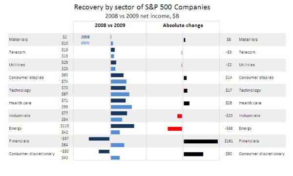
Here’s my interpretation, using in-cell graphs (Thanks Chandoo for the know-how)
Screenshot:
Jon Peltier says
Dale –
I experimented with a timeline, and your comment gave me a reason to post it. Kind of dull with only two time points, but you can see the relative changes in the slopes.
The chart was a little cluttered, so I panelized it (without adding the panel borders). With only two points I think this worls pretty well to show how each sector fared over the two years in our data set.
Jeff Weir says
That panel chart is awesome!
Paresh Shah says
Like the previous discussion on stacked bar charts , this discussion too is turning out to be really insightful one.
Jeff, really like your presentation and the panelized time line by Jon is cool!!
Jon Peltier says
Thanks, Paresh, and to all who have commented.
I’m just writing about things I find interesting. It’s comments by all of you readers that makes this a discussion.
Edouard Buning says
Thank you all for your comments on my guest post. I never thought that the post would produce this many reactions :-).
Adding the $ in every data label was indeed not the best idea as well as forgetting to mention that we are talking of billions of dollars.
I noticed in my professional work that less experienced readers of graphs have difficulties with the interpretation if there are more than 4 – 5 items in the graph. That’s why I added the gridlines. So thanks Colin for the hint to use a light grey color instead of gridlines.
I liked Jeff’s contribution that extended the graph to give us the complete picture and Jon’s final graph with the timelines.
It is interesting to see how the original Business Week graph could be improved in so many different ways.