This brief tutorial shows how to construct a slope chart in Excel, provides a simple VBA procedure to apply and format data labels quickly, and shows a finished chart with some manual repositioning of overlapping labels.
In Format all data labels at once on the Mr Excel forum, a user was frustrated with having to format data labels on his slope chart one point at a time, which is a very tedious and frustrating experience. One solution to such tedious tasks is VBA, and I wrote a procedure that would apply and format all data labels at once. The procedure ran instantly, compared to the many minutes it would take to create and format the labels by hand.
Slope Charts
A slope chart is a nice way to compare two sets of matching data, for example, before and after sales data. The before points are plotted in the left side of a line chart, and the after points are plotted on the right, and you can trace the performance of each item by tracking the sloped lines connecting the points.
Edward Tufte introduced Slope Graphs in The Visual Display of Quantitative Information; examples of slope charts and tutorials showing how to create them in Excel abound on the interwebs.
Creating the Chart
Slope charts are not specifically built into Excel, but line charts are, so slope charts are easy to do. The complication is with data labels.
This is the slope chart data in the Mr Excel post:

Select the data and insert a line chart to create the slope chart.
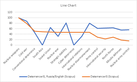
Excel always tries to minimize the number of series and maximize the number of points per series, which is usually the way you want your chart to be plotted. But a slope chart has multiple series and only two points per series, so you need to switch rows and columns:

Usually the chart Excel inserts is larger than I need, but in this case, there is a lot of data and I need lots of room for my labels, so I have made the chart taller and wider.
The chart has a legend, but this legend is nearly useless. The best practice is to apply labels right on the chart. It can be done manually, but Excel first adds default labels above the points showing just the values. We need to select the labels for each series individually to add the series names, then we need to select the left and right labels separately to position them to the left of the left category or to the right of the right category. Bo-o-o-oring!
The Data Label VBA Procedure
VBA to the rescue!
The simple procedure below first removes the useless legend, which lets the actual data fill the space more effectively. Then it cycles through the series, adding data labels with leader lines to each series, specifies that the labels show series name and value, colors the label text to match the series lines, prevents wrapping of longer labels, and positions each label on the appropriate side of the chart.
Sub ApplySlopeChartDataLabels()
  If ActiveChart Is Nothing Then
    MsgBox "Select a chart and try again!", vbExclamation
    GoTo ExitSub
  Else
    With ActiveChart
      .HasLegend = False
      Dim iSeries As Long
      For iSeries = 1 To .SeriesCollection.Count
        With .SeriesCollection(iSeries)
          Dim iColor As Long
          iColor = .Format.Line.ForeColor.RGB
          .HasDataLabels = True
          .HasLeaderLines = True
          With .DataLabels
            .ShowValue = True
            .ShowSeriesName = True
            .Font.Color = iColor
            .Format.TextFrame2.WordWrap = False
            With .Item(1)
              .Position = xlLabelPositionLeft
            End With
            With .Item(2)
              .Position = xlLabelPositionRight
            End With
          End With
        End With
      Next
    End With
  End If
ExitSub:
End Sub
Simply select the chart and run the code. The easiest way is to press Alt+F8, select ApplySlopeChartDataLabels, and click Run.
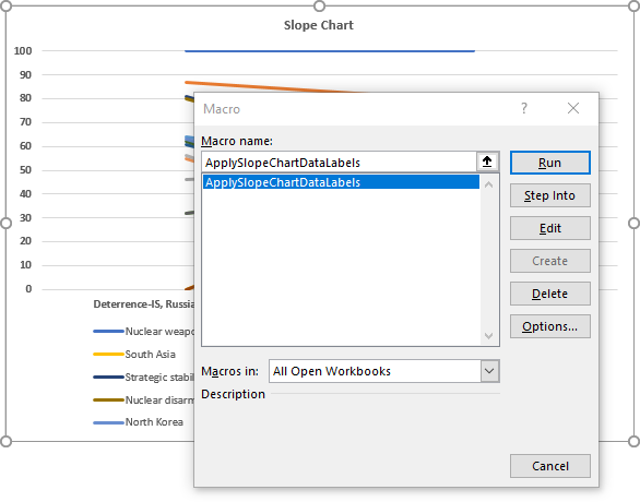
The chart with labels looks like this:

Repositioning the Overlapping Labels
That was fast, but there are numerous overlapping data labels. Writing VBA to alleviate this is rather complicated (I’ve tried!). You need to select each label (use two single clicks: one to select the series of labels, another to select a specific label) and drag it into position with the mouse.
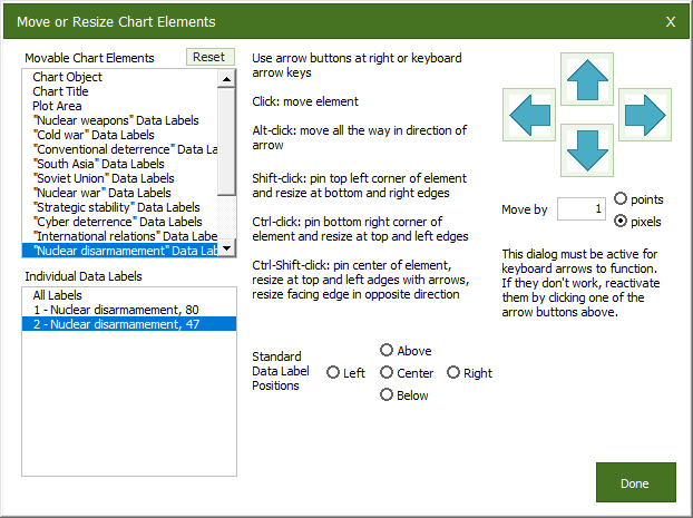
I’ve taken some of the tedium out of this experience with the Move/Resize Chart Elements function in Peltier Tech Charts for Excel, my commercial charting add-in. With it, I can select a set of labels, or even an individual label, and apply a built-in position, or move it by one or more pixels or points at a time, with the arrow buttons on the dialog or with the arrow keys on my keyboard.
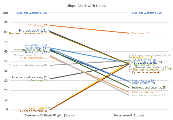
Using my utility it took about five minutes to disentangle all the data labels. Labels in the default left or right position do not have leader lines connecting the labels to their respective points, but once a label is moved, its leader line appears. The result looks good and is easily digested:

Update: Data Label Alignment
I have published a follow-up, Prevent Overlapping Data Labels in Excel Charts, which has VBA procedures that will un-overlap data labels in these charts easily.

Related Posts
Slope Charts
VBA for Data Labels
- Prevent Overlapping Data Labels in Excel Charts
- Apply Custom Data Labels to Charted Points
- Label Each Series in a Chart
- Label Last Point for Excel 2007
- Add Totals to Stacked Bar Chart
Slope Charts in Peltier Tech Charts for Excel
This tutorial shows how to create Slope Charts, including the data layout needed, and the detailed combination of chart series, chart types, and formatting required. This manual process takes time, is prone to error, and becomes tedious.
I have created Peltier Tech Charts for Excel to create Slope Charts (and many other custom charts) automatically from raw data. This utility, a standard Excel add-in, lays out data in the required layout, then constructs a chart with the right combination of chart type and format. This is a commercial product, tested on thousands of machines in a wide variety of configurations, Windows and Mac, which saves time and aggravation.

Please visit the Peltier Tech Charts for Excel page for more information.


derek says
I understand that this article is about applying formats to data labels, but my response to the original inquirer would have been “this isn’t the chart type you want”. Given that there were only two coordinates, an orthogonal coordinates chart, that is a scatter chart, would have been the way to go in my opinion, rather than parallel coordinates. Parallel coordinates is when there are too many coordinates to comfortably display them orthogonally.
Jon Peltier says
Derek –
Like this. The takeaways are certainly different than in the slope graph. I see a bunch of measures near the middle of the Y-axis, spread across the X-axis. There are two points trending towards or at the top right corner. And a handful in the middle of the X-axis and well below the middle of the Y-axis. I don’t understand the political details to make sense of what I see.
A slope chart is a special case of a parallel coordinates treatment, where there are only two coordinates. For this data, I’m not sure it’s before and after or just two different cases. Slope charts are effective at showing before and after, emphasizing the change between two points, as shown by the slope of the connecting line, more than the specific values of the points.
Labeling the points is easier in the XY chart, using the Value from Cells option for the data labels and selecting the range of labels. Reducing overlap of these labels is still an issue.
derek says
Thank you!
I usually put a 45 degree line on such charts, to show the “no difference” condition and how far the points are from it. I’m addicted to log scales, but here it wouldn’t because some data points are at zero.
Another thing I try is a scatter graph of change in value against initial value. Now the “no difference” condition is a horizontal line with the data scattered above and below it according to whether it increased or decreased.