The Problem
In a comment to another post, a reader asked about fixing the series names in his charts. Apparently he has been given dozens of charts, and all the series are named Series1, Series2, etc., the default names you see if names have not been defined. It turns out his series data is in rows, and the series names are in the cells just to the left of the data.
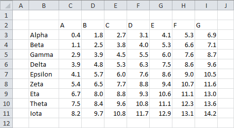
So the data looks something like this:

This is what I call “nice” chart data. It’s all in a single block, not bisected by blank rows or columns, with the series names and category labels in the first row and column, and with the top left cell blank. The top left blank cell helps Excel parse the data range into category labels, series names, and values.
If you select such a data range and insert your chart, Excel automatically figures out the series names and category labels. But someone may have selected the range without including the series names, or perhaps the series names weren’t there at first but were filled in after the chart was created.
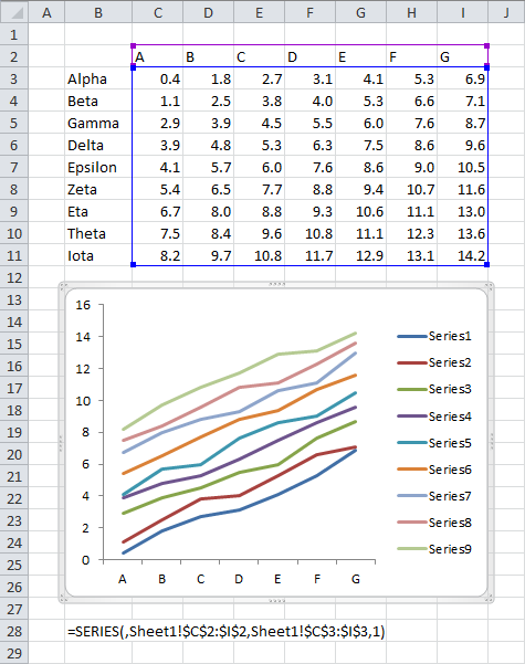
So here is the situation:

The category labels, highlighted in purple, are aligned in a row. The value data, highlighted in blue, are plotted in rows, parallel to the category labels. No cells are highlighted to indicate series names. The formula for the first series is shown below the chart. The reference for the series name should be between the open parenthesis and the first comma. Since it’s blank, Excel uses the boring Series1 nomenclature.
We’re going to use the series formula to figure out the series names. For this series, we can extract the arguments from the formula. To review, the arguments are: Series Names, Category Labels (or X Values), Y Values, and Plot Order. We will determine the range for the Y values, find the cell right before this range, and insert its reference into the series formula where we now have a blank.
The VBA Code
The code as scoped out above gets the cell to the left of a row of values, but note that I keep writing “the cell before the values”. We’ll make the code a little smarter than average: it will determine whether the data is in rows or columns, and if it’s in rows, take the cell to the left of this data, but if it’s in columns, take the cell above this data. Good thinking, eh? Burn me twice, shame on me.
Here is the procedure that does all the work. We pass in the series, and it fixes the series formula. The steps taken by the code are:
- get the series formula
- extract the comma separated list of arguments from within the parentheses
- split the CSV list of arguments into an array
- find the range corresponding to the third argument
- find the cell right before this range
- insert the cell’s address into the array of arguments
- reconstruct the formula
- reapply the formula to the series.
In other words:
Sub AssignSeriesName(srs As Series)
  ' assign series names to series in charts
  ' use cell above or to left of series values
  ' for series data by row or by column

  ' parse series formula
  Dim sFmla As String, sArguments As String, vArguments As Variant
  sFmla = srs.Formula
  sArguments = Mid$(Left$(sFmla, Len(sFmla) - 1), InStr(sFmla, "(") + 1)
  vArguments = Split(sArguments, ",")

  ' get ranges
  Dim rYValues As Range
  Dim rName As Range

  Set rYValues = Range(vArguments(LBound(vArguments) + 2))
  If rYValues.Rows.Count = 1 Then
    ' by row: want cell to left
    Set rName = rYValues.Resize(1, 1).Offset(0, -1)
  ElseIf rYValues.Columns.Count = 1 Then
    ' by column: want cell above
    Set rName = rYValues.Resize(1, 1).Offset(-1, 0)
  Else
    ' dude
  End If

  ' get address
  Dim sNameAddress As String
  sNameAddress = rName.Address(True, True, , True)

  ' reconstruct & apply series formula
  vArguments(LBound(vArguments)) = sNameAddress
  sFmla = "=series(" & Join(vArguments, ",") & ")"
  srs.Formula = sFmla
End Sub
Okay. We can use this in three ways.
1. To select a series and get the series name for just that series:
Sub AssignNameToSelectedSeries()
  Dim srs As Series
  If LCase$(TypeName(Selection)) = "series" Then
    Set srs = Selection
    AssignSeriesName srs
  End If
End Sub
For the next two cases, we’ll use this helper procedure, which accepts a chart, and fixes all the series in the chart:
Sub AssignSeriesNamesToChart(cht As Chart)
  Dim srs As Series
  For Each srs In cht.SeriesCollection
    AssignSeriesName srs
  Next
End Sub
2. To select a chart, and do each series in the chart:
Sub AssignNamesToSeriesInActiveChart()
  If Not ActiveChart Is Nothing Then
    AssignSeriesNamesToChart ActiveChart
  End If
End Sub
3. And finally, to loop through all of the series in all of the charts on the active workbook:
Sub AssignNamesToSeriesInAllCharts()
  Dim chtob As ChartObject
  For Each chtob In ActiveSheet.ChartObjects
    AssignSeriesNamesToChart chtob.Chart
  Next
End Sub
To run your code, select the series you want to name or the chart you want to name, or activate the sheet with the charts you want to name, press Alt+F8 to open the Macro dialog, select the appropriate macro, and click Run.

The Results
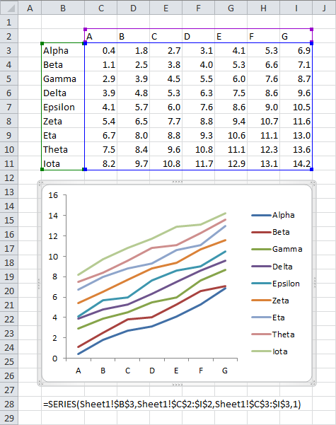
Here is our first chart above after running the code. The highlighted ranges include the green outlined range with series names, and the names are also shown in the legend. The series formula shown below the chart now has a reference to the cell with the series name.

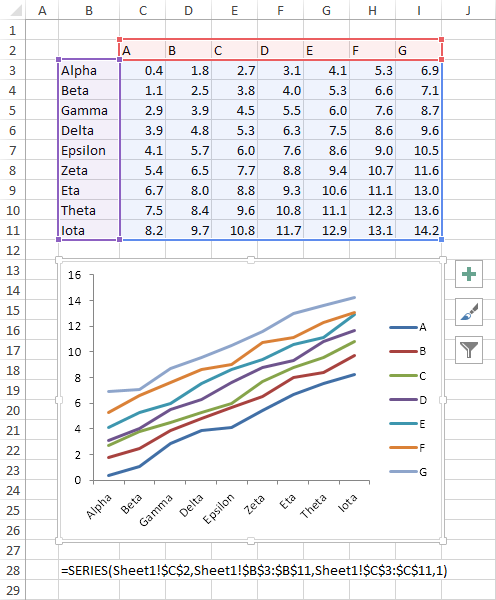
Let’s test the code with the following chart, with data plotted in columns and no series names. Before:

And after:

The series names are highlighted in the worksheet and appear in the legend, and the series formula has been updated with a reference to the cell with the label.
First look at Excel 2013
The last two screen shots look a bit different, don’t they? That’s because I did the second half of the experiment in Excel 2013. It looks a little lighter, because the row and column headings have no color and the chart outline isn’t so thick and gray when the chart is selected.
The highlighting of the ranges in the worksheet is more pronounced. The outline for the values are still blue, but the line is thicker, and the range is filled in with a light shade of blue. The outline for the category labels is still purple, but again, the line is thicker and the cells are lightly filled. The series name outline has switched from green to thicker red, and the cells are lightly shaded in 2013. I like this more obvious shading in 2013. Back in about Excel 97, I first noticed the outlining after I’d been using it for months. The thin outlines were not obvious enough until I already knew what I was looking for.
Also, when the chart is selected, three icons appear to the right of the chart. These are new user interface bits that handle adding and removing chart elements (the plus sign), applying color schemes and gaudy visual effects (the paintbrush), and on the fly filtering of the chart’s data (the funnel). The first of these icons is a nice addition, putting the chart elements right next to the chart instead of a mile away on a ribbon tab that’s usually not even visible. The middle icon will be too tempting to people who like flashy but nonsubstantive charts. The third icon is actually pretty cool, because you can show and hide whole series, or data points for given categories, just by checking and unchecking boxes in a dialog.
I’ll describe these new chart icons in an upcoming post. Stay tuned!


Meic Goodyear says
The end result is still sub-optimal, with the legend showing in reverse order of the lines – a design fault in Excel in my view.
Better to sort on column I into descending order, so at least the lines and legend correspond.
Better still to attach the series name to the right-most point in each series and get rid of the legend altogether, so the series names are spaced with the lines and if the lines cross the right name is still with its own series. If the names overlap you might need a little bit of manual adjustment, but that’s a small price to pay for the rextra readability.
Jon Peltier says
Meic –
Actually, I almost always replace the legend with data labels. Here I was just showing the new formats, and didn’t bother with the labels. Here’s the improved chart:
See Label Last Point for Excel 2007.
Meic Goodyear says
Spot on, Jon! And very much what I would have expected from you.
Terrifically quick response, too
KK says
If chart data range in not one contiguous space splitting series formula does not work.
Try to build chart where only odd rows are used.
In that case formula is
= series (name, (row1, row3, row5), (row1,row3,row5),1)
So splitting formula into single arguments would require more advanced string manipulation.
Jon Peltier says
Using alternate cells is not good Excel chart practice. The main reason is that each cell in the address must be qualified with the range name:
=SERIES(Sheet1!$B$1,(Sheet1!$A$2,Sheet1!$A$4,Sheet1!$A$6),(Sheet1!$B$2,Sheet1!$B$4,Sheet1!$B$6),1)
Before there are more than about 15 or 20 points, the series formula will crash, because the addresses for X values and the Y values will each exceed the allowed number of characters, close to but less than the magical 255 (though a quick test shows that in Excel 2013 this limit is not so easily reached).
In any case, you could write your own string manipulation code, knowing that there are still four arguments in the SERIES() formula, and the second and third may be comma-separated addresses enclosed in parentheses. I would adjust my data layout to make my data ranges contiguous.
Chris says
John,
Love your work, been a long-time admirer.
Just wondering though…when you gonna update your logo to reflect the fact that Excel 5 is dead and gone? :)
(99 Designs should be able to get you a nice one)