About the Revenue Chart
This tutorial shows how to enhance a simple column chart of revenues to show percentage changes or variances between columns.
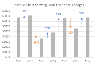
I saw a similar chart on my colleague Jon Acampora’s web site, Column Chart That Displays Percentage Change or Variance.
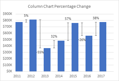
Jon uses another set of columns as a dummy series, and puts error bars and data labels on these hidden columns to show his variances. But using columns as his dummy series leads to some constraints. First, Jon’s visible columns have an apparent gap width of 100%; you could balance gap width and overlap to get a larger gap width, but it’s not possible to make it any smaller. Second, with only a single dummy series, there is a single set of data labels and error bars, so you cannot color code positive variances from negative ones. Third, Jon had to manipulate the year labels on the horizontal axis by padding them with space characters, in order to center these labels under the visible columns. But the chart above has been resized without tweaking the number of padding spaces, so the labels are offset.
In my version of this chart, I use two dummy series, both of type XY Scatter. This allows any gap width between the columns, it provides for different colors for positive and negative variances, and it requires no label manipulation for the year labels to align beneath the columns. I also formatted the error bars with arrowheads to help indicate the direction of the change.
Building the Chart
Revenue Data
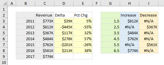
I’m using the data from Jon’s example. The column chart values are years and revenues, with Delta showing the difference from one year to the next, and Pct Chg showing how large Delta is as a percentage of that year’s revenue.
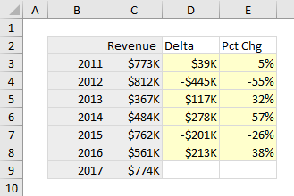
I selected the gray shaded cells and inserted a plain old column chart.
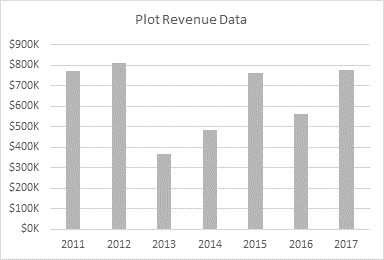
Note that I’ve changed the columns’ fill color from the default blue to gray. Later I’ll use blue for increases and orange for decreases. Blue and orange are a better combination than green and red, because about 8% of men and less than 1% of women have color vision deficiencies that make it difficult to distinguish green and red.
Data for the XY Dummy Series
The dummy XY series can be plotted on the primary axes with the columns. But we can’t use the year numbers as the X values. In a column chart) or a line or area chart), the X values of the data points (columns) are simply sequential numbers starting with 1. In our revenue chart, the seven columns have X values of 1 through 7.
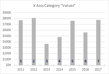
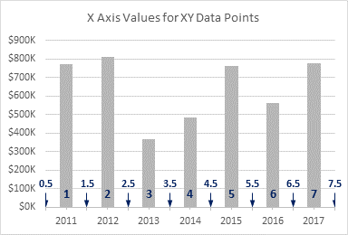
We can plot XY points anywhere along the axis, not just at the whole numbers where the columns are. The axis actually starts at 0.5 and extends to 7.5, and we will locate our dummy XY points halfway between each adjacent pair of columns.
I’ve set up a second data range for the XY series. The X values are in the green column, and I will plot Increase and Decrease XY series using the blue and orange columns. Increase shows the second value of each pair if the data increases, or it shows #N/A. Decrease shows the second value of each pair if the data decreases, or it shows #N/A. The Delta values will be used for custom error bars for both Increase and Decrease; Pct Chg will be used for custom data labels for both of these series.
Adding the Dummy XY Series
Copy the range of green, blue, and orange shaded cells. Select the chart. On the Home tab of the ribbon, click the Down arrow on the Paste icon, and choose Paste Special. Choose to add the data as New Series, in Columns, with Series Names in First Row and Categories in First Column.

Excel adds the data as new columns.

Note that I’ve applied my color scheme of gray for Revenue, blue for Increase, and orange for Decrease. The default color scheme uses the same colors in a different order.
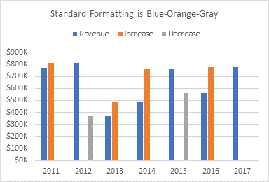
Right click any series in the chart to open the Change Chart Type dialog. Change both Increase and Decrease to XY Scatter, then uncheck the Secondary Axis box for each.

The markers are now positioned between their respective columns.

Add Error Bars
This chart uses custom error bars to show variances between revenues. Naturally I’ve written a tutorial on this topic, Custom Error Bars in Excel Charts.
Select the Increase series, and click the plus icon floating beside the chart to add error bars.
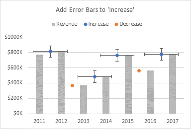
Fun fact: the three icons floating next to the chart are called Skittles.
Select the horizontal error bars and press Delete.

Select the vertical error bars, and press Ctrl+1 to open the Format Error Bars task pane. For Error Amount, choose the Custom option, and click Specify Value. The dialog allows you to select a value or range for positive and another value or range for negative.

This is one of the dumbest dialogs in Excel: it’s very small, and the value boxes aren’t even as wide as the narrow dialog, so it’s difficult to read the whole address when you populate one of the boxes.
We will only add negative error bars, reaching from the marker at the upper value down to the lower value. Delete the ={1} in the box, then select the range with the Delta values. If you don’t delete what’s in the box, Excel usually does not overwrite it, so you get ={1}+Sheet1!$D$3:$D$8 (but the value in brackets is hidden in the undersized box), and then you get an error message.
To get zero for the positive error value, you can’t just clear the box, you must enter a zero, and in some versions of Excel (as I recall) you have to put the zero in brackets. Like I said, it’s a dumb dialog.

You can’t see the whole address, but the Negative Error Value box contains =Sheet1!$D$3:$D$8.
Here’s the chart with the custom error bars.
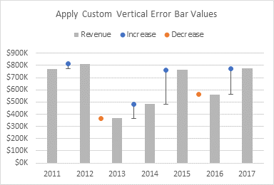
Format the Increase series so it uses no markers.
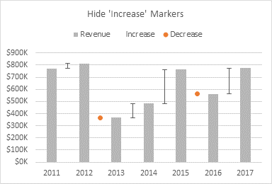
Now format the error bars. Specify No Caps, then change the line color, and add an arrowhead for the starting arrow type.
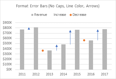
Lather, Rinse, Repeat
Repeat the error bar protocol for the Decrease series. Add error bars.
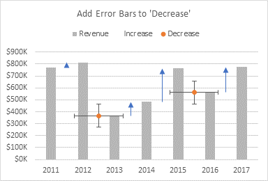
Delete the horizontal error bars.
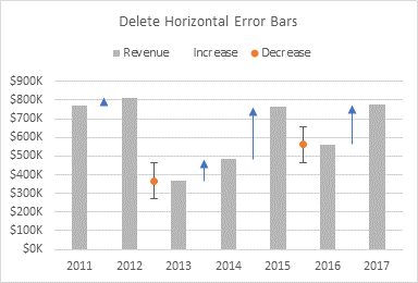
Apply custom error bar values, using the same range for negative error bars. Since the Delta values are themselves negative, the negative error bars will extend in a positive direction from the points.
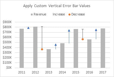
Hide the markers.
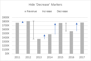
Format the error bars: No Caps, line color, and starting arrowhead.

Add Data Labels
Select the Increase series, hidden at the tips of the blue arrows. Click the plus skittle next to the chart, then click the arrow next to Data Labels, and select Above. Excel adds data labels showing the value of each point.
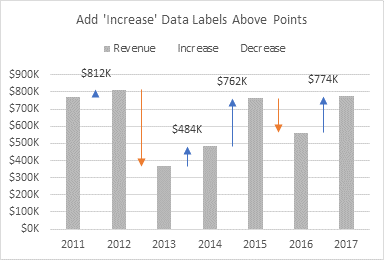
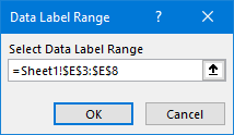
Format the data labels, and select the Value From Cells option, and click on Select Range. In the dialog, select the Pct Chg range in the worksheet.
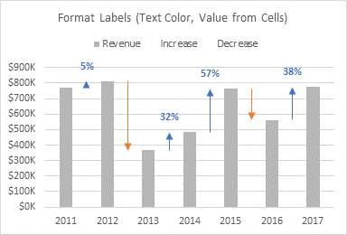
Then unselect the other options (Y Value, Leader Lines), and change the font color to match the arrows.
In the same way, add labels below the Decrease data points.
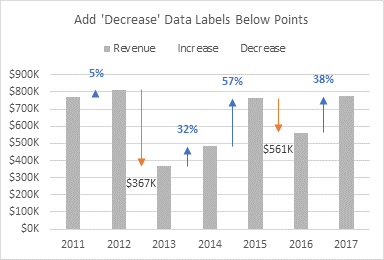
Apply label values from cells and change the label text color.
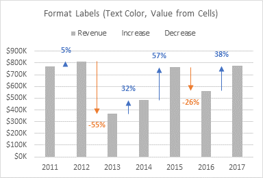
Finally, remove the legend.
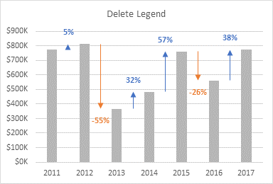
The Finished Product
It was a lot of steps, but the final effect is worth the effort.


aliris says
You positively make me smile.
All this work for what is, indeed, a very nice – and useful – graph improvement.
But wow, a lot of work!
Thank you for being you.
Wayne Edmondson says
Hi Jon.. I re-created your solution. I put a RANDBETWEEN() function into the Revenues cells so that I could F9 different data series to test the action of the chart. With data labels defined from the native series (i.e. the underlying values), the chart worked fine. However, once I change the Label Options to Value From Cells, there is an issue. Initially, the +x% and -x% labels are shown correctly, as the data series fluctuates with repeated presses of F9. Eventually, some of the labels disappear. Sometimes you have to close and save the workbook and then they disappear when re-opening. When selecting the Data Labels from the Chart Elements drop down, you can see that the label box is there. But, some of the boxes are empty, while others contain the correct x% figure. I tested a variety of ways to correct it without luck. It seems like the chart engine has a disconnect when cycling through the positives and negatives and retrieving the data labels from a selected range. It does not have the same problem if the data label source is left as the value from the underlying series. Do you have any ideas? I could send you my example if you like, although I’m certain you can re-create the issue yourself. I’d love to hear a solution. I created a VBA solution to Jon A’s chart, but would prefer to be able to get the results without VBA. Any advice or guidance you can give would be appreciated. Thank you!
Jon Peltier says
Wayne –
This sounds a bit familiar, now that you mention it. I’ll dig into it.
In the meantime, I think the answer might be to link the labels to the cells using formulas. See my tutorial Apply Custom Data Labels to Charted Points, and scroll down to the section entitled ‘Manually Link Each Label to Cell with Desired Text’, or use the Chart Labeler add-in mentioned right after that section.
Wayne Edmondson says
Hi Jon.. thanks so much for the quick reply.. very much appreciated. And, your advice solved the problem. I used the manual method of linking the labels to the cells using formulas. It is slightly tedious to do them one by one, but not that big of a deal. One thing I did discover.. I had to do the cell link twice.. once for positives and once for negatives. I set the data to be evenly, positively cascading upward.. 100K, 200K, 300K, etc. and then did each cell link. Then, I reverse sorted and did it again, linking all the negatives. Once completed, it worked perfectly thereafter. Multiple data sets using my RANDBETWEEN and F9 setup responded correctly on the chart and labels. I saved, closed and opened the file and it still worked the same. So, whatever disconnect is occurring with the Value From Cells method is solved using the direct cell link method. So.. old school saves the day.. haha!. I hope you can get Microsoft to look into it. Thanks again for taking the time to help me with this. I mentioned that I wrote some VBA code to manipulate the chart, labels and placement, but having it automated without VBA is ideal. Thanks again. I just found your blog through a recommendation from Jon Acampora. I look forward to more posts in the future. Thanks again for so generously sharing your wisdom, skills and resources.
Jon Acampora says
Hey Jon,
This is a great solution! Thanks so much for sharing your solution and helping improve this chart. I love to see how it has changed/improved over a short period of time. Awesome! :-)
Jon Peltier says
It’s great. You get a question from someone, use your imagination, and come up with a solution. You share it, and somebody asks, what about… Then someone else says, that’s great, but I know a better way to do part of it. Before you know it, half a dozen people have contributed ideas, and the end result is pretty cool.
Arun says
Hi,
I have downloaded excel file from following link, which includes solution provided here.
https://www.excelcampus.com/charts/column-chart-percentage-change/comment-page-1/#comment-91706
In tab “Combo XY – Peltier”, if I choose region “East” then some of the data labels disappear. If I choose region “West”, all labels are fine.
Could you please check and advise?
Kind Regards
Arun
derek says
I like this. I’d only format the negative percentage changes so they don’t have a minus sign, because “minus” is implied in the arrow direction and colour.
Jon Peltier says
Derek –
Good point. One of those six-of-one, half-dozen-of-the-other things.
Bill Benson says
Hi Jon, have not visited your site in a long time because thankfully I have not had to use charts in virtually all of this time. But this was a very well written and well thought out tip. Did you happen to look at Arun’s issue, I am hoping to see how that gets resolved.
Jon Peltier says
I’m aware of the issue Arun has mentioned, in fact, someone emailed me about it even before Arun’s comment.
I know what the problem is, at least the symptoms if not the remedy, and it seems to be a bug in the Data Labels from Cells feature. I encountered this issue months ago and reported it to Microsoft, but it didn’t go anywhere. I’ll report it again with a clearer description of the problem, so they can analyze it.
Andrea Java says
Is this solution specific to versions of Excel > 2010? I mimicked your result at home, where I’m on 365. But when I tried to use the chart at work, where we have 2010, the labels on the error bars/pct increase/decrease points won’t allow me to grab the label value from the pct column. Is there a workaround, or is there just something I’m doing wrong?
Jon Peltier says
Andrea –
The Value from Cells option for data labels was finally introduced in Excel 2013, after many years for begging by users. So unfortunately it’s not available in Excel 2010.
I describe a number of approaches for custom labeling of Excel charts in Apply Custom Data Labels to Charted Points. A technique that works in all versions of Excel is described in section ‘Manually Link Each Label to Cell with Desired Text’, and using an add-in to automate it in section ‘Use the Chart Labeler Program’.
Jason Oh Chang Phang says
Hi. Let’s say I want to show the revenue by products in stacked column for YoY comparison, how to show the percentage % in this case? Currently, the sample is for total revenue growth % only.
Regards,
Jason
Jon Peltier says
Jason –
I suppose you could draw a bunch of smaller arrows end-to-end to make up the total variance, but then you have to decide where the labels need to go. And then what do you do when there are positive and negative arrows in the same stack?
I have a different approach, which uses a split bar waterfall chart (sorry, no tutorial, but my Excel Charting Add-In can make these). It’s like a waterfall chart, but the floating bars show the individual contributions to the change, as in a stacked waterfall. And if the items do not all have the same sign, the stack is divided into a left side for positive items and a right side for negative ones.
Even when there are distinct boxes for each item, there is limited space for labels. You may want to display all of the percentage changes in a table next to the chart, and only highlight the outstanding (high or low) elements in the chart. I used callouts on individual chart data points for this above.
Deean Gallows says
Hi:
Very informative post.
I followed your instruction carefully but I’m getting a weird result. Increases have a down arrow marker and Decreases have an up arrow marker. I am using Excel 2010. It’s hard to follow your instructions using Excel 2010 but I think I got most of it right except for the direction of the arrow markers. Any idea where I went wrong?
Thank you so much
Jon Peltier says
Deean –
In 2010, error bars are a bit different. You need to format the error bar line style so the arrowhead is on the end of the line, not the beginning.
You also have to use an older technique for the data labels. See Apply Custom Data Labels to Charted Points for details.
Alex says
Took me some time to figure out some steps, but the final product is fantastic, bringing me to the question, why such charts are not available out of the box.
Great work – thanks a lot.
Jon Peltier says
Alex –
Which parts were problematic? Perhaps I could clarify them in the article.
I presume these charts are not available out of the box, because there are so many variations on them, everyone wants something a little different, and nobody is satisfied with what anyone else wants. Basic column charts are easy. Customisations are hard.
Greg Heath says
Jon,
Have you done anything likes this using data from a power pivot data model?
Jon Peltier says
Greg –
I have not done so, but I don’t see why it couldn’t be done. You could spit out year and revenue from the data model, then do the calculations and chart in Excel; alternatively you could do the calculations in the data model, drop those into Excel, and insert the chart.
Alison Gutacker says
Hi Jon,
I have several projects that I am trying to compare the cost increases over time. I’ve followed your tutorial and everything works perfectly. My only question is if I am able to use the slicer/tables when not comparing the same amount of years/time for my various projects. For example, one project has 16 time intervals, while another only has 14. As a result, the chart simply shows null values for the last two time intervals when I select the project with only 14 intervals. Essentially, I would love for my chart to change the number of points it has on its axis depending on how many time intervals I have. Let me know if that makes sense. Thank you!
– Alison
Traci Abbey says
This is amazing! I was wondering if you could figure out how to get it to work with a pivot table/slicer. It works when I first create it, but once I save it, close it, and re-open it I start losing percentages.
Thanks!
-Traci
Jon Peltier says
Hi Traci –
You cannot make this chart as a pivot chart, since it has some XY Scatter series, which are not supported in pivot charts. But you can Make Regular Charts from Pivot Tables. You will have to work out dynamic ranges for when the pivot table changes size (see Dynamic Chart using Pivot Table and Range Names.
Without seeing the data or knowing how you are pivoting or slicing the pivot table, it’s hard to know why the chart is losing details. Did you mean that the chart was losing the data labels which show the percentage changes? I know that there is a bug in data labels that use Values from Cells, where if you make a point disappear (maybe the series becomes shorter) then reappear (the series becomes longer again), the reappearing point has lost the labels.