Sometimes it’s desirable to make a regular chart from a pivot table, but Excel makes it difficult. If your active cell is in a pivot table, inserting a chart automatically inserts a pivot chart. Defining a source data range that intersects a pivot table automatically converts the chart into a pivot table. And once a chart becomes a pivot chart, it cannot be converted back into a regular chart.
In a moment I’ll show how to make a regular chart from a pivot table’s data. But first let’s review some of the strengths and weaknesses of pivot charts.
Pivot charts have some advantages over regular charts:
- Pivot charts are dynamic
- Pivot charts are interactive
- Pivot charts can be pivoted
However, the same infrastructure that conveys these advantages also results in some shortcomings:
- Some chart types (XY) are not available to pivot charts
- The date scale axis is not available in pivot charts
- All data from the pivot table must be included in the pivot chart
- Data from outside the pivot table cannot be included in the pivot chart
- Pivot chart formatting options are limited (alleviated to some extent in Excel 2007)
- Pivot chart formatting may be lost when the pivot table is changed
When pivot charts were first introduced in Excel 2000, I was excited by the possibilities, yet discouraged by their limitations. I rarely used pivot charts because I felt the limitations far outweighed their capabilities. The formatting capabilities in Excel 2007 are much less constricting than in Excel 2003, so I am more likely to use pivot charts in 2007. While I strongly dislike working with Excel 2007 charts, Excel 2007 pivot charts are greatly improved. The restrictions on pivot chart data sources are still limiting.
Microsoft hosts a number of decent Pivot Table examples. I will use one of them for this tutorial. Go to the Microsoft example 25 easy PivotTable reports, which has a link to Excel 2002 Sample: PivotTable Reports. From this page you can download a self-extracting executable named Reports.exe, which contains four workbooks. The top few records of the Source Data worksheet of the SampleSalespersonReports.xls workbook looks like this:
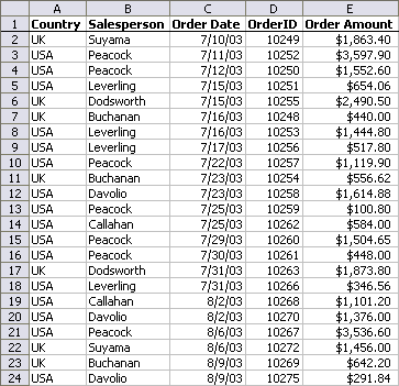
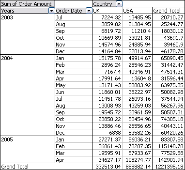
To create a pivot table in Excel 2003, select one cell within this data range, and choose Pivot Table and Pivot Chart Report from the Data menu. To keep things uncomplicated, place the pivot table onto a new worksheet. Drag the Order Date field to the rows area, the Country field to the Columns area, and the Order Amount field to the Data area. Group the Order Date field by month and year as described in Grouping by Date in a Pivot Table.
In 2007, select a cell in the data range, and choose PivotTable from the Insert ribbon tab. By default, manipulation of the fields is done in a Pivot Table Field List pane, not in the worksheet. You can override this setting if you’re willing to trade the new pivot capabilities introduced in 2007 for the convenient but apparently old-fashioned on-sheet button manipulation. In the PivotTable Field List, check the boxes in front of the fields you want in the pivot table, then drag them to the appropriate areas at the bottom of the pane. It’s basically the same as in 2003, just within the task pane.
The resulting pivot table looks like this:
To make a pivot chart, select any part of the pivot table and insert a chart. Excel 2007 places the pivot chart on the active worksheet.
In Excel 2003 and earlier, by default the pivot table is created on its own chart sheet. This is rather inconvenient, since I always move the pivot chart to the same worksheet as the pivot table anyway. To avoid this sheet switching, I select a blank cell that isn’t touching the pivot table, and insert a chart without specifying any data. I then select the blank chart, invoke the Source Data command, and click in the pivot table, which instantly turns the chart into a pivot chart associated permanently with this pivot table.
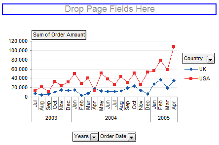
The pivot chart is linked to the pivot table, so any changes to the pivot table are reflected in the chart. In Excel 2003, the same dragging around of field buttons to pivot the table can also be accomplished in the chart, and the pivot table keeps up. A regular chart is not dynamic in this way. You could write VBA procedures that detect a pivot table change and adjust the chart’s series data accordingly, but that’s probably beyond the scope of any blog post.
However, a pivot chart doesn’t let you add data from outside the pivot table, or exclude data from the pivot table (though you could format a series to make it invisible).
In Excel 2003, you cannot change the size of the plot area or the position of the legend, chart title, or axis titles (other than deleting them). You can remove the pivot field buttons (Pivot Table toolbar > PivotChart dropdown > Hide PivotChart Field Buttons) to gain a little space, but you still can’t move or resize the chart elements.
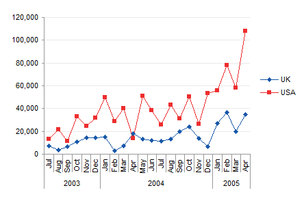
Excel 2007 doesn’t have the Field Buttons cluttering up the chart. Instead there is a floating PivotChart Filter Pane that, together with the PivotTable Field List, serves the same function less intrusively. Excel 2007 also allows you to move or resize the individual chart elements. But the other inflexible features of pivot charts remain.
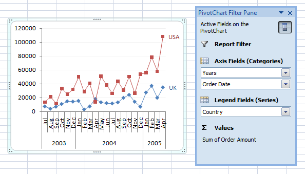
So you decide you need a regular chart to regain your formatting and source data flexibility.
Making a regular chart is actually easier than you think, as long as you are careful about setting the chart series data. You cannot set the overall source data range for the chart. You have to start with a blank chart, and add your data one series at a time.
Here is the protocol for creating a regular chart similar to the pivot chart above, using the pivot table’s data.
- Select a blank cell which is not touching the pivot table.
- Insert a chart. In Excel 2003, go to Insert menu > Chart, and select a chart type and subtype in step 1 of the Chart Wizard, and click Finish. In Excel 2007, simply select a chart type from the Insert tab, then choose the desired subtype.
- Right click the chart, choose Source Data or Select Data. In Excel 2003, click on the Series tab.
- Click the Add button to add a new series.
- Click in the Series Name box, and then select the cell with the series name (e.g., the country label UK).
- Click in the Values, Y Values, or Series Values box, then select the range containing the Y values (the Order Amount data under the UK label(.
- In Excel 2003, click in the Category (X) Axis Labels or X Values box, then select the range containing the category labels; In Excel 2007, click Edit under Horizontal (Category) Axis Labels, then select the range containing these labels. In both cases, this is the two-column range between the Years and Order Date field buttons at the top and the Grand Total label at the bottom.
- Repeat steps 4 through 7 as required for all series, including data inside and outside the pivot table.
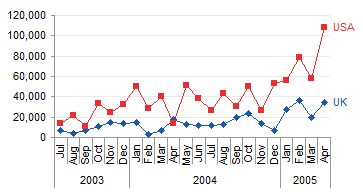
If I have other data for a country not included in the pivot table, I can simply add it to a regular chart per the protocol above. A pivot chart allows no outside data.

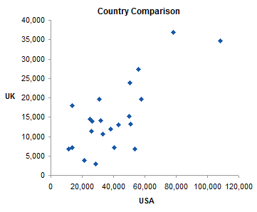
If I want an XY chart, I can create a regular XY chart using the protocol above. A pivot chart cannot use the XY chart type, nor can it use a date-scale axis in a line chart.
Update
A follow-up post uses a regular chart, showing how to Create and Update a Chart Using Only Part of a Pivot Table’s Data.


Lawrence says
Jon,
I originally sent this last month, but I had some email issues and I don’t know whether you replied. Apologies if I’m redundant.
Here’s my question: Is it possible to add vertical lines to a column chart when the Y-axis is already in use?
I currently have a chart with three revenue lines plotted as clustered vertical columns on the Y-axis and the total revenue plotted as a tall, fat column on the X-axis (that makes it look like the individual revenue columns are inside the total revenue column). The data is quarterly and spans several years. What I would like to do is add vertical lines that represent start/end of full fiscal years. So that’s a vertical line after every 4th data series/quarter (except the final series which may or may not end on the 4th quarter at the time the chart is run since it is a dynamic chart).
Am I asking the impossible?
Happy New Year!
Lawrence
Leslie says
Hi,
I often make regular charts from pivot tables. I have a formula in my pivot table, and when it pulls blank cells for the formula, it appears as 0. I used the NA() text and now the table cells are blank where they should be. BUT they still plot as 0 on the line chart. How can I fix this?
Thanks!
Leslie
Jon Peltier says
Leslie –
The pivot table shows blank, so now might be the time to go to the source data dialog, click on hidden and empty cells, and choose the gap option for empty cells.
Leslie says
Thanks, Jon. But that isn’t working. I wonder if it’s because my formula is within the pivot table? It works if the formula is in a cell.
Jon Peltier says
Leslie –
Aren’t the “blank” cells in the pivot table really blank?
Leslie says
What I have is a pivot table that displays Field1. Then I inserted a Calculated Field = IF (ISBLANK(Field1), NA(), Field1+Field2/6). I guess my problem isn’t really with the chart so much as it is with the pivot table formula – when Field1 is blank, the calculated field = 0. Thanks!
Anonymous says
where is the Create a chart??
Jon Peltier says
Anonymous –
In Excel 2003 and earlier, go to Insert menu > Chart, and select a chart type and subtype in step 1 of the Chart Wizard, and click Finish. In Excel 2007 and 2010, simply select a chart type from the Insert tab, then choose the desired subtype.
KR says
thank you for your help & support. nice tips
Shelley Bokelman says
Another quick way is to copy and paste your pivot table as values. Add any additional data you need to the right of pivot table data you just pasted. Select the data and create the chart and format as you would like. Then go back and paste in the pivot table over the data you copied as text. It will keep the chart you originally created and allow you to use the pivot table to change the values within the chart. It isn’t pretty, but it worked for me.
Tyler David says
Hi Jon, I basically am trying to get my graph to ignore any NA entries. Not sure why they don’t have an easy way to do it.. So is my below formula that I was able to get my reference cell to show NA instead of 0. But really I just need a 2010 excel graph to either ignore a 0 or ignore an NA.
=IF(‘Entry Sheet’!AC15<1,NA(),'Entry Sheet'!AC15)
Jon Peltier says
Tyler –
Yes, it’s a problem, as I describe in Mind the Gap – Charting Empty Cells.
Anonymous says
instead of 1000000 lines on pivot charts, i would have prefered the line “if you want a regular chart from a pivot, you have to create all series by hand” under this headline.
Lucy says
Excel 2013 won’t allow the work around of making a regular xy chart and then adding data from the pivot table to the chart as a series. Anytime I select any cells in the pivot table as my chart data, I get the frustrating “you can’t make xy charts from pivot tables” error message. (Can anyone explain to me why this functionality was taken away in 2007?!) But, Shelley Bokelman’s earlier post DID work. 1) Copy and paste your pivot table as values, 2) create a regular chart from the pasted values section, 3) Paste the pivot table over the data you copied as text.
Thanks Shelley and John for a lot of great tricks for Excel.
Jon Peltier says
Lucy –
You could never make a pivot chart of XY type.
If you select a blank cell that isn’t part of or touching a pivot table and insert an XY chart, a blank chart is selected. Go to Select Data on the ribbon or right-click menu, click on Add to add a series, and select the individual X and Y ranges. Click OK and your XY chart is using data from the pivot table.
Lucy says
OK, Excel is very finicky! If I follow Jon’s instructions exactly, then it does work. I first tried to insert the blank chart, then “Select Data”, as Jon said, and then, instead of clicking “Add” and then selecting the range in the pivot table as my data, I clicked on the “Chart data range:” box and selected the pivot table data as my data. It seems to do the same thing but my way does NOT work and I get the bad error. Apparently it is very important to add a new series using the Add button and not the Chart data range: box. As they say in 2nd grade, “Follow the teacher’s directions!”. I hope others will read this and avoid the frustration I felt.
Jon Peltier says
Lucy –
I’ve added emphasis to the following paragraph:
Making a regular chart is actually easier than you think, as long as you are careful about setting the chart series data. You cannot set the overall source data range for the chart. You have to start with a blank chart, and add your data one series at a time.
bs0d says
This solution is a big problem when dealing with any more than probably 5 chart series. In one instance, I had 100+ chart series to plot. I wanted the advantages of a regular chart as outlined by Peltier, but needed the flexibility of the pivot table to manipulate the data behind the scenes. This keeps me from duplicating charts and data over and over.
What I did, was create another tab. Use cell references back to the pivot table data. Include with the other data you wish to plot. Then simply insert chart on the referenced cells. Excel will automatically create each series, and a non-pivot chart. You can use some formulas to cleanup references that extend beyond the pivot table as it grows and shrinks with your filtering. Hope this was clear enough, cheers.
Peter says
This is simply a solution I stumbled across in partial ignorance while trying to align the PT columns with the axis categories of a column chart (my problem was that the rows and column switching seems to be synchronised between the chart and the table). The solution I offer for comment was to use
= IFERROR( GETPIVOTDATA( … ), “” )
to form the intermediate data table and build (somewhat less volatile) charts from that.
Megan says
Hi Jon
I have 20 regular scatter plots plotted from data within a pivot table. Any suggestions on how I can unhinge my graphs from the pivot table data without needing to Edit each X series and Y series? I am using Excel 2013. I want to get my graphs out of Excel and into Acrobat for a publication (.tif or .pdf at 300dpi). Regards Megan
Jon Peltier says
Megan –
If you need a chart type not supported by Pivot Tables (e.g., XY Scatter), you don’t have much choice. You could copy the pivot chart to another range, as values or with formulas linking to the pivot table, and build your charts from this pasted range.
If you simply need to show less data than the pivot table displays, you could filter the unwanted data from the pivot table, export the chart, refilter the data for the next chart, export it, etc. This might be slightly less tedious than dealing with all the series formulas, but it has to be repeated if the data changes or the charts need reformatting.
Peter Bartholomew says
My previous post was a bit cryptic so the formula below may clarify the point. It provides a simple replication of the PT data, as suggested by Jon, but based upon GETPIVOTDATA.
= GETPIVOTDATA( “Sum of Revenue”,PT.anchor,”YQ”,quarter)
/ GETPIVOTDATA( “Sum of Units”,PT.anchor,”YQ”,quarter)
If you are used to using the function simply by clicking a cell then the ‘Item’ contains a simple string. The function will, however, take a reference if you type it in. Here the name ‘quarter’ references a complete list of the quarters from another sheet and the array formula returns the corresponding array of values. That, in turn, permits the use of a greater range of chart types and, being a normal chart, its formatting is stable through updates of the PT.
The reason there are two function calls in the formula is that I have used the ratio of two value fields to give a weighted average price – but that is a different problem.
Jon Peltier says
Peter –
This is a good example of a flexible way to get pivot table data into a form that can be used for other purposes, for example, a nice output table, or in this case, the precise chart you want.
Keis says
Hi Jon
I am trying to create pivot tables with pivot charts for each value(name of person) in a selected field(names).This should appear on individual worksheet as it represents a different person.can you advise how do i do that? I know i can generate multiple pivot tables on to each worksheet but need the pivot chart to be likewise.
Appreciate your kind help
Jon Peltier says
Keis –
I would put the name into a page field (), and select one name in the pivot table. Then I would create my chart on the same worksheet as the pivot table, and format it how I want them all to look. Then I would copy the worksheet for each additional name, and switch the names in these pivot tables. The pivot charts will be linked to the pivot tables on the same worksheet, so each chart will show the data for the selected person.
Keis says
Dear Jon
Thanks for your suggestion. As its quite tedious, wondering if there are shorter turnaround time.
I do have another query on pivot charts. For example, we are measuring the %recommendation of a salesperson (responses are either Y or N) . The response was put as a count in the value and %of row total. We want only to look at the%Y and not show the %N. i had formatted the N without line etc to give the visual to be invisible but noted then when i add the slicer for the chart using field sales person. After clicking down the list a few times, the N response line appears in the pivot chart and also affects the original %Y line (either losing the line leaving behind only the markers) Weird i know. did i miss something?
Thanks for your kind guidance
Jon Peltier says
Keis –
This is a known behavior of pivot charts: see Pivot Chart Formatting Changes When Filtered.
Jon Peltier says
Keis –
My colleague Jon Acampora explains a much faster way to produce many versions of one pivot table. Put the field you want to split by into the Filters area, then on the Pivot Table Tools > Analyze tab, click Options > Show Report Filter Pages. See Create Multiple Pivot Table Reports with Show Report Filter Pages.
jim says
I had managed to plot a regular chart from my pivot table (via a very convoluted process) but every time I tried to amend it, as you say, it reverted to a pivot chart
Thanks for pointing out the simple hack to avoiding this – my afternoon has been so much more relaxed as a result
Jon Peltier says
Jim –
Glad I could help.
celgersma says
My pivot table grows and shrinks in length based on slicers and the additions of new data (i.e. one more week or production, or selecting YTD or QTD slicers). It seems to me that all the solutions above are based on the assumption that the dimensions of your data don’t change. If my pivot table is growing and shrinking, do I have any workaround to keep my formatting?
Jon Peltier says
Cassandra –
That’s exactly right. A regular chart can’t keep up with changing dimensions of the data range.
But you could define some Named Ranges that work by counting the number of rows taken up by the pivot table, and resizing the chart data accordingly. This article may help: Dynamic Chart using Pivot Table and Range Names
Elvin Jay S. Tesoro says
Hello Sir Jon, I’ve been a fan of your blogs for a year.
I came across this post of yours and helped me a lot (because of a bunch of issues with Pivot Charts including formatting).
Everything seems perfect until I encounter another problem again: Regular Charts (I’m using Line-series) cannot recognize #N/A from a Pivot Table. My main purpose is for Line Continuity since we all know the line trims whenever it detects a blank.
I have blanks from my source table (inevitable) and I put #N/A in the “For empty cells show” setting of the pivot table. Now, when I “Select Data” for the Regular Line Chart from the Pivot Table Column with those #N/A entries, the chart acknowledge them as “zero” values. But when I create a Pivot Line Chart, this pivot chart just recognizes “real” #N/A’s (i.e. there is line continuity and no zero points). Of course, I don’t want to put #N/A for blanks in the original source table since it will generate another problem on pivot table calculations (for subtotals during row field collapsing).
I don’t really understand why the Regular Line Chart doesn’t recognize #N/A entries (“For empty cells show” setting) from a Pivot Table. Kindly help me on this Sir :)
Jon Peltier says
Elvin –
Are the #N/A values which are displayed in place of empty cells real #N/A error values (centered by default), or are they text “#N/A” (left aligned by default)? I suspect they are text, plotted as zero values like any other text value would be. Why are blank cells unacceptable in the chart?
Elvin Jay S. Tesoro says
—Sir Jon, Good day again!
Wow, thank you for your swift reply Sir.
It seems like they are texts since they are left aligned after I set #N/A on “For empty cells show” setting. I tried to copy one #N/A from the PT and paste into a regular cell and seems like it maintain its zero value, but after I edit it with “F2+Enter” key, it becomes a real #N/A error.
Like I said I want my Line-series chart to maintain “continuity”, i.e. line still connects from one point to another point, even if there are blanks in between them. This was also my past problem but thanks google the simple solution was to put #N/A on these blanks. Thus, I would need my Regular Line Chart to recognize these #N/A’s in PT as real #N/A error values so that it will maintain line continuity between blanks from the original source table. Is there any workaround here Sir?
Thank You.
Jon Peltier says
Elvin –
Right click on the chart, and choose Select Data. Click the Hidden and Empty Cells button, and choose the empty cells option to connect data points with line.
Elvin Jay S. Tesoro says
—Sir Jon..
Wow! I really forgot this solution (I did come across this setting but t’was long time ago). Thanks for reminding me Sir. Very simple and straightforward.
I have to read your blog on “Plot Blank Cells and #N/A in Excel Charts” for more details.
Thank you so much again and Sincerest Regards,
Elvin