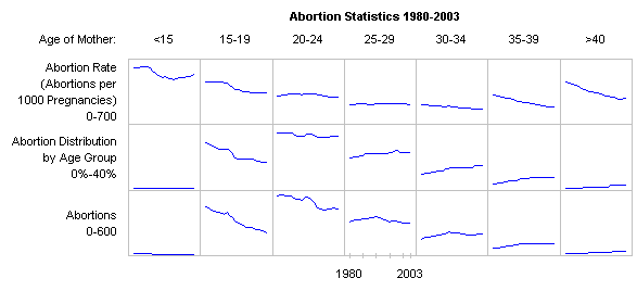
In Chart Design: Abortion Ratios 1980-2003 Jorge Camoes shows a nice panel chart of Abortion Ratios vs. Year (1980-2003) for different age groups, taking US Census Bureau data. I reproduce a few panels of Jorge’s chart below; click on the chart to see his entire panel chart.
Jorge points out the downward trend in the curves from 1980 to 2003, which are evident in all seven age groups in the full panel chart (the “<15” age group actually has started to increase again after about 1995). What is less obvious is a downward trend from the “<15” through “30-34” age groups, which then rises again from “30-34” through “>40”. Jorge cautions against missing such patterns when planning a display such as this.
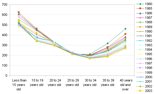
The first step to constructing an analysis like Jorge has made, is to examine the data from as many directions as possible. When you have rows and columns of data, the first exploratory charts you must make show the data plotted with series in rows and with series in columns. I made two charts of this sort, not separated yet as a comprehensive panel chart would be. The first chart below shows the data as Jorge has plotted it; the second shows the same data plotted orthogonally.


The first chart shows the downward trend Jorge chose to emphasize; the second chart shows the “U” shaped pattern Jorge warns us not to miss. There is no “best way” to show all of this information on a chart. Sometimes the solution is to use more than one chart.
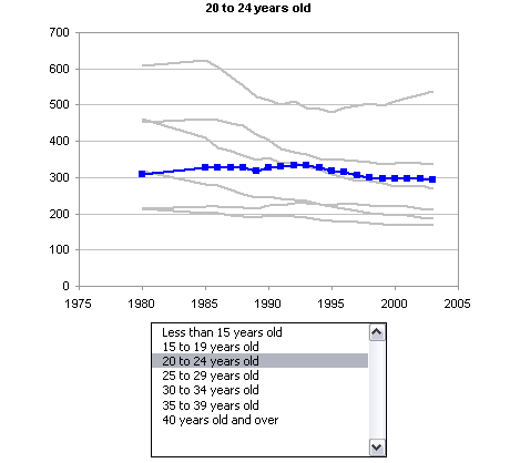
One way to make this easier depends on the ability to provide an interactive chart. In Excel this can be done using worksheet controls that redefine dynamic ranges as they are adjusted by the user. I used this approach on my web site to describe an Interactive Parallel Coordinates Chart. For this exercise, I created an interactive version of each of the charts above in a downloadable zipped workbook. One of these charts is shown below. All series are shown in light gray to provide context, while the series selected in the listbox is shown in a distinct color.

Jorge also points out that while the Abortion Rate is highest for the youngest age group, the percentage of abortions by age group is lowest for this age group. Another pair of charts displays this behavior; I will show these below, and suspend my analysis. Jorge has added this data to his panel chart using a thin bar beside each panel. Alternatively, an additional chart adjacent to the first may be used to show this data.


Some brainstorming could help identify reasons for the observed behavior. For example, the “<15” age group has the fewest pregnancies, and most of these are terminated by abortions.
In Small Multiples – Abortion Data 1980-2003, Andreas Lipphardt has written about Jorge’s panel chart. Andreas likes the panel (small multiples) chart, but feels that it can be improved. He would leave off the light gray lines showing data from other panels (I actually like them, but Andreas is right, they really aren’t necessary here). Andreas would replace the bars showing the percentage of total abortions by age group (between the panels in Jorge’s plot) and replace them with another row of panels, showing how this data trends with time (Jorge had used a single time point, I believe the last year of the study). Andreas’ added panel corresponds to the first chart of my second pair, above. Following Andreas’ adjustments to Jorge’s chart, it may not be a bad design to include several rows in the panel chart. Here is a first cut, with absolutely minimal labeling.


Jon Peltier says
Jorge – The nice thing about the light gray series is that, while they are not necessary, they help with the perception of the small multiples.
The age distributions are approximately constant, and some of the absolute numbers are pretty flat as well. But it doesn’t really hurt to demonstrate this to the reader. a row of panels is a only couple cm high. furtherdiscussion can concentrate on the top row.
Jorge Camoes says
Jon, nice work. We can tell how to create a chart in Excel, and we can say “this chart is better than that one”, but we must never forget the discovery stage. It may be not as glamorous as the final display, but it may be very rewarding.
Regarding the use of grayed out series, I also agree with Andreas, they are not necessary. But adding that small amount of redundancy may actually help the reader. They provide some context within the chart without losing focus.
As you can see, the ratio in the “<15” group is very high, but the actual volume, or proportion, is very low. I was trying to visually combine these two measures. Sure we can add a new row with time series for proportions, but they are relatively stable since 1992, so we can assume that the trend is not relevant.
This is not chart design only, it is information assessment. Do you think the information relevant? Use it. You don’t think there is any added value? Trash it, aggregate it, whatever. This shows why everyone that deals with data should learn how to communicate it. It is not a designer thing, it is not about creating “prettier” charts.
dermot says
Very nice work, Jon. I like your advice to look at data from different angles to see what emerges (as well as the effort you’ve gone to in building the charts). It’s what some would call exploratory charting.
Jon Peltier says
Dermot –
The exploratory stage, or discovery, as Jorge called it, is one of the most interesting parts of the analysis of a new set of data. You have to try different ways to look at the data, slice it every way possible. You see the trends you may have expected, you see some that surprise you, and you are always thinking how and why. That’s what makes pivot tables so powerful. If I were more invested in this data, I’d put it into a flat list, and run pivots against it.
Once you’ve learned from your pivots or other exploratory charts what is most interesting about the data set, you can then spend time reproducing the pivot views. You can put them into different chart types, such as these panel charts, or into interactive charts such as the ones in the example workbook.
Andreas Lipphardt says
Jon,
I like your panel chart. Its a good idea to include the Abortion Numbers as a 3rd measure int the panel chart. What I like particularly is that you created a matrix like version, that not uses redundant chart axis like my version:
http://blog.xlcubed.com/small-mutiples-abortion-data-1980-2003/
My version used a set of regular line charts. Its seems your version uses a tweaked XY Chart, correct? Would be good to see the Excel technique to create such a panel charts for multiple measures and categories.
Is it possible to add a Y axis for the 3 measures?
Andreas
Jon Peltier says
Andreas –
I use a single XY chart subdivided into the panels using (for example) gridlines. In the chart I created here, the data spanned 0 to 7 on the horizontal axis and 0 to 3 on the vertical. Data is normalized to scales of 0 to 1, then the appropriate integer is added to place the data in the appropriate row and column of the panel chart.
These two pages describe techniques used in constructing panel charts.
Panel Charts with Different Scales
Panel Chart Example: Chart with Vertical Panels
I am working on a utility to generate panel charts, but it has not been easy, since every one I produce seems to have its own idiosyncrasies, and thus needs plenty of human guidance.
Colin Banfield says
In spite of the power of PivotTables, there is one major area that they fail completely i.e. multivariate data visual analytics. In other words, finding trends and patterns in multivariate data. Ok, well the problem lies with PivotCharts and not the PivotTables per se, but the two are synchronized at the hips. The answer of course are “panel” PivotCharts, like the one you show at the end of your post and the types you see in products like Tableau and Spotfire . However, I’m very pessimistic that Microsoft will ever figure this out but if or when they do, it’ll be one of the most powerful features ever seen in the product…not to mention the elevated status Excel would enjoy as a BI front end.
Now, let us pray…..
Andreas Lipphardt says
In fact, there is a new tool that brings multivariate visual data analytics into Excel, XLCubed. The new XLCubed release supports MicroCharts in XLCubed Grids (Grids are more or less PivotTables)
Its not supporting all kinds of trellis displays, like Tableau does, but Grids that enrich the numbers with MicroCharts definitely helps you to see trends and patterns you would miss with the regular PivotTable. I will blog a bit more the capabilities of the XLCubed the next days on
http://blog.xlcubed.com
Jon Peltier says
Colin – Among the twelve gajillion items on my back burner is a utility to make panel charts such as the one in this article. Microsoft may not put everything into their products, but they did build in flexibility. I’ve used all manner of data sources in these charts, including pivot tables. The hard part is coding all the interaction I have with a chart before it’s “ready”.
Andreas – Sounds interesting. I’ll have to check it out.
Colin Banfield says
Andreas – I’ve looked at XLCubed in the past with much envy and the VisualGrids are great. However, I provide solutions for small businesses (under 100 employees), most of whom don’t have OLAP servers. Also, when a company does not advertise pricing online it strikes fear in me. Having said that, I’ve recently downloaded an eval copy of XLCubded to take a closer look.
Jon – Great idea. Best of luck! Let’s see if you can get out of the gate before Microsoft :-)
andar909 says
hi, andar here, i just read your post. i like very much. agree to you, sir.
james says
You stupid idiots need to do something about abortion. It needs to STOP NOW!
There are millions of young children and babies that could have a life and a future that never make it because of your women and their stupid decisions.
What about the stupid chart? Haven’t you noticed that the rate is going up and up each year? Every child deserves a life and to live and to be happy. You waste of time people just don’t care, those babies could be YOUR children those babies could be YOUR grand kids. C’MON from man to man, believe that we can change the future and we can change lives, let them live on. I just want you people to notice what is wrong here, and this is IT, this is wrong. Babies are a gift from god and i don’t think god appreciates the way we treat his children, these are little angels we’re killing HERE!
PLEASE, i’m begging for a change and i need your help!
thank you.
Jon Peltier says
James –
Thanks for your opinion. However, this isn’t a political action kind of blog, so your protest is misplaced. In addition, you are misreading the chart: except for the under 15 age group, the numbers of abortions have been declining.