In Plot your data around the clock, Chandoo proposed a complicated bubble chart to show website traffic vs. time of day.

I thought it was daring of Chandoo to try such a unique treatment of the data, but I found the bubbles difficult to interpret, and it was distracting that I had to look from chart to chart to try to see the whole picture. My complete review of Chandoo’s chart is in Rock Around The Clock.
Jorge Camoes has chimed in with a radar chart solution in Charting around the clock.

Jorge’s chart prevented the side to side motion needed to see the entire picture, but it does not show where the lines join to make a 24-hour record of the data.
Note: This chart is a novelty, and is not as good at representing the data clearly as a line chart would be. It’s really only effective at showing the difference between pairs of points 12 hours apart, the AM and PM values. This chart type cannot effectively show trends or compare values an hour or more apart. For effective data presentation, stick to line charts.
I created my own 12-hour circular graphic, which addresses my conceptual problems with the charts shown thus far. It’s actually a combination radar-XY chart, using the radar to reproduce Jorge’s nice Roman-numeral clock face, and the XY series uses Chandoo’s trig algorithms to locate the actual data.
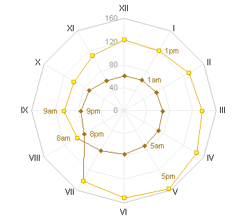
I presented this chart in Rock Around The Clock, but I did not show how I made it. This post has instructions.
Radar-XY Combination Chart Data
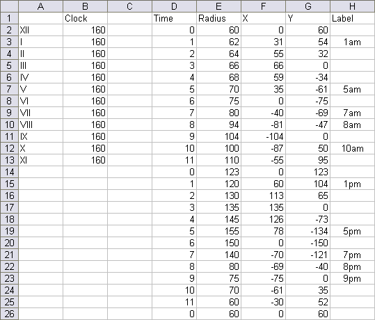
The chart has two blocks of data. The first block in columns A and B consists of data that drives the labeling of the chart numbers. I’ve used Jorge’s Roman numerals for the time labels in column A (the category labels of the radar chart), and the values of 160 in column B correspond to the maximum value in the chart.
The data in Columns D through H are used in the XY series. The time in column D is the time in hours, with 0-11 AM followed by 0-11 PM. The radius (column E) is the set of values to be plotted radially from the center of the chart. We accomplish this in an XY chart by converting the angle and radius to X-Y coordinates. The angle goes from 0 to 360 degrees (0 to 2 PI) from 0 to 12 hours. Columns F and G contain trig functions to handle this conversion. Cell F2 has this formula:
=E2*SIN(D2/6*PI())
Cell G2 has this formula:
=E2*COS(D2/6*PI())
These formuas are filled down to row 26. Note that the first point is repeated at the end of the table: while the radar chart automatically connects the first and last points, an XY chart does not assume that the points trace a circuit.
Column H contains labels which will be applied to selected points.
Creating the Radar-XY Combination Chart
Start by selecting A1:B13, and create a radar chart. The data traces the circumference of the chart. I’ve changed the axis spacing from 20 to 40, because there were too many gridlines.
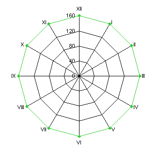
This appearance of the radial spokes and circumferential is reminiscent of a spider’s web, so radar charts are also known as spider charts.
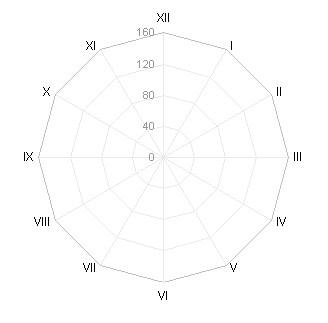
Change the gridline and axis (spoke) line color to very light gray. Change the data series and the axis labels to a medium gray, so these features will not overwhelm your plotted data.
Select and copy F1:G26, select the chart, and use Paste Special to add the data as a new series. Excel adds it as another radar series. Since it has 24 points, the series changes the chart so that it has 24 spokes, and the first series covers only half of the chart.
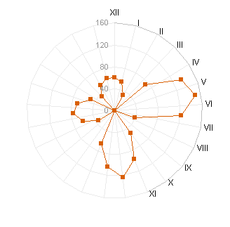
Right click the new series, choose Chart Type, and select an XY chart type. Excel plots the XY series on the secondary axes, and adds secondary X and Y axes to the chart.
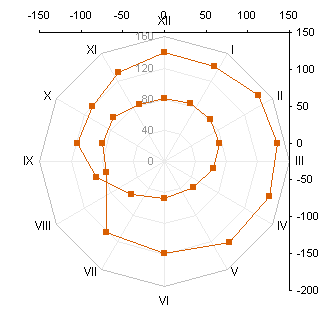
Change the secondary X and Y axes so that both have a minimum of -160, a maximum of 160, a major unit of 40, and the matching axis crosses at zero. The axes are coincident with the axis of the radar chart.
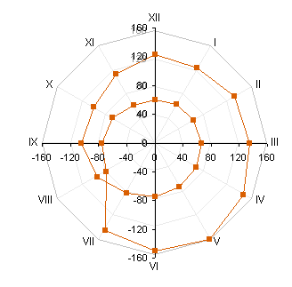
Finally, format the secondary X and Y axis to be invisible: no line, no ticks, and no tick labels.
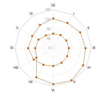
If you just want to show the 24 hour cycle, you can stop here. To help clarify the chart, I added some labels to selected points, showing the corresponding time, using Rob Bovey’s Chart Labeler.
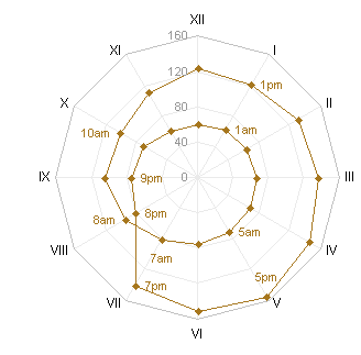
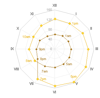
You may want to show the daytime data points with different formatting. You can individually format the particular points, but I prefer to add a new series, so I can edit formatting in one step instead of one step per point. Copy F10:G21, select the chart, and use Paste Special as before to add the data as a new series.
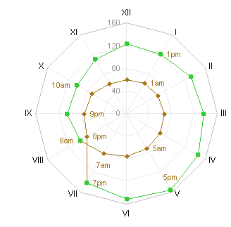
Apply the desired formatting to the daytime series
Download RadarXYAroundTheClock.zip to see a workbook that shows these steps.


Colin Banfield says
Why folks think it necessary to invent these complicated and unreadable charts is something I’m yet to figure out. It’s as if somehow, the standard charts become too boring after a while. In my opinion, the best way to view this data is with a simple (yeah “boring”) line chart, period.
Colin Banfield says
Jon, understood. Perhaps you should put a disclaimer at the top of these anti-Tufte/Few posts :) The nice thing about the simple line chart is that you can clearly see traffic trend over the day, which isn’t obvious with the radar chart. By the way, I’m all for novelty, but only when the novelty serves a purpose better than or as an equal alternative to something else. In this regard, sparklines, bullet graphs and panel charts are examples of good novelties, but even these are variations of bread-and-butter charts. Another great novelty you’re recently blogged about is the Gapminder type animations.
In the end (except for marketing brochures), it’s all about (or should be about) presenting data in a manner that allows one to make informed decisions. I haven’t a clue what inferences could be made from the radar chart, far less the original bubble chart.
Jon Peltier says
Colin – Good point. For many years I had on my site a tutorial showing how to make gauge-type charts in Excel. I think I did it for laughs, to show it could be done.
The tutorial received a lot of traffic, and I received many emails, mostly from people who couldn’t figure out the math behind it. I would tell them the gauge is not a very effective chart, and they wanted to use it anyway. Finally I took the tutorial down, and replaced it with a statement explaining why it was no longer available, and why it was an ineffective means of display.
Now I receive the occasional request to send the archived page to somebody, “just this once, I promise not to abuse it”. I politely decline. To use a gauge chart is to abuse a gauge chart.
Jon Peltier says
Colin –
I somewhat agree. My first alternative, you may recall (Rock Around The Clock), was a boring old line chart, and when I examine similar data myself, that’s what I use. But people like novelty, and when Jorge raised the stakes, I had to respond in kind.
It’s so difficult to be this competitive, and always right as well. As if.
Colin Banfield says
Jon, I remember your gauge chart quite well..er…I think I have the stuff filed away in a folder somewhere ;) So many dashboard companies use these speedometer things that I think that ordinary folks believe it’s uncool not to have them (marketing can be a powerful influence sometimes). I must confess that I too was taken in initially. When one thinks of the effort it takes to emulate gauges and produce other not-so-useful charts in Excel though, it’s not even a question of diminishing returns, since the result isn’t superior to better alternatives that take less time and effort to create.
I just had a shuddering thought. Speedometers could show up in the next version of Excel!
Jon Peltier says
Gauge charts and pie charts (and probably others) suffer from being too common. People are so familiar with them, that they don’t realize the charts show nothing. Marketing tells people that it’s cool to use these displays, and people think it’s useful to use them.
Exemptions says
I know the post is old it’s worth bringing up a couple of points.
I agree that this type of chart should be avoided but SOMETIMES there may be exclusion(s) to the rule.
– Line charts sometimes can’t use used to communicate continuity of the first data point and last data point (0-24 hrs).
– “clean radar chart” for reading historical compass heading
– “clean radar chart” to track rotation of thunderstorms relative to a fixed observer at a location (basically a radar at an airport). The chart is typically called “hodograph”. If you know how to read the chart you will be able to say things about the storm’s relative motion and whether it has the potential to turn violent. Line chart can be used and one can recognize trends easy but not unique patterns which is more emphasized in a radar chart. Also you can easily orient yourself to the compass direction (0-360).
– “clean radar chart” to track predominant wind flow at a location during a 24-hour rounded clock. If you use standard line chart, you will be able to see high/lows quickly but you will have a harder time orienting yourself to the compass direction. It’s a lot easier to do that on a radar plot (0-360)
Jon Peltier says
These are good points. The lack of continuity from last to first point is an issue, but I don’t think it’s really all that important. Forcing the line chart to wrap around into a radar chart reduces the clarity of its values more than it gains continuity through arbitrarily connecting the endpoints.
What is notable is that all of the other examples you’ve given relate the radar chart to geographical coordinates, the way radar itself is mapped to geographical coordinates. Compass headings, wind directions and velocities, tracking of storms and aircraft. For these purposes, distance and angle make more sense and are more comprehensible than converted X and Y on a line chart.
Exemptions says
Thanks for acknowledging the use of radar chart to geographical coordinates. I have read blogs and stuff from experts in this field and haven’t found one that fully acknowledge this use of radar charts. Perhaps, you should help spread the words to other experts in the field of data presentation. My assumption is that you know a lot more than I do which is very much true :)
Sujeesh John says
Probably gauge charts are not useful to a great extent since it shows a snapshot & not a trend. In an actual gauge we look at the sweep of the gauge needle to derive the trend. Can we have something like that in the gauge chart.
Sorry for really late reply, stumbled upon this on searching for gauge charts recently
Jon Peltier says
Sujeesh –
The technical term for what you want is a line chart.
Ilyas says
Hey everybody I’m new to this website and I really really hope that whoever wrote this article or anyone else could please please help me in my project!
The chart I’m trying to create is very similar to the 12 hour circular graphic above however it is a bit more detailed in that the 12 hour time is in minutes (0 to 720 minutes). The graph will have 12 major and 720 minor “spokes” or gridlines. The radius is 360 minutes (6 hours or major gridlines by 60 minutes or minor gridlines). There is no AM/PM specifications, the labels will show different fractions (12 in total) of the generated radar series in months instead. This will intern show the movement of the event on the clock face according to the changes in its starting time and duration.
Basically what I’m trying to show is a series of events. They are 5 to 10 daily events in total. They take place from throughout the year (from 1st of Jan to 30th of Dec) at different starting times (hh:mm) and last for different durations (mm). The position of each event on the clock face will represent its starting time (from 1h to 12h, or from 0m to 720 minutes) and its duration (depending on the radar, from 0m to 360m). The starting time and duration of each of the events changes on a daily basis throughout the year. This will intern show the movement of the event on the clock face according to the changes in its starting time and duration.
It is a bit similar to the graph where the author introduced the secondary axis and before he made them coincidence with the radar axis (in that the event’s starting time does not always match the “clock-hand”-like gridline. If you take the same chart and ignore the secondary axis, you will see that there are two events taking place from VII to VIII: one at around 7:20 and the other at 7:30. The event starting at 7:20 would last 120 minutes and the other one starting at 7:30 would last 50 minutes. This is what i am trying to show on my chart. The events would form a continuous line from 1st of Jan to 30th of Dec where the 30th of Dec would connect to the 1st of Jan forming an infinitive loop so to speak.
I am open to suggestions if you think there are simpler ways of achieving the same result, and in case I haven’t made myself clear enough I am happy to email the drawing of the graph I want to make in Excel to you. If you have any other queries please email me at ilyasmussin at gmail.com.
Thanks so much for this article and any help i could get (in advance)
Keep up the good work!