 One of the resources I use on my web site is SiteMeter, which has basic (free) and more extensive premium versions of their web site statistics service. I am not endorsing SiteMeter here, just describing their statistics. Sitemeter provides web site tracking by hour of the day. This is pretty granular, compared to daily or monthly statistics, and I haven’t found much use for this detail. In any case, though, it provides a means to illustrate that radar charts, also known as spider charts due to the web-like appearance of their spokes and gridlines, are just not very good for most routine purposes.
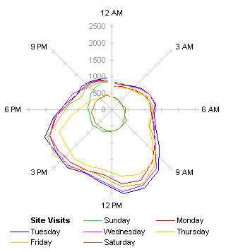
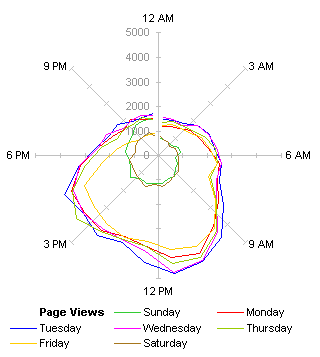
Below are two radar plots of site statistics, Site Visits on the left and Page Views on the right, orbiting around the origin according to time of day. Midnight is at the top of each chart, noon at the bottom, and the curves proceed, well, clockwise around the charts.


What can we say about the information in these two charts? Well, Saturday and Sunday are close to the center, so they must have less traffic. Also, for the weekdays, the curves bulge at the bottom, so daytime obviously gets more traffic than nighttime. The times in the SiteMeter data corresponds roughly to my own time of day here on the East Coast of the US, since I get around 50% of my traffic from the US, though I don’t offhand know the East Coast vs. West Coast split.
The radar charts certainly look useful at first glance. They are multicolored, which is good, and there is a kind of satisfaction of feeling that the cyclical nature of time (Sunrise, Sunset) is reflected by the cyclical nature of the displays. Because the values are represented by radial distances in the radar charts, it is difficult to compare different times, and it is not easy to follow hour-to-hour trends in the data.
Another problem is that the larger values are at the bottom of the chart, which is counterintuitive. This could be corrected by putting midnight at the bottom of the chart.
This was easier than it seems: I’m using a combination chart, with a hidden radar series providing the spokes, and the daily traffic data plotted on hidden X and Y axes, using trig functions. All I had to do was reverse the directions of the hidden X and Y secondary axes, and change the category labels of the hidden radar series.


Maybe this helps, maybe it doesn’t. The larger values are higher in the chart, but the variation in the orientation of radial distances is not alleviated. We’re also conditioned to see midnight on the top of our clocks (noon too, on a 12-hour analog clock). The radar chart is the source of cognitive dissonance.
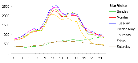
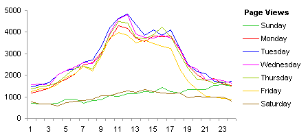
The inferiority of the radar chart becomes even more evident when compared to line charts showing the same Site Visit and Page View data (below). The charts start at midnight on the left and end at midnight on the right, and time flows smoothly from left to right. Instantly more detail is apparent than in the radar charts, and further details reveal themselves on closer viewing.
While the radar charts show a nondescript jellyfish-like bulge during the day, the line charts show a two-humped Bactrian camel appearance. There is a big hump just before lunchtime on the East Coast, and a smaller hump in mid- to late afternoon. The first bump can be explained by people starting to zone out before lunch, and surfing the web. The afternoon bump is a bit late for the West Coast pre-lunch traffic, but the West Coast pre-lunch crowd may be partially obscured by folks on the East Coast killing a few moments before leaving work for the day.
A smaller bump is evident in the early morning in the Site Visits chart (and you can imagine a similar bump hiding in the Page Views chart). Could this be the pre-lunchtime bump from Europe?


The Friday curve is interesting. It begins the same as the other weekdays, but it lags by midmorning, and by evening it drops to the Saturday level. Obviously people are trying to finish up their week’s work, and aren’t surfing as much. They may be leaving early, and nobody is browsing technical web sites on the weekends.
By midafternoon Sunday, traffic starts to pick up. I suspect this is due to my Asian visitors accessing the site. This traffic is usually drowned out by Europe and especially the Americas, but on Sunday evening (Monday morning to midday in Asia) it’s the major source of visitors.


Colin Banfield says
Jon, a cycle plot might be an interesting alternative.
Jon Peltier says
Colin –
Here are cycle plots for a week last month. The day-by-day variation is hard to read clearly.
I also plotted monthly totals by hour of day, but these were distorted because I started in the middle of August, and the service has missed some weekly reports (one in September, two in December, and one in March). It’s a free service and you get what you pay for.
Naomi B. Robbins says
I’ve heard that radar plots are very common in Asian countries but Westerners have a hard time understanding them. Sorry, I don’t remember the source of that info. In any case, it makes you wonder how much of our understanding is due to perception and how much to socialization.
Naomi B. Robbins says
Colin – I’d use the word addition rather than alternative since the line charts and the cycle plots emphasize different aspects of the data.
Jon- Your data is cyclical with weekly cycles (Sat. and Sun. so much lower than weekdays.) Cleveland introduced cycle plots for time series data that had the cyclical component removed. For more information I’d look at Visualizing Data or one of these papers:
Cleveland, William S. and Irma J. Terpenning. 1982. “Graphical Methods for Seasonal Adjustment.” Journal of the American Statistical Association, 77:52-62.
Cleveland, R.B., W. S. Cleveland, J.E McRae, and I. Terpenning. 1990. “STL: A Seasonal-Trend Decomposition Procedure Based on Loess.” Journal of Official Statistics, 6:3-73.
Michael Pierce says
I agree, the radar charts are nice eye candy and they seem like you should be able to discern something from them, but it’s difficult (at least for this Western socialized mind).
The line charts are much easier for me to understand and I like your correlation to the workday. Makes sense. The other conclusion I would draw, since the linear patter is similar in both charts, is that most visitors are hitting the same (one or two) pages. And that would make sense for a blog-oriented site; most folks are likely just hitting the most recent updates.
One minor nit…at first I was drawn into the charts wondering why Thursday traffic would be so much lower than other weekdays. Then I realized that Sunday and Thursday colors are similar and I was confused; even more so because I was lazy and the Thursday entry in the legend is awfully close to the endpoint for Sunday’s data. Anyway, colors a little more distinct would be helpful.
Jon Peltier says
Naomi –
I attempted the monthly totals to average out the day-of-the-week fluctuations, but as mentioned, my database was incomplete. Usually I track a 7-day moving average to minimize the daily effect. I know that’s not really rigorous, but for Q&D analysis, it suits my needs.
Jon Peltier says
Michael –
Sorry about the colors. They look distinct on my main monitor so I didn’t spend a lot of time with them, but on my secondary monitor the colors are not so distinct. Probably your screen is set up more like my secondary screen.
derek says
I made a couple of comments from work, but they don’t seem to have made it.
The first was to say that a stepped polar line could have mitigated the weakness of polar line graphs, by making it clear that the line actually was falling then rising (instead of giving the appearance of just taking a short cut across the circle. But I then said that this only worked because Jon’s data points were hourly, and the real numbers were a continuum: the higher the resolution Jon chose (hits per minute, hits per second), the richer the cartesian line graph would look, but the polar graph would get weaker, even in its stepped form.
My second comment was that the cycle plot had a problem with aspect ratio: as it is, the daily trends are too spiky to be discerned, but if the graph were expanded horizontally until the daily trend was rich and clear, then the hourly trend would be too flat (that’s a problem with simple time series too– there is often no one aspect ratio that works on every scale).
I put it better the first time, but c’est la vie electronique.
Jon Peltier says
Derek –
I have a couple panel charts that I use to track blog stats. One has day of the week panels arranged horizontally, the other has these panels arranged vertically. I find that the vertical panels are easier for me to track, I think because I still have the better resolution in the vertical direction, which is the variable of interest.
mike says
I don’t get it. It’s easy to follow the hourly trends, and it’s easy to compare different times. There’s no problem with having large values on the bottom of the chart, or in any other direction. The radar charts you posted are much more intuitive and easier to interpret than the other types of charts on the page.
Jon Peltier says
Mike –
That’s great if radar charts work for you. I find that in general, they are not as useful as people think. The radar charts in this post are not terrible and the cyclical nature of the data actually helps with comprehension. Radar charts that show unrelated categorical data along different spokes are especially difficult to use reliably.