Someone asked in the newsgroup how to create an XY chart in Excel that uses the label at the top of the columns of X and Y data for the axis titles. That’s not built in, but it’s not hard to do if you know a little VBA. I’ve taken an example from my web site, Interactive Chart Creation, and embellished it a bit.
The VBA procedure (code below) actually works a bit like my first recollection of Excel charting, which had two dialogs, one asking for the data range, the other asking for the range of cells to cover witth the chart. Since I always align my charts with the cell boundaries, this is nicer than the Chart Wizard in Excel versions up to 2003 and the Insert Chart command in Excel 2007.
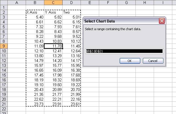
The code uses a couple of input boxes to get the ranges from the user. I’ve added some smarts so it uses the selection as the default for the source data range in the first input box. If the selection is a single cell, the macro uses the cell’s current region (the contiguous range including the cell).
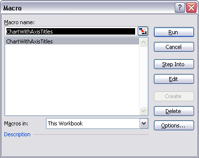
Copy the code below (use the plain text view of the code for copying) into a regular module in the VB Editor, then from Excel’s Tools menu, choose Macro, then Macros, or use the Alt+F8 shortcut key combination, then select and run the macro ChartWithAxisTitles.

The first input box asks you to select the data range. Note that the active cell C9 has been expanded to its current region B2:D21 for the dialog’s default data range.

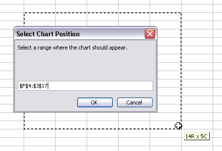
The second input box asks you to select a region for the chart to cover.

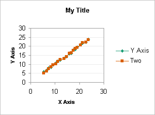
The result is an XY chart with default chart and series formatting. I’ve cleaned up the formatting slightly here, after the procedure inserted the chart, but obviously there’s room for improvement, particularly with the spacing of the chart elements.

My data range had three columns. The first is used for X values and the X axis title, the others are used for Y values for two series. The cell above the first Y data column is used for the Y axis title, and the cell above each Y data column is used for the corresponding series name.
Here is the minimally documented code:
Sub ChartWithAxisTitles()
   Dim objChart As ChartObject
   Dim myChtRange As Range
   Dim myDataRange As Range
   Dim myInitialRange As Range
   Dim sInitialRange As String


  ' bail out if we're not on a worksheet
   If Not ActiveSheet Is Nothing Then
     If TypeName(ActiveSheet) = "Worksheet" Then

       ' propose an initial data range
       If TypeName(Selection) = "Range" Then
         Set myInitialRange = Selection
         If myInitialRange.Cells.Count = 1 Then
           Set myInitialRange = myInitialRange.CurrentRegion
         End If
         sInitialRange = myInitialRange.Address(True, True)
       End If

      With ActiveSheet

        ' ask user for range that contains data for chart
         On Error Resume Next
         Set myDataRange = Application.InputBox( _
             prompt:="Select a range containing the chart data.", _
             Title:="Select Chart Data", Default:=sInitialRange, Type:=8)
         On Error GoTo 0
         If myDataRange Is Nothing Then Exit Sub

        ' ask user for range chart should cover
         On Error Resume Next
         Set myChtRange = Application.InputBox( _
             prompt:="Select a range where the chart should appear.", _
             Title:="Select Chart Position", Type:=8)
         On Error GoTo 0
         If myChtRange Is Nothing Then Exit Sub

        ' cover chart range with chart
         Set objChart = .ChartObjects.Add( _
             Left:=myChtRange.Left, Top:=myChtRange.Top, _
             Width:=myChtRange.Width, Height:=myChtRange.Height)

        ' Put all the right stuff in the chart
         With objChart.Chart
           .ChartArea.AutoScaleFont = False
           .ChartType = xlXYScatterLines
           .SetSourceData Source:=myDataRange, PlotBy:=xlColumns
           .HasTitle = True
           .ChartTitle.Characters.Text = "My Title"
           .ChartTitle.Font.Bold = True
           .ChartTitle.Font.Size = 10
           With .Axes(xlCategory, xlPrimary)
             .HasTitle = True
             With .AxisTitle
               .Font.Size = 8
               .Font.Bold = True
               .Characters.Text = myDataRange.Cells(1, 1)
             End With
           End With
           With .Axes(xlValue, xlPrimary)
             .HasTitle = True
             With .AxisTitle
               .Font.Size = 8
               .Font.Bold = True
               .Characters.Text = myDataRange.Cells(1, 2)
             End With
           End With
         End With

      End With
     End If
   End If
 End Sub


Matt says
I have just started running into a problem where a selected range is not recognised as a range and so I get spat out on through the isrange…exit sub checks (2003, XP sp2). Has anyone else had this occur and know a solution?
Thanks
Matt
Jon Peltier says
When you get this error, go to the VB Editor, open the Immediate Window (Ctrl+G), type in
?typename(selection)
then press Enter and see what the response is. If that doesn’t help, step through the code and see where you are ejected from execution.
Jon Peltier says
Matt responded via email instead of posting here. He said:
If I select a range of cells then the suggested code in the immediate
window returns type Range. When I select the same range of cells when
asked for a chart range via the input box, then run the immediates
window on ? typename(myDataRange) the type of myDataRange returns type
Nothing, hence I get spat out at ‘If myDataRange is Nothing Then Exit
Sub’.
If I accept the default data range then I get spat out on the ‘If
myChtRange Is Nothing Then Exit Sub’ as this input box again returns
type nothing.
I have just changed PCs (supposedly within the same standard operating
environment) – are there any VBA references that should be set by
default?
Matt –
After the Set MyDataRange = statement, insert this code:
MsgBox "MyDataRange is type " & TypeName(MyDataRange" _
    & vbNewLine & "Error " & Err.Number & ": " & Err.Description
Similarly, after the Set MyChtRange = statement, insert this code:
MsgBox "MyDataRange is type " & TypeName(MyChtRange" _
    & vbNewLine & "Error " & Err.Number & ": " & Err.Description
Then rerun the code, once accepting the default data range, once setting your own, and email me screen shots of the message boxes.
DaleW says
Jon,
Early in your minimally documented code, I believe the following line contains a typo, as
If myInitialRange.Cells.Count = 1 Then
precedes a block of code that seems like it was meant to apply if a useful XY range had been selected, so you probably meant:
If myInitialRange.Cells.Count > 1 Then
Nice little subroutine, by the way.
Jon Peltier says
Dale –
Actually that’s a bit of intelligence built into the code. myInitialRange is defined as the selected range, but if this range has only one cell, the code then defines myInitialRange as the current region of the active cell. This is similar to the way the chart wizard determines the range to use for the source data of a chart. It’s usually so much easier to select one cell in a range than to meticulously select the entire range.
DaleW says
Ok — that is a handy feature IF someone wants to just select one cell of the range to plot AND go with Excel’s guess at what the entire range should be.
Unfortunately, for the user who has already selected exactly the range to be charted before calling this marco, this bit of intelligence plays dumb and makes one reselect the range.
I bet you meant to put the following line of code one line later, so it gets executed either way, between instead of before those two END IF statements:
sInitialRange = myInitialRange.Address(True, True)
Jon Peltier says
Doh! I said the code was smart. I made no such assertions about the coder!
Mohammad says
I am trying to generate the similar graph but I want to select for example first 10 coloumns as X and 10 second coloumns as Y.
please let me know which kind of modification I should do.
Regards
Jon Peltier says
Mohammed –
Is the data in rows? Or do you have 10 series, with all ten X ranges first, then all ten Y ranges?
Mohammad says
Thanks for your reply.
I have 10 series ,such that for example in first series X are($A$1:$A$10) and Y are(!$K$1:$K$10) and in second seris X are ($B$1:$B$10) and Y are($L$1:$L$10) and so on.
Jon Peltier says
Mohammad –
That’s one of the data layouts that my Quick Excel XY Chart Utility can handle. It’s called X-X-Y-Y and it’s 4th from the left in the first row. This will not add the axis titles, but by adding all the series, the ustility will save you more time.
The utility is free and works well up to 2003. I haven’t tried it in 2007 but I don’t think there’s going to be a problem with it.
Let me know how it works.
Mohammad says
Many thanks
It works for me in excel 2007.the good thing is that the program can be used for many X:Y data arrangement.
Wu says
My question is how to keep the x-axis labels as what it is:
My data:
Time 16 to 24 25 to 54 55 +
2007Q1 4.2 4.7 0.5
2007Q2 3.6 3.3 0.8
2007Q3 2.1 6 0.8
2007Q4 6.2 5.3 1.4
2008Q1 3.1 5.2 3.3
2008Q2 2.4 4 1.3
2008Q3 6.1 5.6 1.4
2008Q4 7.7 4.6 2.2
How can I lable the ticks in X-axis as 2007Q1 instead of 1, and somethng like that?
Thanks
Jon Peltier says
Wu –
You need to make a line chart, not an XY chart.
Find the line of code that says
.ChartType = xlXYScatterLines
and change it to
.ChartType = xlLineMarkers
Wu says
Hi Jon,
It works. You make my day much better; Thank you very much!
Wu
Jon Peltier says
Bo –
This approach is complicated by the use of multiple areas in the data range selection. The code has to recognize that it is using two areas, then note the order of columns. Instead of going sequentially, the columns in your example skip from B to F.
Here is the enhanced code, with the changes highlighted:
Abdulla says
Jon
I’ve added secondary Y axis to chart but unable to set a title for it!!
I’ve used
With .Axes(xlValue, xlSecondary)
.HasTitle = True
Any reasons why that happed. I’ve tried different chart type.
Jon Peltier says
Did you add the axis in code?
What is the chart type?
Abdulla says
Jon
Yes, I’ve added axis in code for xyscatter chart:
Then I started adding the series:
Jon Peltier says
1. Add the ‘YlineT’ series first, change it to XY type (which I don’t see in the
.With .NewSeriesblock), and then code the secondary axis.2. I don’t think you need the
.SetElementline if you explicitly code to add the axis.Abdulla says
Jon
I’m sorry to post the whole code here , I tried a lot to solve the issue but failed. I created the series first but again it didn’t shows the y axis!!
Actually, I have a lot of series that is plotted using FOR NEXT statement, so, I’ve created the Chart first. I hope you can figure out the mistake
Option Explicit
Dim TF As Worksheet
Dim OIL As Worksheet
Dim WTR As Worksheet
Dim TG As Worksheet
Dim GL As Worksheet
Dim RG As Worksheet
Dim WC As Worksheet
Dim YlineT As Worksheet
Dim CONTROL As Worksheet
Dim AllWells As Worksheet
Dim FLP As Worksheet
Dim WHP As Worksheet
Dim CHP As Worksheet
Dim GLRate As Worksheet
Dim THT As Worksheet
Dim YlineP As Worksheet
Dim MM As Worksheet
Dim NewWs As Worksheet
Dim cht As Chart
Dim myChtObj As ChartObject
Dim Lastcol As Long
Dim Currcol As Long
Sub IndividualPlots()
On Error Resume Next
Set TF = ThisWorkbook.Worksheets(“TF”)
Set OIL = ThisWorkbook.Worksheets(“OIL”)
Set WTR = ThisWorkbook.Worksheets(“WTR”)
Set TG = ThisWorkbook.Worksheets(“TG”)
Set GL = ThisWorkbook.Worksheets(“GL”)
Set RG = ThisWorkbook.Worksheets(“RG”)
Set WC = ThisWorkbook.Worksheets(“WC”)
Set YlineT = ThisWorkbook.Worksheets(“YlineT”)
Set CONTROL = ThisWorkbook.Worksheets(“CONTROL”)
Set AllWells = ThisWorkbook.Worksheets(“ALL WELLS”)
Set FLP = ThisWorkbook.Worksheets(“FLP”)
Set WHP = ThisWorkbook.Worksheets(“WHP”)
Set CHP = ThisWorkbook.Worksheets(“CHP”)
Set GLRate = ThisWorkbook.Worksheets(“GLRate”)
Set THT = ThisWorkbook.Worksheets(“THT”)
Set YlineP = ThisWorkbook.Worksheets(“YlineP”)
Set MM = ThisWorkbook.Worksheets(“Master Monitor”)
Application.ScreenUpdating = False
ClrChtsMM
Lastcol = TF.Cells(5, Columns.Count).End(xlToLeft).Column
For Currcol = 2 To Lastcol
Set myChtObj = ActiveSheet.ChartObjects.Add _
(Left:=250, Width:=375, Top:=75, Height:=225)
With myChtObj.Chart
.ChartType = xlXYScatter
.Axes(xlCategory).TickLabels.NumberFormat = “m/d/yy”
.HasTitle = True
.HasAxis(xlValue, xlSecondary) = True
.Axes(xlCategory, xlSecondary).CategoryType = xlAutomatic
.SetElement (msoElementSecondaryValueAxisTitleAdjacentToAxis)
.Axes(xlCategory).MinimumScale = CONTROL.Cells(2, 8).Value
.Axes(xlCategory).MaximumScale = CONTROL.Cells(4, 8).Value
With .Axes(xlValue, xlPrimary)
.HasTitle = True
.AxisTitle.Text = “Oil, bopd / WC, %”
End With
With .Axes(xlValue, xlSecondary)
.HasTitle = True
.AxisTitle.Text = “Water, bwpd / TG, mscf/d”
End With
.ChartTitle.Text = TF.Cells(4, Currcol)
.ChartTitle.Font.Size = 10
.HasLegend = True
.Legend.Position = xlLegendPositionBottom
.Location Where:=xlLocationAsObject, Name:=MM.Name
‘YlineT Plot
If CONTROL.Range(“YlineT”).Value = “x” Then
With .SeriesCollection.NewSeries
.Name = “=” & YlineT.Name & “!R1C2”
.Values = “=” & YlineT.Name & “!R” & 7 & “C” & Currcol & “:R” & 8 & “C” & Currcol
.XValues = “=” & YlineT.Name & “!R” & 7 & “C1:R” & 8 & “C1”
.Border.Color = RGB(0, 0, 0)
.Format.Line.Weight = 3
.MarkerStyle = xlMarkerStyleNone
End With
Else
Resume Next
End If
‘Plotting TEST data, oil, water, TG, GL, WC
If CONTROL.Range(“O”).Value = “x” Then
‘OIL Plot
With .SeriesCollection.NewSeries
.Name = “=” & OIL.Name & “!R1C2”
.MarkerBackgroundColor = RGB(51, 153, 102)
.MarkerForegroundColor = RGB(51, 153, 102)
.Values = “=” & OIL.Name & “!R” & 6 & “C” & Currcol & “:R” & 96 & “C” & Currcol
.XValues = “=” & OIL.Name & “!R” & 6 & “C1:R” & 96 & “C1”
.Border.Color = RGB(153, 204, 0)
End With
Else
Resume Next
End If
If CONTROL.Range(“WC”).Value = “x” Then
‘WC Plot
With .SeriesCollection.NewSeries
.Name = “=” & WC.Name & “!R1C2”
.MarkerBackgroundColor = RGB(51, 204, 204)
.MarkerForegroundColor = RGB(51, 204, 204)
.Values = “=” & WC.Name & “!R” & 6 & “C” & Currcol & “:R” & 96 & “C” & Currcol
.XValues = “=” & WC.Name & “!R” & 6 & “C1:R” & 96 & “C1”
.Border.Color = RGB(0, 204, 255)
‘.Format.Line.Weight = 1.75
End With
Else
Resume Next
End If
If CONTROL.Range(“W”).Value = “x” Then
‘WTR Plot
With .SeriesCollection.NewSeries
.AxisGroup = 2
.Character.Text = “DDD”
.Name = “=” & WTR.Name & “!R1C2”
.MarkerBackgroundColor = RGB(0, 0, 128)
.MarkerForegroundColor = RGB(0, 0, 128)
.Values = “=” & WTR.Name & “!R” & 6 & “C” & Currcol & “:R” & 96 & “C” & Currcol
.XValues = “=” & WTR.Name & “!R” & 6 & “C1:R” & 96 & “C1”
.Border.Color = RGB(0, 0, 255)
End With
Else
Resume Next
End If
If CONTROL.Range(“TG”).Value = “x” Then
‘TG Plot
With .SeriesCollection.NewSeries
.AxisGroup = 2
.Name = “=” & TG.Name & “!R1C2”
.MarkerBackgroundColor = RGB(128, 0, 0)
.MarkerForegroundColor = RGB(128, 0, 0)
.Values = “=” & TG.Name & “!R” & 6 & “C” & Currcol & “:R” & 96 & “C” & Currcol
.XValues = “=” & TG.Name & “!R” & 6 & “C1:R” & 96 & “C1”
.Border.Color = RGB(255, 0, 0)
End With
Else
Resume Next
End If
If CONTROL.Range(“GL”).Value = “x” Then
‘GL Plot
With .SeriesCollection.NewSeries
.AxisGroup = 2
.Name = “=” & GL.Name & “!R1C2”
.MarkerBackgroundColor = RGB(128, 0, 0)
.MarkerForegroundColor = RGB(128, 0, 0)
.Values = “=” & GL.Name & “!R” & 6 & “C” & Currcol & “:R” & 96 & “C” & Currcol
.XValues = “=” & GL.Name & “!R” & 6 & “C1:R” & 96 & “C1”
.Border.Color = RGB(128, 0, 128)
End With
Else
Resume Next
End If
‘Plotting PRESSURE data, FLP, WHP, CHP, GLRATE, THT
If CONTROL.Range(“FLP”).Value = “x” Then
‘FLP Plot
With .SeriesCollection.NewSeries
.Name = “=” & FLP.Name & “!R1C2”
.Values = “=” & FLP.Name & “!R” & 7 & “C” & Currcol & “:R” & FLP.Cells(1, 1).Value & “C” & Currcol
.XValues = “=” & FLP.Name & “!R” & 7 & “C1:R” & FLP.Cells(1, 1).Value & “C1”
.Border.Color = RGB(0, 102, 204)
End With
Else
Resume Next
End If
If CONTROL.Range(“THT”).Value = “x” Then
‘THT Plot
With .SeriesCollection.NewSeries
.Name = “=” & THT.Name & “!R1C2”
.Values = “=” & THT.Name & “!R” & 7 & “C” & Currcol & “:R” & THT.Cells(1, 1).Value & “C” & Currcol
.XValues = “=” & THT.Name & “!R” & 7 & “C1:R” & THT.Cells(1, 1).Value & “C1”
.Border.Color = RGB(255, 153, 204)
End With
Else
Resume Next
End If
If CONTROL.Range(“WHP”).Value = “x” Then
‘WHP Plot
With .SeriesCollection.NewSeries
.Name = “=” & WHP.Name & “!R1C2”
.Values = “=” & WHP.Name & “!R” & 7 & “C” & Currcol & “:R” & WHP.Cells(1, 1).Value & “C” & Currcol
.XValues = “=” & WHP.Name & “!R” & 7 & “C1:R” & WHP.Cells(1, 1).Value & “C1”
.Border.Color = RGB(0, 0, 0)
‘.Format.Line.Weight = 1.75
End With
Else
Resume Next
End If
If CONTROL.Range(“CHP”).Value = “x” Then
‘CHP Plot
With .SeriesCollection.NewSeries
.AxisGroup = 2
.Name = “=” & CHP.Name & “!R1C2”
.Values = “=” & CHP.Name & “!R” & 7 & “C” & Currcol & “:R” & CHP.Cells(1, 1).Value & “C” & Currcol
.XValues = “=” & CHP.Name & “!R” & 7 & “C1:R” & CHP.Cells(1, 1).Value & “C1”
.Border.Color = RGB(255, 0, 0)
End With
Else
Resume Next
End If
If CONTROL.Range(“GLG”).Value = “x” Then
‘GLRate Plot
With .SeriesCollection.NewSeries
.AxisGroup = 2
.Name = “=” & GLRate.Name & “!R1C2”
.Values = “=” & GLRate.Name & “!R” & 7 & “C” & Currcol & “:R” & GLRate.Cells(1, 1).Value & “C” & Currcol
.XValues = “=” & GLRate.Name & “!R” & 7 & “C1:R” & GLRate.Cells(1, 1).Value & “C1”
.Border.Color = RGB(255, 153, 0)
End With
Else
Resume Next
End If
End With
Next Currcol
‘Arrange charts in grid
Chartgrid
Application.ScreenUpdating = True
End Sub
Sub ClrChtsMM()
Set MM = ThisWorkbook.Worksheets(“Master Monitor”)
If MM.ChartObjects.Count > 0 Then
For Each myChtObj In MM.ChartObjects
myChtObj.Delete
Next
End If
End Sub
Jon Peltier says
One reason it’s hard to find the problem is that your first command is
Since you are telling VBA not to show you any code errors, it just skips any statements that are problematic. Take out that line, then run the code, and when you get to an error, fix it, then run it again, until there are no more errors. You should only use
On Error Resume Nextfor a small segment of code (one or two lines), if you know exactly what error you are likely to get, so you can deal with that error, and then useOn Error GoTo 0to reset the error.I would not be surprised to see errors starting a couple lines after
since your chart has no data yet.
Abdulla says
Jon
GREAT!
I’ve read your last comment too many times until I figured out the problem.
Now it’s working correctly. thanks a lot for your valuable advise :)
Peter says
Hi Guys,
ive been searching for help for a week but simply cannot find the answer.
What Im trying to achieve is to plot a graph from user specified range(it will ask him to set first row and lastrow) What Im unable to do is to set the x axis label correctly. I always get 1,,,10 stuf.
here is example:
So for example, I ask user to set first row via inputbox and he set 6, then I ask for lastrow and he set 10. I can get this working just fine but x axis show 1,2,3,4,5 instead of 6,7,8,9,10. How to that via VBA?
Jon Peltier says
Are “Exa1” and “Exa2” labels above the data in columns B and C? If not, they should be. If necessary, insert a row so they fit into row 1, and so the data for weeks 1 to 10 fit in rows 2 to 11, and make sure cell A1 is blank. Then when you define your data range, use the union of your existing data range with the range “A1:C1”. This puts a blank cell in the top left corner, which forces Excel to parse the first row as series names and the first column as X values.
(This shouldn’t really matter. Since you define the chart type as XlXYScatterLines, it should automatically use the first column as X values, and it did for me in a test in Excel 2016. But other Excel versions may not do this rigorously, and in any case it’s better to define things so clearly that Excel can’t use an alternate interpretation.)
Here is your code. I’ve made the change to the data range described above. I’ve also given some variables more descriptive names, and I’ve used Application.InputBox for all user entries, so I could specify that the week numbers should be numeric (Type:=1). I also used the width and height of the user-selected range for the height and width of the chart, which is how I would have expected it to work, but you can change that back.
Using Excel 2007 or later, you might replace .ChartObjects.Add with the following:
Using Excel 2007 or later, you might replace .ChartObjects.Add with this, which applies the nicer default style:
Anyway, here’s the modified procedure: