In Preliminary Data Exploration in Excel I showed how to start the process of analyzing a table of data. The data I started with was a flat table, one row per observation, but it wasn’t normalized. That is, each input parameter had its own field. A more flexible arrangement is to replace the several fields for each factor with two fields: one for factor name and one for factor value. This means each observation needs as many records (rows) as it has factors.
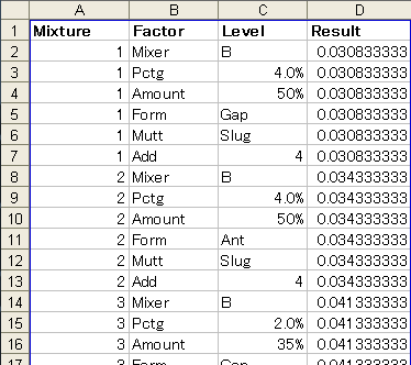
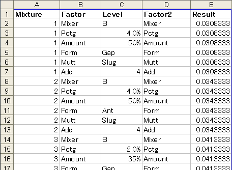
This is what the top section of the data looks like when normalized in this way. I’ve converted the range to a list for all the usual reasons.
Marginal Means Plots
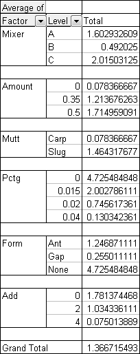
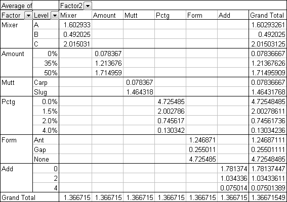
Instead of constructing a table of formulas to analyze the data, I can instead create a simple pivot table. The data area contains Average of Result, while Factor and Level are stacked in the rows area, with Level inside Factor. The empty rows come from checking the Empty Rows Between Items for the Factor field.
I could make a pivot chart, but I dislike pivot charts. The plot area cannot be resized, and the pivot fields and buttons clutter them up.
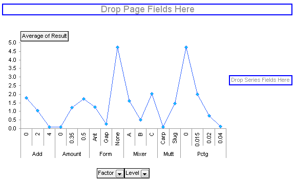
You can hide the fields and buttons, but you still have limited formatting capability. What’s worse, the blank spaces in the data range are ignored by the pivot chart, so points for one factor are connected to points from the next factor.
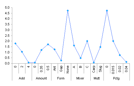
Instead I’ll make a regular chart.
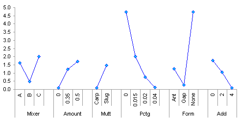
This is almost like the first chart from the previous article, except that the factor names aren’t centered under the factor values. This is fixed by changing the layout a bit, by showing data in the Factor field in outline form, not table form, and retaining the space after each item.

Now the labels are centered. The chart based on a grid of formulas has less space between groups of labels, but we’ll accept this in exchange for how easy pivot tables make our work.
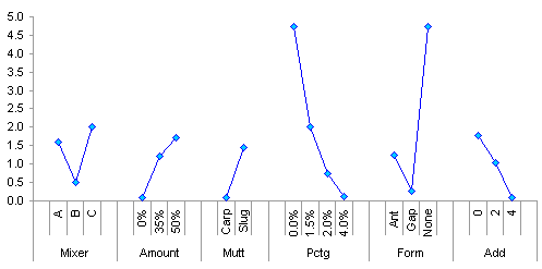
The second set of formulas in the previous example allowed for separate series for each factor. To get this with a pivot table, we need a duplicate Factor field. When added to the list containing the data, Excel renames it Factor2.
Now we place Factor2 in the columns area, and this splits the table into six columns, one for each factor.
These six columns become six separately formatted series in the chart.
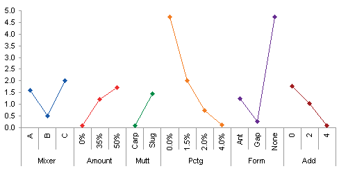
Interaction Plots
In order to work interactions into the pivot table, you need to reintroduce the original columns for the factors and their values. Since we’ve already changed the table so that one observation requires six rows, we need to add six times the original data. If someone knows more about pivots than I do. please explain to me how to do this without using scads of data.

Anyway, here is a pivot table, one of the six needed to display all of the interactions. You can only neatly show one separate factor in the columns area. It’ easy enough to change the pivot table, of course: drag one factor off the table and drag another on.

Here’s pivot table two of six. Pivot tables three through six are not shown here.

An interaction plot can be built from each of these pivot tables. These are essentially the same as those in the earlier analysis, and the same conclusions can be drawn from them.


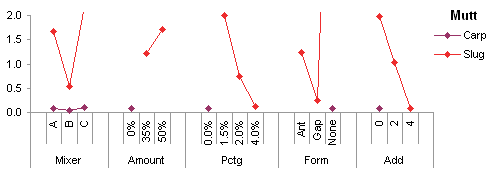


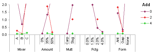
Even though some data preparation was required, and for some of the analysis a lot of data had to be duplicated, but creating an analysis using pivot tables can be easier, faster, and much more interactive than one using formulas.
The Data
If anyone would like to use this data and try to add to this preliminary analysis, the data is available in the following two CSV files: Table1.csv and Table2.csv.
For more about pivot tables, check out these pages on my web site:
- Pivot Tables and Pivot Charts
– Contributed by fellow Excel MVP Debra Dalgleish. Check out Debra’s Excel Tips page
– Introduction to Pivot Tables in Excel
– Working with Pivot Charts in Excel
– Pivot Table Programming
– Pivot Table and Pivot Chart Links - Making Regular Charts from Pivot Tables (TechTrax Article)
- Pivot Table Articles on the Peltier Tech Blog
– Explore Your Data With Pivot Tables
– Preliminary Data Exploration with Excel Pivot Tables
– Making Regular Charts from Pivot Tables
– Update Regular Chart when Pivot Table Updates
– Using Pivot Table Data for a Chart with a Dual Category Axis
– Grouping by Date in a Pivot Table
– Referencing Pivot Table Ranges in VBA
– Copy a Pivot Table and Pivot Chart and Link to New Data
– Pivot Table Conditional Formatting with VBA
– Dynamic Chart using Pivot Table and Range Names
– Dynamic Chart using Pivot Table and VBA - Books on Excel Pivot Tables
– Excel Pivot Tables Recipe Book: A Problem-Solution Approach by Debra Dalgleish
– Beginning PivotTables in Excel 2007: From Novice to Professional by Debra Dalgleish
– Pivot Table Data Crunching by Bill Jelen and Michael Alexander
– Pivot Table Data Crunching for Microsoft Office Excel 2007 by Bill Jelen and Michael Alexander


Mathias says
Good post, which provided me with a moment of enlightenment, even if it’s on a trivial point. I had to generate charts displaying the impact of multiple factors, broken down by level, on a metric of interest, and I never thought of inserting a blank row between the factors, to “disconnect” the chart between factors. I was never happy with my chart, and this is a great solution.
Is there any way to achieve the same disconnectedness without inserting blank rows, besides creating one series for each attribute?
Mathias
Jon Peltier says
Mathias –
You can format a series point-by-point. This allows you to format certain points not to have the connecting line. Very tedious, and when the pivot table refreshes, you risk losing and having to reproduce this formatting.
Mathias says
Jon,
Thank you for the reply. I have to agree with you, removing the line by hand for individual points is tedious – and to automate the process through VBA, I would have to add some convention to the input data, which is brittle and doesn’t seem much of an improvement over simply inserting rows!
As an aside, this made me realize how the line chart was constructed, object-wise, with every point “owning” the line that connects it to the previous point, the first point having no line (but the UI to edit the parameters of that phantom line :) ).