A few well-designed charts, based on carefully manipulated data, can bring a lot of understanding to a set of data. This is an example taken from a manufacturing facility; the data has been obfuscated to protect any trade secrets, but then, I’ve been out of manufacturing for over five years.
The data consists of 71 mixtures; here is a subset of the data. There are six factors, each with multiple levels, and one result from each. For this process, it is desirable to have as small a result value as possible. Like most industrial experiments, this one has a large matrix, and it is only partially filled in. Perhaps the missing data represents such poor performance that the mixtures were discarded without being analyzed. Perhaps the experimental project ran out of time, or materials, or budget. The missing data makes it difficult to perform your typical statistical analysis, but we can borrow statistical methods and still gain some valuable insight.
In this example, we’ll look at Marginal Means plots and Interaction Plots.

Marginal Means Plots
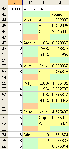
Here is a simple looking table used to calculate marginal means, which are the means for each level of a factor, averaged over all levels of all other factors. For example, of all the mixtures, the average for all mixtures that involve Mixer A is 1.603. As described, this is not a statistically rigorous marginal means analysis because of the unfilled nodes in the experimental design matrix. Regardless, it can provide useful insights into the manufacturing process.
The shaded cells will be used as the source data of a marginal means plot. Green shaded cells must be empty. Tan cells should contain a space character, which doesn’t show but makes the category axis labels line up. Yellow cells are the rest of the source data.
The formula in cell M44, shown below, is copied into the non-blank cells in M44:M66.
=SUMIF(OFFSET($A$2:$A$72,0,$J44),$L44,$H$2:$H$72)/
COUNTIF(OFFSET($A$2:$A$72,0,$J44),$L44)
A2:A72 is the first column of data, showing the mixture number. Here’s how it works:
- Offset finds the column for the given factor, which is offset from A2:A72 (the mixture number column) by the value in column J. The Mixer data is one column right of the Mixture Numbers.
- Sumif compares this factor column to the appropriate factor level in column L, and if it matches, includes in the total the value in the results column, H2:H72.
- Countif makes the same comparison, but only counts one for each match, without adding the results value.
- Sumif divided by Countif produces the average.

A line chart is produced from the shaded cells. The empty cells (green) provide the gaps between the connected points of each factor.
 .
.
A marginal means plot resembles a Main Effects Plot
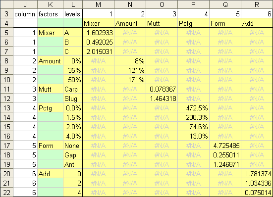
An alternative arrangement of worksheet formulas produces one column of calculations per factor, and therefore one series per factor, allowing for easy formatting of different factor averages. The color scheme is the same as above: shaded cells are the chart’s source data range, and green cells must be empty. I’ve used conditional formatting to de-emphasize but not completely hide the #N/A values.
The formula in cell m5, which is copied into the entire range M5:R22, is
=IF($J5=M$3,SUMIF(OFFSET($A$2:$A$72,0,$J5),$L5,$H$2:$H$72)/
COUNTIF(OFFSET($A$2:$A$72,0,$J5),$L5),NA())
The Sumif and Countif are the same as above, but the calculation is only performed if the index in column J matches the number in row 3. Otherwise the formula returns NA(), or #N/A, which will not be plotted in our line chart. The resulting table has values along the diagonal.

The shaded area is used to create an alternate marginal means plot. No breaks in the line is needed, because the breaks already occur between different series.

What does the marginal means plot tell us? Recalling that smaller result values are better, we see that Mixer B produces the best results, higher values of Amount are bad. Carp beats Slug, results improve steadily as Pctg values increase, as are larger Add values. The Gap form is a bit better than Ant, and both are far superior to None.
This is a good first cut of the data. We can eliminate None in the Form factor and lower Pctg values. But the plant manager needs to evaluate the data more closely, because he has two nonnegotiable constraints:
- The result must be less than 1, and preferably less than 0.5.
- An acceptable result must be achieved using any of the Mixers.
Interaction Plots
We now need to look at interactions between the different factors. As with the marginal means analysis, missing values in the experimental matrix make a rigorous statistical analysis impossible. But we can still gain insights from such an analysis.
The interactions table is pretty complicated. The color scheme is the same: shaded indicates chart data, green are cells that have to remain empty, and tan should contain a space character.
Whereas our extended marginal means table had data on the diagonal, the interactions table has no plottable data along the diagonals, because the interaction of a factor with itself in undefined.
The formula in W6, which is copied into all of the non-blank cells of the table, is
=IF($T6=W$3,NA(),
IF(SUMPRODUCT(--(OFFSET($A$2:$A$72,0,$T6)=$V6),--(OFFSET($A$2:$A$72,0,W$3)=W$5))=0,NA(),
SUMPRODUCT(--(OFFSET($A$2:$A$72,0,$T6)=$V6),--(OFFSET($A$2:$A$72,0,W$3)=W$5),$H$2:$H$72)/
SUMPRODUCT(--(OFFSET($A$2:$A$72,0,$T6)=$V6),--(OFFSET($A$2:$A$72,0,W$3)=W$5))))
Here’s how the formula works:
- If the index in column T matches that in row 3, it returns a non-plotting #N/A error.
- The first Sumproduct counts how many mixtures match the indicated level of one factor with that of another factor. If this value is zero, we return the #N/A error. Otherwise we’d get a #DIV/0! error, which plots as if it were a zero value.
- The second Sumproduct adds up the results values for each mixture that is counted in the first Sumproduct.
- The third Sumproduct is the same as the first, and it counts the matching mixtures.
- The results total divided by the number of results is the average.

We could plot this entire table, but the chart would be crowded and impossible to decipher.

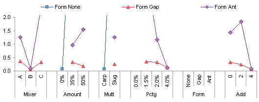
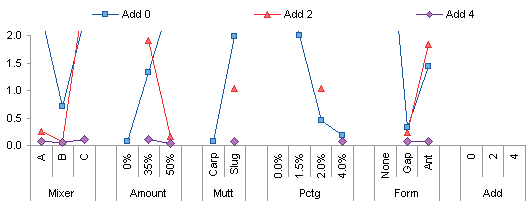
It makes more sense to break this into six different plots, one per factor.
Looking at the first one gives insight into what factor levels would produce acceptable results for all mixers. 0% Amount, Carp, 4.0% Pctg, Gap or Ant (but probably Ant), and Add 2 or 4 (probably 4). Follow-up mixtures should be evaluated to test these conditions and to determine how tight the limits should be. For example , can we get away with Add of 1, especially if this is an expensive Add. Or, can we really use either Gap or Ant Form, since having a choice provides flexibility in the process.

The other interaction plots support the observations made above.
The next two plots give rise to another observation. When Amount is 0%, Mult is Carp. When Amount is 35% or 50%, Mult is Slug. The plant manager confirms that Slug is added to pure Carp to bring the amount from 0% to 35% and 50%. This means we can remove the factor Mult from the analysis to clean things up a bit.


If we pore over the other interaction plots we may come up with additional simplifications, or perhaps other higher-order interactions to investigate.


Summary
There are a large number of standardized statistical methods which can help us gain insight into the important processes around us. Even if we lack the required data for a rigorous statistical treatment, we can still make useful observations using these methods. And we often find that, instead of answering questions, such analyses merely show us what other questions we should ask.
Follow Up
In Preliminary Data Exploration with Excel Pivot Tables I show how to carry out this analysis using pivot tables and a somewhat tweaked data source, rather than cumbersome formulas.


Colin Banfield says
Very interesting analysis. A pity that the original source data wasn’t in a normalized table form instead of the cross-tab form shown. Then it would be a simple matter of creating a PivotTable with the appropriate aggregation. From this you could then use a PivotChart (or a series of PivotCharts as the case may be).
BCC says
Good stuff. Any chance that you could post the source data? I’d like to take a shot at a couple other methods, to compare and contrast.
Jon Peltier says
Colin –
I thought of the data arrangement, and was starting to rearrange it, when I decided it was late and I needed sleep. It would be a great follow up topic, wouldn’t it?
Jon Peltier says
I will consider posting the data. I have to make sure it’s sufficiently sanitized. Following Colin’s suggestion, I’ll post it in this format and after normalizing it.
Colin Banfield says
Jon, sounds good. I mention the use of PivotCharts, but I have to admit that I find PivotCharts to be one of most brain-dead, worst implemented features in Excel. I’ve always had issues with PivotCharts for anything but the simplest PivotTable structures. However, I never figured out their real limitations until I connected two things: 1) A demo of Tableau’s software and your article on panel charts:
https://peltiertech.com/Excel/ChartsHowTo/PanelChart1.html
When I got to the section of the article titled “Panel Chart (almost)” then it struck me. Although the PivotChart was designed to chart PivotTable data, in fact it has no knowledge of the underlying PivotTable structure (unlike Tableau). Therefore, if the PivotTable has more than one dimension (which is of course very common), you end up with nonsensical charts like the line chart shown in your article. The PivotChart should be able to understand the multiple item levels in the PivotTable and create individual charts automatically. If it were capable of doing so, it would be one heck of a visual analytical tool.
Anyway, with two row dimensions, the technique you describe elsewhere (i.e. making a copy of the outer dimension(s) as another field in the source data and using that field(s) in the column area of the PivotTable), works well to create the separation shown in the first couple of charts in your post here. However, start adding additional dimensions (row or column area) and you end up with the kind of mess as shown in you crowded chart.
Having had to do something similar to what you’ve done here (but with sales data broken down by product, region & date), I ended up creating multiple copies of the PivotTable data so that I could filter each table (and thus chart) by the data I wanted to isolate on individual charts. The resulting charts were then stacked on each other. Although the result looked good, the process was ugly. At least I didn’t have to create formulas.
Sorry ’bout this long-winded response :)
Oh, by the way, I have to say that the using the duplicate field technique in a PivotTable allows one to create cycle plots quite easily.
DaleW says
Jon, clearly an heroic effort, which would be more readily rewarded if you had the luxury of a full factorial design and thus could end up with a real and reasonably robust main effects plot instead of just marginal means.
Much of your dataset meets plant requirements (Response<0.5), with at least 20% of Responses wonderfully between 0 and 0.06, but you have several outliers over 2. This is a rough dataset to interpret by subgroup means (marginal or binary interaction), because any unfortunate combination with other factors is likely to perturb such a mean, and it may not be fair to hold the factor or factor pair of interest responsible.
This dataset would be a great opportunity to use your box plots and other methods from Tukey’s Exploratory Data Analysis (EDA) approach to visualize the scatter of your data. With a good statistics package, one could create a scatterplot matrix from your raw Excel data in minute or so, and we could see not just the averages but all 71 points scattered for every individual or pairwise combination of factors. If you can figure out a way to turn a raw dataset with arbitrary N factors and 1 response into such a matrix plot using just a general tool like native Excel, I would be impressed. (But I’d still recommend turning to the specialist — a real stat package — when the plant manager gets around to asking an engineer to use the dataset to quickly fix any problems.)
Jon Peltier says
Dale –
All true. And speaking as a former plant engineer, the plant manager is not likely to provide for such a fancy package, and unfortunately in many cases, not likely to care. This data was generated and analyzed by a more forward-looking facility, and still Excel is the tool of choice.
Jon Peltier says
Yes, pivot charts are pretty dumb. As great as pivot tables are, that’s how lame pivot charts are. I generally make regular charts from pivot tables, which I learned to do in Excel 97 (pivot charts were introduced in 2000) and never forgot. I describe the use of regular charts to display pivot data in Making Regular Charts from Pivot Tables and Regular Charts from Pivot Tables, and numerous follow up posts.