Cynthia makes a mean cranberry-apple pie, and also a black bottom pie featuring a chocolate cookie crust, layers of chocolate and eggnog flavored pudding, and whipped cream. So you could accurately say that Peltier Loves Pie. But not pie charts.
There has been a lot of discussion about pie charts and bar charts lately. See for example
- The three laws of great graphs, by Seth Grodin
- Seth’s Three Laws of Great Graphs, this blog
- Bar graphs vs. Pie charts, follow-up by Seth Grodin
- Bar graphs vs. Pie charts, follow-up on this blog
- Peltier Loves Pie, on Daily Dose of Excel
Over the past few years there have been a lot of other discussions about pie charts, mostly advising against their use.
- Ask E.T. – Pie Charts (forum), hosted by Edward Tufte
- Save the Pies for Dessert (pdf), by Stephen Few, Perceptual Edge
- Piecharts are for middle management (scroll down one screen), by Coda Hale
- Warning against using piecharts, by Bernhard Reiter
- Learned Bad Ideas, by Jamuraa, Base Zero
- Pie Charts Must Die. Mmmmm. Pie. by Eric G. Myers
- The Problem with Pie Charts, by Zach Gemignani, Juice Analytics
- Wikipedia (warning against pie chart usage)
- Pie Charts, Writing for Change – Effective Writing, Fahamu.org
This would be a good time to give some guidelines for using pie and bar charts. With the esteemed commentary cited above, maybe I should give guidelines for using bar charts and not using pie charts. But first, an anecdote describing my favorite pie chart ever.
This took place nearly 20 years ago. My metals research group was having our monthly staff meeting, amid rumors of impending layoffs in the company. My colleague Mike started his presentation with a table similar to this showing how he divided his time among various activities during the preceding month:

Then he put up his chart:
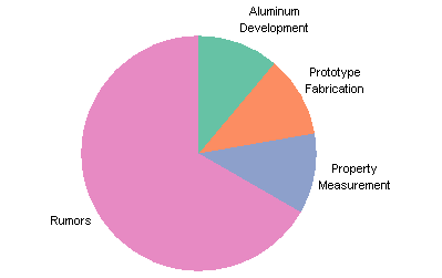
The mismatch between Mike’s chart and his table relieved the tension we all had been feeling for days. Unlike most pie charts, this one was intended to be laughed at.
Pie Charts
Pie charts are ubiquitous, and people have the false impression that pie charts are an effective means of conveying numerical information. Research shows that they are not. According to William Cleveland, the effectiveness of different human visualization skills are ranked as follows:
- Position along a common scale
- Position along identical unaligned scales
- Length
- Angle or slope
- Area
- Volumn
- Color
A pie chart relies upon angle (4th in the list) or area (5th). A pie chart also needs different colors for each point, so there may be some unintended weighting of values by color; some colors may be bolder than others, or there may be connotations related to certain colors (e.g., green = good, red = bad).
Guidelines for Pie Charts
- Avoid pie charts. Especially avoid pie charts for a technically and numerically literate audience. Usually a bar chart is an effective substitute.
If you disregard the above guideline, you’ll probably disregard the rest, but for what it’s worth, here they are: - Use data labels on the segments rather than a legend.
- Limit pie charts to no more than about 5 segments.
- Sort segments in descending (or ascending) order by numerical value.
- Use 2D pie charts only.
- Don’t use shadows, fill gradients, glows, or other distracting effects.
- Don’t use multiple pie charts for multiple sets of data.
Example Pie Charts
These examples are provided as much to show the limitations of pie charts as to show how to use them. After all, my first guideline clearly states “Avoid pie charts”, and many experts have weighed in against their use. Below you will see the problem with using a legend, you will see clutter and illegibility when using too much data, and you will see why pies are not good for multiple series of data. In Pie Chart Rounding in Excel I showed a problem in how Excel rounds percentages in pie chart labels.
This is a simple pie chart. Having a separate legend forces the reader to move his eyes back and forth to learn which segment corresponds to which category.
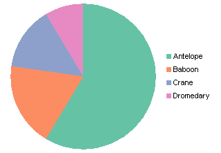
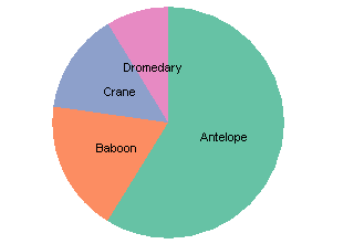
Applying data labels to the segments reduces the amount of time needed for the user to understand which segment corresponds to which category. Here the “Center” label position is used. If I cared more (hey, it’s only a pie chart), I’d move the “Dromedary” label up a bit higher.
Data has been added to the chart, increasing the number of data points (segments) from four to seven. The labels overlapped badly in the “Center” position, so they were moved to the “Inside End” position, and they are still effective in identifying the segments. However, the labels are getting crowded; we’ve exceeded the maximum recommended points per pie chart, and the label crowding should be a strong hint that we’ve gone beyond the usefulness of a pie chart.
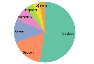
Even more data has been added to the chart, bringing the total to eleven segments. The labels have been moved to the “Best Fit” position, and they don’t fit all that well. Between the first half of “Giraffe” and the end of “Kangaroo”, there is a jumble of overlapping words.
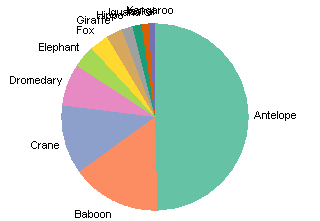
The labels can be manually repositioned, and if they are moved far enough (and if the setting is checked), Excel draws leader lines from the pie wedge to the label. This sounds like a good idea, but it still results in a cluttered chart. In any case, with so many smaller wedges, it is difficult to judge relative values, and if the data weren’t sorted such a judgment would be impossible. Notice that the pie has shrunk to allow room for the labels, further reducing resolution.
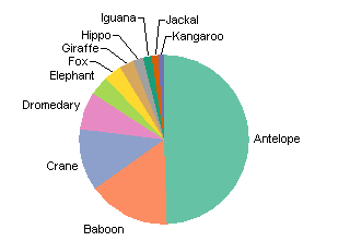
Some of the problems with the cluttered and shrunken pie chart above can be alleviated by removing the labels and adding a legend. We’ve lost clutter, but imposed extra eye motion on the reader to correlate category to pie slice.
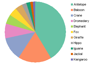
Edit 21 November 2008 – I don’t know why I left this chart out of the mix: the famous 3D Pie Chart. It was in the workbook I used to cook up all of these other pies.

For fun, read my post on 3D Pie Charts
What happens if we want to show two sets of data, for example, last year’s and this year’s numbers? We could show two pie charts:
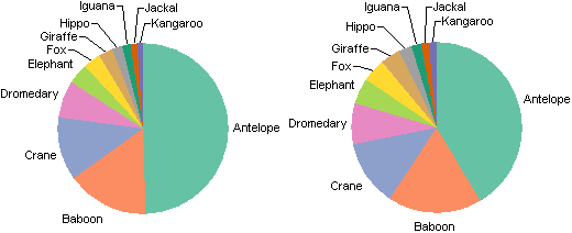
But the varying orientations of the points make it hard to compare values between pies. We could switch to a donut chart:
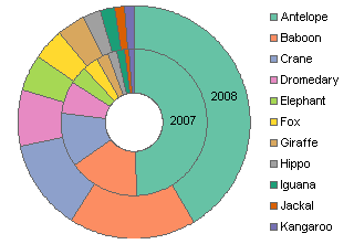
The different areas of the inner and outer rings, and the misalignment of the inner and outer segments, make it hard to compare values. The legend separates the data from the annotation. Neither of these options makes sense for displaying multiple series of data. In fact, I presented a column chart alternative in Column Chart to Replace Multiple Pie Charts.
Bar Charts
Coming soon to a feed reader near you: Peltier Goes Bar Hopping, a set of guidelines for bar charts.


Andrew says
Peltier Goes Bar Hopping…hope I can join you next year Jon ;-)
Jenny says
Very good to know – pie graphs are out!