One of the mysteries of modern life is the order in which series appear in the legend of an Excel chart. People have been driven mad while attempting to reorganize legends in their charts. I’ve spent years working with Excel charts, and I’ve made some observations and generalizations about Excel chart legends. These are only valid for charts in Excel 2003 and earlier, as there seem to be some substantial differences in behavior introduced by Excel 2007.
Summary of Legend Entry Order Rules
Before presenting the rules for legend entry order, a couple of terms need to be defined:
Axis Group – An axis group is the collection of all series plotted on an axis. There is always a primary axis group in a chart, and sometimes a secondary axis group.
Chart Group – A chart group is the collection of all series of a given type within an axis group. For example, there may be a primary line type chart group, or a secondary column type chart group.
When you manually reorder series in a chart, the series available for you to reorder at any given time are all part of a single chart group. You won’t even see other series in the list.
Here are the rules for legend entry order, in vertically listed legends, for charts with horizontal category (X) axes and vertical (Y) axes. The rules are explained and illustrated in the article below.
- Series are listed according to chart type, in this order: Area, Column and Bar, Line, and XY.
- Within each chart type, primary axis series are listed first, followed by secondary axis series.
- Series within each chart group are listed according to plot order.
- If the first chart group listed represents stacked series, series within all chart groups are listed in reverse order.
Effect of Series Type on Order of Legend Entries
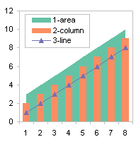
Series are listed according to chart type, regardless of their plot order. The order of chart types in the legend is area, then column or bar, then line, and finally XY. This matches the bottom-to-top stacking order of the series in the chart.
Here are two combination charts with the same chart types. The area series is listed first and the line series is listed last, regardless of the plot orders of the series (the number at the beginning of the legend entry label).

Effect of Axis on Order of Legend Entries
Series on the primary axis are listed before series on the secondary axis.
In the left hand chart below, the first two series are on the primary axis and the last two are on the secondary axis. In the right hand chart, this is reversed. In both cases, the primary axis series are listed first in the legend.
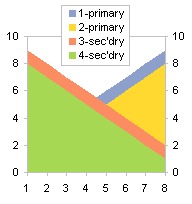

This relationship is true as long as all series are of the same chart type (e.g., all are area, column, or line chart series).
Effect of Series Type and Axis on Order of Legend Entries
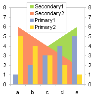
If the combination chart has series on both primary and secondary axes, the plot order is dictated first by chart type, then within each chart type by axis. A combination of series that share chart type and axis is called a chart group.
The area chart series in the charts below are listed first, whether they are plotted on the primary or secondary axis.

Order of Legend Entries in Stacked Charts
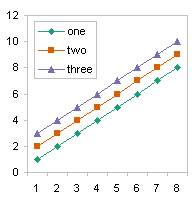
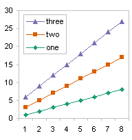
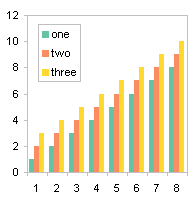
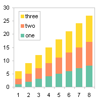
Generally series are listed in the legend in the order they are plotted. However, in vertically stacked charts (line, column, and area), if the legend lists the series vertically, the entries are reversed so they match the stacking order: series one on the botton, series two above series one, etc. In the following examples, the series are plotted in the order one, two, and three.
Here are unstacked and stacked line charts, with normal and reverse legend entry order.
Here are unstacked and stacked column charts.
Here are unstacked and stacked area charts.


In a bar chart, whether clustered or stacked, entries in a vertically aligned legend are listed in the same order as they appear in the chart. The alignment matches the order of the bars in the chart, even if the order of the bars is reversed by plotting an axis in the reverse order.
Effect of Stacking, Axis, and Chart Type on Legend Entry Order
The order of all series within a chart group is reversed if the first chart group listed in the legend is stacked.
In the case where all series types are the same on primary and secondary axes, what matters is the stacking of the primary axis series. Unstacked primary series 1 and 2 in the chart at left are listed first, so no series are listed in reverse order, even though secondary series 3 and 4 are stacked. Primary stacked series 3 and 4 are listed first in the chart at right, so primary axis series 3 and 4 are reversed, as are secondary axis series 1 and 2, even though secondary series 1 and 2 are not stacked.
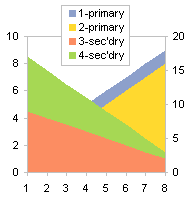

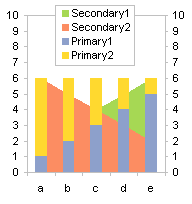
In the case where there are different chart types on primary and secondary axes, the behavior is dictated by the first chart group listed in the legend. In the chart at left, the secondary area series are stacked, so all chart groups (both the secondary area and primary column series) are listed in reverse order, regardless of whether the columns are stacked. In the chart at right, the secondary area series are unstacked, so no chart groups (neither secondary area nor primary column series) are listed in reverse order, even if the primary columns are stacked.

Unique Horizontal Bar Chart Legend Entry Ordering
Here are a clustered bar chart and a stacked bar chart, with series listed in the order they appear.


Here are a clustered bar chart with the category axis plotted in reverse order, and a stacked bar chart with thevalue axis plotted in reverse order. Again, the series are listed in the order that they appear in the chart.
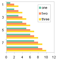
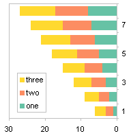
This reordering of a legend based on a reversal of the order of an axis only appears in a bar chart with a vertically aligned legend.


Gordon says
Brilliantly explained as usual Jon, thanks. Makes (almost) perfect sense now you’ve explained the ground rules, why can’t Microsoft document their own products to this degree?.
Andy Pope says
Hi Jon,
Are going to cover Trend lines in another article?
About 4 years ago I tried to create a addin that would allow users to select which items would appear or be hidden in the legend. But I gave up in the end as the combinations you have describe were just too convoluted to code and get reliable results.
Jon Peltier says
Yeah, trendlines mess up the legend, and I forgot about that. I think they (and error bars) also mess up the series indexes and the series sequence, but I don’t recall exactly how.
I’d like to see a simple property added to the Series object: AppearsInLegend. Even better, how about making the LegendEntry object a member of the Series class, then adding .Visible to the LegendEntry. Unfortunately for 2007, they removed more than they added to Excel charting. I do not have high hopes for improvements in Excel 14.
Andy Pope says
Either of those suggestions Jon would be a useful addition to the OM.
Jan Schultink says
Great research and explaining.
The order in which the automated Microsoft legend appears is one of the reason I usually create them manually in PowerPoint charts. A bit more work but 100% in my control.
Indigo says
What should I do with a combination chart (column and line) that does not seem to follow your rules? I have 6 legend entries, 3 are column and 3 are line. I cannot seem to sort the legend so that it comes up as:
— North Plan [ ] North Actual
– – South Plan [ ] South Actual
->- West Plan [ ] West Actual
No amount of fiddling I do with the series order will get it to line up nicely. All I get is:
— North Plan [ ] North Actual
– – South Plan [ ] South Actual
[ ] West Actual ->- West Plan
Jon Peltier says
Indigo –
When I make a chart such as you describe, I get three column series in the legend followed by three line series. When I set up the legend to show three rows and two columns of entries, the top two and the first in the middle row are column series. There’s no way to get the lines in one column of legend entries and the columns in the other. You could make a two-row legend, with all the column series in one row.
John Krumm says
Thanks for this informative post. It really helped me get a chart looking the way I wanted it to. My problem was that I wanted to show only a subset of the legend, so I need the ones I wanted to show near the top of the legend. I couldn’t do this because I had a secondary vertical axis, and one of the legends that I wanted near the top was on this axis. I ended up creating a small phantom series on the primary vertical axis with the legend entry that I wanted to show. This phantom series was tiny, in my case a really short line segment, but I gave it the right series name and line type to give the legend entry I wanted.. Now its entry is near the top of the legend like I want, but you can’t see the actual series on the chart. Problem solved.
Jon Peltier says
John –
Good job. Just because it doesn’t seem like Excel can do something, doesn’t mean you should stop trying to think of other ways to do it. I like your phrase “phantom series” better than the “dummy series” I’ve been using all along. I might have to adopt it as my own.
Marvin Woods says
Jon – You’ve got a great site, an excellent gift to the world. However, I’m afraid it won’t be long before I won’t be able to go to your site at work because my IT people will probably block it — Everytime I go to your site, your site meter trips my Trend Micro OfficeScan, which complains about the link to htpp://i.copygator.com/?cg=4a310, which it regards as a “malicious site” and duly notifies my IT department.
I don’t know if others are getting this as well, and I don’t know if there’s anything that you can do (or care to do) about it, but I thought you might like to know that it may prove to be a significant issue to some people (such as me).
Cheers
Jon Peltier says
Marvin –
That URL only links to an image file, so I’ve stored the image on my host server. If that messes up how copygator works, I’ll hose that altogether.
Mike Orton says
Great explanation, shame the Microsoft documentation didn’t cover this, but more of a shame that the programmers thought this was an acceptable solution – renders Excel Charting totally useless for my purposes!
Thanks again.
Peter Muwaswes says
Very informative.
Is there anyway either (direct or rigging) to change the order of legend entries displayed in legend key?
I have graph with actuals and forecast entries for 1st 3 months displayed from left to right then just forecast entries for next 8 months and would like to display legend key with actual legend entries on left and forecast on right to match graph display.
Any insight/direction you can provide on this would be greatly appreciated.
Thanks,
Pete
Peter Muwaswes says
Found a way using your related posts. Very helpful.
Pete
Jeff says
Pete: please provide a link or more details.
Jeff says
Found it — Here’s how to change the order of the data series:
Right click on the data series (the plot on the chart) and select “Format Data Series,” then click “Series Order.”
Bob says
Sorry if this has been covered, I didn’t read everything in detail…
I had several line charts (max, avg, min on the main/left vertical axis) and a bar chart (std dev on the secondary/right vertical axis) on the graph but somehow the bar chart ended up on top of the legend. This makes sense according to what is written above, where bar charts take precedence over line charts. However, if you change the bar chart to a line chart you can move it to where you want and then change it back to a bar chart, and the legend will look the way I wanted it, with the three line charts on top and the bar chart on the bottom.
I’m sure it’s unnecessarily tetchy and will reorder itself if and when I make some other change, but it’s good for now.
Jon Peltier says
Bob –
Thanks for confusing the issue,
I wrote up this tutorial based on what I’ve observed over many years in Excel 97 through 2003. There were consistent rules which were always followed. 2007 came along and broke some of these rules, usually when you least expected. Then 2010 fixed some rules and broke a few others.
Ian says
Hi Jon,
I am running excel 2010 and the file has a marco so it is an .xlsm but the marco is unrealated the chart details.
I have a graph which has 5 stacked areas on the main axis, 5 xy line-points on the secondary axis, and then another series of xy points on the secondary axis. I only want to have the stacked areas and the xy points on the legend as the xy line-points have their labels on the chart.
Following what you suggest around the rules I moved the xy point series to place 11 (this did not change the legend) but I saved it, closed and reopened and it came through correct, Awesome! I close the sheet and come back later to copy the graph into a report and it has reverted back to returning one of the xy line-points as the 6th category :( with the xy points still in position 11. I don’t know why this behaviour is happening, do you?
Jon Peltier says
I’ve seen inconsistencies in the order of legend entries between Excel 2003, 2007, and 2010. I haven’t used 2013 enough to find more, but I’m sure they exist.
website says
When I initially commented I clicked the “Notify me when new comments are added” checkbox and
now each time a comment is added I get three emails with the same comment.
Is there any way you can remove me from that service? Thanks!
Jon Peltier says
Your email does not appear in the list of subscribed comments for this or any post.
Tammy says
How do I change one letter of a word in a figure legend so that it can be a symbol? I have the correct writing of it, but it converts the symbol back to the regular letter and you can’t select just one letter to change font. I need to put TGFb1 with the b as a the symbol ‘beta”.
Jon Peltier says
Tammy –
Since you can’t select one character at a time for formatting, you need to hunt through the upper characters of your font for a suitable symbol. You may need to use another font that has a greater variety of these symbols. For example, there are fonts designed for chemists that incorporate superscripted and subscripted numerals, greek letters, and other technical symbols.
Rick says
Jon, this link explains how easy it is to change the order of entries in the legend:
http://excelribbon.tips.net/T013214_Adjusting_the_Order_of_Items_in_a_Chart_Legend.html
Garent says
Why does the name and legend index not correspond anymore when the looping order is reversed? i.e
Jon Peltier says
Garent –
It seems incredible, but there is no direct linkage between a series and the corresponding legend entry.
If you loop upwards (1 to N), if you delete the first legend entry (“Series1”), then the second entry (“Series2”) is now the first, and so on. If you run the second bit of code on a chart with five series, you’ll end up with Series2 and Series4 in the legend, even though you may have thought you were keeping Series4 and Series5.
Jakob Kanis says
When I entered three trendlines on my 3-columns per month XY graph for 8 months it changed my 3 -part Legend Series into one. A Problem. How to solve that?
Jon Peltier says
Jakob –
Could you upload your workbook to a file-sharing site, so I can see with my own eyes what you are experiencing?