A common question in online forums is “How can I show multiple series in one Excel chart?” It’s really not too hard to do, but for someone unfamiliar with charts in Excel, it isn’t totally obvious. I’m going to show a couple ways to handle this. I’ll show how to add series to XY scatter charts first, then how to add data to line and other chart types; the process is similar but the effects are different.
Displaying Multiple Series in One Excel Chart
Displaying Multiple Series in an XY Scatter Chart
Single Block of Data
This is a trivial case, and probably not what people are asking about. But I’ll cover it just for completeness.
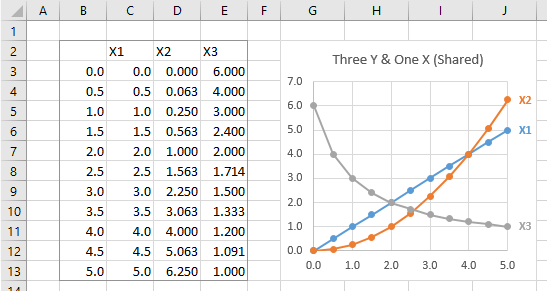
If I have a single block of data, I can select the block of data, or just a single cell within it, and Excel will build a chart using all of the data. The first column (if series are plotted by column) is used for X values, the rest of the columns become the Y values, and the first row is used for series names.
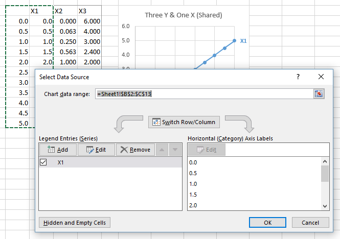
Select Series Data: If I somehow have a chart that uses only part of the data, I can right click on the chart and choose Select Data, or I can click Select Data on the ribbon, and the Select Data Source dialog pops up. I can then edit the Chart Data Range, either by manually editing the address, or by selecting a different range, to update the chart.
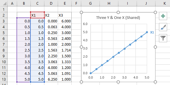
Highlighted Chart Data: But it’s even easier to do without the dialog. If I select the chart, I can see the chart’s data highlighted in the worksheet.
I can click on any of the handles on the corners of the highlighted ranges to stretch the amount of data used in the chart.
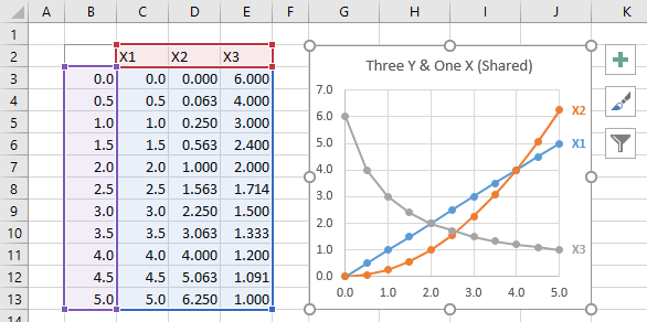
Easy peasy, right? I’ve written about this simple yet powerful technique for controlling chart data in Chart Source Data Highlighting, Chart Series Data Highlighting, and Highlighted Chart Source Data.
Note: The default Excel chart has a legend, and I’ve replaced it with color-coded data labels on the last point of each series in the chart. When new series are added, they would also be listed in the legend. In my sample charts above, I had to add the data label every time I added a new series. What a pain, you say? Not really. In Peltier Tech Charts for Excel, one of the most used features adds a label to the last point of a selected series, or the last point of every series in one or more selected charts. A relates feature matches the label color to the plotted series.
Multiple Blocks of Data
It’s not as easy to manipulate your chart’s data when the data resides in separate blocks of data, such as this:

You have to start by selecting one of the blocks of data and creating the chart.
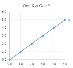
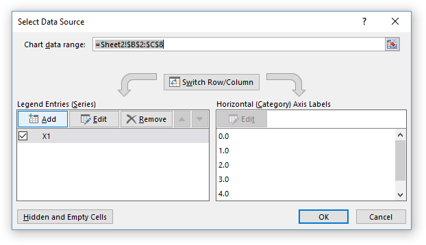
Select Series Data: Right click the chart and choose Select Data, or click on Select Data in the ribbon, to bring up the Select Data Source dialog. You can’t edit the Chart Data Range to include multiple blocks of data. However, you can add data by clicking the Add button above the list of series (which includes just the first series).
The Select Data Source dialog disappears, while a smaller Edit Series dialog pops up, with spaces for series name, X values, and Y values.
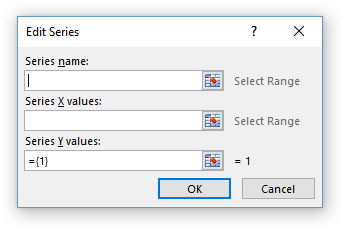
Select ranges for each of these…
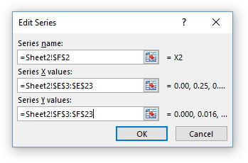
… then click OK and the new data appears as a new series in the list.
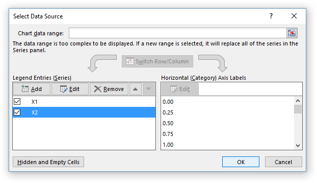
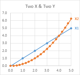
The chart now has two series. Note that in an XY Scatter chart, each series can have its own X values, independent of the other series in the chart.
Repeat as needed to fully populate the chart.
Not too bad, but I’m not a huge fan of the Select Data Source dialog. It just seems like too much work. And like the expansion of data within a single range that I started this article with, there’s a faster and easier way to add data to a chart from different ranges.
Copy – Paste Special: Select and copy the data you want to add to the chart, then select the chart, and from the Home tab of the ribbon, click the Paste dropdown, and select Paste Special. You will be greeted with the Paste Special dialog.
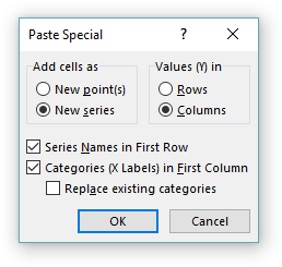
Make sure that the settings in the dialog are correct: Values (Y) in rows or columns, series names in first row, categories (X labels) in first column.
The Replace Existing Categories setting would replace existing X values with those being pasted, which makes little sense for an XY chart that already has X values defined. We’ll talk about this setting when we discuss Line charts. For XY Scatter charts, I never ever check this box.
Click OK and the chart has a new series.

Copy the next range, select the chart, Paste Special.
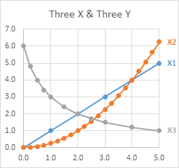
Again, in an XY Scatter chart, each series can have its own X values, plotted along the same X axis scale, independent of the other series in the chart.
This is pretty easy. It’s even easier to use Paste instead of Paste Special, but sometimes Excel guesses incorrectly on those row/column, first row, first column settings, and you’ll have to undo the Paste and do Paste Special.
Displaying Multiple Series in a Line (Column/Area/Bar) Chart
I’m using Line charts here, but the behavior of the X axis is the same in Column and Area charts, and in Bar charts, but you have to remember that the Bar chart’s X axis is the vertical axis, and it starts at the bottom and extends upwards.
Single Block of Data
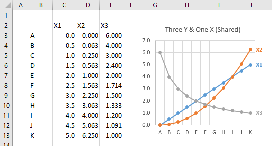
When your data is in a single block, a Line chart works just like the XY scatter chart. The first column (if the series data is plotted in columns) is used as X values, or more accurately, X labels; the rest of the columns are used as Y values. The first row is used for series names.
Multiple Blocks of Data
When there are multiple blocks of data, Line charts still work mostly the same as XY Scatter charts. Let’s look at this simple data.
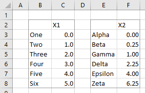
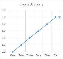
Start by creating a Line chart from the first block of data.
Select Series Data: Right click the chart and choose Select Data from the pop-up menu, or click Select Data on the ribbon.
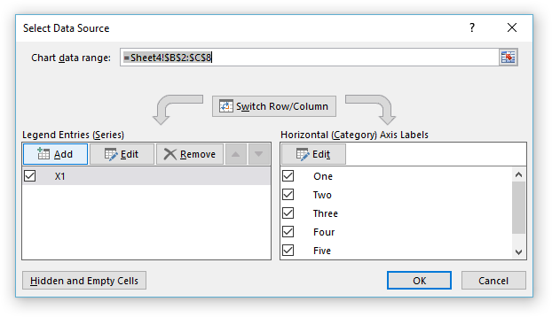
As before, click Add, and the Edit Series dialog pops up. There are spaces for series name and Y values.
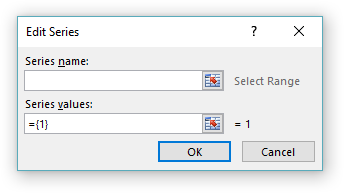
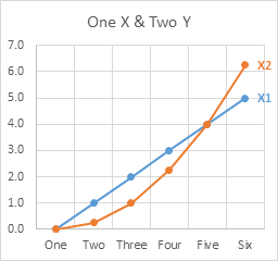
Fill in entries for series name and Y values, and the chart shows two series. The original X labels remain on the chart.
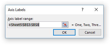
This dialog differs from the one seen when adding data to an XY Scatter chart, because there is no place for X values (or X labels). To change the X labels, click the Edit button above the list of X labels in the chart. The Axis Labels dialog appears.
The reason for this is that Line charts (plus Column, Area, and Bar charts) treat X values differently than XY Scatter charts. XY Scatter charts treat X values as numerical values, and each series can have its own independent X values. Line charts and their ilk treat X values as non-numeric labels, and all series in the chart use the same X labels.
Change the range in the Axis Labels dialog, and all series in the chart now use the new X labels.
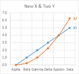
The differences between Line and XY Scatter charts can be confusing. What is important is that the data can be formatted the same (markers or no markers, lines or no lines), while the X values are treated differently (numerical values in XY Scatter charts, non-numeric labels in Line charts).
Copy – Paste Special: As in XY Scatter charts, adding data to Line charts can be faster and easier with Copy and Paste Special than with the Select Data dialog.

Check the settings in the dialo: Values (Y) in rows or columns, series names in first row, categories (X labels) in first column. If Replace Existing Categories is unchecked, the original X labels will remain in the chart. Click OK to update the chart.

Although both series are plotted against the original X labels, if we examine the series formulas, we see that the original series formula contains the original X labels range ($B$3:$B$8), while the new series formula references the new range ($E$3:$E$8).
=SERIES(Sheet4!$C$2,Sheet4!$B$3:$B$8,Sheet4!$C$3:$C$8,1) =SERIES(Sheet4!$F$2,Sheet4!$E$3:$E$8,Sheet4!$F$3:$F$8,2)The X labels specified in the first series formula is what Excel uses for the chart. If we had selected only the new Y values, ignoring any new X values, and kept Categories in First Column unchecked, both series formulas would reference the same X label range.
Here is what happens when we check Replace Existing Categories.

When we click OK to update the chart, the new X labels appear along the axis. In addition, both series formulas include the new X label range.

This usually isn’t what I want, so I almost never check Replace Existing Categories for any chart type.
The behavior even becomes stranger when we use mismatched data ranges. The second range below has many more rows than the first.

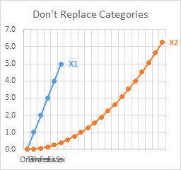
Here is the chart if we paste special with Replace Existing Categories unchecked. Both series use the same X labels, so the axis has enough spaces for the longest series. Since the first labels are being used, these fill the first part of the axis, overlapping excessively, while the rest of the axis remains unlabeled. The first series is pushed to the left of the chart along with the axis labels, since it only uses a fraction of the X axis labels.
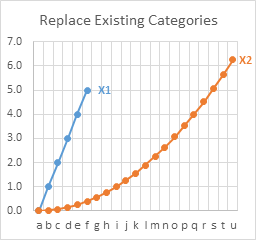
Here is the same chart if we paste special with Replace Existing Categories checked. Both series use the new X labels, which fill the entire length of the axis, and they don’t overlap excessively since I wisely used one-character labels. The first series is again pushed to the left of the chart, since it has many fewer points than the second series.
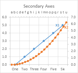
You can assign one series to the primary axis and the other to the secondary axis, and each axis will be long enough for its labels. Below, the first series is plotted on the primary axis (bottom and left edges of the chart), while the second series is plotted on the secondary axis (top and right edges).
It is easier to assign the new series to the secondary axis because I kept the Replace Existing Categories unchecked. This kept the new X label range in the series formula even though the series was initially plotted against the original labels. When I switched the series to the secondary axis, it used the new X labels from the series formula. If I had used Replace Existing Categories, the original categories would have been removed from the original series formula, and I would have had to restore them.
I oversimplified when I stated earlier that all series in a Line (Column, Area, Bar) chart use the same X labels. It’s more accurate to say that all primary axis series in a Line chart use the primary axis labels, while all secondary axis series use the secondary axis labels.
You can try to do a little rescaling of axes to make the chart look better. Here I set the same maximum and minimum values for primary and secondary Y axes. I also formatted the Axis Position to On Tick Marks for both primary and secondary X axes: “One” lines up with “a” and “Six” lines up with “u”, and fortunately there are the right number of categories that each category on the primary scale lines up with a category on the secondary scale (“Two” with “e”, “Three” with “i”, etc.). This alignment was a happy accident.
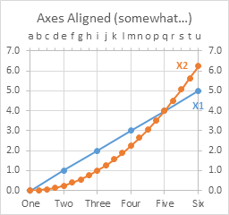
I hardly ever have a secondary X axis on a line chart, since there is usually no relationship between the two sets of labels, but our eye insists on seeing such a relationship. I’ve written about this confusion caused by Secondary Axes in Charts, even when applied in a well-meaning way.


ANDRE SOUZA ESPIRITO SANTO says
I Would like to have a “combination” chart, with bars and lines at the same time.
But, I don´t wanna show the X axis, is it possible ?
Thanks
Jon Peltier says
Andre –
Format the X axis so that it displays no labels and no tick marks, and so that it uses no line.
Carlos says
My Paste drop-down and Paste Special is not same, I have only three options in different windows showed.
Thanks
Jon Peltier says
Carlos –
What options do you see?
If you copy a range, then select the chart, then go to Home tab > Paste dropdown > Paste Special, you will see the dialog shown here.
Jeff Weir says
Great tutotial Jon. I didn’t know about the paste special option. Or perhaps I once did but it’s slipped though my ever widening mental cracks.
Alfred says
thanks for the great tutorial. I was wondering if there is a way to do the same thing but instead have the first column recognized as Y and second column as X. In other words, is it possible to switch the axes?
Thanks you.
Alfred
Jon Peltier says
Alfred –
This is not something that’s easy to do. In fact, the easiest way is probably to rearrange the data before adding it to the chart. You can manually edit the series formulas, and you can manually change selections in the Select Data dialog, and we all know that manual operations can be tedious and error prone. You could also write VBA code to change things up. I’ve written routines that create a chart from data that has a different arrangement than X-Y1-Y2-Y3 in successive columns, and routines that edit series formulas, and routines that switch X and Y in a chart.
hoho LEE says
Thank you for this cool guide.
One quick question, How did you manage to add only one thick series label on the rightmost spot? (X1, X2)
Jon Peltier says
Hoho –
You can select just the point (one click to select the whole series, another to select just one point) and add a data label. Then format the data label to show only the series name.
If you want a VBA solution, look at Label Each Series in a Chart, Label Last Point for Excel 2007, and Label Last Point – Updated Add-In. This function has become an important feature of my commercial Excel add-in, Peltier Tech Charts for Excel.
ahd says
How can I see three input boxes when adding a new series? I usually see two: the series name and the values
Jon Peltier says
If the series is an XY Scatter type, the Edit box contains three boxes: Series Name, Series X Values, and Series Y Values. If it’s any other type, the Edit box contains two boxes: Series Name and Series Values, and you need to click the other Edit button to edit the Axis Label Range.
Abdul says
In some real life data, the independent variable x is arbitrary as well as the dependent variable y. Checking the various tutorials and videos, it is almost always assumed that the x variable is uniformly incremented. How about plotting arbitrary x,y pairs?
Jon Peltier says
Abdul –
Most of the data I used here was uniformly spaced, except for the third series in the xy scatter example with three series each having unique x values. But any of these techniques will work with arbitrarily-spaced x values.
Jon Peltier says
Abdul –
Most of the data I used here was uniformly spaced, except for the third series in the xy scatter example with three series each having unique x values. But any of these techniques will work with arbitrarily-spaced x values.
Mike says
Hello – I would like to plot 2 set of values *every* day. So, temp readings for (AM) would be Open, High, Low, Close. Set 2 would also have identical variables for PM. How do I draw a line chart where each set is plotted separately. Also If I were to draw a line chart where values for Set 2 continue right after Set 1, identified by a different line color. ie. AM and PM were identified by different color, how would I do it? TIA
Jon Peltier says
Mike –
Do you want actual OHLC for both AM and PM in the same chart? Or do you just want to show one of the OHLC values for each of AM and PM? The first is much more complicated.
Mike says
Hi Jon – Thanks for responding. Ideally I would like to see OHLC for day time and night as a continuum. So, after open, the temps may drop first and then reach a high before close. Alternatively, temps may go high and then go low. My table will have open, Value 1 , value 2 (Value 1 could be high/low, ditto for value 2). and then close. for each set ( day and night).
Rust says
Hi Jon,
I d like to rearrange one of the series from secondary axis to primary. What i mean is I have 4 series in the chart and 2 of them belong to upper axis (secondary horizantal) and other 2 should (just 1 of them is primary for now) belong to lower axis (primary horizantal). However, if i change that one from series options, the line disappears. I hope you can help
Thanks
Jon Peltier says
Rust –
Generally, a series on the primary axis is plotted against the primary horizontal and vertical axes, and a series on the secondary axis is plotted against the secondary horizontal and vertical axes. If one of the primary or secondary axes is not present in the chart, a series will use the other axis. So in your chart, if there is only a primary vertical axis, all primary and secondary axis series will be plotted along that axis. But I suspect your chart may have all four axes, and the series you want to switch to primary has Y values that fit on the secondary axis but not on the primary axis. Yeah, it’s confusing.
If that’s not the situation, tell me more about the configurations of the data and chart, and I’ll try to help.
Rust says
Hi Jon,
Thanks for the reply and sorry for the delay. I didn’t expect to get an answer that soon. The situation was exactly like you said. As i understood from my research, there is no solution or option to arrange one axis to primary other axis to secondary of the same data. What i did to overcome is, I rearrange the range of one axis to other datas range, basically linearization.
Best regards
Arjun says
Can I add two or more lines in one graph of MS Excel on iPad pro?
Jon Peltier says
Arjun –
I don’t have an iPad, so I can’t test it. What I can test is Excel Online, which runs Excel in a browser window. I believe Excel Online is more advanced than other non-standard (standard being Windows or Mac) endpoints for Excel.
I can create a chart in Excel Online. If I use Select Data from the ribbon, I can only change the overall chart data, and I cannot even select the data, I have to type in the new address. I cannot change data series-by-series. I also can only create a chart if I have selected a contiguous range (a range with just one area).
So I will say that this cannot be done on an iPad.
As you are already aware, Excel on an iPad (as well as Excel on other mobile devices and tablets and Excel Online) has only a very small subset of the features of Excel for Mac and Windows (and in fact, Mac still lags behind Windows).
Jasmine says
Hi Just wanted to say thank you so much for this page, it is really useful.
Terry Husted says
Thanks for the instruction on how to add other data to one chart by using the “Paste Special” feature under the Home menu Paste section. I had no issues with older versions of Excel in having multiple lines on one chart, but this version was kicking my A$$. Thanks so much!
David Bird says
Regarding Jon Peltier’s response to Arjun on 10 Feb 2021 about the Excel online version:
The “Select Data” dialog seems to have very limited functionality (or does it?). As stated, you can’t drag to select a data range. You must type the range. However, I have been able to type multiple (noncontiguous) ranges with a comma separator. This avoids having to rearrange a sheet. Yea! (I have not found this comma feature documented anywhere.)
I was hoping to enter one or more SERIES() formulas in this text box. That would expose a lot of hidden functionality. Can it be done? Help!
Jon Peltier says
David –
My exchange with Arjun was a year and a half ago, and Excel Online has made numerous advances in charting. These advances serve to show how extensive desktop Excel’s charting capabilities are.
The Select Data dialog in Excel Online (shown below) is still very rudimentary and requires you to type in the data range address.
But you can drag the handles on the highlighted data range (the small squares on the corners) to resize the chart’s data range.
And while you can’t explicitly change the data ranges for each series, you can now enter a multi-area range in the Select Data dialog.
You can also select a multiple-area range, then insert the chart, and the chart will accept the selected range. I think when I replied to Arjun, you could not Ctrl-select a discontiguous range.