In this post I compare two styles of visualization, then ask my readers a question. One visualization is good at attracting viewers, but poor at actually getting its information across. The other visualization is very effective at displaying its information, but on its own will not capture a lot of attention. I ask my viewers how do we make visualizations that are good at getting attention, but at the same time show information without distortion and confusion.
Magazine Quality Visualization
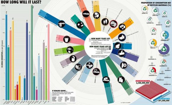
Nathan Yao of FlowingData has presented us with a chart from New Scientist which asks How Long Will the World’s Natural Resources Last? The graphic is a typical magazine infographic which uses nice colors and strange effects to try to get across a point.
The chart shows US annual consumption rates in a bar chart on the left, a star-shaped pattern in the center showing how long each will last at current and accelerated rates of consumption in the center, and ring-shaped pie charts showing how much of current consumption is satisfied by using recycled materials on the right.
The bar chart of consumption rates is not straightforward: it uses a log scale and thus has no zero baseline. The bars are narrow, which fortunately minimizes the 3D effect. I’m not sure what real purpose is served by this chart: it shows a single rate of depletion (US; the rest of the world is not shown) which has no context without some measure of existing reserves.
The recycling donuts not only show a proportion based on recycling, they also show something based on diameter or area of the donuts. They have replaced the confusion over whether diameter or area encodes a variable with confusion about what this variable even is. I don’t believe the 0% for recycling of platinum: when working in the laboratory, we saved all thermocouple wire and electrode foil and turned it in for credit at the lab supply office.
The central starburst is basically another bar chart with a logarithmic scale. The scale isn’t labeled; I only noticed it after a while, when I realized the unequally spaced concentric circles were more than mere decoration. There is no reason for the circular/radial pattern other than to take up more space with this information than necessary. As I’ve discussed in Spiraling Down the Drain, Replacement for an Oil Price Radial Chart, and Radar Charts are Ineffective, there is no need for circular charts, even if there is an underlying cyclic pattern to the data.
There seems to be a political message in this graphic about US consumption. The central chart shows two durations: one based on current world consumption rates, the other based on applying 50% of the US current consumption rate to the world’s population. It is certainly no easy chore to determine the relative consumption rates of the US and the rest of the world from the spokes. There also is a small inset chart showing the US population compared to the population of the rest of the world. It’s a common rant that such a small fraction of the world’s population has no right to consume resources at a greater rate than everyone else.
Some readers of Nathan’s post pointed out that these predictions by nature are never very accurate, since technologies change, leading to increased r reduced demand for given materials, and new sources of rare materials are discovered, and known sources which are not economically infeasible may become feasible through increased market value or through advanced in extraction technology. Estimates of consumption and of reserves are also mere swags, and often misstated for political purposes.
Informative Visualization
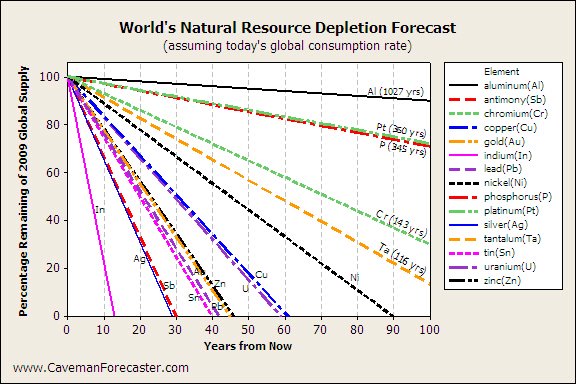
Matt the Caveman Forecaster wrote about this graphic in World’s Natural Resource Depletion Forecast Graphic. He did not care for the radial chart which is the focus of the infographic. Matt normalized the remaining reserves so today’s reserves are represented by 100%, and used a simple line chart to show when we will supposedly run out of each resource.

Matt saved me the trouble of making this chart, very nice of him. If I had made it, I would have made the chart a little larger, and probably closer to square. I’d have removed the legend, made the lines solid and less bold, and made the labels more distinct. But even if someone were to apply the gaudiest 2D formatting, it’s still easier to understand than the New Scientist original.
The Bottom Line
Information displays capture attention when they include colors and eye-catching features. The magazine version of this infographic effectively draws attention to itself: has plenty of color, and the starburst draws attention much as an asterisk in a printed page of text. Unfortunately trying to use the asterisk shape as part of the quantitative display has ultimately reduced its effectiveness at transferring data from the designer to the reader.
Information is most easily understood when simpler displays and chart types are used. When a display type—the radial chart—is invented for the purpose, and gratuitous unlabeled features—the logarithmic scale on the concentric circular gridlines—are added, comprehension is delayed or even prevented.
The dilemmaremains: how to attract attention effectively, then take advantage of this attention to effectively display a set of information? If you are simply trying to show some general trends or have your viewers take away some general impressions, then the requirements are less strict, and elaborate graphics may be sufficient. The Circos type illustrations Nathan shared with us in Visual Representation of Tabular Information – How to Fix the Uncommunicative Table is a nice example of this. You can onle read semi-quanitative information from it, but the circos patterns help you see relationships between items which would be more difficult to show through more conventional means.
The New Scientist visualization featured at the top of this post is less informative than confusing. The line chart described by Caveman Forecaster, and a bar chart showing comparative recycling rates, are so easy to comprehend but by themselves do not sparkle enough to attract the attention of disinterested passersby.
I’m not a graphical designer, so I have no tricks in my portfolio. How can comprehensible charts be made more likely to be read?


Naomi B. Robbins says
One way to catch attention without distorting the data is to frame the chart with an attention -getting graphic. Tufte mentioned this back in his 1983 Visual Display of Quantitative Information (see page 59). I recall a simple line chart in the NY Times about the baby Bell phone companies. The line chart was framed in a telephone that put the chart in context but the decorations did not interfere with the graph. Another suggestion that I made in Creating More Effective Graphs was to use pictures for labels. This doesn’t apply to all graphs but can be very effective for some labels.
I’m looking forward to hearing other suggestions Jon’s readers make.
Jon Peltier says
Hi Naomi –
Thanks for your suggestions. Framing a chart is reasonable, in fact, I hinted at it (a bit jokingly) in the last chart of my Bad Bar Chart Practices, or Send in the Clowns post.
Jorge Camoes says
Jon, I don’t know anything about tantalum or antimony and frankly I don’t care. So what, if the are depleted?
Now, what are you going to do to show me that I should care?
First, make it personal. Add my life span to the chart (and my sons’ and grandsons’). Then tell me what will be the impact on my lifestyle. Is this something that is used in my car, in my cellphone, in my clothes?
So, this is the rule: make the chart as informative as possible. Then make sure that the chart conveys a message the reader can relate to. Don’t target the eyes, target the brain and the heart.
Michael Pierce says
Interesting…beyond the flash of the radial chart, it’s almost the incomprehensible nature of the chart that grabs my attention–trying to understand what it means. But it probably only grabs my attention because I like charts; most other folks probably wouldn’t care enough to try.
I agree with Jorge. Although the revised chart is cleaner and I can easily devise which items are going to disappear first, I don’t know why I should care. It looks like Indium will disappear in my lifetime but I have no idea what that means. I also like the suggestion of putting the time line in terms of generations; will I see it disappear or my grandkids?
The other issue, and I’m sure this is a problem with having appropriate source data, the consumption rates probably are not linear. Are the consumption rates increasing or decreasing for these elements?
Jon Peltier says
You should care because someone went to the trouble of designing a whole new kind of chart, instead of using one of those mundane old tried and true types. Well, I guess that’s why you should care about the chart, but who knows about the indium. Oh wait, I do. Indium is used to make transparent electrodes (as Indium Tin Oxide) in flat panel LCD screens. Now it’s somehow relevant, especially as you can imagine the acceleration in its consumption rate.
Jorge Camoes says
Jon, the book “Made to Stick” discusses the “Curse of Knowledge” – the more you know, the worse you become at communicating that knowledge. That partially explains the problems with Matt’s chart and other “informative visualizations”.
Forced to remove “chart junk” to make the chart Tufte-compliant, we often remove (or don’t add) the necessary chart elements that create the connection between our highly optimized chart and the reader.
One man’s junk is another man’s treasure. You may know what indium is used for and how important it is in the overall scheme of things. But a larger audience doesn’t know that, and that’s why those little icons the first chart are priceless.
Jon Peltier says
Jorge –
I know what indium is used for because a decade ago I worked in a lab where another group was working on displays (I was working on turbine components for jet engines, so I also know what niobium, hafnium, tantalum, platinum, tungsten, and other metallic elements are used for). I didn’t remember the exact details, but 30 seconds on Google led me to the transparent electrode information that I put into my comment.
Anyone else could have used Google to find the same information (plus some nutritional supplement information that I think is total rubbish). The problem is that most people a priori couldn’t care less. You can lead them to Google, but how do you make them search?
The little icons, or small informative labels, may seem unimportant to the expert designing the charts, but they are not chart junk.