When people think of an Excel combination chart, they usually think of a chart with lines and columns, or something similar that they found on the list of “Built-In Custom” chart types (I just love that oxymoron). However, line and XY series are types that combine to make decent charts. The line chart’s Date Scale category (X) axis provides the only proper date formatting in all of Excel, while the XY chart type provides a great deal of flexibility missing from line charts.
The chart below shows six months of daily stock data, using a line chart, and six months of an imaginary monthly market index. Note two features of this chart.
First, the date axis ticks are displayed at the first of every month (the vertical gridlines are usually unnecessary, but I’ve added them here to help illustrate the axis scaling). This can only be done using a line chart; in an XY chart, you have to pick a single value for the tick spacing, so you cannot accommodate the unequal days in a month.
Second, the markers for the market index are not plotted on the same dates as the stock price data. This could be done in a line chart, if you didn’t mind a lot of blank cells, but using an XY chart type for this series makes it simple without having to precondition the data.
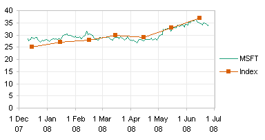
As far as the appearance of the series is concerned, you can use XY or line types interchangeably. Either chart type accommodates lines or no lines, markers or no markers. You don’t have to use a “Line” chart just because you want your markers to be connected by a line. The difference between Line and XY charts is in how the X values (dates) are presented on the chart.
Trade-Offs between Line Charts and XY Charts
Before we get into the actual construction of these combo charts, let’s compare the treatment of dates in Line and XY charts in Excel.
| Line Charts | XY Charts | |
| Nice date scaling | No date scaling | |
| Data plotted only on integer day numbers (midnight at start of each date) | Data plotted anywhere along axis (any time, not just midnight) | |
| All series use same X values (same dates) | Each series uses independent X values | |
| Identical series formatting: lines or no lines, markers or no markers |
Identical series formatting: lines or no lines, markers or no markers; |
|
| Only vertical (Y) error bars can be applied | Vertical (Y) and horizontal (X) error bars may be applied |
Creating the Chart
Let’s start with some simple data:

The Line data has X values at 1-Jan-01 and 3-Jan-01. The XY data has X values on these days but at 6 am (1/4 of the way from 1-Jan to 2-Jan) and 6 pm (3/4 of the way from 3-Jan to 4-Jan). Dates are represented as whole numbers in Excel, and times are represented by the fraction of the way from one date to the next. 1-Jan-01 is actually 36892, the number of days since 1-Jan-1900; 1-Jan-01 6:00 AM is actually 36892.25, 6/24 of the way between days 36892 and 36893.
Select A1:B3, and insert a line chart. Copy D1:E4, select the chart, and use Paste Special to add the data as a new series, series in columns, series name in first row, categories in first column.
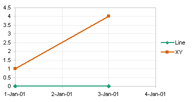
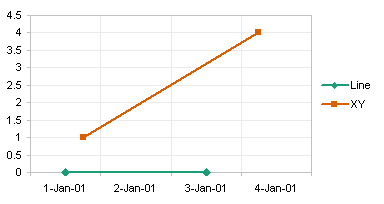
Both series have a line chart type. Both series have markers at exactly 1-Jan-01 and 3-Jan-01, even though the second series has non-integer date-time value.
I have formatted the date scale axis as follows. The base unit is Days. The box for “Value (Y) Axis Crosses Between Dates” is unchecked. Any other formatting is up to the user.
Right click on the second series, choose Chart Type, and select the XY type with straight lines connecting the markers. Excel changes the chart type and puts the series onto the secondary axes.
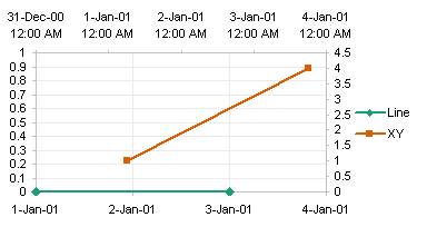
We want both series on the primary axis, so right click the XY series, choose Format, and on the Axis tab, choose Primary. The series line up appropriately.
In this chart I don’t really need the Line chart series to display data. I use the Line chart series to provide the nice date axis, then I would hide the series by formatting it to display no lines or markers.
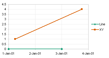
Be aware of the “Value (Y) Axis Crosses Between Dates” setting. If you have not unchecked the checkboxbox, the axis crosses between dates, so instead of crossing at midnight on 1-Jan-01, it actually steps back a half day and crosses at noon on 12-Dec-00. The axis maximum moves forward a half day, to noon on 4-Jan-01. The tickmarks and gridlines are no longer located on midnight between dates, but at noon of each date. The Line chart points still are plotted at midnight and the XY points at the appropriate times, but the positions of the tickmarks and gridlines make it look like the 3-Jan-01 6 PM point is plotted somewhere on 4-Jan-01.
Prior to Excel 2007, the date-scale axis was referred to inaccurately as a time-scale axis. Since the data in a line chart can only be plotted by date, not by time, the nomenclature was changed in Excel 2007.
Regrettably, in Excel 2007 Microsoft has broken the treatment of XY series dates on a Line chart’s date scale axis. The XY series is treated like just another line chart series, and is forced to use the same integer X values (dates) as the first line chart series. You can still combine the chart types, but now you have to use primary and secondary axes, which means keeping the Line and XY series properly aligned becomes a challenge. Instead of moving the XY series to the primary axis, keep it on the secondary. Remove the secondary Y axis, and the primary axis will adjust for both series. Format the axis scale limits of the secondary axis to match those of the primary axis.
This brings up another way that Excel 2007 has broken charting functionality. In Excel 2003 and earlier, if you wanted to specify a time or date in the axis scale dialog, you could enter your value as a time or date. This is so much easier than figuring out the day number and the fractional time. But in Excel 2007 you are forced to enter 36892 and 36895 as the secondary axis limits.
Here is the chart in Excel 2003 using the Excel 2007 primary and secondary protocol.
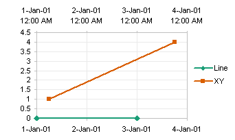
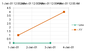
Here is the same chart in Excel 2007. Note the secondary axis ticks don’t wrap nicely as they do in Excel 2003. This is probably another bug, but since we already have the primary axis tick labels, we can hide the secondary labels.
For more on charting in Excel 2007, see Changes to Charting in Excel 2007.
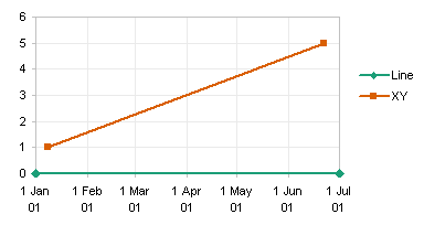
Let’s look at another chart, which uses the following data, which has values across months.

Here is a line chart of two series, constructed using the exact same protocol as the earlier example. Although the second series uses dates that are different from those defined by the first series, these different dates are ignored.
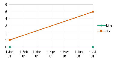
I have formatted the date scale axis as follows. The base unit is Days, the major unit is one month. The box for “Value (Y) Axis Crosses Between Dates” is unchecked. If you look closely, you can see that the months do not all occupy the same distance along the axis: February is noticeably smaller than January and March.
The second series is converted to the XY type, and it is moved back to the primary axis (see below). Now its endpoints fall on the intended dates.
For our final example, let’s look at daily stock prices and monthly market index values on the same chart. This chart is constructed the same as the previous two examples, by inserting a line chart with two series, and applying the appropriate formatting to the date scale axis. The exact data isn’t important: I downloaded the stock data from Yahoo and made up the index data.
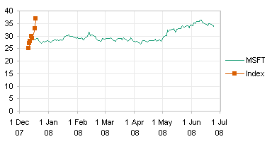
When the Index series is converted to XY and plotted on the same date scale axis as the stock price (line chart) series, it lines up appropriately.


dermot says
nice analysis, Jon, thank you
David says
Excellent tutorial, well presented – Thanks Jon
Alvaro Ledesma says
Small correction needed:
The second series should be a XY type:
Says:
“Right click on the second series, choose Chart Type, and select the line type with straight lines connecting the markers.”
Should Say:
Right click on the second series, choose Chart Type, and select the XY type with straight lines connecting the markers.
Jon Peltier says
Alvaro –
Good catch, thanks! That’s what I meant to say, but it came out wrong. I’ve corrected the protocol.
Billy says
Hi there,
I have a bar chart with a data table below.
The default excel bar chart puts the Y Axis data in reverse order to want I want.
When I change the Y Axis data around by reversing the order, it also reverses the data table order as well. So it is around the wrong across ways.
Y Axis
2001
2002
2003
2004
Default – X Axis Data Table >> 2004 / 2003 / 2002 / 2001
What I want for Data Table>> 2001 / 2002 / 2003 / 2004
What I want is the X Axis around the other way, while the Y stays the same.
But they appear to be linked and default to either depending on whether you reverse one or not.
Any solutions.
Cheers Bill
(Shaky) Christchurch
New Zealand
Jon Peltier says
I have never liked the built-in data tables that Excel puts into its charts. They are totally inflexible. You have no control over order of entries, formatting, or even what to include and exclude.
If I need a data table, I simply construct one in the worksheet adjacent to the chart, and link cells in my table to the original data. Then I can format the table any way I want.
Dave Van Tol says
In Office 2010 I wasn’t able to follow the protocol. The paragraph starting with ‘Be aware of the “Value (Y) Axis Crosses Between Dates” setting’ gives me trouble, since that setting is no longer a check box. I haven’t figured out a solution yet; if I do, I’ll let you know.
Jon Peltier says
In 2007/2010 you will see two option buttons under “Position Axis”: “On Tick Marks” and “Between Tick Marks”. “Between” is default; change this to “On Tick Marks”.
Jon Peltier says
Rick –
Of course. Look for Gridlines on the ribbon. Make sure you make them light gray, not the dark default color.
Andy says
Hi Jon
Is it possible to use excel to create a column graph where the data displayed on each day is a different colour? ie i have 10 data point for ten days each day I would like to see as a different colour.
thanks in advance for your help and apologies for this simple question!
regards
Andy
Jon Peltier says
Andy –
Make your column chart, then format the fill color, and check the “format colors by point” button. Alternatively just select each bar with two single clicks (one to select the series of bars, the second to select the individual bar) and format it separately.