Most charts use some kind of legend to help readers decode the charted data. Excel charts have legends by default, and these legends have a great deal of flexibility (as well as some frustrating constraints).
The best legend is actually no legend at all. A legend by its very nature is somewhat separated from the chart, so a reader must move his eyes back and forth to decode the chart. Placing labels directly on or adjacent to the plotted data is more effective, but it can be more work, and for charts with a lot of data that’s entangled together, data labels may not be practical.
Legend Formatting
The default formatting for the borders in a chart is black. The plot area is also filled with a muddy gray color, but I’ve removed that already.
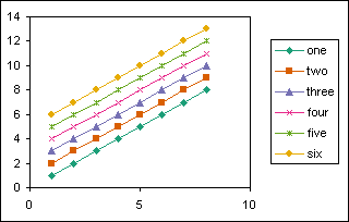
That’s so many dark lines that I forget I’m supposed to look there for some data. This can be improved by removing the outermost border and using a light gray for the plot area and legend borders.
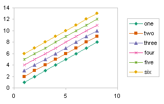
In fact, that’s still too many visible lines, but I’ll use the light gray in this article so the outlines of the plot and legend are clear.
Without any extraneous borders at all, the data stands out in the chart. Ah, now that’s why we made a graph, to show the data.
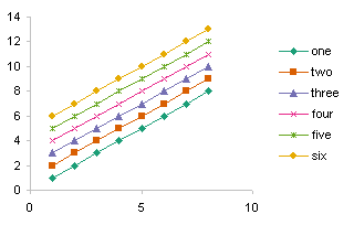
The problem with a legend is that it’s somewhat removed from the data. You can move the legend so it’s more integrated into the chart. Just click on the legend, and drag it by its edges to a new location.

You could even tweak the colors in the legend, to make the legend blend in.
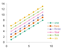
Of course, the best legend at all is no legend. Identify the data instead with labels attached to the data series.
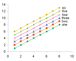
The labels are a bit close together, but matching their text colors to the series colors improves the separation between adjacent labels.

Legend Placement
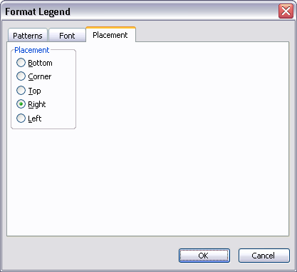
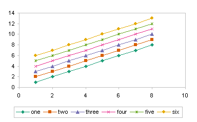
The Excel 2003 Format Legend dialog is shown below, with the Placement tab visible. There are five predefined placements, and the default placement is Right.
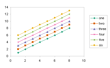
Here is a chart with the legend in the default Right position.
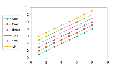
This chart has its legend in the awkward Left position. If the value axis were on the opposite side of the chart, this would not be so awkward.
This legend is at the top of the chart.

This legend is at the bottom of the chart. This is probably less effective than the top position, because the horizontal axis comes between the legend and the chart it describes.
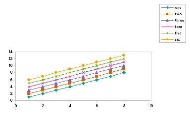
This legend is in the least useful corner position. Even Excel knows this is an untenable position. When this position is selected, the chart scrunches up into the opposite corner, and the chart’s text autoshrinks to 5.5 pt. When you change the font to a legible size, like 8 pt, the legend moves to near the right position and the chart itself expands to its original size.
The default placements, at least right and top, are okay. But Excel leaves too much space around the legend and between the legend and the rest of the chart. I start with a default legend position, then reposition and resize the legend to suit my tastes.
Automatic Resizing and Rearranging of the Legend
Let’s return to the the Top position to see a few characteristics of the legend. The legend entries are evenly distributed across the legend.

Suppose the labelsin the legend entries different lengths. All of the entries move to maintain a nice distribution.
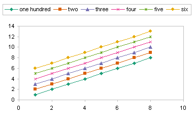
If the legend entries are about the same width, but the chart itself cannot accommodate them all, Excel wraps them to fit.

Manually Resizing and Rearranging the Legend
When you select the legend, its edges and corners are highlighted with the familiar handles that allow resizing. Drag the legend by its edges to move it to a new location.
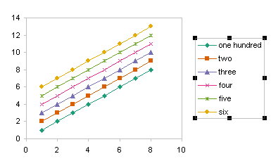
When you begin resizing the legend, the boundaries around the legend entries are displayed.
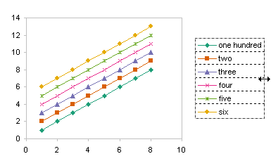
As this legend is made narrower, the first legend entry wraps to two lines. The other legend entries assume the same dimensions as the largest one, and to accommodate the taller entries, the last one is pushed below the bottom edge of the legend.

When the mouse is released, only five entries are visible.

The legend has to be stretched downward to provide room for the last entry.

Now they all fit, but the spacing doesn’t look very nice. Unless all legend entries have to wrap, it’s probably better to make the legend wide enough to prevent wrapping.
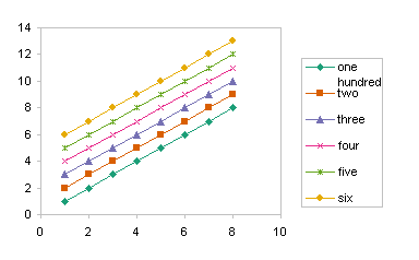
As soon as the legend is being manually resized, all legend entries assume the same dimensions. The other five entries in this legend forget that they had resized themselves to accommodate the longer “one hundred” label.
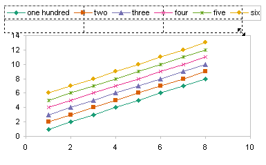
This legend has been rearranged into a 2 row by three column grid.

This legend has been resized to a 3 row by 2 column grid.

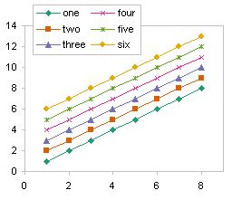
By default, the entries are listed in order, filling rows first, then columns. For example, the entries for one and two are side by side.
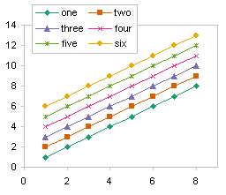
If you’d like the entries to be listed in order filling columns then rows, with one above two above three, you need to rearrange the order of series in the chart. Series one is plotted first, four second, two third, five fourth, and so on.
Follow up posts in the blog: Legend Entry Tricks in Excel Charts, which will feature formatting tricks enabled by the individual entries in a chart legend, Order of Legend Entries in Excel Charts, which will describe some of the intricacies of legend entry order, and Double Legend in a Single Chart, which shows a dummy series approach to adding multiple legends in a chart.


SpeedBall says
Hey- like your posts!
I’ve been trying to figure out since a long time but how do we get away with legend and use labels instead? When I use data labels in chart wizard(/options) the labels get attached to each data point instead of how neatly they’re displayed in your chart…
Any help?
thanks
Jon Peltier says
Hi SpeedBall –
Thanks for the comment. In answer to your question, I use a very simple routine to label the last point of each series in the chart. It can be found in two places, in my blog at Label Each Series in a Chart, and on my tutorial site at Label the Last Point in an Excel Chart’s Series, where there is more discussion about the technique and development of the code.
Jerry Betz says
Jon,
I have found difficulty in ordering legend entries via automation in VBA, especially if the chart has a dual Axis. I have macros that update the legend if an option box is selected to display the series. It may be a limitation of Excel 2003, but the series for one axis will be grouped first, then the series for the second axis. When selecting a series object, and trying to re-order the series on the Series Order Tab in the Format Data Series dialog box, only series for the axis in which it is ascribed to can be re-ordered. Perhaps this is a feature that I should learn to embrace.
I utilize your techniques in setting up Dummy Series in the construction of charts, I wish there was a way to select an option in a dialog box to tell Excel to omit these series from Chart Legends. This would make macros that customizing legends easier, especially in dual-axis charts.
Thank you for sharing in all of these posts, and for personally helping me out in other posts (http://www.dailydoseofexcel.com/archives/2008/08/15/my-coding-technique/).
Jon Peltier says
Hi Jerry –
Working with legend entries in VBA is a challenge, because there is not a linkage between a series and its legend entry. We have suggested this for future developments of Excel by Microsoft. A legend object model linked to the series collection would be outrageous.
Reordering is actually only possible within a chart group, which is a collection of series of a given type and on a given axis. This is more constrained than you mentioned, but if you’ve never tried this on a combination chart, you would not have run up against it.
I talk about chart groups in a future post, the one talking about legend entry order. Wednesday, I think.
SpeedBall says
Thanks a lot Jon!! you rock!
SpeedBall says
My data required me to put the labels at the start of the series (the series are converging in the end) which made the data labels to overlay on themselves.
I’ve added following bit of code for it to decide on its own what is the best place to put labels (start or end)…decision is based on stdev of the first and last data values.
Dim xrange1, xrange2 As Variant

      If ActiveChart Is Nothing Then
        MsgBox "Select a chart and try again.", vbExclamation, "No Chart Selected"
        Exit Sub
      Else

        k = 0
        tot = ActiveChart.SeriesCollection.Count
        ReDim xrange1(1 To 1, 1 To tot)
        ReDim xrange2(1 To 1, 1 To tot)

        For Each mySrs In ActiveChart.SeriesCollection
            k = k + 1
            xrange1(1, k) = mySrs.Values(1)
            xrange2(1, k) = mySrs.Values(mySrs.Points.Count)
        Next mySrs

        stdev1 = WorksheetFunction.StDev(xrange1)
        stdev2 = WorksheetFunction.StDev(xrange2)

        For Each mySrs In ActiveChart.SeriesCollection
          bLabeled = False
          With mySrs
            ptcount = .Points.Count
            If stdev1 > stdev2 Then
                startpt = 1
                endpt = ptcount
                xstp = 1
            Else
                startpt = ptcount
                endpt = 1
                xstp = -1
            End If

            For iPts = startpt To endpt Step xstp
Jon Peltier says
SpeedBall –
Great idea. I may just post that as a complete routine when I have a chance.
Shadowfax says
Hi,
The legend on my chart does not show/list all the data series which I have plotted in the chart. Initially I thought it was a size issue, and I’ve tried to resize it, but that didn’t work. Please help.
Thanks!
Jon Peltier says
Shadowfax –
If you have a great many series, you may need to change the height of the legend, to display more rows of legend entries, as well as the width of the legend, to display more columns.
Larry Caretto says
I may have missed this point in your discussion, but I have found that once a legend is created, it can be dragged anywhere in chart/plot area. In particular, when I have data whose plots gives space in the plot area, I like to drag the legend into the plot area and increase the plot area to fill the entire chart area. This is especially useful when space requirements limit the size of a chart.
Jon Peltier says
Larry –
Good point. The article mentioned in passing that you can move the legend, but now it explicitly states that the legend can be clicked on and manually dragged to a new location.
Jenni Killmer says
Hi Jon, Your blog always comes up when I have an Excel charting challenge before me, and you always come through. This page describes exactly what I was looking for, but in myxcel 2010, I find that “cell” boundaries do not show up when I resize the Legend box in my chart. Are you aware of an equivalent to this feature in Office 2010?
Jon Peltier says
Jenni –
You just have to guess based on how the individual legend entries behave.
Eric says
Hi Jon,
I’m struggling to understand how legend objects resize themselves automatically. I’ve been trying to use VBA to position my legend, but I have noticed that before I move the legend it has a certain width, and that width changes after I move the legend without me changing it (the legend.width).
Is there some setting that I’ve missed to turn this “feature” off?
I’ve also noticed that sometimes the plot area is also changed after I change some property of the chart or chartobject object in VBA. I checked out events, but could see nothing that might apply.
Thanks for any help / comments / suggestions,
Eric
Mari-Jo says
I must be missing something very basic, but I’m trying to find out how to change the text in the legend to reflect the actual content of the data (instead of “Series1”, “Series2”, etc.) I know I’ve done this in the past – earlier version of Excel? – but I’m just not seeing it in 2010. Can you point me? Thanks.
Eric says
To change the legend entry for a series you have to change the name of the series. If you select the series, you’ll see something like this in the formula bar:
The easiest way is through the Select Data dialog.
Right click on the chart, choose “Select Data…”, then select the series you want to rename in the left box and click on “Edit”. In the “Edit Series” dialog box you can change the name of the series, which will change the entry for it in the Legend.
Eric says
Whoops… forgot the series formula:
=SERIES(,, )
If you’ve got just “Series 1” or the like for a series, then that entry will most probably be blank.
Sean says
I have a variable line graph with Legend. Its reading from H11:S16 (12 months data).
For H16:S16, this row’s data might varies. A radio button is available to select either Product A or Product B.
I have no problem to read and display the Product A data as it will show all 6 lines of data. But when I select Product B, it will be 1 line lesser than Product A.
When selecting Product B, my graph is showing a “na” in the legend. How can I / How do I need to not display the “na” when I select on Product B ?
Jon Peltier says
You mean “#N/A” the error message, which is different from “na”, some arbitrary text, right? Does your chart still contain two series, but one is hidden using #N/A for the plotted data? This means you always have two legend entries in the legend. Replace the legend with data labels on the last point of both series. When a series is not plotted, its label is not shown. A legend with one entry is pretty much useless anyway.
sean says
Yes, 2 series. Its not showing #n/a in the legend. Just na only. Cos that row 16 will display #n/a as i used this to hide( =na() ). Sorry, i dun quite.understand ‘Replace the legend with data labels on the last point of both series. ‘ Can u show me a screen shot pls?
Jon Peltier says
If you used =NA() in a formula, the result will be #N/A, not “na”. Check the formula.
To see what I meant by labels, check the last two images before the subheader “Legend Placement” above.
Sidi says
this was not very helpful in finding what i was looking for, it was to long and overdrawn
Jon Peltier says
Sidi –
What were you looking for?
M.E. says
Thank you very much for your helpful postings.
Using Pivot Chart graphics as an example, what if you have 300 data values in your legend instead of only 6? It does not seem to be possible to enlarge the legend box’s perimeter enough to view all of them. Is there a way to be able to view all of them or scroll through them somehow?
In Pivot Tables, one can double-click on a cell and learn what data is feeding into that cell. Is there a similar way to click on one of the illustrative lines in the Pivot Chart and see what data it is composed of? (This might also be an alternate way to view the data values that are not visible in the legend as described above.)
Thank you very much for trying to help with this!
Jon Peltier says
That’s a huge legend. Is the chart even legible?
You can’t scroll a legend. You can mouse over the plotted data as see some information about the points.
I don’t use pivot charts much. I don’t even know if double clicking drills down into the data the way double clicking in the pivot table does.
Nantz says
All I want to do is reverse the order of the legend. Is there a simple way to do this? I’ve looked everywhere. I’m using Excel 2010.
Jon Peltier says
Reversing the plot order of the data will reverse the legend, at least within series of a given chart type. Unfortunately it is often desirable to reverse the legend but keep the data in the same order. No easy solution.
Schorsch says
Is there a way to align the legend of a plot in Excel to the gridlines?
I asked this question on [superuser](http://superuser.com/questions/629119/how-to-snap-legend-to-grid-in-microsoft-excel-2010-graph) and was pointed here.
Jon Peltier says
There is no automatic way to align a legend with anything.
You can manually align it, and if the chart changes you are likely to have to realign it.
Click on the legend and drag it with the mouse so the top of the legend (or bottom) lines up with a gridline. Then click on one of the resizing handles on the perimiter of the legend, and stretch the legend so that the legend entries are aligned between gridlines.
I presume this is what you meant.
Larry Caretto says
When placing the legend on the chart, you can locate the legend boundaries at the midpoints between grid lines then adjust the transparency of the legend so that the grid lines show faintly behind the legend.
Carol M. says
My legend entries have too much white space between them on a single line. There are six entries and they should all fit nicely on one line, but the legend insists on wrapping them into two unless I make the chart outline enormous. I have changed the font all the way down to 8 pt, but it makes no difference.
Jon Peltier says
Carol –
Make sure there aren’t extra space characters at the ends of the series names.
SBB says
Hello,
How do I get the Legend to sit in FRONT of a shape in my chart? I have a 50% translucent gray rectangle that I want to put BEHIND the Legend, but the Legend remains behind the shape so that the shape contniues to partially obstruct the Legend.
Thanks!
Jon Peltier says
Any shape in a chart floats in a layer in front of the other chart elements. You can’t put the shape behind the legend.
Denise says
Why does my 2010 Excel Graph Legend font size change after I have saved it to the size font I want?
Example: Legend Font Size 4.4 – Changed to 8.0 and Saved – Reverts back to Font Size 4.4 after several days.
Anybody have any ideas…………This is driving me CRAZY ! ! ! !
Jon Peltier says
Denise –
That’s bizarre. Font size 4.4 is pretty small, isn’t it? Does Excel get drunk on the weekend and change everything?
Natalie says
I have the same issue as Denise – very frustrating!
Trey says
Denise,
I have been having the same issue with Excel 2010. Did you find a solution? VERY frustrating!
Malika says
I am trying to figure out how to remove numbers from a chart legend. I have Googled and asked my classmates with no luck.
Jon Peltier says
Where do the numbers come from? The legend displays the series names, usually taken from cells in the worksheet. You can change the contents of those cells, or you can click Select Data on the Chart Tools > Design ribbon tab, then select a series in the Select Data Source dialog that appears, click Edit, and type in a different series name or link to a different cell.
Rose says
“The best legend is no legend.”
Surely you’re joking.
Jon Peltier says
Rose – Not joking at all. Labeling the points directly is much better than using a legend.
Hessel de Walle says
Hello,
Maybe a better way to put your lables at the end of a series as a legend is by using names. In that case you don’t need additional columns.
Look at my example on Google Drive: Excelpictogrammen.xlsx in https://drive.google.com/drive/folders/0B7HgkOwFZtdZVmhRQUZFM28yc1U
Jon Peltier says
Hessel –
That’s actually a clever approach. It’s not as robust as I’d like: when I extend a series, the labels don’t keep up, so I need to delete the labels, add them back, and reassign the name. And if I close and reopen the workbook, I have to repeat this process. (Only tested in 2016, which is not quite as robust as 2013 in many charting features.)
I usually just run a small VBA routine, as described in several places:
Label the Last Point in an Excel Chart’s Series
Label Last Point for Excel 2007
< a href="Label Last Point – Updated Add-Inhttps://peltiertech.com/label-last-point-updated-add-in/" title="Label Last Point – Updated Add-In">Label Last Point – Updated Add-In
My commercial Excel add-ins include an updated and very robust version of the labeling routine.