This is a continuation of Legends in Excel Charts – Formats, Size, Shape, and Position, which started a discussion about the legends in Excel charts. That article talked about legend formatting, and how the best legend is no legend at all: it’s more effective to put the text labels right on the data. But sometimes you just need a legend. The article also showed the default legend configurations, and showed how to change these to suit.
This article continues the discussion, showing how to use the legend components–legend entries and legend keys–to access more advanced legend functionality.
Legend Entries
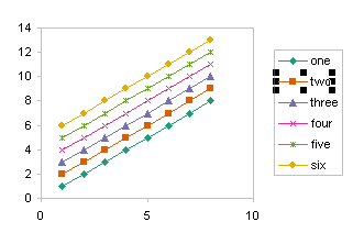
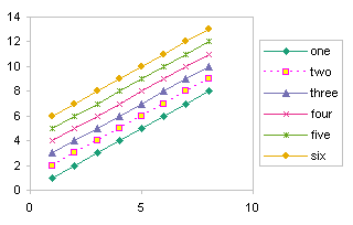
Legend entries are treated somewhat independently of each other. You can select a legend entry with two single clicks, one to select the whole legend and the other to select the entry itself.
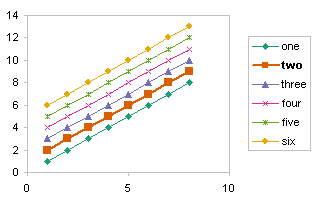
You can format the text of the legend entry. I’ve bolded the legend entry “two” and to enhance the highlighting of this series I’ve used a thicker line in the chart.
You can selectively remove a legend entry by selecting it and deleting it, while leaving the series in the chart.
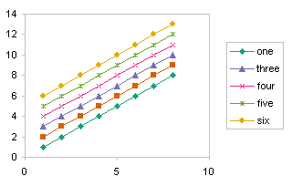
In order to restore any legend entries to the legend, you must delete the whole legend, then add the default legend back to the chart, and reapply any custom formatting.
Don’t select the legend key before pressing the Delete key . . .
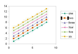
. . . because you will delete the series itself, not just the legend entry.

However, you can select the legend key then format it, which in turn formats the series in the chart.
This last section does not apply to Excel 2007. You cannot select the legend entry in a chart in Excel 2007. I don’t know why this was changed, because it seemed a nice alternative way to access a series when you otherwise could not select it.
Multiple Legends in a Chart
Sometimes people want to split the legend into different parts. This is not possible. However, like many other visual effects in Excel charts, you can fake it. Here I have two charts, my working chart on the left, and a dummy chart on the right. In the working chart, I have removed the entries I don’t want in one of the legends. In the dummy chart I have removed the entries that are in the working chart’s legend.
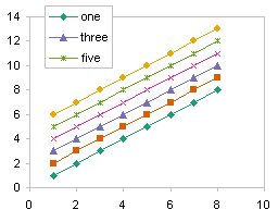

I then used a screen capture program (I use SnagIt) to copy the legend from the dummy chart, then I selected the working chart, and pasted this image into the chart, and moved it to where I wanted it.

This is not a dynamic solution: if a label or series format changes, the static image which comprises the second legend may have to be refreshed. This is why I make a separate dummy chart as above. Both charts use the same data and series formats, so I only need to repeat the copy and paste to update my dual legend chart.
Follow up posts in the blog: Order of Legend Entries in Excel Charts, which describes some of the intricacies of legend entry order, and Double Legend in a Single Chart, which shows a dummy series trick to add multiple legends to a single chart.


Alistair Knock says
Regarding multiple legends in a chart, it’s possible to do this dynamically by overlaying a transparent copy of the chart on top of itself, but in practice it isn’t worth the hassle of trying to get things pixel perfect. Set up the chart with all series and legends displayed, move legend on top of the chart, maximise the plot area, set the chart and object backgrounds to be transparent, turn off any ‘auto’ checkbox you see in the axes settings, then make a copy of the chart. Delete half the series from one and the other half from the other, and overlay one on top of the other (using the top left of the window helps here).
Both charts will then update in accordance with data changes, but you usually end up with some of the axes labels drifting away from other other… you could turn off everything on one chart, but on a complex graph there’s a niggling fear that the plotted points will do noticeably so as well.
Jon Peltier says
Alistair –
Yep, this is possible, and as you say, it’s a lot of effort. Easier would be to scale the Y axis of the second chart so no points are visible, then hide EVERYTHING on the second chart except for the legend. No text, no lines, no borders, no fills. Keep all the series, of course, but they’re out of sight by being off scale. Now you don’t have to keep trying to align everything pixel by pixel.
derek says
Would it not be easier to have the top chart with no graph area border or fill, but a solid plot area, and the bottom chart with a solid border and fill, but a slightly smaller plot area hidden under the plot area of the top chart? No deleting of everything required, just shrinking the one chart plot area until it’s completely hidden under the other. The bottom legend must stay away from the top plot area, though.
Jon Peltier says
Derek –
If everything’s hidden, it will stay hidden. If a plot area is still visible, but behind the other chart’s plot area, any number of things may happen that cause the lower one to be seen.
Besides, your way won’t let you place both legends in front of the plot area the way my example shows.
Matt Healy says
One of my favorite tricks is to use one or more Text Box objects instead of legends on top of a Chart, because Text Boxes are much more flexible. Not only can they be formatted however one desires, but also a Text Box can have DYNAMIC content. Click on the Text Box, then type a cell reference into the Formula Bar and the value of that cell will be displayed in the Text Box, and then of course any formula one desires can go into that cell. I like to use Forms widgets like spinners or scrollbars in conjunction with OFFSET formulas so the contents of the Text Box change automagically.
Jon Peltier says
Matt –
Lots of ways to skin a cat. Textboxes are pretty flexible, but a legend entry can be equally dynamic. Put the formula into the cell referenced as the series name.
derek says
One headache I have regularly that y’all might be able to give me some ideas about is the opposite of multiple legends in one graph: one legend for multiple graphs. On one level it’s as easy as deleting the legends from all but one graph, but that’s often visually unbalanced. I sometimes end up creating a picture object to sit in a convenient spot in the middle of the group.
Jon Peltier says
I’ve done this the same as the dual legend trick. Say four charts have the same series, but look at different parameters. A 2 x 2 layout of charts is good, but four legends is overkill. So I make a fifth chart with all the series, but scale the axes so the data doesn’t appear, and hide all the other chart elements. This produces just a legend, which I move into the center of the layout.
derek says
So obvious now you mention it!
One other technique you (and Matt) might be interested in that I’ve used in the past is extra data series, for scatter charts or bubble charts. This was for when I wanted:
a) to comment on the meaning of error bars in a scatter chart. Making extra series lets me show and label a sample set of error bars.
b) to give a scale to bubble charts. Two or three sample bubbles would be labelled with their sizes, to enable the viewer to interpret the bubbles in the chart.
c) where I’ve used data labels instead of Excel symbols in scatter charts. Data labels can be much more complex in meaning than the small simplistic set of symbols available in Excel. But then I have to craft a custom legend for them.
d) as above, but where I’ve resorted to Autoshape drawings as symbols. This is fraught with potential for inaccuracy the way Excel draws shapes, but where I feel confident it works, I want a way to show the legend. Excel’s own legend facility produces awful squashed things in place of the proper shapes.
Jon Peltier says
Derek –
I love this out-of-the-box stuff. Panel charts are out-of-the-box, and I’ve reached further out to use dummy series each with one point and a data label to construct a custom legend in the corner of each panel.
The dummy bubble series is helpful to make sure the bubble sizes are consistent from one chart to the next. Make a bubble with the largest value you’d expect in any of the charts and add it to all charts. This largest bubble scales all the bobbles in the charts. I wrote about this in Control Bubble Chart Bubble Sizes.
Paul says
Hello Jon, I am rather confused about something I thought maybe simple to do that is proving not and I am hoping from having read your articles here that you maybe able to assist.
When creating a simple line chart, I have 5 series of data, to the left of the chart is an area (using data validation by list) which allows the user to choose what they want to appear on the chart. This is done by 5 drop down boxes.
If the user chooses a blank because they only want to show for example 4 series of data then choosing the blank obviously removes the data from the graph. However it still leaves the series line in the legend. So what I need to try and find out is how to remove the line series when a blank is selected and if something is selected then to put the series line back into the legend…….any ideas ?
Jon Peltier says
Paul –
This requires VBA to add and remove the series from the chart, or to apply an autofilter that hides rows without data (Excel’s default is to skip plotting of hidden data). The other option is to skip the legend but label the series directly, as in Label Each Series in a Chart and Label Last Point for Excel 2007. When the series is suppressed, so is its label.
Marta says
Hi John,
Thank you for all your helpful tricks and hints. I am hoping that you will be able to help me with this challenge.
I am wondering if there is a way to dynamically adjust the order of points in a series in on a BAR chart.
I am writing VBA code that will adjust the order based on point xvalues. The bar chart has one series. Currently the items in the legend are displayed in alpha order. I need to move an item with a particular name to the end in the legend ONLY.
I appreciate any help, guidance and suggestions you can give me!
Marta
Jon Peltier says
The legend and the series/points are linked. You can fake it if you add a series, format it like the one that should appear last, but give it zero values so it does not appear in the chart. Hide the regular legend entry for that item (two single clicks to select just the item, and press Delete).
Katherine says
Hi Jon:
I’ve moved my legend to the lefthand side of the bar chart. The legend titles are lengthy enough that they wrap into two lines, which appear in *centered* formatted text.
Is there any way to format the sets of wrapped legend label text to appear *flush right* instead of each wrapped set appearing in centered format?
Jon Peltier says
Katherine –
If you are talking about the category axis labels, when they wrap the text is centered, and there is nothing you can do about it. Unless, that is, you want to hide the labels and replace them with text boxes. If you’re doing one chart and will never have to adjust it, this is okay, but for a lot of charts, or for charts which are frequently updated, it becomes tedious. If you can make shorter labels (fewer characters) it may help. Another trick is to make the chart a lot wider than you need, and shrink the plot area inside to the size you want. There is a lot of white space, but the labels will not wrap.
Katherine says
Awesomely-fast response, Jon. Thank you!
Unfortunately, the labels must mirror a long text field, and you nailed it: we’re doing high-volume production of charts with these labels, so the “tedious” fix isn’t tenable for this particular project.
Your authoritative and speedy post/response experience has been a wonderful introduction to your site, services and Excel wizardry.
Much appreciated– thanks again.
If anyone else has any insight on how to override Excel defaults for how the text in chart legends is formatted (flush left, flush right instead of centered), would love to hear it!
norm says
As usual you are the only person I can find on the web who really knows their Excel.
I was looking for a way to remove legend entries ( I wanted to keep the trendline rather than the original data line) and you gave it to me in seconds.
You Rock!
Thanks heaps
Norm :)
Matt says
Love your blog, it’s taught me a lot. Wondering if you can help with this one.
I’m trying to write some VBA which will move a chart legend if not all of the entries are displayed. So, for instance, if one or more legend entries are not visible, move the legend beneath the chart rather than to the right of it. The charts are themselves being generated using VBA.
What I can’t find is a way to tell if any of the legend entries are hidden before the chart has been redendered. And even then, once the chart has been rendered, it’s too late to move the legend.
Have you any idea how to achieve what I’m trying to do?
Jon Peltier says
Matt –
Compare myChart.Legend.LegendEntries.Count to myChart.SeriesCollection.Count. You can tell whether there are any legend entries missing, and locate the legend accordingly.
Fabio Italiano says
Hi Jon,
I have the following task
I have over 60 teams in different regions (names are the same in all regions)
When I report them on a scatter chart (i.e. Team and hours spent on research)
Excel creates a key legend for each team reported
I would like to keep the key legends consistent across the regions. So far it has been a tedious manual work to ensure consistency. I am wondering if there is anyway do it automatically (maybe by asigning a symbol to each team and using the symbols in the charts?)
Thank you in advance
Fabio
Jon Peltier says
Fabio –
Use the approach in my article about conditional charts to put each team into its own series.
Grace says
The multiple legends trick is simple and effective, now I can sure impress my boss, thanks. As usual this is a brilliant site to master excel.
dan says
Thanks
Confused says
Jon,
Quick question – Is it possible to show only the text in legend and not the corresponding line? Basically, I want the color of Series Name itself to point towards the series and avoid showing the line beside the text (which is redundant).
After reading the comments, I think one way is to use text boxes instead of legends but that will not allow the color of series name to be dynamically linked with the color of corresponding data in the chart. Can you please suggest something? I would like to avoid VBA, if possible.
Cheers
Jon Peltier says
The legend shows both legend key and series name.
I like to label the last point in each series. Then I often color the label text to match the series line.
To dynamically color the label text to match the line would require some hefty VBA, especially if the series line color is automatically assigned.
Confused says
Thanks for the reply. I guess I’ll just have to live with the legend keys!
Cheers
Tim says
Hi there John,
I have a question for you, I have a table set up in excel for users to input survey readings for a building. obviously the readings are taken at certain dates and will continue to be taken in the future. As a result, the columns for the future data are blank and what i want to happen is as soon as a user begins to input data into one of the blank cloumns the data starts to plot itself on the existing graph (which it does). However, in the legend entry i dont want to see the coloured lines for the future data as this is confusing if there is no corresponding line on the graph. Is there any way you can stop a legend entry appearing if the series name is blank and there is no graph data? I want to make it as idiot proof as possible so deleting the individual legend entry and then having to go into the menus to get it back isn’t really an option…
Tim
Paul says
In response to the message from Tim, you could hide the row where the data would or should come from. Hiding the text/date will remove it from the legend. You could use VBA to hide the row up until a certain date as an example
Kristen says
How do I change the labels in the legend? I am doing a pie chart and don’t seem to be getting anywhere.
Jon Peltier says
Kristen –
In a pie chart, the legend labels are the category labels The easiest and most reliable way to set up data for a chart is to put category labels (or X values) in a column and (Y) values in the next column, then put a label in the cell above every value column (a pie chart has one value column) and leave the cell above the category labels blank. Then select this range and make your chart. Excel figures out where within your data the category labels, series names (the labels above the values), and values are located.
wm says
jon,
quick question on legends for stacked graphs. i have several graphs (one for ea. dept.) that use identical data points (i.e., x and y axis are identical, note, different data but exact same format).
the legend colors for each of the graphs are identical except for one. the legend selection is set on automatic for legend fill for all. how do i change that one graph so the legend colors match the others. thanks
Jon Peltier says
WM –
This sometimes happens if you create your chart, remove a series low in the plot order, and add another series.
Say I start with 4 series, all automatically formatted:
A B C D
I remove a series:
A C D
I add a new series:
A C D E
Even though the series are in the plot order above, their order among the automatic formatting series is:
A E C D
because E is given the first available automatic format, which had been taken by B.
If you then make another chart with A C D E, the auto formatting will be different.
The remedy? Copy one of the matching charts, and replace its value with that from the unmatched chart.
wm says
awesome! that worked. thanks.
rich007a says
Hi Jon,
Your site has such depth of information, I’m almost scared to read anywhere for fear my head will explode. Thanks.
One quick correction though if I may; you said above “You cannot select the legend entry [did you mean key?] in a chart in Excel 2007.” This is not quite true. Yes, it looks like you can only select the legend entry text, but if you right-click and format it, setting the fill or border colours will change the associated series in the plot – just like when you select the legend entry key in Excel 2003.
I stumbled in here looking for how to format the selected legend entry with VBA. Once I figured out that formatting the fill and line of the legned entry actually formats the series, I thought I was home and dry, but now I’m stuck on the legend entry font. I fear there really is no way to determine legend position, i.e. the X in cht.Legend.LegendEntries(X), if I know the Y in seriescollection(Y)… not without coding all the legend order “logic” you so skillfully explained (at https://peltiertech.com/order-of-legend-entries-in-excel-charts/.
Cheers
Rich
______________
My picture:
http://fud.community.services.support.microsoft.com/Fud/ImageDownloadHandler.ashx?fid=58e6f0c3-698e-4889-9508-b1cc7f149c2e&sid=011de397-649d-43ff-a152-8714e39e9949&sz=150
Christie Hall says
I need to include a narrative of the figure below the figure but inside the margins of the figure. Much like the including the note below a table. APA format requires this. Do you know how I might be able to do this? thanks for your help, Chris
Bo Jensen says
I would like to put the relevant lengend next to each end point of a curve.
Let us say I have 3 curves and I want the legend to be shown next to the relevant curve. Is there a way to do this – I can get the data lable with the y-value shown but I am strugling with the legend – using Excel 2010.
Regards
Bo
Jon Peltier says
Bo –
Are you looking for something like Label Last Point for Excel 2007?
Laur says
Is it possible to apply a filter to the legend in a pivot Chart? I want to be able to hide some of the entries but be able to reapply them without having to reformat the data… The Values for each parameter in the Pivot Table always reverts back to the default when it is reapplied.
Jon Peltier says
You want to hide certain legend entries? Select the legend, then click again to select a legend entry, then press Delete. To restore entries, you must delete the entire legend, then add it back to the chart.
Humberto Barreto says
Trying to apply formatting to specific characters in a legend.
ActiveChart.Legend.LegendEntries(1).Font.Name = “Arial” works, but
ActiveChart.Legend.LegendEntries(1).Characters(2, 3).Font.Name = “Symbol” does not.
Is this an example where the text box is superior to the legend?
Thanks, Humberto
Jon Peltier says
Humberto –
Only the entire legend entry can be formatted at once. You cannot format individual characters.
Fred says
I have a standard two-tone color scheme alternating grays (light to dark) with colors (dark to light) on white/no backgrounds for all the charts in my document to ensure clarity & contrast whether viewed on screen or printed in black and white, and 1pt white borders around the data to get an exploded pie effect on pies and distinct (noncontiguous) columns on barcharts. The problem is the white borders carry over to the legend color key boxes, which are small to begin with, making them even smaller. My color scheme looks distinct in the charts, but not in the legends. If only I could resize those little boxes!
I see that a few years have passed since you said the legend keys in Excel 2007 (I’m using 2010) could not be formatted independently, so I harbor a hope that something may have been discovered in the interim.
Jon Peltier says
There’s nothing to discover if it hasn’t been created.
The legend keys (those little boxes) are sized according to the font size of the legend entry, and you need a row of pixels all around to show the border. I suppose you could use enormous fonts for the legend entry labels.
rich007a says
My advice to Fred would be to add a set of dummy (without data) series which he could format without any borders. Keep the legend entries for the dummy series and delete the legend entries for the real data. Messy I know, but I think that’s the only way…
Hope that helps.
Cheers
Rich
Fred says
I see. Well, I appreciate your time. Thank you.
Jon Peltier says
Actually, Rich makes a good suggestion, which I had forgotten about.
You might experiment with a border that matches the fill for the dummy series, and try out different border line weights.
Paul Bourne says
Very helpful. Thanks for being there.
Jennifer says
This blog saved me so much time. Thank you for sharing your tricks to help others.
DINAKAR says
Hi
I am creating line charts in excel. In total I am presenting 5 line series in one chart.
The issue is I need the line charts to appear only when they have some data i.e. if the data is zero or if there is no data relating to a particular series, then the line shouldn’t appear. I am able to fix this by using a NA() function.
But when I am enabling legends for the chart, it is showing legends for even for those lines which has no data or have NA() in the data. I want the legend for the particular series to appear only when the line series for that data appears.
Is it possible to do so?
Jon Peltier says
Dinakar –
If you label the series instead of using a legend, you will (a) not have unused legend entries, and (b) make the chart easier to read.
Haider says
Can anyone suggest is it possible in EXCEL chart …. i want show the data range in chart area , where as my legends are outside the chart .. e.g i have 5 rows a,b,c,d,e, with data against these rows, but in legend i can only want to show a,c,e data but my chart will not disturb… its still the same with five rows data
Jon Peltier says
Haider –
You can hide individual entries in the legend. Click once to select the legend, then click once more to select the undesired legend entry, then press the Delete key. Repeat as needed.
You cannot hide individual rows of data in the data table of a chart.
K Lee says
Hello,
Re: deleting legend entries
Working in: Excel 2010 (v14,0.7128.5000 [32 bit])
I have a line chart that is contained entirely with a collapsible group section – the user can choose which sections to view, and it expands to show the charts and tables therein. The chart
On this chart, I have two dummy series to automate displaying only the final data label in a series, as the time increases – the chart expands incrementally weekly, and the final weeks data point only is displayed, though the series is plotted for each week in the chart.
In the Legend, I delete these two dummy series names “Forecast Data Labels” & “Avg Data Labels”, so that they do not show.
Ostensibly, everything appears as normal, I am left with only the three remaining series names that I want displayed, and the two dummy series perform their functions as intended – just to provide those single data labels in the right places.
However, when you collapse the grouped section, save, close the file, re-open it, and expand the section again, the legend entries for the dummy series reappear, no matter what I do.
Is this a known bug/glitch/feature?
Is Excel, for want of a better phrase, ‘re-loading’ the legend data when it expands the grouped section.
Is there a better workaround than what I am currently doing?
Which is to force the legend, by resizing it specifically, into two rows with the unwanted legend entries the only things on the bottom row.
Then I position the legend such that its bottom row disappears off the bottom of the chart area, leaving only the top row appearing to be displayed.
I’ve used the techniques for dummy series and charts in grouped sections often before, (possibly in conjunction) but can’t remember encountering this.
Thanks for any thoughts anyone has.
Kind Regards,
K Lee
Jon Peltier says
Legends are kind of funky. The legend entry can be tied to the series by series name, but you can’t reliably tell the legend entry from the series, and vice versa. It would be nice to have more control over this, such as a checkbox to display a series name in the legend. Also, it would be nice to be able to more easily adjust the order of legend entries independent of series chart type and axis group.
I’ve seen a lot of instances where formatting changes in a chart when data is adjusted, for no good reason, but most of my observations have been in Excel 2013. These are frustrating, and result in stupid reworking of charts. I haven’t specifically seen reloading of legends, but then, I avoid them whenever possible.
K Lee says
Mr. Peltier,
Thank you sir, for so prompt and fulsome a response.
The opening sentence, at least re-assured me that It’s probably not just me missing something then!
Best Wishes,
K Lee
R.Someswaran says
Hai,
If you decrease your graph size their wont be any decrease in size of the legends, of course we can reduce font size of the legend, my question is how to reduce the representation line in the legend. For example in the legend bar near to “one” you have the green line with diamond, suppose say the line length is 1cm i want to reduce it to 0.5 cm is it possible?
Jon Peltier says
Unfortunately Excel doesn’t let you change the length of the line in the legend entry.
R.Someswaran says
Hai,
Thank you for answer. I want the change in legend to paste the graph in the word file or power point slide.
If you want to paste 4 or more graphs in a slide you need to reduce the graph size, but legend size wont get reduced.
The other way: Instead of direct pasting of graph from excel we can do the following for proportionate reduction of legend with respect to reduction in graph size.
First copy the graph from excel
Open Microsoft Office word – Paste(Top left corner) – Paste Special(Alt+Ctrl+V) – (select) Picture(Windows Metafile)
Abdulla says
Jon
I attempted to del legend entery using the following code:
the problem, it works ok for all legend except the one with data label, is there any issue with the code?
Jon Peltier says
Abdulla –
I don’t really know when your code works and when it doesn’t, but I think the Exit Sub is bailing you out before you intend to. Try this:
Abdulla says
Jon
Thanks. but it shows me an error in following code:
the message i got: “Method (legendentries) of object (legend) failed” :(
I’m wondering why if i replace (i) with number of series (4) it works!!!
Abdulla says
Jon
I had written another code and seems run OK :)
The problem now that i can’t remove more than a legendentry in one loop, i.e i can’t use Or in the If statement as follows:
Jon Peltier says
I don’t know why you got the error with the Legend Entries, since it’s from the same code you posted.
Your last code could be cleaned up a bit:
You need to count legend entries backwards, because once you delete one, the numbers of the others after it move down by one. It’s unfortunate that Microsoft didn’t reference the legend entries more closely to their respective series.
I also don’t know why your If statement doesn’t find both series by name, unless it relates to the changing indices of the legend entries. You could use a Select Case instead of the If:
Abdulla says
Jon
That works perfect :)
You are really Guro, Inspirational :)