Every so often the default axis labels aren’t quite what you want. You might want to highlight one of the labels by bolding it or using a different color. However, the built-in axis labels can only be formatted en masse. We’ll get around this limitation by hiding the built-in labels, then add a dummy series and add data labels, which can be individually formatted.
There are two techniques, an easy one for charts with horizontal category axes (line, area, and column charts), and a more involved one for charts with vertical category axes (bar charts).
It’s probably a good idea to review your old blog entries every so often. This is an upgraded article from five years ago.
Horizontal Category Axis (Line or Column Chart)
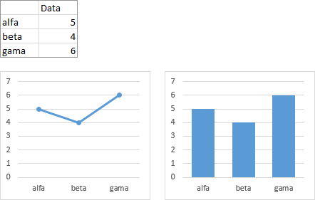
We’ll use this simple data to make simple line and column charts to illustrate this process. This same trick can also be applied to area charts.
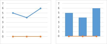
The dummy series will use zero values. Add this data to the chart using any convenient method. You can select the chart and drag the outlines of the highlighted data range, if the data range is simple enough and you put the dummy data right next to it. You can copy the data and use Paste Special to add it to the chart. Or you can add the series using the Select Data dialog.
You can’t see the new series in the column chart, because the added columns have zero height. But there is a space for the bar next to the blue bars above the labels.

In the column chart, you need to change the chart type of the added column series to a line chart.

Format the category axis (horizontal axis) so it has no labels.
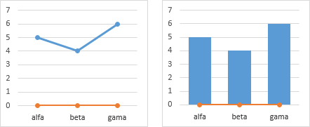
Add data labels to the the dummy series. Use the Below position and Category Names option.
Format the dummy series so it has no marker and no line.
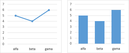
To format an individual label, you need to single click once to select the set of labels, then single click again to select the specific label, then apply your formats.

But go easy with the formatting, which was overdone in these charts. You want to highlight one or two labels, not keep Crayola in business.
Vertical Category Axis (Bar Chart)
We’ll start with the same simple data to make simple bar charts to illustrate this process. The left hand chart in the pairs below is a plain bar chart. The right chart has had its categories reversed following the protocol in Excel Plotted My Bar Chart Upside-Down, which adds a couple steps to this approach. This approach works fine for clustered or for stacked bar charts.

The dummy series will use slightly negative values. Add this data to the chart using your favorite method. Select the chart and drag the outlines of the highlighted data range. Copy the data and use Paste Special to add it to the chart. Or add the series using the Select Data dialog.

Move the new series to the secondary axis, and make sure it’s a clustered, not a stacked, bar chart type. Never mind how ugly the overlap looks.
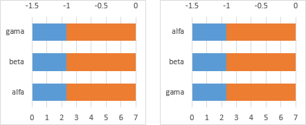
If you’ve reversed the order of the primary category (vertical) axis of your bar chart, and moved the horizontal axis to the maximum category (right hand chart of the three above), there are a couple more steps to be done here. First you’ll have to add the secondary category (vertical) axis to the chart.

Then reverse the category order of the secondary vertical axis and move the horizontal axis to the automatic position, i.e., zero (see Excel Plotted My Bar Chart Upside-Down).

Delete the secondary horizontal axis and the secondary vertical axis if you had to reverse it.

Format the category axis (vertical axis) to have no labels.
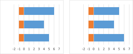
Add data labels to the secondary series (the dummy series). Use the Inside Base and Category Names options.

Format the value axis (horizontal axis) so its minimum is locked in at zero. You may have to shrink the plot area to widen the margin where the labels appear.
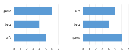
Single click once to select the set of labels, then single click again to select a specific label, then format away.

But pay attention to the rules. Use formatting sparingly, to highlight only one or two items in the chart. Remember, if you highlight everything, you highlight nothing.


Kalle says
Hi Jon,
First of all thanks for all your good postings. I use them often in min day to day work.
I have a question in regards to using two axis with one bar and one line. I have sales on the first axis, no problems there and I have operating margin on the second. The problem is that this value can be negative and I would like to be able to make the negative value below the horizontal axis. I have made an image that I think will explain what I am trying to say.
The problem is rooted from that I have several of these charts and it’s not clear how well the company is doing if the negativ values aren’t below the axis.
Thanks Jon!
Jon Peltier says
Kalle –
Your second chart does it, but I’m inclined to make a panel so the lines and bars don’t all overlap:
Kalle says
Hi Jon,
Thanks you for your response!
Yes the chart, that I did in paint because I am unable to make such a chart in excel since I can alter where the horizontal axis start when using two axis. Would it be possible to make that chart in excel?
Second question, the chart you did above, do you have any instructions on how to make one?
Again, thanks! You are a rock to the Excel community!
Jon Peltier says
Kalle –
Both of your charts and my panel chart can be made in Excel. I’ll write a tutorial and post it soon.
Kalle says
Great! Thanks!
Kalle says
Hi Jon!
How is the tutorial coming on? ;-)
Thanks
Kalle
Jon Peltier says
Kalle –
I have a dozen half-written tutorials in the queue, including yours. It’s coming!
Kalle says
Great to hear Jon!
Again, thanks for your good support and site!
Vijaya Varna Das says
Hello,
Please let me knwo whether i can combine both Primary Axis and Secondary axis would bar graph, and show two diffrent values in bar graph it self. Primary and Seconary axis would be side by side. Please send me a solution. Appreciate your support.
Jon Peltier says
Vijaya –
I always advise against using primary and secondary axes to describe multiple sets of data in a chart, unless each series is only used for a separate panel of data. Otherwise, the chart is too easy to misread. For bar charts, the tricks required to show primary and secondary bars without overlapping makes them too hard to create and to maintain.
Ruud says
Hello,
I have a question regarding graphs.
I have the below table which i would like to present in a graph:
10-Aug-11 19-Aug-2011 131 37 416 307
15-Aug-11 20-Aug-2011 126 85 221 339
16-Aug-11 13-Sept-2012 150 97 142 221
the first three numbers (131, 126 and 150) are related to the first three dates (10-Aug-11, 15-Aug-11 and 16-Aug-11), all other numbers are related to the other dates (19-Aug-2011, 20-Aug-2011 and 13-Sept-2012).
What I want is a graph with 4 lines, the first running from 10-Aug till 16-Aug and the other three running from 19-Aug- 13-Sept.
How can I do this?
Thanks.
KR.
Ruud
Jon Peltier says
Ruud –
Put all of the dates in the first column, and the values in the applicable rows, then make your chart.
Calvin says
Hi,
I have a question, where my data table has zeros and I do not want the axis to show their lables.
Priority Local Name Short Name Place of Incorp BC H-Address
1 0 0 0 0 0
2 0 0 0 0 0
3 0 0 0 0 0
4 0 0 0 0 0
5 0 0 0 0 0
6 0 0 0 0 0
7 0 0 0 0 1
8 0 0 0 0 0
here i dont want the local name, short name in my axis columns. Is there a way not to show them?
Regards,
Calvin
Jon Peltier says
Calvin –
You talking about the data table that Excel builds along the chart axis? I hate those things. They are totally inflexible.
If I need a table next to the chart, I make one in the worksheet. This way, I can include and exclude what I want, format it how I want, all much more easily than using the data table.
Chris says
Hi Jon,
Thanks for all the great posts – I’ve learnt so much about charting in Excel from your blog!
One question – sometimes bar charts have dual / nested / layered (what ever you want to call it) category axis labels. Is it possible to individually format text in such a category axis?
Thanks for your help!
Regards,
Chris
Jon Peltier says
Angel –
Did you add the dummy series with data labels? It is these data labels, not the axis labels they replace, that can be individually reformatted, in Excel 97 through 2013.
Jon Peltier says
Angel –
If you got zeros, it probably means the label option is to show values, which is the default. Click once on the labels so they are all selected (if only one is selected, click something else, then click once on them again). Press Ctrl+1 (numeral one) to open the Format Data Labels dialog or task pane. For Label Contains, choose the Category Names (or X Values) option. Now you can hide the normal axis labels: click on those or elsewhere on the axis, press Ctrl+1, and in the Format Axis dialog/task pane, for Axis Labels, choose the option None.
Kalle says
Hi John,
Hope all is well!
I keep following you blog, but I haven’t seen any post on the secondary axis. Could you please explain how to do it?
Thanks
Kalle
Jon Peltier says
Kalle –
Are you asking how to get secondary axes in your chart?
First you have to assign one or more series to the secondary axis (select the series, press Ctrl-1 to format it, and make your selection). Excel will now draw a secondary Y axis for these series. You can add the secondary X axis (or remove the secondary Y axis) using the controls on the ribbon or on Excel 2013’s plus sign icon next to the chart.
Kalle says
Hi John.
No the problem is how to get 0 as the baseline for both axis. This is difficult (for me that is) when the values are sometimes negative on the second axis. I have tried to show it in the first image. Would that be possible to do?
Thanks
Kalle
Jon Peltier says
Kalle –
Check out this tutorial:
https://peltiertech.com/Excel/Charts/AlignXon2Ys.html
Urban Landreman says
I have a similar modification I want for an axis label. I want to change the font for one character in one of the labels. The character is the Less Than Or Equal To sign which I can get in Symbol, but not in Arial. So, I’d like the label to be Less Than Or Equal To 100, but using the symbol for Less Than Or Equal To. I can change the font for the whole label, but not for a specific character within the label. Any suggestion?
Jon Peltier says
As a matter of fact, Arial does support Unicode characters.
You can use the Insert tab > Symbol feature (the rightmost button on the Insert tab) to add any of these characters, right where the cursor is.
When the Symbol dialog opens, go to the dropdown right above the Insert and Cancel buttons, and select the Unicode (hex) option (the ASCII options only show the first 255 characters). Now a dropdown appears, labeled Subset, above the top right corner of the grid of symbols. Choose Mathematical Operators from this dropdown and you’ll see ≤ (hex 2264 or dec 8804) and ≥ (hex 2265 or dec 8805) in the top row.
Cynthia says
Any idea how I can have point than 12 cells in my data range for the horizontal axis labels? I have selected 13 cells but only 12 show…
Thanks
Jon Peltier says
Cynthia –
Could you post a screenshot of the data range next to the chart?
Geoff says
Thanks for another great tutorial, Jon. My problem is that the data labels on the new dummy series are very long (e.g. 30-40 characters) and I can’t manage to create enough space for them. Originally, when the labels were on the primary axis, I could resize the plot area and the space for the labels would eventually widen so it was sufficient. Any that were too long would get cut off and show an ellipsis… But now the labels seem to reach a certain maximum width and then the lines start breaking (which actually looks far worse than ellipses) and I can’t figure out how to stop them. I’ve tried adjusting the axes, changing the values of the dummy series, trying different label alignments, etc., but nothing seems to help. Any suggestions?
Jon Peltier says
Geoff –
The axis labels created using this approach are not actually axis tick labels. They are data labels on hidden data points. These are never shortened with ellipses, but instead show their full text, wrapped wherever Excel wants to wrap them. Fortunately Excel lets you resize these data labels by selecting each one individually and dragging the corners, at least since about Excel 2013 or maybe 2010.
Geoff says
Thanks Jon. Maybe that’s why i couldn’t figure it out. I’ve got Excel 2010 and it lets me move the labels but not resize them. Looks like it might be time for an upgrade…
Son Wilson says
Amazing!!! I had searched all day on the Internet to do this, and only your instructions gave me what I wanted. Thank you so much!!!
Ed says
Hi John –
Thanks for the tutorial although I’m stuck pretty early on. How do you change the chart type of the added column series to a line chart without changing the whole thing?
Jon Peltier says
Hi Ed –
Select the individual series first. Right click on that series, and choose Change Series Chart Type from the pop up menu. You’ll be able to change just that series, and if you’re using Excel 2013 or later, any of the other individual series.
Kathy says
Hi, when I click into my chart’s axis, I’m not able to follow the last step:
“Single click once to select the set of labels, then single click again to select a specific label, then format
away.”
Whenever or wherever I click all the text in the axis is highlighted. Could it be because I have the chart set up to reference some cells in excel?
What else would cause me to not be able to do what’s working for everyone else?
Jon Peltier says
Kathy –
Have you selected the axis labels and not the data labels for the new series? You should format the axis so it does not have any labels. Otherwise the labels are actually drawn in front of the data labels for the added series. Once you hide the axis labels, you can select the series data labels, and then you can select the individual data labels.
Vince says
Nice hack! Thanks for sharing this.
Vince
Sean says
Thanks so much!!!!!!!!