The Problem
I received an email from a university professor who wanted to show a histogram of model residuals overlaid with a normal distribution curve. He wanted the histogram to be displayed as filled bars.
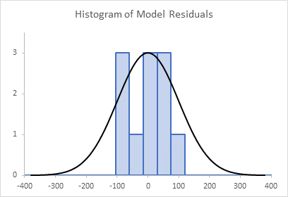
You can follow along with this tutorial using the sample workbook at the link below:
The Normal Curve
The normal curve data is shown below. C1 and C2 have the normal distribution mean and standard deviation. Column E has the values for which we’ll plot the normal distribution (from -380 in cell E3 to 380 in cell E41), and column F has the calculated distribution values. Cell F3 has this formula
=NORM.DIST(E3,$C$2,$C$3,FALSE)
and this is copied down to cell F41. Cell C5 has the maximum calculated distribution value (which is in cell F22), and cell C6 has the maximum height of any of the histogram bars. These latter values are used in column G, which “normalizes” the normal curve to the histogram, using this formula in cell G3:
=$C$6/$C$5*F3
which is filled down to cell G41. We normalize these normal distribution values so that the normal curve and the histogram can be plotted on the same vertical axis scale.

Chart 1 is an XY Scatter Chart (lines and no markers) showing the normal data from columns E and F:
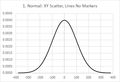
Chart 2 shows the normalized normal data from columns E and G:

We’ll return to chart 2 in a moment.
The Histogram
The residual data is shown in P2:Q8, where P3:P8 holds the bin edges, and Q3:Q7 the counts between these values:
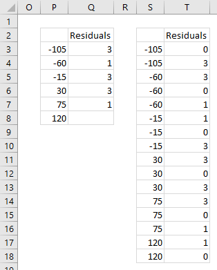
I’ve reformulated the residual data in columns S and T so I can plot the outlines of the histogram columns. This data is plotted in an XY Scatter chart, chart 3:
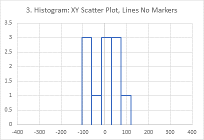
This is right out of my tutorial, Histograms Using Excel XY Charts.
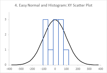
If you don’t needed your histogram to be shaded, you could easily combine these two data sets into a simple XY Scatter chart (chart 4):
But shaded histogram bars require a little bit more work, as described in my tutorials Filled Histograms Using Excel XY-Area Charts and Histogram Using XY and/or Area Charts. To include the normal curve, you’ll need a combination chart, which I’ll show in the next section.
For the combination chart, I’ve modified the residuals data in columns AC and AD. The X values cannot be negative (I’ll tell you why later), so I’ve increased the X values by 400. I’ve also included extra zero values at the minimum (X = 0) and maximum (X = 800).

Chart 5 shows this data in a Line chart:
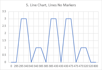
Chart 6 shows this data an Area chart:
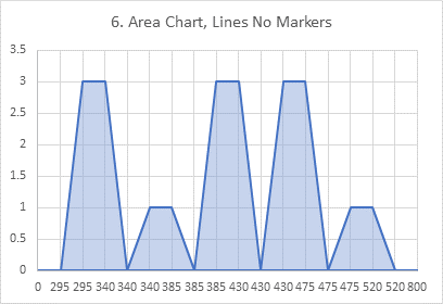
I’ve formatted the area chart series with a medium blue outline (the default is no outline), and a light blue fill with 50% transparency, to let the gridlines show through.
We’ll ignore the line chart (chart 5), since it results in unfilled bars, and continue with the area chart (chart 6). Even though the area chart doesn’t give us nice bars (yet), we’ll beat on it until it does.
In Chart 7, I’ve set my X axis scale to be a Date scale:
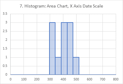
The values in column AC are now treated as dates. In Excel there are no such thing as negative dates, so we had to offset these histogram X values by 400, so they are all greater than or equal to 0. A Date scale axis automatically uses the minimum and maximum X values as its endpoints (0 and 800), the X values are plotted proportionally, and each time an X value is repeated, the Y values are plotted on the same vertical line at that X value. This gives us our nice histogram bars.
Combination Chart with Normal Curve and Histogram
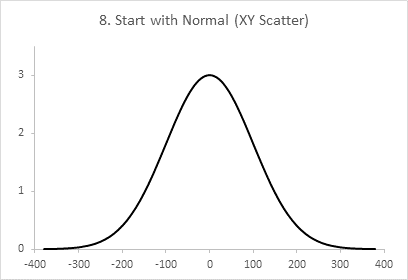
Chart 8 is the original normal curve from chart 2:
Copy the residuals data in AC:AD, select the chart, and use Paste Special so the data is plotted as a new series with X values in the first column and series name in the first row:
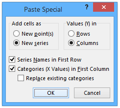
Chart 9 is the result. The histogram is plotted as a second XY Scatter series, and it’s offset to the right by 400.

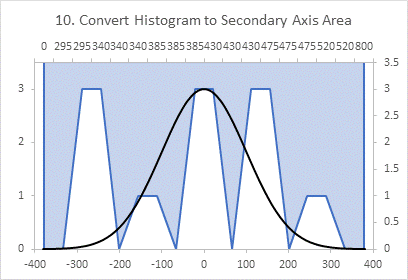
In chart 10, I’ve changed the series type of the histogram data to an Area chart, and moved it to the secondary axis. It looks weird, but it’s too early to panic.
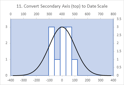
In chart 11, I’ve formatted the secondary horizontal axis (top of the chart) so it uses a Date axis scale. Don’t worry about formatting this axis. The bars are in the right place, just colored outside, not inside, the outlines.
In chart 12, I’ve hidden the secondary horizontal axis (don’t delete it). I did this by changing the line to no line, and changing the labels to no labels.

In lucky chart 13, I’ve selected and deleted the secondary Y axis (right side of the chart). This makes the area chart fill below the line, so inside the bars. And the chart is complete.

Related Topics
Here are a few tutorials about Histograms:
- Dynamic Array Histogram
- Histogram With Normal Curve Overlay
- Histograms Using Excel XY Charts
- Filled Histograms Using Excel XY-Area Charts
- Histogram Using XY and/or Area Charts
- Histogram with Actual Bin Labels Between Bars
- Histogram on a Value X Axis
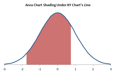
Here is one about filling below a normal curve:
Here are some tutorials about shading of charts:




Den says
Hi, Jon!
It’s amazing instruction and beautiful chart! You are the best excel chart master! When do you plan to add this functionality to your add-in for Excel?
Jon Peltier says
Den –
Histograms are already part of my add-in, not done this way, but instead as regular column charts, with a magic X-axis.
DEN says
I mean the overlay of the normal distribution curve on the histogram. This is a very illustrative chart and the automation of such a multi-step algorithm will be very helpful.
prashant says
Some problem with the linked file, Cannot download it.
Jon Peltier says
Prashant –
In Chrome, if I click on the workbook icon, the workbook is downloaded into my Downloads folder. If I right-click on the icon, I can click on Save Link As and save the workbook wherever I want. I just tested and the workbook does download as expected, and then I can open and edit it like any other workbook.
derek says
The interesting properties of the date scale type mean you can arrange the values in more intuitive separate blocks, which is what I always do.
Sometimes I don’t create helper series at all, but write the expression directly into the series formula. But that’s a bit of a show-off stunt, prone to error, and hard to hand over to anyone else.