This is a guest post from Jon Schwabish, an economist and data visualization creator. You can reach him at [email protected] or by following him on Twitter @jschwabish.
The ‘Fiscal Cliff’ Gallery
For a few weeks now, The Washington Post has posted a gallery of charts to help explain what is meant by the ‘Fiscal Cliff’, a series of tax increases and spending cuts that is scheduled to occur at the beginning of next year. The full slide show can be found at The ‘fiscal cliff’ explained in charts.
There are 7 charts in the collection, and although most of them are simple bar charts, from a data visualization perspective, they fail in various dimensions.
So I decided to issue myself a personal challenge: Redesign all 7 charts following 5 basic rules.
Fiscal Cliff Chart Redesign Rules
- Use the actual data. For all but one of the charts the data were available on the chart itself or from the listed source. For the sixth slide—“Sequester cuts to the FEMA budget”—the data were not readily available, so I eyeballed the values.
- Do not overly modify text or labels. Even though some of the labels were shorthand or incomplete, the objective of the challenge was to improve the visualizations, not correct syntax.
- Use a single color scheme and font. The gallery is a collection of charts from multiple sources—the Tax Policy Center, the Committee for a Responsible Federal Budget, and Post staff—so the color schemes and fonts vary. I chose a single, blue color scheme and used the ‘Corbel’ font throughout.
- Only use Microsoft Excel. Because many people use Excel extensively, I wanted to show that creating quality data visualization does not require complex software or knowledge of programming languages.
- Apply good data visualization principles. My redesigns incorporate simple strategies:
- keep data and labels close together;
- deemphasize tick marks, gridlines, axes (i.e., ‘chartjunk’); and where possible, include data directly on the chart.
The Charts: Before and After
Chart 1: Fiscal Cliff Components (Tax Policy Center or TPC).
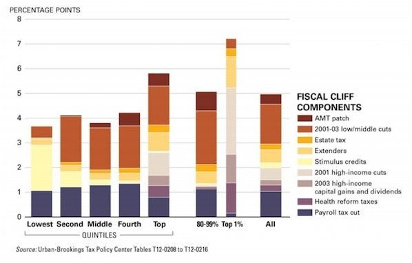

This was probably the most difficult chart to redesign. On the one hand, you might want to focus on the increase in the average federal tax rate by income quintile (the height of the bars). On the other hand, you might want to focus on the components of the fiscal cliff for each group (the portions of each bar). Combining those, however, clutters the attempt to visualize both goals. For my redesign, I chose to focus on the distributional analysis and sacrifice the imagery of the rising average federal tax rate as incomes rise. The second chart in this set—and the first in the original TPC document—tells me that basic story more clearly anyways. An alternative approach would be to use several small charts (‘small multiples’) and stack them together in some way, but I chose to stick to the spirit of the challenge and only redesign the single chart. Plus, had TPC made a series of small charts, it’s not clear to me that The Washington Post would have picked it up.
As for creating this in Excel, it’s a simple stacked column chart where the intervening series are set to an empty fill. The values of the empty fill series are set so that the heights of each section are equal. The labels on the left side are inserted using separate series added as scatterplots.
Chart 2: Average Federal Tax Rate by Cash Income Percentile, 2013 (Tax Policy Center).

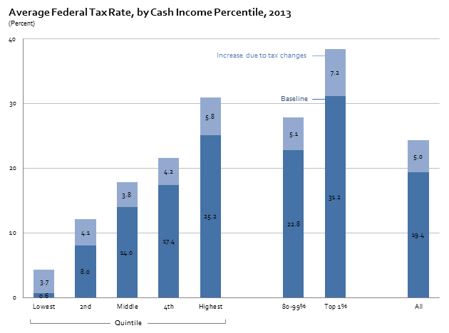
I didn’t like the yellow-blue combination here because it emphasized the effect of the Fiscal Cliff on the baseline, which may have been the intention, but I thought it was too much. I also moved the labels right onto the chart and lightened and reduced the number of gridlines.
Chart 3: Size Components of the “Fiscal Cliff” (The Washington Post, based on data from the Congressional Budget Office).
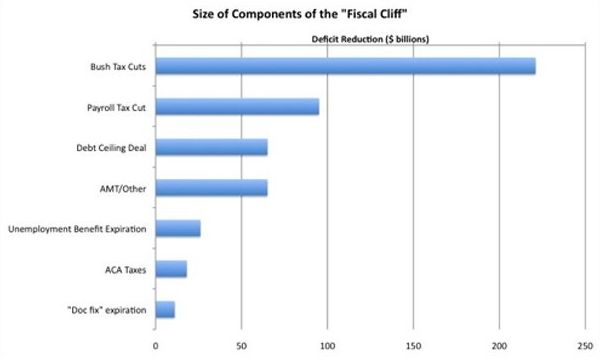
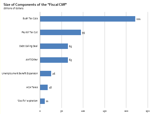
This simple redesign including lightening the gridlines, left-justifying the title, and adding the data to the chart. The original chart also appeared to have some sort of vertical gradient, which I found unnecessary.
Chart 4: Marginal Tax Rate Increase under Fiscal Cliff by Income (The Washington Post, based on data from the TPC).
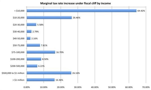
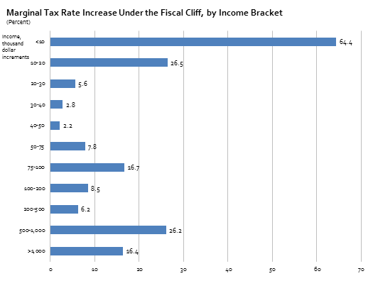
Similar to chart #3, I lightened the gridlines, deleted the gradient, and left-justified the title. I also simplified the y-axis labels by getting rid of the dollar signs and the thousands units and deleted the hundreds decimal points in the x-axis labels.
Chart 5: Economic Impact of Fiscal Cliff, Zandi Multipliers (Committee for a Responsible Federal Budget).
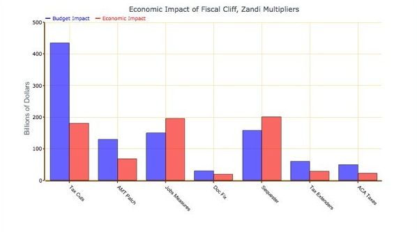

I lightened the gridlines and the heavy axis lines, moved the legend onto the graph, and deleted the outline of each column. (The outlines add three redundant elements to show the height of each column.) I also used a single blue color scheme; in the context of the Fiscal Cliff, which is inherently a policy issue, using blue and red invokes images of the two political parties, which is not really an issue in this graph. Importantly, I also sorted the data by the Budget Impact, which gives the graph both a more appealing look and a quantitative basis for ordering the groups.
Chart 6: Sequester Cuts to the FEMA Budget (in millions) (The Washington Post).
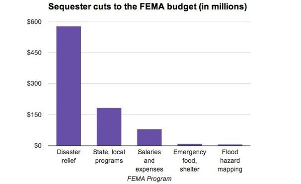
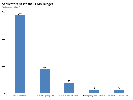
Simple changes: deleted the dollar signs; left-aligned the title; reduced size of “(in millions)” in the title; added data labels; and reduced the size of the x-axis labels.
Chart 7: Effect on Fiscal Cliff Components on Deficit and GDP (The Washington Post).


This chart probably resulted in the largest number of changes, but all of the decisions were so easy to make: sorted the data from smallest to largest; used shades of a single color scheme instead of the menagerie of original colors; moved the legend to the area between the columns; deleted the gridlines; left-justified the title; and put the Totals to the outside of the two columns instead of at the top, which looked terribly cluttered.


Adam says
One small quibble on Chart 7: The data was sorted smallest to largest, but the order of the legends were not changed, so it the legend does not line up correctly. I also think that the black text on the darkest blue is a bit difficult to read. Otherwise, good work using Excel.
Jon Peltier says
Adam –
That’s embarrasing. I’ll attend to that as soon as I can.
Jordan G says
For Chart 4, your revisions were significant but not enough to overcome its design limitations, in my opinion. The problem, as I “see” it, goes back to preattentive attributes. The categories on the x axis are at least ordinal, so listing them in a downward ascension (which I realize wasn’t your idea to begin with!) runs counter to what we know about the spatial positioning attribute in which moving upwards signifies greater quantities.
Below is my own redesign of Chart 4. I don”t submit this redesign as “the answer,” but I do think it provides greater visibility into the marginal increases and decreases within each income grouping by working with the properties of spatial positioning (listing the income buckets from left-to-right as they represent greater quantities).
I have two final thoughts. First, for Charts 1 and 2, you might consider reversing the order of the x-axis. This follows Few’s advice in Information Dashboard Design, where broader categories are to the left and their more specific instances to the right. Second, for Chart 2, plotting the baseline seems unnecessary. The increase due to the fiscal cliff is a percentage change, so you can simply plot the change by itself. I’m not sure that the baseline adds anything except to show the obvious.
Then again, I’m sure others will disagree with me on these points.
Jon Peltier says
As a matter of fact, I have concerns with the original and the reworked chart 4. Jordon is correct about the order and orientation of the category axis. I think his rework only goes partway to showing the data.
Since the percentages are averaged over the brackets they represent, it makes more sense to draw a step chart, with a horizontal line at the percentage from the lower to upper edges of each bracket.
The brackets at the lower end are much narrower than those at the upper end, so I decided to make two charts, one showing the low end of the income range, and one showing the broader picture.
Jordan G says
Jon-
When I first started thinking about Chart 4, that’s how I imagined it would look. But, as I began to build it, I decided I would go with points instead of bars. Part of the problem, for me, was that the average was being assigned across the entire income grouping. It’s true – that’s exactly what averages are for – but I wasn’t feeling comfortable with visually assigning a single average across an entire range, especially with no knowledge of the actual distribution. Your chart however does more justice to the data by using x-axis to its fullest – so perhaps this initial hesitation was wrong on my part.
Jon Peltier says
Jordan –
I know the data isn’t flat across each segment, but that’s how the data is presented. Your line chart has the problem of (seeming to) interpolate between the centers of the brackets. I tried to make it like a histogram with its bins for holding data.
Jon Schwabish says
@Adam: Oops. We will fix that soon; thanks for catching.
@Jordan/Jon: Thanks for the reworks. I like Jordan’s approach, but the discontinuities between some of the categories bother me (why the break between the $40-50 and the $50-75 groups?) as does the implied interpolation between groups. However, I do like that the graph is clean and easy to read. Jon’s rework is probably an improvement as well, but the problem–as you both note–is that there are things going on within each income group that the averaging leads to an incorrect implication that the marginal tax rates are constant within buckets, which they are not.
Jordan G says
@Jon S: The breaks exist to indicate a significant change an interval (in fact, I meant to make the 200-500k interval appear farther out in a similar manner albeit still connected). My guess is the designer of the original chart was attempting to create groupings of “low”,”medium”, and “high” income categories – I tried to recreate this grouping in my redesign. Of course, I don’t really know how useful these categorical groupings are. The choice to use them may have been arbitrary on the designers part or perhaps reflective of knowledge not presented in this chart. Perhaps your domain knowledge of economics could shed some light here.
Bob says
Hi Jon,
How were you able to display the ” |—- Quintiles —-|” on the first chart? Did you just add a text box?
I also like the rework you posted here on Dec 10th.
Cheers
B
Jon Schwabish says
Bob, yes, a text box with a white fill. You can then draw the bracket and center the text box over the bracket. In that way, you only have to draw one bracket.