You can add flexibility to your data analysis by grouping variables. For example, you may have daily sales figures that fluctuate greatly in value, some days having no sales at all, some days with small values, and some with large values. A plot of this data is very noisy, and it’s hard to see any patterns.
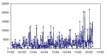
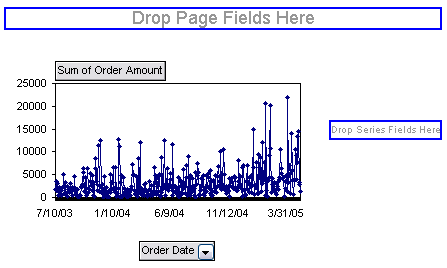
In a pivot table, you can group dates by various measures ranging from seconds to years, to get a clearer view of the data. Plotting by month will smooth out the noise of a daily plot.
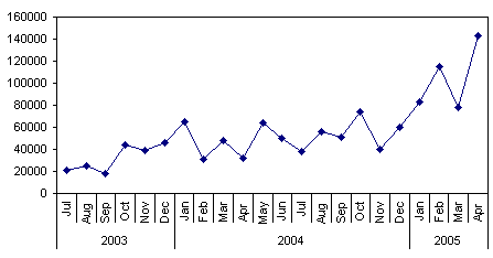
You can combine groupings, for example, to compare monthly sales by year.

These plots are regular charts which use pivot table data as their source. This technique will be covered in a (near) future post. The charts below are the corresponding pivot charts.
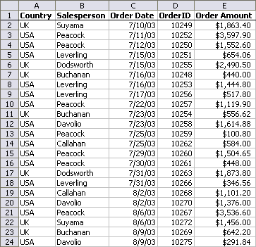
Microsoft hosts a number of decent Pivot Table examples. I will use one of them for this tutorial. Go to the Microsoft example 25 easy PivotTable reports, which has a link to Excel 2002 Sample: PivotTable Reports. From this page you can download a self-extracting executable named Reports.exe, which contains four workbooks. The top few records of the Source Data worksheet of the SampleSalespersonReports.xls workbook looks like this:
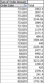
To create a pivot table, select one cell within this data range, and choose Pivot Table and Pivot Chart Report from the Data menu. To keep things uncomplicated, place the pivot table onto a new worksheet. Drag the Order Date field to the rows area and the Order Amount field to the Data area. The top few rows of the pivot table looks like this:
Click in this pivot table and click the chart wizard button. The resulting pivot chart looks like this when it is relocated to the worksheet:
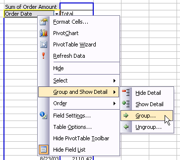
To group the dates, right click anywhere in the date field range, choose Group and Show Detail, then choose Group.
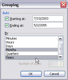
To group by any time period, select that period in the dialog. To group by weeks, select Days, and change Number of Days to 7. To group by month, choose Months; note that this grouping will combine data for each month regardless of year. In this example, group by both Months and Years.
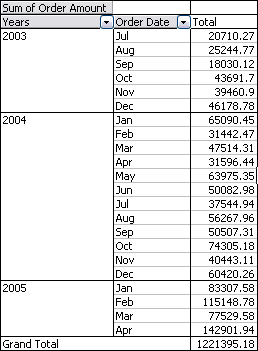
The Order Date column of the pivot table is split into a Years and a Months column.
With the new grouping of months and years, the pivot chart changes to plot months and years along the category axis.

Click on the Years field button, and drag it to the columns area, where the Total label is located. This splits the data into three yearly columns, each showing monthly totals for the respective year.

The pivot chart now shows one series of monthly sales for each year.

The dynamic nature of this pivot chart illustrates one of the benefits of pivot charts: the chart continues to display the data no matter how the table is pivoted. This makes pivot charts indispensable during the early stages of data exploration. The pivot chart’s relative inflexibility when it comes to formatting and handling of arbitrary (non-pivot-related) data, make pivot charts a liability during later stages of data presentation.
In an upcoming blog entry, I’ll describe how to create regular charts like those in the beginning of this article using data from a pivot table.
For more about pivot tables, check out these pages on my web site:
- Pivot Tables and Pivot Charts
– Contributed by fellow Excel MVP Debra Dalgleish. Check out Debra’s Excel Tips page
– Introduction to Pivot Tables in Excel
– Working with Pivot Charts in Excel
– Pivot Table Programming
– Pivot Table and Pivot Chart Links - Making Regular Charts from Pivot Tables (TechTrax Article)
- Pivot Table Articles on the Peltier Tech Blog
- – Explore Your Data With Pivot Tables
– Preliminary Data Exploration with Excel Pivot Tables
– Making Regular Charts from Pivot Tables
– Update Regular Chart when Pivot Table Updates
– Using Pivot Table Data for a Chart with a Dual Category Axis
– Grouping by Date in a Pivot Table
– Referencing Pivot Table Ranges in VBA
– Copy a Pivot Table and Pivot Chart and Link to New Data
– Pivot Table Conditional Formatting with VBA
– Dynamic Chart using Pivot Table and Range Names
– Dynamic Chart using Pivot Table and VBA - Books on Excel Pivot Tables
– Excel Pivot Tables Recipe Book: A Problem-Solution Approach by Debra Dalgleish
– Beginning PivotTables in Excel 2007: From Novice to Professional by Debra Dalgleish
– Pivot Table Data Crunching by Bill Jelen and Michael Alexander
– Pivot Table Data Crunching for Microsoft Office Excel 2007 by Bill Jelen and Michael Alexander


Consultant Ninja says
Jon-
Interesting post. Is there a way to create primary & secondary level x-axis labels in a normal excel chart, not just a pivotchart? The Years and then the months above them looks very good, but I’ve never seen a solution that can produce that in normal charts.
Jon Peltier says
Ninja –
It’s all in the way you arrange the data:
Chart with a Dual Category Axis
The category labels take up two columns, and judicious use of blank cells in the first provides the arrangement of the levels. In fact, you can have more than two levels, at the expense of readability.
Consultant Ninja says
Works wonders. Thank you sir, I bow down to your excel wizardry.
Dan says
Hi Jon
This is great!
However, I was wondering if it would be possible to group dates by weeks as well?
I see that “Weekly” is not one of the options in the list.
Gary Waters says
Dan,
In the grouping box, select Days only (hold down the control key and click on any other’s selected to deselect them). The ‘Number of Days’ box is now enabled, select 7. Now the dates will be grouped, using the Start at Date (like 6/1/2008 – 6/7/2008).
Ken Stern says
This is a great tip, thanks again. For anyone who happens to learn about it from this post, as I did, I’ll note that the data cannot have any blank cells, and that they must all be formatted as dates, for this feature to work. If not, you get the dreaded “Cannot group this selection.” error!
Thanks for the great blog and keep the tips coming!
Jon Peltier says
Ken –
I’m surprised I didn’t mention that. I spent an hour the first time I tried grouping dates, and it failed because my data source included a blank row.
Jon Peltier says
Mitch –
If any cells in the Date column contain non-dates, you will get this message, since Excel doesn’t know how to group such values with dates.
Mitch says
what if you receive the error message that you cannot group these dates in the pivot table??
What I am I doing wrong
Jay Killeen says
Is there any way to group minutes in the same way that you have explained grouping days. Its driving me insane that it is giving the option to group days, and allows you to say how many days, but it does not do the same thing for every other time grouping option.
Any suggestions.
All I am trying to do is group loads of concrete delivered within 7:00am and 7:30am each day.
Jon Peltier says
Hi Jay –
It looks like Excel’s grouping feature only gives you the ability to define a bin width if you are grouping by days.
The entry box below the list of time periods only says “Number of days”, and it is disabled if any time period other than days is selected:
Below is a set of times, randomly distributed between midnight and 4am. The first pivot table is merely a list (and I have chosen to sort by time). The second is grouped by hours and minutes. Only the hours and minutes that appear in the data are listed, unless you choose the field option to show items with no data, in which case you will display every minute of every hour in the table. There is no provision to group into 15 or 30-minute intervals. The last block uses the frequency array function to do what you ask. The first column defined the upper limit of each bin. The second column contains an array formula:
{=FREQUENCY(E5:E29,N5:N13)}Don’t type the curly brackets. Select the entire range that will contain the output, type the formula into the formula bar, then hold Ctrl+Shift while pressing Enter. If done correctly, Excel rewards you with the curly brackets.
Richard Robinson says
The critical thing for me was not including the column headings in the pivot table selection! If you include them you can’t use the group by date function. You get an error message. After much hair-tearing I started again without the headings and it is fine.
Thanks v. much
Jon Peltier says
Richard – That’s right. Any non numeric values preclude grouping within that field.
Thom Mitchell says
Most helpful for a Pivot Table newbie! Thanks, Jon!
Jon Peltier says
Come on, Thom. No excuse to stay a newbie at such a useful and powerful feature.
Mark says
Good tips, thanks Jon
sassybax says
Thank you for this post. I was looking for a good tutorial on grouping by date but couldn’t find any until I hit this page.
Diane.
Pablo Santiago Sánchez says
Does this work for Excel 2007? I’m kind of lost with the menus on this Office version…
Jon Peltier says
Hi Pablo –
When I use pivot tables in 2007 I still use the 2003 layout, which bypasses the enhancements in 2007 pivot tables and allows you to manipulate the pivlt table in place in the worksheet. I don’t know if you can right click on a field and choose group in the 2007 style, or if you have to find it in the task pane or ribbon someplace.
Pablo Santiago Sánchez says
How do I set Excel 2007 to work on the 2003 layout? :-(
Jon Peltier says
Pablo –
I think you can keep the 2007 layouts and the Group funcitonality will work.
To get the 2003 layout, which enables dragging of pivot field buttons, go to Pivot Table Tools > Options tab > Pivot table group (far left) > Options dropdown > Options, Display tag of dialog > Check box for Classic Pivot Table Layout.
Melissa says
I have a pivot table grouped in 7-day increments. When I sort it, however, it treats the dates as numerical values rather than dates, I think.
For example, it sorts the month of March as 3/1-3/7, 3/15-3/21, 3/22-3/28, 3/29-4/4, then sorts 3/8-3/14 last. The only reason I can think of is because it is sorting based on the numbers in order, rather than the date value. How do I fix this??
alison says
I have the same problem as Melissa, is there a way round this, as when you set to 7 days, it ignores the month and year, so group the 17th march with the 18th of april then you get the 24 march after this…
Jon Peltier says
It’s sorting as text. 3/1 comes before 3/2, which is before 3/8. I usually use a dummy column with the first day of the week in it, and sort by that.
Srikanth says
Was breaking my head days and hours to crack this..Your tips were really healpfull and worked…Thank you Jon.
gvolkov says
Is this possible in Excel 2010? Tried everything but grouping menu is grayed out.
Eric Janssens says
Really great post. And a great website as a whole. Thanks a lot !
Shiju Cherian says
Hi Peltier,
Thanks for your helpful post and blogs.
Concerning grouping or converting the date format in pivot table, i tried the same in Excel 2007, but was unable to locate the option for “Group & show detail”.
Kindly help with the issue as I don’t want to add columns in source data for changing the format and then pulling it onto the pivot.
Advice requested.
Regards
Jon Peltier says
Shiju –
Pretty much the same in Excel 2007:
2003: To group the dates, right click anywhere in the date field range, choose Group and Show Detail, then choose Group.
2007: Right click on the dates (the date field range) or on the “Order Date” header. Click on the popup menu item called “Group…”.
ale says
Hi,
I am trying to group a bunch of data by weeks but I am using Excel 2007 and when I click on Group it doesn’t open the grouping dialog box.
It automatically creates instead a Date2 field and a Group1 row.
Just to be precise, I need to select all the data rows in order to be able to group and not getting the error message “Cannot group that selection” (I guess this is because I have the grandtotal at the bottom of the pivot table).
Does anyone know why I don’t have the grouping options available in Excel 2007? Do I need to activate something?
Thank you in advance for your help and support.
Regards,
Alessia
Jon Peltier says
Alessia –
It’s not the grand total at the bottom that is causing the problem. Make sure you don’t have any non-dates in the date field. This includes blank cells as well as values that look like dates but are stored as text.
ale says
I actually had everything formatted as date but I have just realized that for some reason it wasn’t considering it.
My raw data comes as 2011-11-14. I selected them all and formatted as date but the layout didn’t change. It does change to 14/11/2011 only when I simply enter the cell and press Enter. I am sure I am missing something because not even the copy format worked and I had to change them all “manually”, but… I don’t know what it is.
Any clue?
Thank you for your help,
Ale
Anonymous says
I have been trying to figure out a way to use the date field to allow me to group my data by day of the week. In order words, to be able to show if over the course of a long period of time, if certain days of the week show increased (or decreased) activity. Is there a way to accomplish this in Excel 2010, short of manually adding columns of data to assign day of week? Otherwise I can’t seem to figure it out.
Jon Peltier says
You can’t look at separate days of the week by grouping. Grouping by dates can only give you a weekly average or weekly total.
What I usually do, kind of a kludge really, is add a column in the data with the formula =MOD(A2,7), where this formula is in row 2 and column A has the date. Then I format this using the custom number format DDD, for the 3-character abbreviation for day of the week (DDDD would spell out the whole day name). This field can then be used as any other field, so you can filter the pivot table by day.
Pat says
I have the same question as another post, but haven’t seen an answer. I have been unable to group dates in Excel 2010. At least not like in the above instructions. Is there a way to do it?
Pat says
This is Pat, again. Just found the problem! The data I had had typing errors in some of the dates. This is what caused the problem! Fixed those dates and then had no problem grouping dates in Excel 2010
Jon Peltier says
That’s right. All you need is one non-date in the data range, even a blank cell, and grouping by date breaks.
Anonymous says
Anyone has the Excel 2002 Sample: PivotTable Report file as I checked MS website and it’s disappeared. Also searched for it online and only found invalid links to the MS website.
Thanks,
Dan says
I’m up to speed on what you are talking about in this post, but the next step is driving me crazy. My data has values between Aug 2011 and Aug 2013. I grouped by year and by month creating plots similar to yours above. I want to filter out anything 8/1/2013 side too, because the axis has to show the whole year up to December even though there are no values in those months yet.
Example data:
Jan – Dec 2012: 5 units per month
Jan 2013: 0 units per month
Feb – Aug 2013: 5 units per month
Sept – Dec 2013: 0 units per month
Chart should show only Jul 2012 to Aug 2013 (no skipping Jan 2013 or showing a flat line before July 2012 or after Aug 2013) grouped by year and month as shown in your second plot in the post above.
Does this make sense? Thanks for your response.
David Bezear says
Can you advise me how to group data by Financial Year and not Calender
Jon Peltier says
David –
I think you need to add a column to the source data.
I searched Google for ‘pivot table group by fiscal dates’ and got several potentially relevant results on the first page.
JC says
Hi Jon, the article is very helpful.
I’ve also been reading your other posts on incorporating VBA into pivot table and that got me thinking…
Is there a way to change the pivot data source automatically (for example, every time refresh pivot is hit) to only include row that is not empty?
Best regards,
JC
Steve says
Great explanations but I have come up against a problem with grouping data by month and year. The problem is as follows: I want to be able to show all months from January in 2014 but not show January month in 2013. When I exclude January month in 2013 the pivot excludes January 2014. Is their a work around for this problem.
Jon Peltier says
Steve –
You could also apply a filter that excludes January 2013. Perhaps “Later Than” as shown below:
Ethan S. says
Hey Dave!
Long time reader of the blog and I have a question on sorting using dates/numbers in a pivot table. I have a bunch of credit scores from 300-800 and I want to group these into buckets (i.e. , 300-400, 400-500, etc..) The only problem is that there are Null values within the data set. I can replace the null values with a dummy credit score such as 9999 then group the table and filter away any of the 9999. However, the null values are important for the analysis as well and I hate to just filter them away.
What I ideally want to do is group the pivot table into the credit score buckets with a Null bucket at the end (i.e., 300-400, 400-500, …. Null). Is there a way to do this quickly and easily using a pivot table?
Happy to provide any follow up details and thanks for the help!
jess says
I have a workbook with source data. I have a workbook with pivot table links to source data.
I would like to group date by week (instructions above are great!).
But so far this only works when I am working in the source data workbook.
Why? I want to periodically update the source workbook.
Why not work in the source workbook? Even with 8gb the memory caps out and excel dies. I do a lot of data manipulation. Even saving the formulas as values after calculation doesn’t help.
Why not use a database? This is a portable application for many workers. They also may not have internet access.
Any suggestions?
Sarah says
Hello
Is there a way to group data by month, however starting/ending on a specific date? Specifically, I require month end to be on the 26th of each month, rather than in line with the calendar month. This would be most useful as financial reporting does not necessarily align with calendar months.
Thanks, Sarah
Anne Walsh says
I would love to get your views on this one. I have a data set that has daily sample entries. The users need to track the individual sample values (scatter) against upper levels, lower levels, daily mean (done via line chart). I’ve done that grouping by date using a combination of line chart and scatter chart and it’s worked well. Now the user wants to know how to get the same effect BUT using a sample name e.g. Audit001 instead of the date i.e. grouping by the Audit001 entry rather than the date. I can get the data to group together using a pivot chart BUT I am struggling with how to overlay the individual data points to show up as a scatter chart on it. Yes, I know I can’t use a scatter chart with a pivot table but even when I depivot it, I can’t see how to do it. Am very open to idea of any add-ins that can do this. Thanks as always :-)
Jon Peltier says
Anne –
The problem is that you can’t use nonnumeric labels along the X axis of a scatter chart.
You might be able to adopt the approach taken in Salary Chart: Plot Markers on Floating Bars
Anne Walsh says
hi Jon, THANK YOU so much for that…I was struggling with it and had tried quite a few approaches but wanted to check with you as the Chart guru…:-) I’m going to have a look at the blog post you recommended and see if it does the trick. It’s for two scientists and they were delighted with the charts when I combined the scatter and dates and then just wanted the same where they had batch references. Could this be done using one of your Add-ins? I did check but couldn’t find anything that seemed to solve it. Or indeed any other add-in? Thank you so much again :-)