My daughter asked me about her physics homework the other night. The problem was to determine the relationships describing how long it takes water to drain from a hole in the bottom of a bucket given various hole diameters and initial water heights. Given the derived relationships, the student was to determine the time to drain a bucket with a hole of diameter 4 and initial height of 20. The data is shown in this table; presumably diameter and height are in cm and time in sec.

The first step is to plot the data using XY charts. Below we see time to drain vs height for various hole sizes and time to drain vs hole size for various diameters. This was easy: select the range of data, including the top row (with numerical heights but not the “height” label) and left column (with numerical diameters but not the “diam” label, then create an XY chart. Use the data in rows alignment to get the first chart, then copy the chart, and switch to data in columns.


There’s no linear relationships in any of the plotted series. My first impulse when I see curved lines like above is to look for a power law fit of the data. This is done by converting both X and Y axes to logarithmic scales.
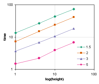
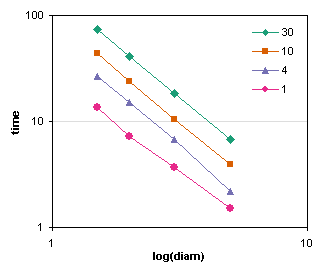
Now we have what appear to be straight parallel lines in both charts. This is very promising, because it means we’re likely to have a relationship of the form
Time = A * Height exponent 1 * Diameter exponent 2
One benefit to charting data in this way, is that it can show irregularities in the data. For example, the lowest series in the left hand chart above visibly deviates from a straight line: the second point bulges downward. The lowest series in the left hand chart has a similar bulge at its second point, and the last point of the next highest series seems to have dipped as well. Behavior like this may indicate measurement errors, and a wise researcher would repeat these tests.
A guestimate of the slopes of the charts above show that time increases with height to the power of 0.5 (i.e., the square root of height) and decreases with diameter to the power 2. I’m not sure about the height, but the diameter to the power 2 makes sense: the area of the hole is proportional to the diameter squared, so the amount of water escaping must be proportional to the area of the hole.
We can add power law trendlines to these charts to get more exact fits. In the first chart, the slopes (powers) are about 0.5, and in the second, about -2. Good guestimate.
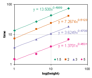

You can use simple linear regression to determine these formulas. Excel has worksheet formulas that calculate the SLOPE and INTERCEPT of a set of points, using the following syntax:
=SLOPE(Yrange,Xrange)
=INTERCEPT(Yrange,Xrange)
To get power law fits, you can take the log of the X and Y values in the worksheet, and use this ligarithmic data in the relationships above, or you can include the log transformation in the SLOPE and INTERCEPT formulas:
=SLOPE(LOG(Yrange),LOG(Xrange))
=INTERCEPT(LOG(Yrange),LOG(Xrange))
For a power law fit, the exponent equals the slope calculated above, while the coefficient is 10 raised to the intercept, 10intercept.
We can plot time vs. square root of height and vs. reciprocal of diameter squared, and we get nice straight lines.


Given straight lines, we can simply interpolate to get the time to drain the bucket for any arbitrary hole size and water height.
In the logarithmic charts below, the initial data is shown by the solid gray data points and lines. Each plotted line has an open symbol corresponding to the interpolated value of height (left) or hole diameter (right). The interpolated values from each chart was used to create an entire interpolated series in the other chart, shown in black. Finally, the final interpolated value was found on this black line, and is shown in red.

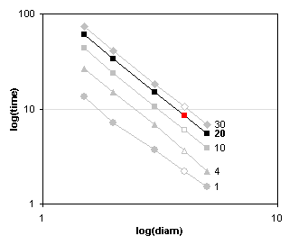
The same interpolation can be achieved on the straight lines from the time vs. square root height and time vs. reciprocal diameter squared charts. The time was 8.5 using either set of charts.


For completeness I’ve drawn the interpolated points and series on the original charts.
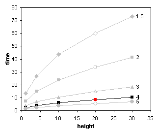
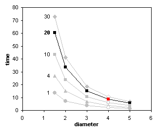
In actuality I interpolated the data numerically in the worksheet, but only after creating the charts above to tease out the form of the relationships.
There are other techniques for determining the relationships in the problem above. This post shows the graphical approach. The next post on this topic will show regression, a statistical approach. After that I will show how to use Goal Seek and Solver as an optimization approach.


Doug Jenkins says
I hope you get a good mark :)
I recall there was a discussion on DDoE a little while ago about the best programming language to teach kids. I made the point that if you want to teach them to use a computer for solving scientific problems (as opposed to teaching programming), then a spreadsheet is a great place to start. I think your post is an excellent example of what I had in mind.
m.garber says
This article (…Simple Physics Problem…) discusses a technique we use to analyze
v-i curves for superconductors (v~i^n. n~20). We look at sections of a given curve by dragging the fill handles on the frame of the source data while looking at the embedded chart – a subject you (and almost no one else) has discussed elsewhere. Walkenbach’s web site gives a macro for extracting information about the resulting data ranges. It would be very helpful if one could use this information, i.e. the x- and y- ranges. Being vba novices, however, we have not been able to automate the calculation of formulas like SLOPE and INTERCEPT. We have conjured up error messages unlike any I’ve ever seen before.
This is a general problem with tutorials – they often don’t cover subtelties in what otherwise seem like simple problems. I would very much appreciate your comments. Space does not allow for some of the many snafus I have run into.
Many thanks, sincerely, mg, Bellport, NY
Jon Peltier says
M.G. –
Do you have trouble getting the range from the chart data into the statistical functions? This would not be too hard to code.
I once built a program that let the user select a subset of data in a chart (by clicking on the first and last point of the subset), then output some statistical calculations in the sheet next to the chart. This was a great program that saved a lot of time in data analysis, and it was a lot of fun to build.