Tips and Tricks
Everybody loves their Excel tips and tricks. I know I’m famous for my extensive collection of Excel charting tricks. But the most important charting trick is Get The Data Right. The secret of successful Excel charting begins and ends with Good Chart Data. I teach it in all of my charting workshops and seminars, so I was surprised that I did not have a blog post dedicated to good chart data. But now I do.
Good Chart Data
What do I mean by “good” data? Of course, “good” has to do with the quality of the data. Where is the data from? How was the data measured or collected? Is the source reliable and trustworthy?
All of this is important, for any data you consume in Excel or in any other program. But right here, “good” data means data that can easily be rendered in a chart, without having to make excessive adjustments to the chart. Good chart data may not be good display data, but data that has been optimized for display, say in that annual shareholder’s report, is almost guaranteed to be bad for charting.
“Good” data has a layout that makes chart creation easy for you, so Excel knows how to partition the data between the important parts of the chart. X values or categories. Y values. Series names.
“Good” data also has as little formatting as possible. Enough formatting to make it readable, but not so much that it causes retina pain.
You can make good charts from bad data, but it will take longer, and you will have to muck around with the chart for a while to make it work. It’s better to spend five minutes with the data now than to spend five hours trying to clean up a chart later.
Tl;dr Good Chart Data
Good chart data has the following characteristics:
- The data exists in a contiguous range: no blank rows or columns
- The data is minimally and consistently formatted: easy to validate visually
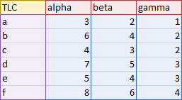
- The data is aligned with Y values in columns (shaded blue below)
- X values are located in the leftmost column (purple)
- Series names are located in the topmost row (red)
- The top left cell may provide some magical behavior (gold)
- The data may exist in an Excel Table
A Good Tabular Display is not Good Chart Data
What if you want to plot your data but also display it in an optimally formatted way? The good new is, you can. The bad news is, it takes more work. You should have two different data ranges: one arranged for best charting outcomes, the other formatted for visual consumption. Both of these ranges should link to the same original source, to make sure changes are reflected everywhere, and you maintain one version of the data.
Good Chart Data is Contiguous
A good chart data range is contiguous, that is, it is comprised of data in a single block of cells. There are no completely blank rows or columns separating the data into separate areas.
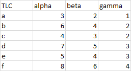
Why is contiguous data important? Because Excel tries to be smart when you click a button. If you select any single cell in the range shown above and click any chart button to insert a chart, Excel tries to determine the extent of your data. Excel will go from the active cell up, down, left, and right until it finds either the edges of the worksheet or a blank row or column, and it will include all of the data within this range for the chart. This is so much easier than having to select the entire data range, especially if the data extends beyond the first visible screen.
Excel does the same hunt for the current region when you convert a range to a Table, or create a Pivot Table, or do any number of other things in Excel.
What About Blank Cells?
It’s perfectly fine to have blank cells within the data range, as long as there are no completely blank rows or columns.
Keep in mind that successful charting means that these “blank” cells should be completely empty. A cell with a formula that returns “” is not blank, because it contains a formula. If you have the formula return NA() instead of “”, the cell will not look blank, it will contain the #N/A error. This looks ugly, but a chart treats most #N/A values as blank cells, while it treats “” as text. Text might be plotted as a zero, or it might mess up an axis.
A cell that contains a space character is also not blank, because it contains that space character. Sometimes people get in the habit of typing the space instead of just skipping the cell. This kind of non-blank cell is hard to fix because both the cell and the formula bar appear blank.
Good Chart Data is Lightly Formatted
You should only use as much formatting as you need to help you quickly scan the data.
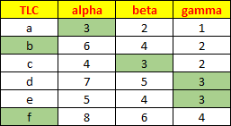
The range below is a bit over-formatted. The header row is bold and multi-colored, and the red and yellow are distracting and may eventually cause eyestrain. Bold text and light gray fills might be okay for headers, though they are unnecessary if the headers follow one or more blank rows.
The dark borders on all of the cells break up the appearance of the data range and the dark lines compete for attention with the numbers. The default light gray cell borders are sufficient. I’ve programmed some buttons in my general purpose and charting software to apply light and medium gray borders to selected ranges.
The green shading can be distracting. (See my arbitrary pattern? All cells with 3 are shaded, while b and d are shaded because they have no 3 in their rows. I don’t know why.) If you find shading helps to identify certain values, don’t manually color the cells: use Conditional Formatting instead, so the shading goes away if the condition is no longer met.
Good Chart Data is Not Centered
You should avoid centering your data. It might look “nice”, but centering hides important characteristics of the data. By default, text is left-aligned in cells and numbers are right-aligned. A common feature of “bad” data is numbers stored as text, and centering everything hides this distinction.
Here is a data range with all of its cells centered. There are some small triangular flags in some cells that indicate a possible error, but I think most of us have learned to ignore warnings like this.
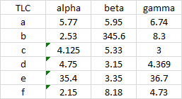
When we uncenter the data, it’s easy to detect the cells with numbers stored as text, even if we’ve ignored the green flags.
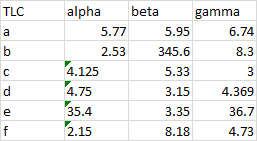
We can select the flagged cells, click the little warning dropdown, and convert them to numbers.
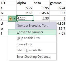
Now that we’ve converted text to numbers, we still have difficulty parsing the numbers, because they have inconsistent numbers of decimal digits. Some numbers look larger than others, but they merely have a longer tail after the decimal point.
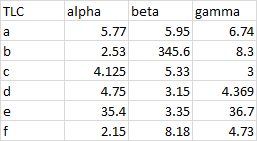
When we apply a consistent format, we can tell that the larger numbers are in fact longer.
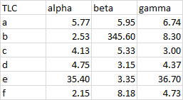
It’s now very easy to identify the largest numbers in each column. You might want to check that value of 345 in the “beta” column since it’s 100 times as large as the rest of the column.
Good Chart Data is in Columns
Excel charts can work with data in columns or in rows. You can use either arrangement and sometimes one just works better than the other. If a chart’s source data has more rows than columns, Excel creates the chart with series in columns. A pivot chart always plots the pivot table with series in columns.
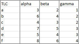
It is probably good practice to get used to using data in columns, because of the way a database table is structured. A database has fields and records. A field is a variable or measurement, such as date, eye color, serial number. A record is a single instance of a set of values for these fields.
When printed on paper or viewed onscreen (or imported into Excel), a database table is shown as a grid of rows and columns. Each column is a field or a variable, and each row is a record. The first row of the database table is a header row that contains the field label. Usually one column of the table, often the first column, contains a unique identifier or key for that particular record.
In the table above, we have fields for TLC, alpha, beta, and gamma. We have records for a, b, c, d, e, and f.
Good Chart Data Has a Header Row
Like a database table, chart data should have a header row. When data is plotted with series in columns, this header row is used for series names, that is, the labels that appear in the legend of the chart.
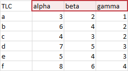
Database tables have one header row only. Chart data ranges usually only have one row, but you can use more, often to good effect.
Good Chart Data Has no Subtotal or Total Rows
Subtotals and totals help to understand data, but they have no place in the source data for a chart. Suppose I have monthly values I want to plot.
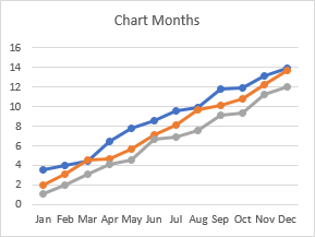
If I put subtotal rows into my source data, it breaks up the visual appearance, so it’s hard to scan the individual values for discrepancies.
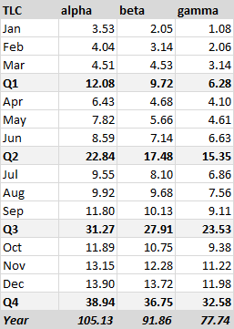
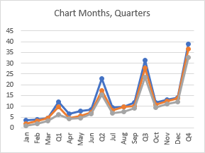
The quarterly subtotals disrupt the flow of data in the chart, and the much larger magnitude of the subtotals shrinks the monthly values.
If I include yearly totals, the quarterly subtotals shrink, and the monthly values are lost in the weeds.
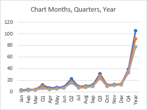
Note that you can filter the quarterly and yearly categories from the chart in recent versions of Excel. Also note that a pivot chart will only show values from the pivot table and not totals and subtotals.
Good Chart Data Has a Header Column
Just as a database table has a unique key field, the data range for a chart should have a header column identifying each row. This column is generally used for labels or values which are plotted along the X-axis of a chart.
This X-axis column should be the first column, to the left of any Y-axis values. This makes charting easier because Excel looks to the left for X values. But you would be amazed at how many people have trouble plotting their data when they have placed their Y values to the left of their X values. You can always tell Excel which data comes from where, but it is a lot more work, especially if you have to do it repeatedly, again and again, ad nauseam (can you feel the tedium?).
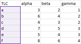
Another trick to help Excel identify your X values is to make the column of X values different from the Y values.
First Column Different: Text
Probably the most common way to make the first column different is by filling it with text. While month names are a component of a date, a list of month names is text, as shown here.
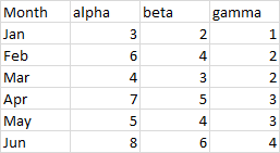
When you select the data range (or one cell inside the data range), Excel uses the text labels in the first column as X-axis (category axis) labels, it uses the other columns as Y-axis (value axis) values, one column per series, and it uses the labels in the header row as series names. Here are line and column charts using this data (and area charts work the same way). Months from the first column are automatically placed along the category axis, headers from the first row are automatically used as legend entries (series names). and each column of Y values is plotted as a distinctly formatted series.
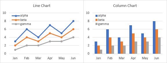
It’s the same with a bar chart, except that the category and value axes are switched. That’s right, in a bar chart, the X-axis is vertical and the Y-axis is horizontal. But the origin of the axes is at the bottom left in all of these charts, so values increase from left to right (like months advance from left to right in a line or column chart). Similarly, months advance from Jan to Jun moving bottom to top in a bar chart (like values increase from bottom to top in a line or column chart).
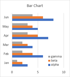
Confused? Since the months are listed from top to bottom in the worksheet, it would make sense to plot them from top to bottom in the chart. But there is logic in how Excel does it, and it is also pretty easy to fix when you know how. See Excel Plotted My Bar Chart Upside-Down for the simple technique.
XY Scatter charts are different: they have numerical axes for both X and Y (category and value) axes. When you plug in text for the X values, the chart doesn’t know what to do. Normally text is considered to have a value of zero, but for X values in an XY chart, Excel substitutes the counting numbers 1, 2, 3, up to the number of points. (Excel also does this if no X values have been specified.)
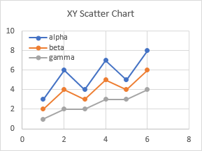
What if ever have an XY chart with the numbers 1, 2, 3, etc. along the axis, and you know you selected numerical data for the X values? Check the range of X values: there is probably a number stored as text, or an actual text label, somewhere in the range.
First Column Different: Dates
Using dates in the first column is another way to make the first column different. Excel recognizes the date formatting of the cell and parses the column as X values. An added bonus is that line, column, area, and bar charts have a special date type of axis (as opposed to the text axis shown above) that provides unique formatting options. This range has dates in the first column; notice that the dates are not uniformly spaced, but are taken on the 1st and 8th of each month.
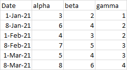
Here are line and column charts made from this data. The line chart looks great and shows some of the enhanced date axis features. The data points are not equally spaced but reflect the non-uniform spacing of the data. Also, there is a tick mark and axis label on the first of each month, despite the nonuniform month lengths.
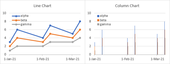
The column chart is wacky though. To accommodate the nonuniform data spacing, the chart has a slot for each day, even days without data. So each column chart series has to appear within the slot for its given day, and there are lots of days in between. This column chart should really be called a toothpick chart.
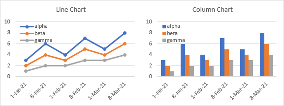
You can always change the axis type to text, and the column chart will look normal. But you lose the non-uniform nature of the dates and the first-of-the-month labels.
An XY scatter chart treats dates for X values just like any numerical X values. You can see the non-uniform spacing of the data.
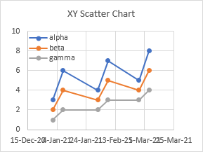
But the axis is not labeled as naturally as the line chart above. Using the value axis algorithm, Excel picked an axis that begins at 44,180 and increases to 44,280 in steps of 20. (Excel stores dates as whole numbers starting on 1 January 1900, so 44,180 is 15 December 2020 and 44,280 is 25 March 2021.) You can format the XY chart’s axis to begin on the 1st of a month, and have a tick label on the 1st of the next month. But for a non-trivial number of months, it’s impossible to repeat this pattern with Excel’s default axis labels.
First Column Different: Numbers
If you have numerical X values in the first column, they won’t be different from the numerical Y values in the other columns. You know those values in the first column are years, and I know they are years, and the header label even says “Year”, but Excel simply recognizes them as numbers.
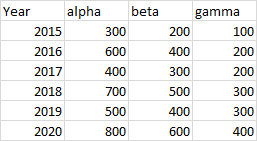
This doesn’t matter for an XY Scatter chart: Excel almost always treats the first column of numbers as X values. This XY chart shows years along the X-axis, as intended.
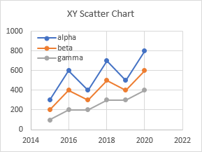
When Excel created this line chart, it saw the numbers in the first column and decided to plot them as Y values. There are two consequences of this: First, there is a series of values near 2000 floating far above the intended Y values in the chart; second, no X values were specified, so Excel simply used the counting numbers 1, 2, 3, etc.
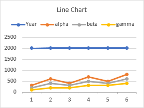
You could avoid this by selecting just the Y values when the chart is created, and specifying the X values later. You could also do this with years by entering dates in the first column (1/1/2015, 1/1/2016, etc.) and formatting them using a custom number format of YYYY, which will display just the year numbers. Since the column now is formatted as dates, Excel will plot them the way you want.
You cannot avoid this by formatting the first column of numbers as text, Excel is too smart, and it converts the numeric text as numbers, and therefore as Y values.
First Column Different: Top Left Cell
You may have noticed the label “TLC” in the header row of the first column. TLC stands for Top Left Cell, and it is a little piece of magic for Excel chart data.
One way to make the first column different from the rest is to clear the contents of the Top Left Cell, as shown below.
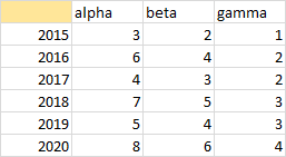
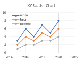
We already know that an XY Scatter chart will plot the first column of numbers as X values with a label in the top left cell. But it also works if the top left cell is blank.
The top left cell works its magic in line (and area, column, and bar) charts. This line chart was generated automatically with the column below the blank top left cell as X values, and the columns below actual labels as Y values. Finally, a way to plot numbers as X values in a line chart without worrying about formats (text or dates).
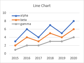
Here is an important difference between XY scatter charts and line charts. Just because you can trick Excel into plotting numbers as X-axis values in a line chart, you can’t trick Excel into plotting those X values as numbers. The next section shows a few different sets of data that will help illustrate this difference.
Spacing and Order of X Values: Numbers and Dates
Evenly Spaced Numbers
Evenly spaced X values seem to be similarly plotted in XY and line charts. In the XY chart, the X-axis begins at zero and extends beyond the highest X value. In the line chart, the first X-axis label is the first X value and the last X-axis label is the last X value, without the padding found in a scatter chart’s default axis values.
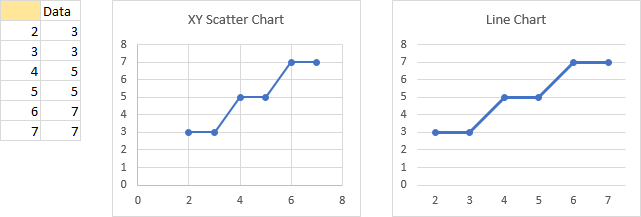
Unevenly Spaced Numbers
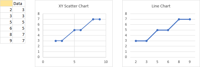
Unevenly spaced X values are plotted differently in XY and line charts. In the XY chart, the X-axis begins at zero and extends beyond the highest X value, and data points are plotted unevenly, reflecting the unevenness in the X values. In the line chart, the first X-axis label is the first X value and the last X-axis label is the last X value, data points and X-axis labels are uniformly spaced regardless of their apparent numerical values, and there are no X-axis labels for missing X values.
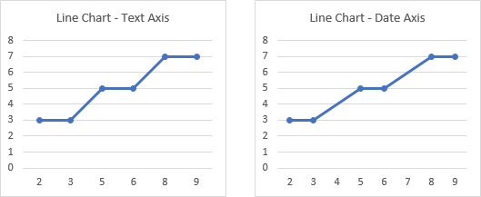
It is obvious that the line chart treats the X values as non-numeric text labels, ignoring any apparent numerical values. This is because the default axis for non-date X values is a text axis (below left). We can change this to a date axis (below right), and we see the data points are now plotted according to their unevenly-spaced numerical values. The first X-axis label is still the first X value and the last X-axis label is still the last X value. (Excel treats the numbers as dates with a format of “D”, so only the day shows.)
Numbers Out of Order
When numbers are out of order, the above behavior is even more different. The XY scatter chart draws the points and the lines connect them in order, moving left or right as the X values decrease or increase. The line chart shows the points in the order they appear in the data range: the first X-axis label is still the first X value and the last X-axis label is still the last X value, so the labels are out of order.
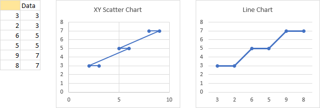
When we convert the text axis (below left) to a date axis (below right), we see that not only have the points been spaced according to their non-uniform values, but that the dates have been internally sorted prior to plotting. This internal sorting is a feature of charts with a date axis. The first X-axis label is the smallest X value and the last X-axis label is the largest X value, so the labels are in order and the points are plotted left to right.

Evenly Spaced Dates
Let’s look at the same charts with dates instead of regular numbers. The XY scatter chart (left) and line chart (right) plot evenly spaced dates along the X axis in a similar way. The data is evenly spaced, so the data points are plotted evenly. The XY chart extends its X-axis a little bit below to a little bit above its data range, while the line chart uses the earliest date as the first axis label and the latest date as the last axis label.

Unevenly Spaced Dates
The XY scatter and line charts also plot unevenly spaced dates similarly. The points are spaced unevenly to reflect the pattern in the data. As before, the XY chart extends its X-axis a little bit below to a little bit above its data range, while the line chart uses the earliest date as the first axis label and the latest date as the last axis label.

Dates Out of Order
Out of order dates are plotted in an XY scatter chart in the order they appear in the worksheet. The lines connecting the points start at the first point, and move left or right for earlier or later dates. In the line chart, the lines always connect from left to right, reflecting the internal sorting that takes place. As always, the XY chart extends its X-axis a little bit below to a little bit above its data range, while the line chart uses the earliest date as the first axis label and the latest date as the last axis label.

Problem with Numbers and Dates Out of Order
Perhaps it’s convenient that Excel’s line charts sort by date prior to plotting, and there are a few tricks that rely on this internal sorting. But this sorting can also lead to problems with data labels.
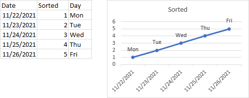
Here is a simple data set, with dates, sorted values, and days of the week corresponding to the dates. The chart uses dates as X values and sorted values as Y values, and the days of the week were used to label the points, using the Values as Cells option. The labels are shown in order from Monday through Friday, as expected.
Below is a data set, with the same information as above, but with the dates out of order. The chart looks the same as above, since the X and Y values are sorted by date before plotting. But look closely at the data labels. These were not sorted prior to plotting, and are no longer in order from Monday to Friday.
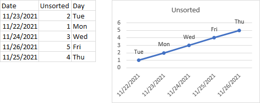
In addition to this problem with data labels, it is likely that someone who is using the data for other purposes may misinterpret the data because they don’t notice or understand Excel’s internal sorting. For these reasons, it is a best practice to sort the worksheet data before plotting your data.
Thanks to alert reader Jim Chisholm for reminding me of this problem.
Top Left Cell Plus
We’ve seen how a blank top left cell can help Excel to parse data correctly into X and Y values and series names.
But this concept of blank cells is more magical than that. Suppose you have two columns of category labels, for years and quarters. Each of these label columns has a blank cell in its header (blank cells are shaded gold). Each year only appears once, next to the first quarter, and there are blank cells next to the other quarters.
Excel sees the two blanks in the top left, and uses both columns as category labels. There are two rows of labels, with quarter labels in the first row and years in the second. Each year label is centered under the corresponding quarter labels, and a vertical tick mark extends from the axis to help delineate the labels.
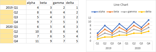
This is a very nice effect, only available for line, column, area, and bar charts that are using a text style X-axis. It will not work for a date axis or for an XY scatter chart’s X-axis: in those cases you will get the numbers 1, 2, 3, etc.
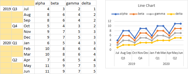
You may have seen this kind of data arrangement in a Pivot Table, with multiple fields in the rows area, and noticed the multiple-tier category labels in the corresponding Pivot Chart. But you’re not stuck needing a Pivot Table, you can build this data layout yourself. You are not limited to two tiers of labels, either: below you can see a three-tiered axis, and I’ve seen it used for 5 or 6 tiers.
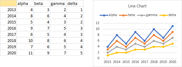
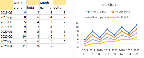
What if you indicate to Excel that you have two rows of series names? The same effect applies. The North label is combined with the alpha and beta series names, What if you indicate to Excel that you have two rows of series names? The same effect applies. The North label is combined with the alpha and beta series names, while the South labels is combined with the gamma and delta series names, to generate compound names.
You can combine the effects of multiple-tier category axis labels and compound series names in the same chart, as shown below.
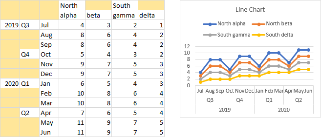
Note that these blank cells must be totally blank, and not just look blank like a formula that returns a value of “”. And while a chart can treat #N/A as a blank in a chart’s Y values, #N/A will be treated as a text label, not as a blank, when used in the series name and category labels regions of the data range.
The Select Data Source Dialog Recognizes Good Chart Data
When a chart’s data doesn’t conform to these definitions of “good” data, the Select Source Data dialog shows only a blank for the chart data range. Below the range selection box, you are told “The data range is too complex to be displayed.” This means that the data is irregular. Not all series start and end at the same row, perhaps, or the series have different numbers of points. Perhaps the series names are misaligned from the Y values, or the series are plotted out of order. Anything that prevents Excel from indicating a nice rectangular block of data.
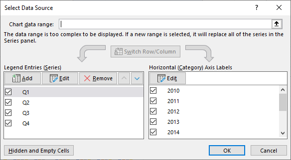
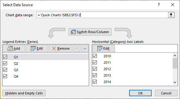
When the data does conform to our “good” data definition, the Select Source Data dialog happily displays the address of the data range.
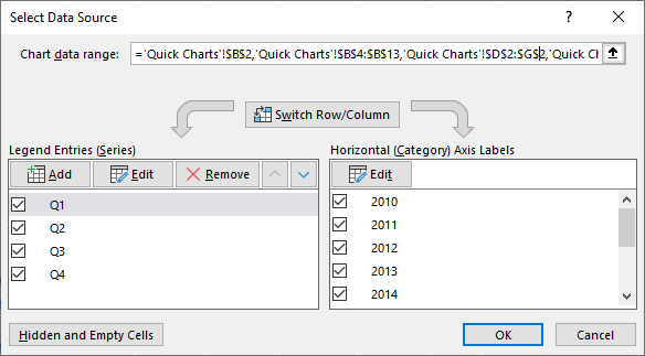
In fact, the Select Source Data dialog is a bit more forgiving that my rules. If the data is separated by complete blank rows or columns, but otherwise fits within a rectangular range, the dialog shows the addresses of the various areas of the data range.
Good Chart Data May Be in a Table
An Excel Table is a special data structure which provide advanced data handling capabilities; I have converted my data into a Table below. The header row has buttons for filtering and sorting of the Table. You can add a total row if desired. There are numerous styles you can apply, some of them approaching hideous; the Table below shows the default style.
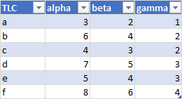
There are many benefits to storing your chart data in a Table. The major benefit is that when you add data to the row below or the column to the right of a Table, the Table automatically expands to include the added data. What’s more, any formulas that reference a Table column or row will update automatically if the Table expands or contracts. This includes chart SERIES formulas and the Chart Data Range formula in the Select Source Data dialog. So if your chart uses a Table like this for its source data, when you add rows of data, each series in the chart will add the corresponding points; when you add columns to the Table, your chart will add series. Dynamic charts made easy!
One drawback to using a Table for your chart’s source data is that the header row of a Table can contain no blank cells. This means that a lot of the blank-cell based data parsing, especially the top left cell magic, may not work with a Table. But if your first column(s) are not numerical, Excel will still automatically parse them into X values. And you could still select just part of the Table, create your chart, then manually specify the X values.


Bob says
Jon,
This post could be a syllabus for a masterclass in Excel Charting.
It should be mandatory reading for anyone who is trying to make a chart.
Well done,
Bob
Jon Peltier says
Thanks, Bob. This is important knowledge, and I wish I’d posted it long ago.
jim chisholm says
Great post. I’ve shared it internally at work with the title “Study this post and put me out of business”.
One thing I’ve noticed with Line Charts with a date axis. If the dates are unsorted (and Excel sorts them internally) the data labels are also sorted – alphabetically – and become disconnected from the data.
Jon Peltier says
Thanks, Jim. I’ve included a warning about this issue, and reminded people that good data should be sorted to avoid this and other problems.
The data labels are not necessarily sorted, though. In the sample I used in my warning, the labels were used in the order they appear in the chart, and not sorted to sync with the dates.
Mark R Biegert says
First-rate post. I will use this as a reference for the students I tutor. Thanks!
Carlos Barboza says
Hi Jon,
Like Bob, this post alone could be a “Masterclass in Excel Charting.”
What’s best is that the principles still hold true with the new capability of Excel: spilled ranges from dynamic arrays.
I’m gonna give it a second read. It was very enriching.
Keb says
Excellent, Chart bible.Thanks Jon