Dual (Duelling) Pie Charts
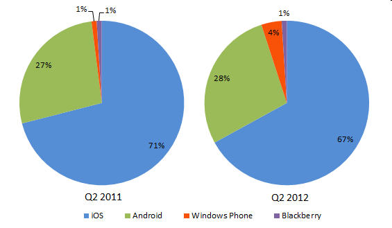
Earlier this year, I saw a BUSINESS INSIDER CHART OF THE DAY story called Microsoft Is Winning More Developers To Its Mobile Platform. They showed how the proportions of new apps built by mobile developers were distributed among the four mobile platforms for the second quarter of 2011 and of 2012. Here is a reconstruction of their chart.

Yes, they used side-by-side pie charts with a distant legend. The data isn’t so complicated that this chart actually distorted anything, but it made the information hard to assimilate. They got their data from a nearly identical chart in Flurry Blog’s Microsoft May Be Closer Than It Appears in Android’s Rearview Mirror. I find this headline amusing, implying that Windows Phone was right behind Android in app development. Several other online channels picked up the same story from these two sources, and some even came to the conclusion that Windows Phone had not only Android but also iOS on the ropes.
Alternative Charts
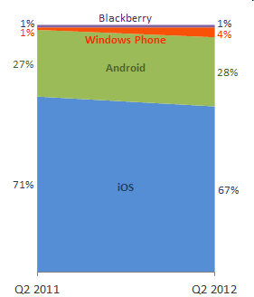
It’s not easy to compare wedge sizes between separate pies (or even within the same pie), so I tried another approach. I built this stacked area chart. It’s easy to see that Windows Phone has gained and iOS has lost share, and that Windows Phone and Blackberry are nearly insignificant compared to Android and iOS. But we can’t really judge any change in Android without reading the data labels.

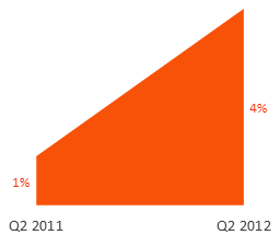
The Business Insider conclusion was that Microsoft was winning more developers. They could have shown this clearly with a single area chart, though it would have ignored the context of the rest of the industry. Of course, the data labels provide some context: even 4% is a very small market share.

Slope Graph (Slope Chart)
Probably the best way to show this data is with a slopegraph: a line chart with two categories, in this case, two dates, showing the changes in the values. This chart shows that iOS has the major share, more than twice Android in second place, and that Windows

Here we can see a modest decrease in iOS, matched by a similar increase in Windows and a tiny increase in Android. Blackberry, thanks for playing. Since these changes are only a few percentage points, I’d like to see monthly or at least quarterly data during the year between the two endpoints, before drawing any conclusions.


Meic Goodyear says
Excellent post. How many times, in how many places, do we have to keep on at this before people take notice?
I would prefer a vertical axis on you slope chart, though.
Thanks
ScottishCalvin says
I think the other telling part here is that Jon’s also changed the Windows Phone colour to orange – different from in the original chart – to make it more readable. The person who chooses the default chart colours at Microsoft probably does it by picking them randomly out of a hat, although at least they don’t use that awful cyan blue that 2003 had.
Bob says
Hi Jon,
When I see charts comparing 2 data sets using %, I always like to know how many discreet items were tallied to make up the stats. How many projects were started in Q2 2011? How many in Q2 2012? The 1% Blackberry could mean that it is doomed if there are only 100 projects, but still have a glimmer of hope if there are 1000’s of projects / developers.
Cheers,
Jon Peltier says
Calvin –
The colors in Excel 2003 and earlier were developed by a gnome living under a bridge, where it was always gloomy and the days were 1 hour long. The colors in 2007 and later were more consciously developed, and in fact the default colors, while drab, are friendly to those with color vision deficiencies.
Naomi B. Robbins says
How about arrow charts?
Jon Peltier says
Bob –
This was a funny measurement. I looked for more detailed data, but found no data for other quarters. I thought I saw figures stating that these percentages were based on tens of thousands of new apps, but I can’t find that now.
Jon Peltier says
Naomi –
The changes are so small compared to the magnitudes, that the arrow chart doesn’t look very good:
Joe Mako says
Jon,
I agree, that arrow chart does not look good.
What if the squished skew of the arrows was fixed, the canvas was a little wider, and labels were on the marks, something like:
http://public.tableausoftware.com/views/PercentofProjectStarts/PercentofProjectStarts
I also agree with your overall assessment, that more historical context would be beneficial, and if that was the case, then an arrow would no longer be useful.
Chris Read says
If you really want to scare Apple and Google (and ignore current market share), you could chart the percentage change in market share:
http://tinyurl.com/awpz8uo
(Ignore the fact that you can’t have a google image chart change where the x-axis sits)
John Miller says
why is any chart needed at all? It’s only 8 data points. The visualization does nothing that a small table wouldn’t do easier and more accurately.
Best Excel Tutorial says
Very cleaver way to show data. Thank you, Jon, for sharing.