Chandoo wrote a tutorial about Sales Funnel Charts in Excel. Technically his protocol was okay, and the result looks, well, like a funnel. I’ve written about Funnel Charts (Bad Graphics) and Stacked Pyramid Charts (Bad Graphics) before, and Chandoo’s doesn’t suffer from a misuse of 3D and shading effects.
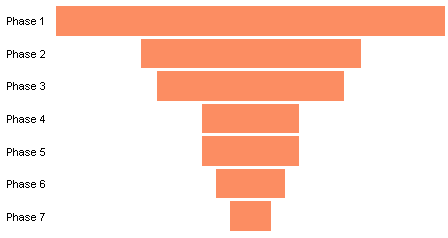
The problem with Funnel and Pyramid charts is that they usually suffer from a misapplication of the funnel metaphor, and Chandoo’s is no different. In this incorrect metaphor, a funnel is used to show an ever narrowing amount of something (sales, in Chandoo’s example) the further along the stream the process goes. The quantity decreases because some of it is removed from the stream or blocked from proceeding. In a real funnel, there is no loss of this quantity, in fact the flux of the quantity past a point must increase to account for the decreased opening size. But nothing is lost.
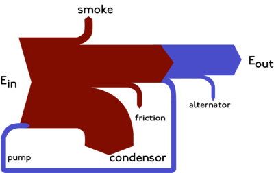
In fact, a better representation would be a Sankey Diagram (see below), which accounts for the losses through the process. But that’s a discussion for another day.
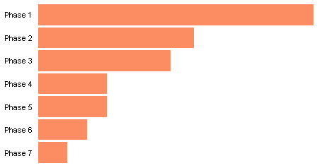
One can still use a bar chart to represent the quantities at each phase of a process. One improvement is to move the bars to one side of the chart. This gives better resolution to the values (wider difference on the chart for the same difference of the measured quantity). This also makes it easier to compare relative values. Because of the shared baseline along the left edge of the chart, it’s easier to judge that in Phase 2 and in Phase 3 the values are respectively a bit over and a bit under 50% of the value in Phase 1. In the tornado chart above, one could not be so confident in these estimations.
In Tornado Charts and Dot Plots I described a different type of chart, variously called a tornado chart or a funnel chart, which compares two populations by plotting bars either to the left or to the right of the middle of the chart. The symmetry is appealing, but the ability to compare two bars that strike out in opposite directions is compromised. I suggested using dot plots instead. Here is a rudimentary dot plot of Chandoo’s data:

If we are satisfied with the resolution of the original funnel chart, we can still benefit from the common baseline by using left-aligned bars half as wide as those of the funnel chart. This also saves a lot of space in a crowded report.

One could also make a column chart of the data, but the category labels either must be rotated or shortened, reducing legibility in both cases.

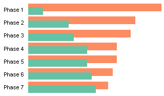
At the outset I said that Chandoo’s protocol was “okay”, but he could have used a different bar chart approach to make it better. Basically, a funnel chart is made of two series, one showing the values (orange below) and the other normally hidden (green) which helps to position the value bars.
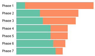
When I make charts like this, I make floating bar charts, which are stacked bar charts, with a dummy series that pushes the value series into position. Below I’ve offset my green and orange bars to illustrate the construction. I can hide my dummy series by formatting with no borders and no fill.

Chandoo chose instead to use clustered bars, as shown below, with the orange bars including the data plus the (green) offset into a total value. The green bars are then moved in front of the orange bars and hidden by formatting them with a fill color that matches the plot area background.
As soon as somebody tries to read values off the chart by mousing over the bars, the superiority of the stacked bar approach is evident. Below I’ve moused over one of the value bars, and we see it’s from the Funnel series and the value is 21,180.

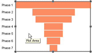
If I try to mouse over one of my dummy bars, the cursor can’t see it, because it has no fill, and instead all that is detected is the plot area.
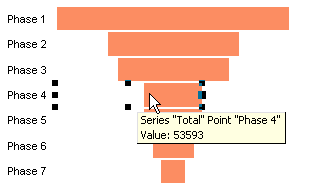
In the clustered bar approach, the exaggerated value of the Total series is displayed (53,593), and if this point is selected, the covered end of the bar is outlined.
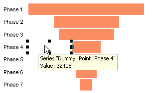
The hidden points can also be detected, as in the Dummy point below with a value of 32,408.
Sometimes it helps to use fancy formatting or designs to make a chart more noticeable. But in a business report, if the data is important, it does not need fancy effects to be noticed. Selecting a funnel chart, even using the improved stacked bar approach, is still a compromise which decreases the effectiveness of the chart.


Tim says
Don’t agree Jon. I think the funnel gives a better idea of how much made it through from one phase to another. A good metaphor is not just glitz.
Jon Peltier says
“A good metaphor is not just glitz.”
I agree. The funnel is not such a good metaphor. And the common baseline of bars in a regular bar chart make it easier to compare one phase to another.
Rene Tenazas says
Jon,
From a purely logical perspective, I’d agree with you. A bar chart with all bars starting from a common baseline provides as much information as the funnel chart in about half the space.
However, from my experience with sales people, for whom “sales funnel” is such a basic term, the funnel chart is a common representation of the fact that the number of prospects declines the further down the sales process one goes. The advantage of the funnel metaphor in this case is that they understand it already. If you show a funnel chart to sales executives, you wouldn’t have to explain it.
Bar charts with common baselines don’t imply a “mandatory narrowing” — it is always possible that the order of the bars may not be sorted in accordance with their value. Thus, a sales executive may spend a few seconds to try and validate the bar chart mentally, something he wouldn’t do with a funnel chart.
If the goal of a dashboard is to deliver information that the audience can grasp in as little time as possible, then the funnel chart, despite its waste of space, may be the better choice for audiences who are used to the funnel metaphor.
Jon Peltier says
Rene –
Thanks for your clear discussion of the merits of the funnel analogue. I can see how a logically suspect but well understood concept can be useful for conveying information. There must be dozens of similar metaphors, which defy logic but still enhance comprehension. I should remember the engineer’s credo:
If it works, don’t fix it.
Not the other engineer’s credo:
If it works, you haven’t fiddled with it enough.
I’ve fiddled with Chandoo’s funnel chart, and made it work for technical folks like myself, but perhaps broken it for those who market and sell what the technical people produce.
And Chandoo, Tim, and Rene: I’ll try to keep an open mind, even while spreading what I think are best practices.
HSA says
This is some very helpful information pertaining the funnel. Thanks
Rick Henderson says
I don’t do a lot with funnel charts, but just as a note maybe it was named more for its shape and not for the metaphor.
Jon Peltier says
Rick –
While the shape of the funnel chart may have led to its name, the name connotes the function of the kitchen implement, which is an inaccurate metaphor. In the horizontal bar orientation, the term “tornado” may be better, because it references the shape but not any particular process flow.
Sandyn Skudneski says
I know this is an old conversation. My thought was this: technical people will look at the mass energy balance to account for everything. Business folks will only concentrate on what will bring them a return. Under this scenario it might be preferred to drop extra information. I’m only thinking about the visualization. I like the other points Jon makes.